
Engineering & Energy
THE PROOF
Two readers, two pages.
The same service, read by a municipal technical office and by a business owner: two pages, not one.
Specifications, certifications, legal references: what a technical office needs
sample data
What we do for Engineering & Energy.
All nine, for every sector. The ones marked we have already shipped here. Each one can be tried.
WebsitesDone here
Found on Google, quick on a phone, and the visits turn into messages.
E-commerce
Sell direct, and the cut you were leaving to the platforms stays with you.
App development
An app your customers open every day, written by the people who designed it.
Branding and logo
The mark people recognise before they read your name.
Social media
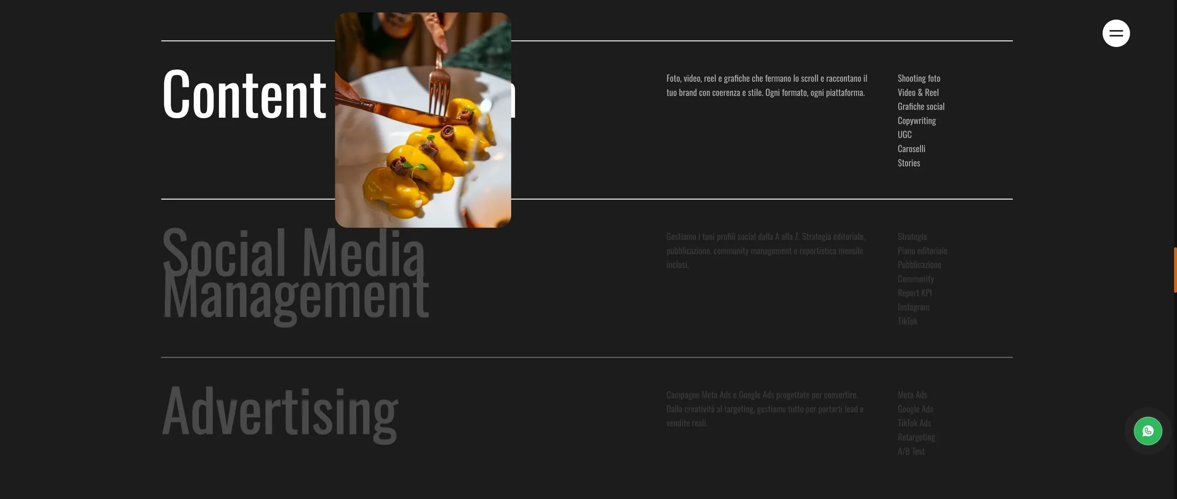
You approve the plan before it goes out. We shoot at your place, and read the numbers with you.
Packaging and labels
A label gets three seconds on the shelf. We design so three is enough.
SEO and Google visibilityDone here
Get found by the people already searching for you.
Ads
We bring customers in from Google and Meta, with numbers you can read.
AI and automation
We connect the tools you use and remove the steps your team repeats every day.
Sector projects.
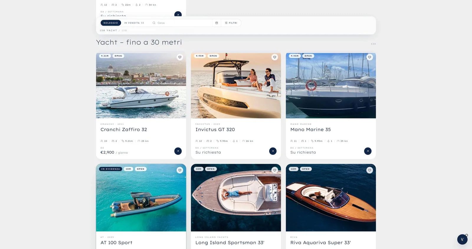
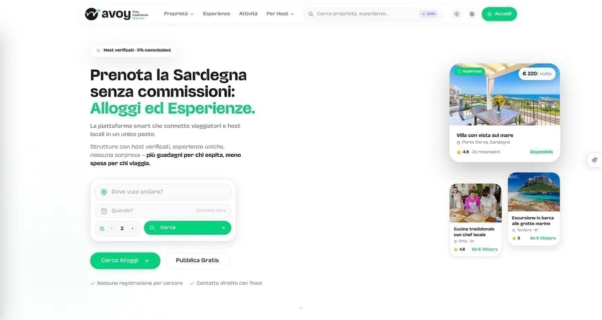
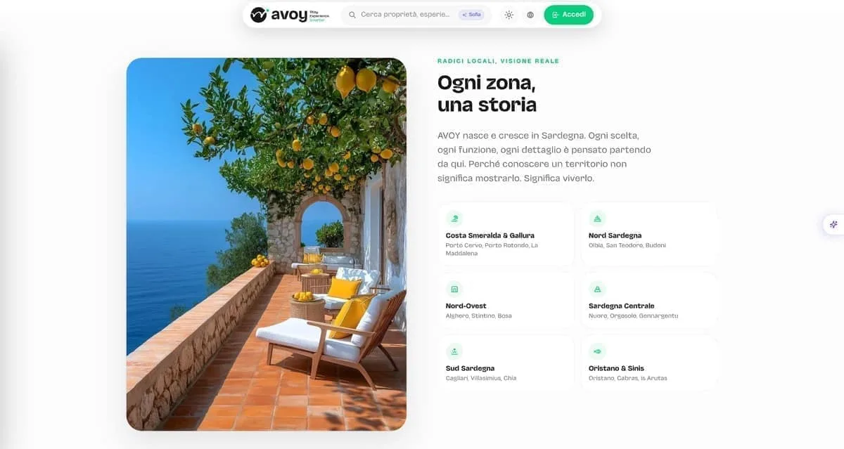
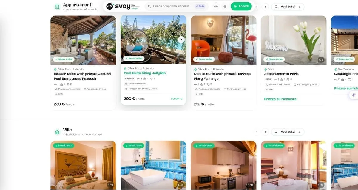


Selling engineering and energy services means working for two buyers with nothing in common: councils and public bodies on one side, companies on the other. They buy through different procedures, they are afraid of different things, and they land on the same page. In this sector we have one project with a page of its own — the site of an engineering firm in Cagliari — and two archive rows, from 2020 and 2021. What follows comes from there.
Two buyers, one page
From outside, the skills are indistinguishable. "Energy audit", "management system", "engineering and architecture services" are three different trades that sound like one thing to anyone outside the field. A site that folds them into three menu items leaves the understanding to the buyer, and the buyer asks for a quote on the wrong thing — or does not ask at all.
Then there is the split audience. A technical office looks at requirements, certifications and the names of whoever has already awarded you a contract. A company looks at what it saves and who answers when the plant stops. One page that half-addresses both is the fastest way to address neither.
The third problem is that the work here does not come out of a brochure. It comes from a reference, from an office that has watched you work, from an invitation. The site does not close the deal. It has to survive the check that comes first, when somebody types the company name in and looks at what comes up.
What the page has to carry
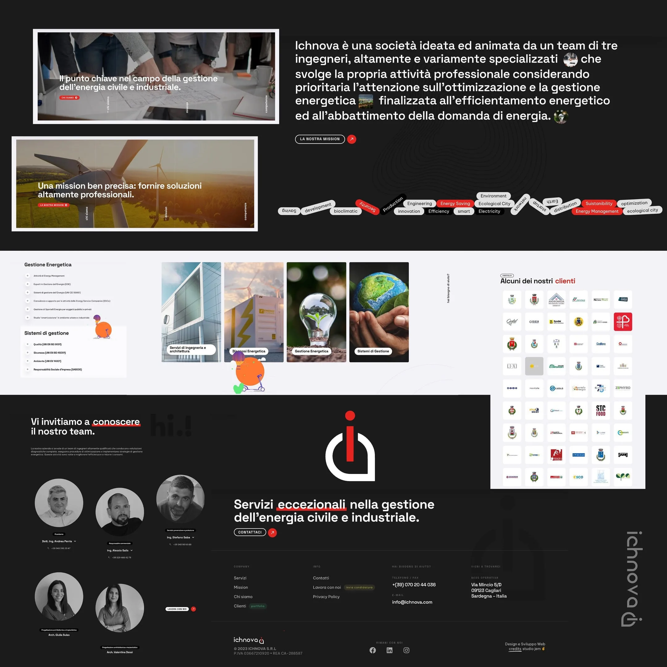
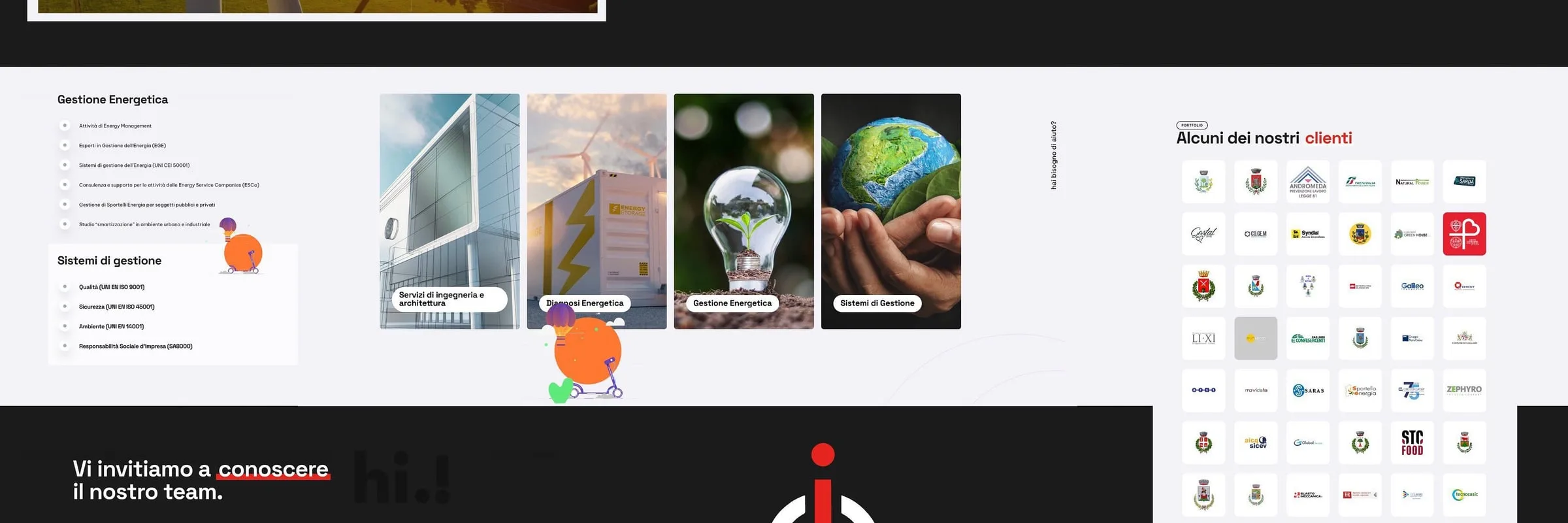
Service areas kept apart and named in full, with the whole list inside them, acronyms included: someone hunting a standard is hunting that exact standard. Clients as evidence and not as decoration, in a grid where public and private sit at the same height, because each of the two has to recognise one of its own. People with name, role and a direct number. Real photographs of sites and landscape — office stock only says you have nothing to show.
What we built with Ichnova
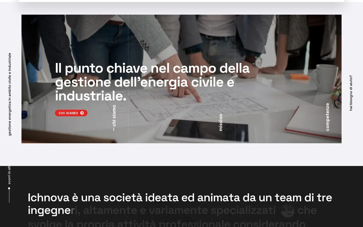
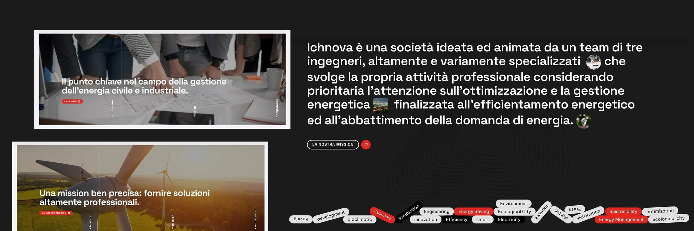
Ichnova is an engineering firm in Cagliari: three engineers, two architects, one job — optimising how a building or a company uses energy. The site is built on the four areas, each with its photographic card and the full list underneath, down to ISO 9001, 14001, 45001 and SA8000. The clients — councils, public bodies, companies — sit in a uniform grid of white tiles that holds forty of them without one shouting over the rest. The team is in black and white, with name, role and a direct phone number.
There was work before that, and we write it as it stands: Been Energia in 2021 and Be.EN in 2020, a website, are two rows of our archive. Neither has a page, and for the first one the catalogue does not even record what kind of work it was. We name them because they are work that was done, not because they add anything to what we can say today.
The portfolio in this sector is short and we would rather write that down. If you are after the studio with thirty engineering firms on the shelf, that is not us. If what you need is a page that holds a technical office's check and a business owner's hurry at the same time, tell us about it in the online quote: no discovery call before we know what we are talking about.
What clients say.

In the world of bilingual yacht charter, the first impression on the web is worth everything. Now our platform is fast, elegant, and provides all the technical details it takes to bring clients on board without a worry.
Your Charter


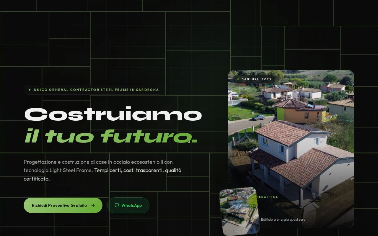
Sanluri is not just a building site. It is the first demonstration that in Sardinia you can build differently — faster, more sustainably, more safely.
Green Tech Costruzioni

We wanted our beauty suite to convey elegance and relaxation from the very first moment. With this new identity and the integrated booking system, clients walk in already in the right frame of mind for wellness.
Estetica Valeria

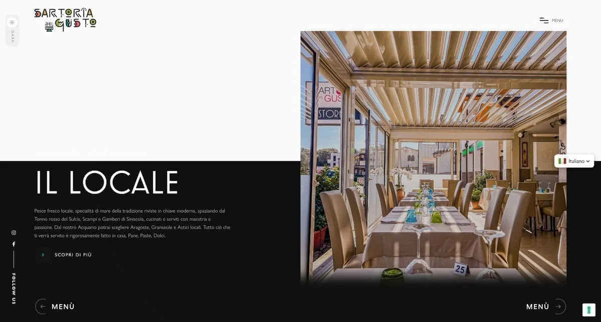
In our restaurant in Olbia the care for the kitchen goes hand in hand with the guest's experience. Between the digital menu and smart reservations, whoever comes to see us enjoys dinner without a hitch, starting from the choice of table.
La Sartoria del Gusto

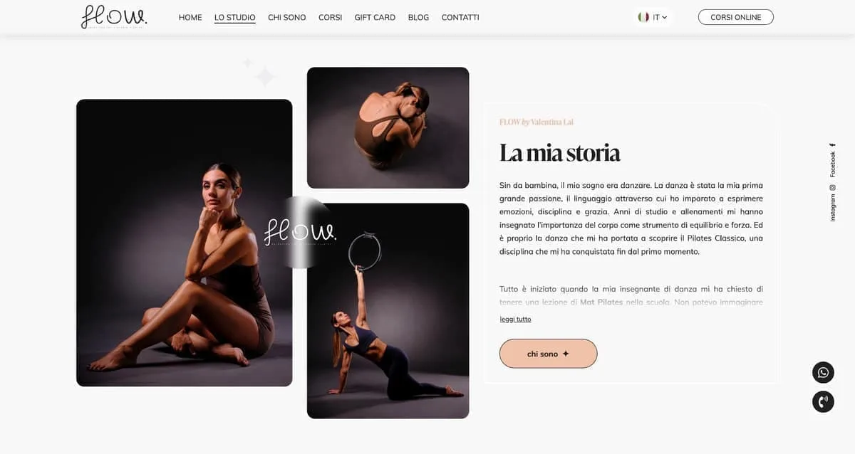
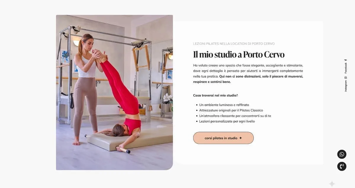
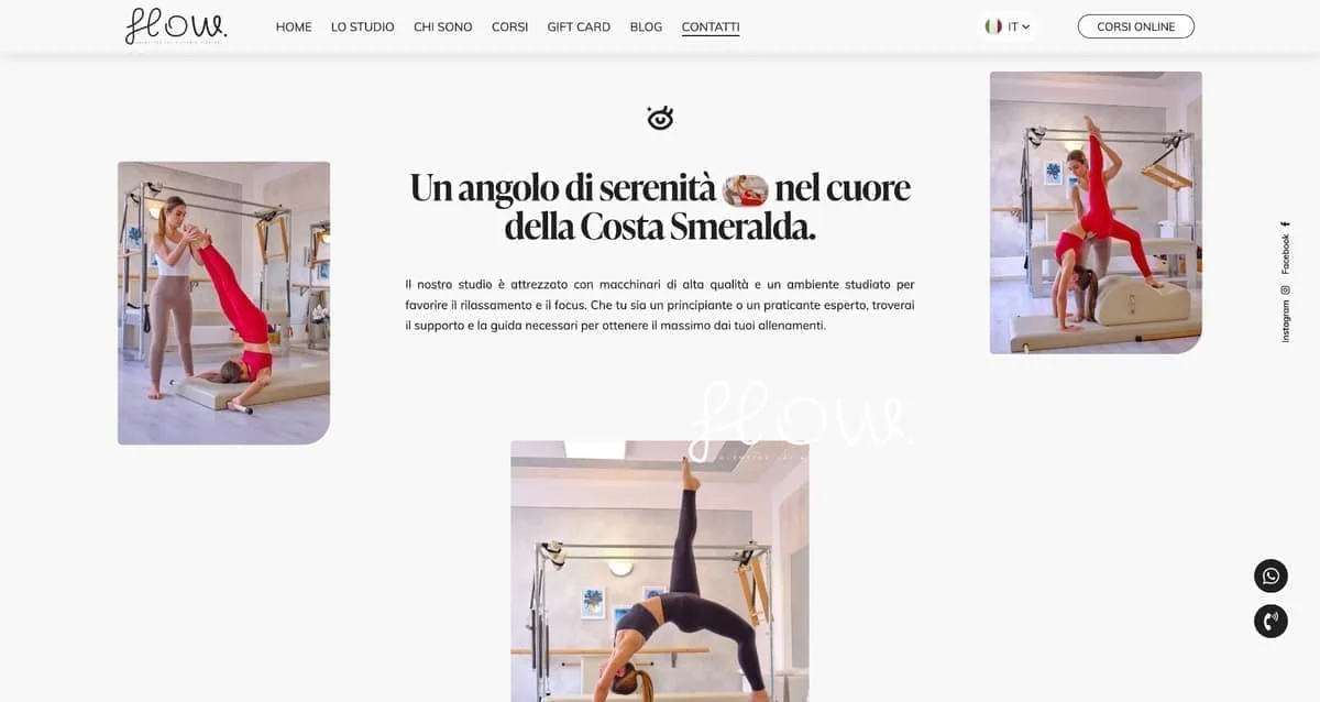
Our physical studio in Porto Cervo needed a website as polished as our rooms. Now managing schedules and classes is smooth, and whoever steps in online finds themselves immersed in our very atmosphere.
Flow Studio Pilates

Our floral installations live on detail and immediate visual impact. Having such a well-kept digital gallery lets us show clients our value straight away — and they often give us carte blanche.
Ketty Flowers Designer

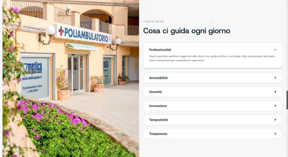
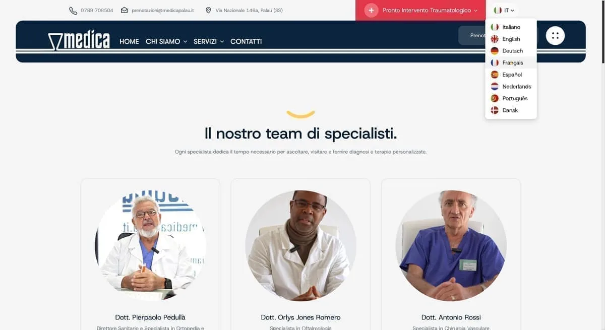
At our polyclinic in Palau we care for patients of every nationality, so a multilingual welcome in no fewer than eight languages is vital. Having a perfectly structured website has removed any misunderstanding and sped up access to appointments.
Medica Palau

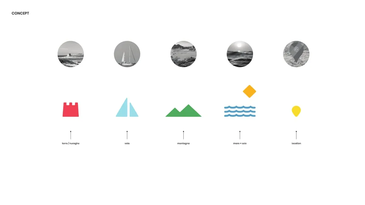
Telling Sardinia without falling into the usual tourist clichés was our real challenge. This brand and the visual identity we built with the team have tremendous strength and breathe the authentic soul of the island.
Sarda Trips
Managing eight lodgings between San Teodoro and Porto San Paolo without handing a small fortune to the big booking platforms seemed a pipe dream. Since we have had our own direct channel, margins can breathe again and guests reach us without intermediaries.
Ambra Holiday Rooms

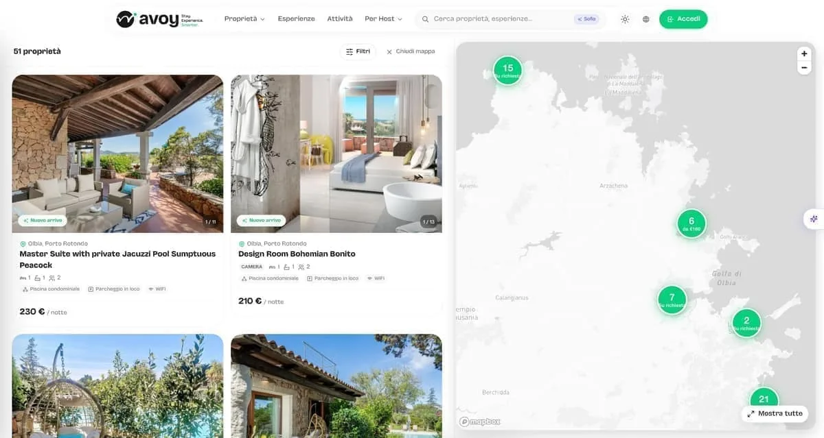
We needed a Sardinian listing platform that highlighted both stays and local experiences, giving owners visibility without punishing fees. With Avoy we have the right tool: fast, organised by category, and without crazy commissions strangling the business.
AVOY
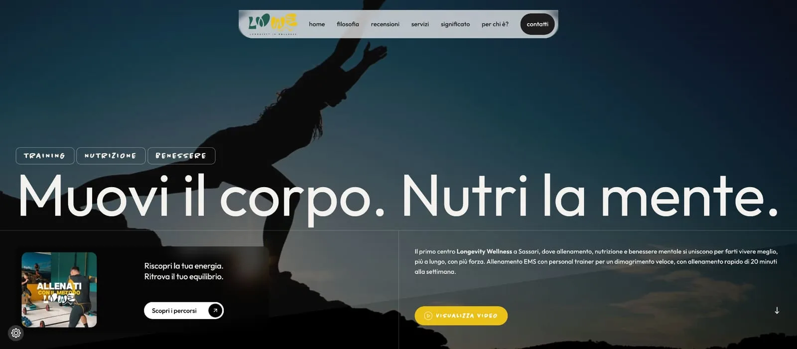
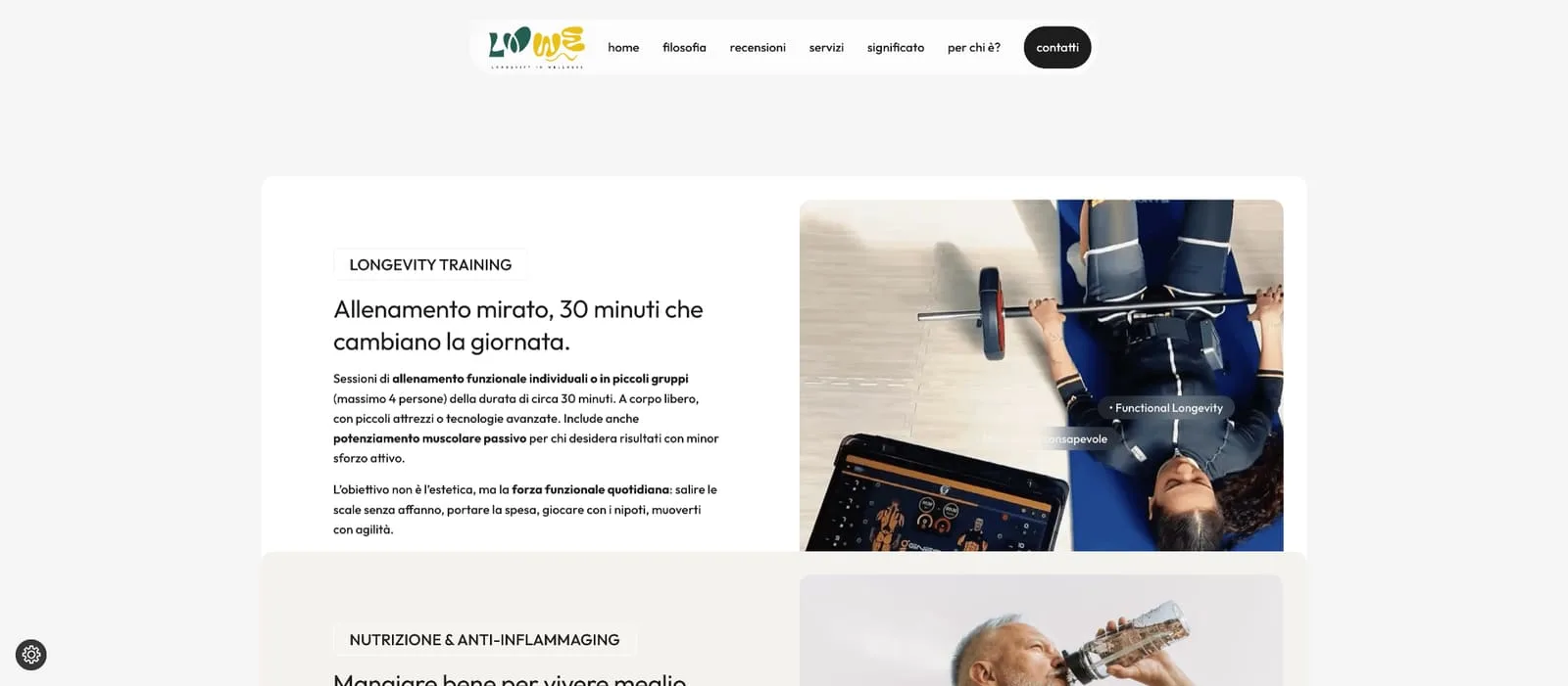
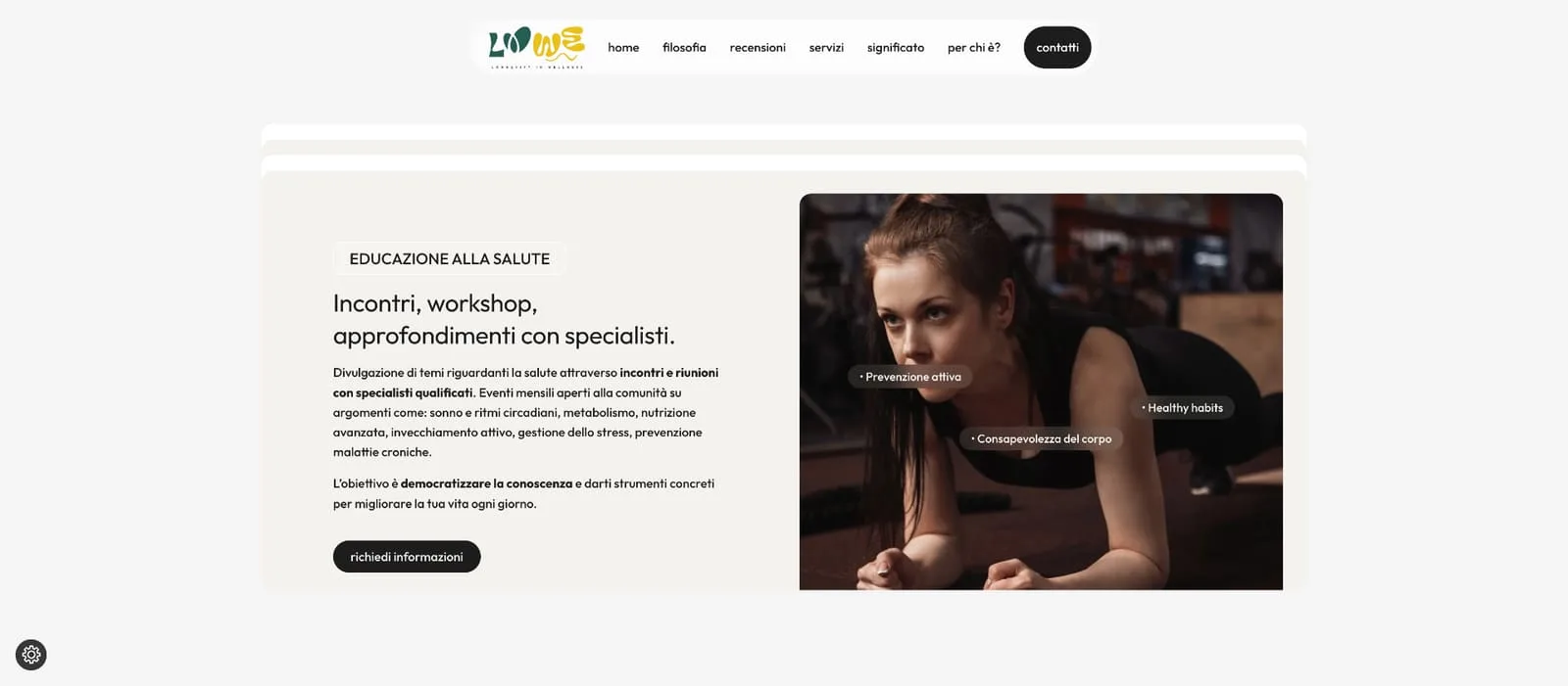
In Sassari we wanted to position ourselves as the Longevity Wellness centre of reference, stepping out of the usual patterns. The new brand and the web platform literally jump off the screen, communicating pure innovation.
LOWE
With three wine shops on the Costa Smeralda we needed an online meeting point that did justice to our labels. Now whoever is looking for the right wine finds the way home straight away.
In Vino Veritas
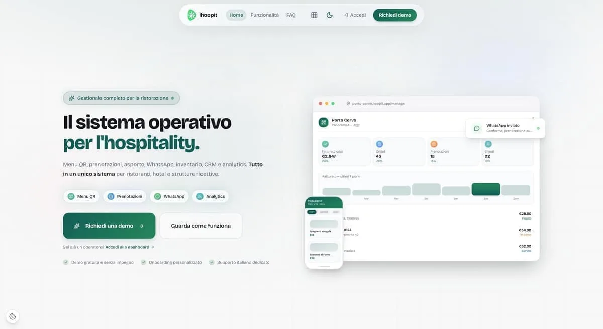
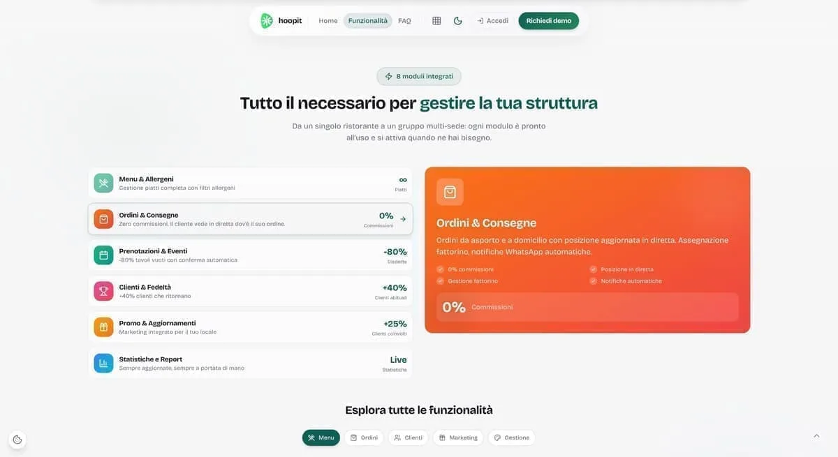
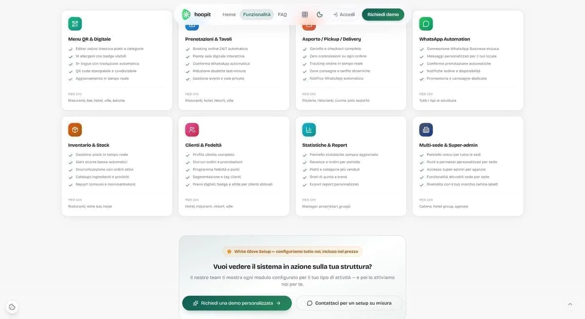
Management software for restaurants and hospitality has to be concrete help between the tables, not an IT nuisance. This software turned our internal organisation around, cutting errors to zero and letting us work with a clear head.
hoopit
Before launching the app for our Pilates classes, between Porto Cervo and the digital side we lost hours coordinating chats and phone calls. Now our clients manage live and on-demand classes on their own, and we finally get to enjoy the work.
Flow Porto Cervo

Launching a sustainable streetwear e-commerce with print-on-demand was a complex bet. Now the shop runs perfectly, the graphics stand out at their best, and we can focus on creativity alone without the stress of warehouse stock.
Fionard
In our line of work roadside assistance allows no waiting, and the workshop has to be a byword for total reliability. Having such a direct digital point of reference lets customers find exactly the seriousness we put on the road every day.
CDA Servizi Auto
As a creative studio we were tired of having a sloppy image. We finally have a website and a portfolio worthy of our capabilities, which speak plainly to anyone who means business.
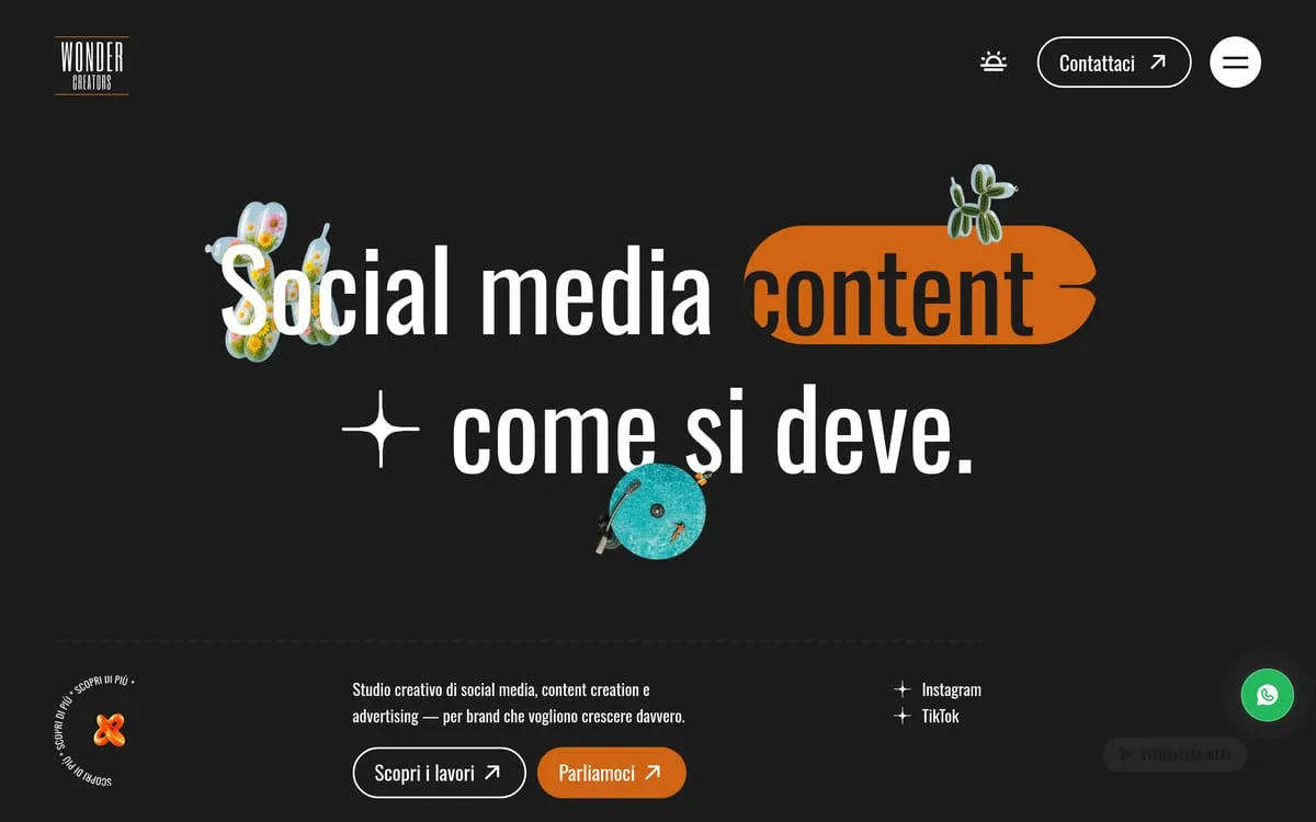
Wonder Creators
Frequently asked.
They read the same page looking for two different things. The technical office wants to know who you have already worked for and under which certifications. The company wants to know what it saves and who picks up when the plant stops. On Ichnova one piece of evidence covers both: the client wall, where municipal coats of arms sit in a row next to company logos.
By keeping them apart and writing them out in full. Ichnova has four service areas, each with its own photographic card and the complete list underneath: energy management, energy management experts, certified management systems, engineering and architecture services. Four generic menu items do not do the job.
Inside the service area they belong to, never in a badge in the footer. On Ichnova the ISO 9001, 14001, 45001 and SA8000 sit in the list under the card: whoever is after an acronym finds it, whoever is after a picture finds that first.
Yes, and it is the first thing that gets cut. In a technical service you choose a person, not a company name. Ichnova's three engineers and two architects are there in black and white, with name, role and a direct phone number under the face.
To survive the check that comes before the work. Someone who names you in a meeting does not close anything: they make a second person want to look you up. What that person finds decides whether you get invited. The site is not the brochure that convinces, it is the check that does not lose you the job.
One with a page of its own, Ichnova, plus two archive rows: Been Energia in 2021 and Be.EN in 2020, a website. We write it as it stands instead of padding the list. What we bring here comes from that project and from the work done in the other sectors.