Francesco Piras
Brand identity and website for a sport psychologist: athletes, coaches, parents.
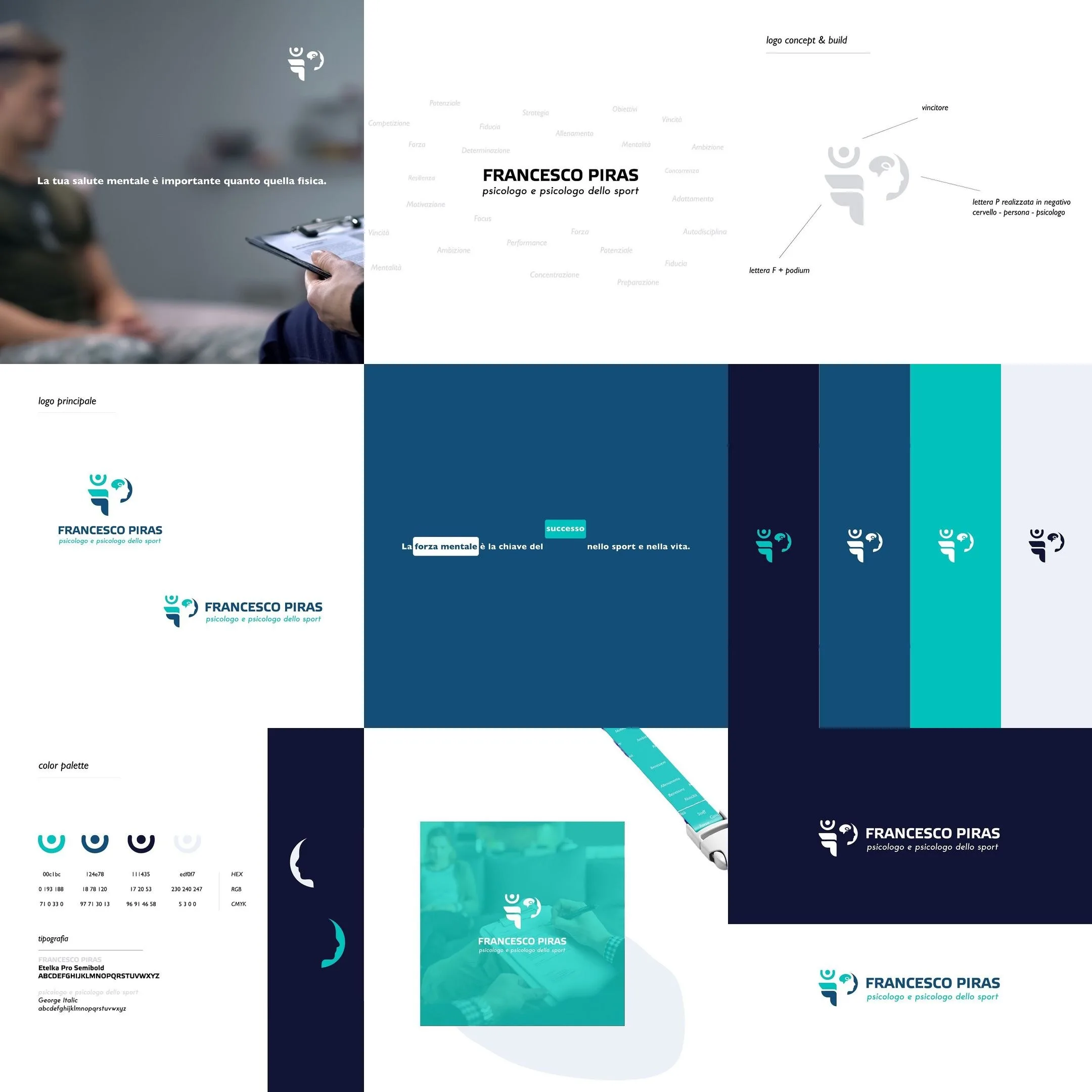
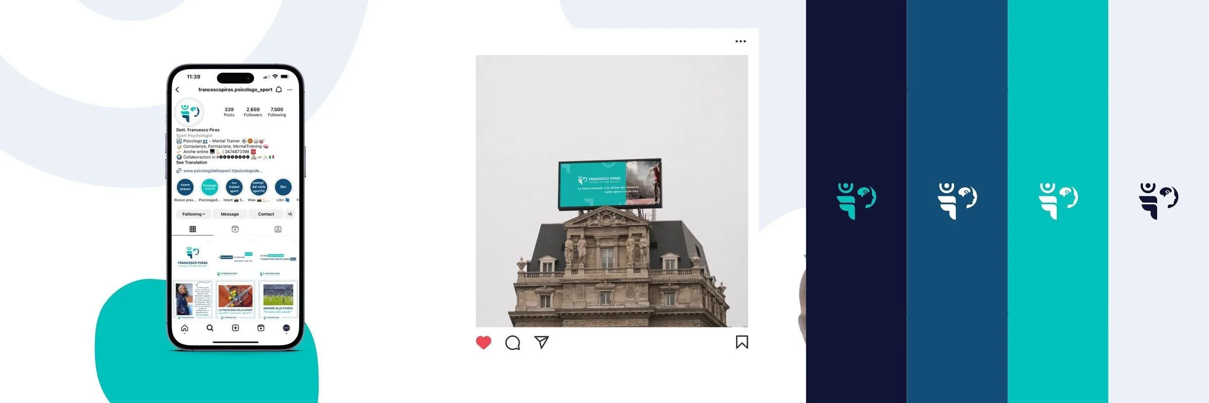
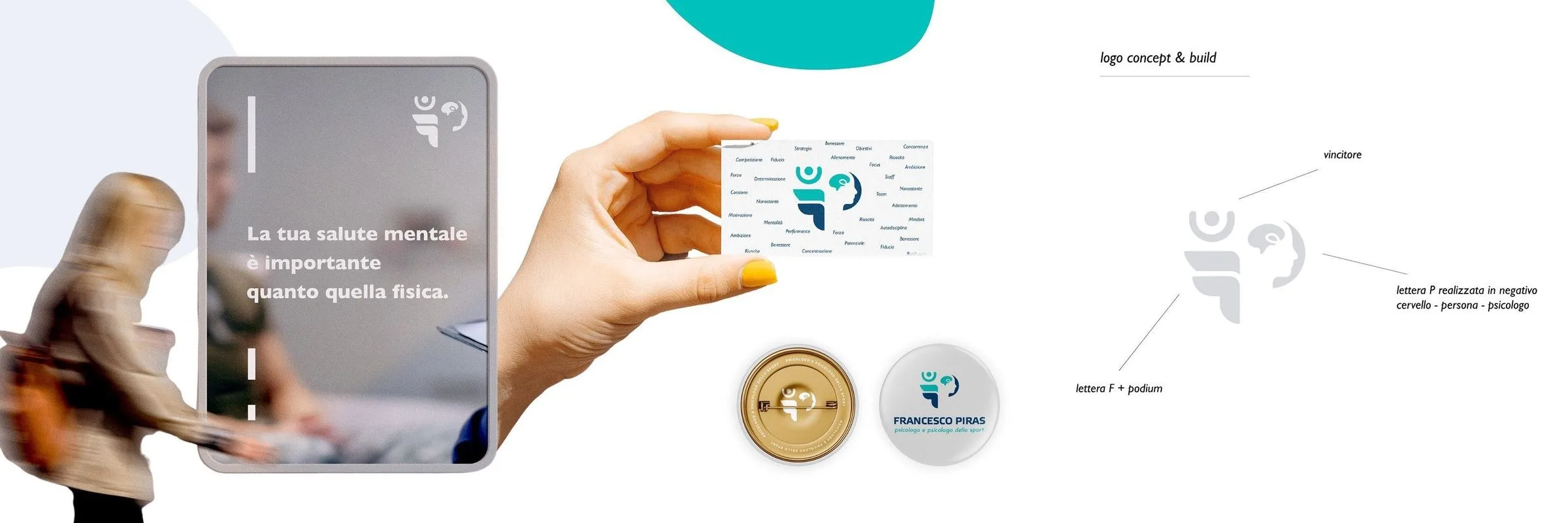
Brand identity and website for a sport psychologist: the F that becomes a podium, the P in negative that draws a profile and a brain, the scale of blues and turquoises, the printed matter for the practice and a site built around three audiences — athletes, coaches, parents.
- Sector
- Healthcare
- Year
- 2023
Context
Francesco Piras is a psychologist and a sport psychologist. Two jobs that sit far apart in the mind of someone searching: one belongs to care, the other to performance.
Challenge
Both had to fit inside the same mark, without either one reading as the subtitle of the other.
Design
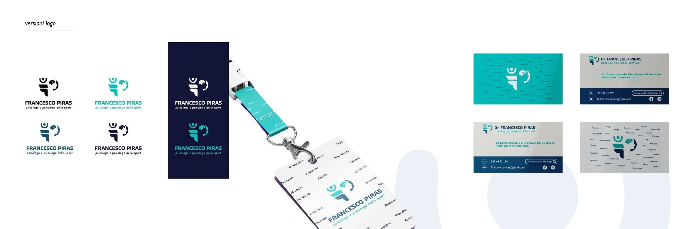
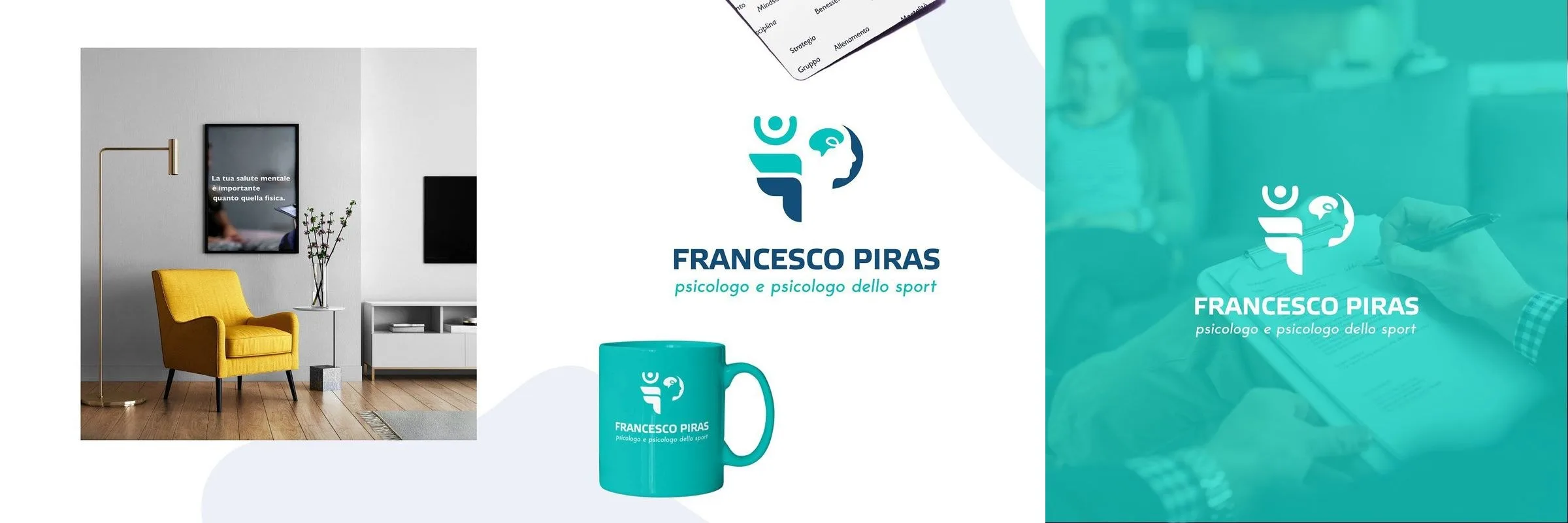
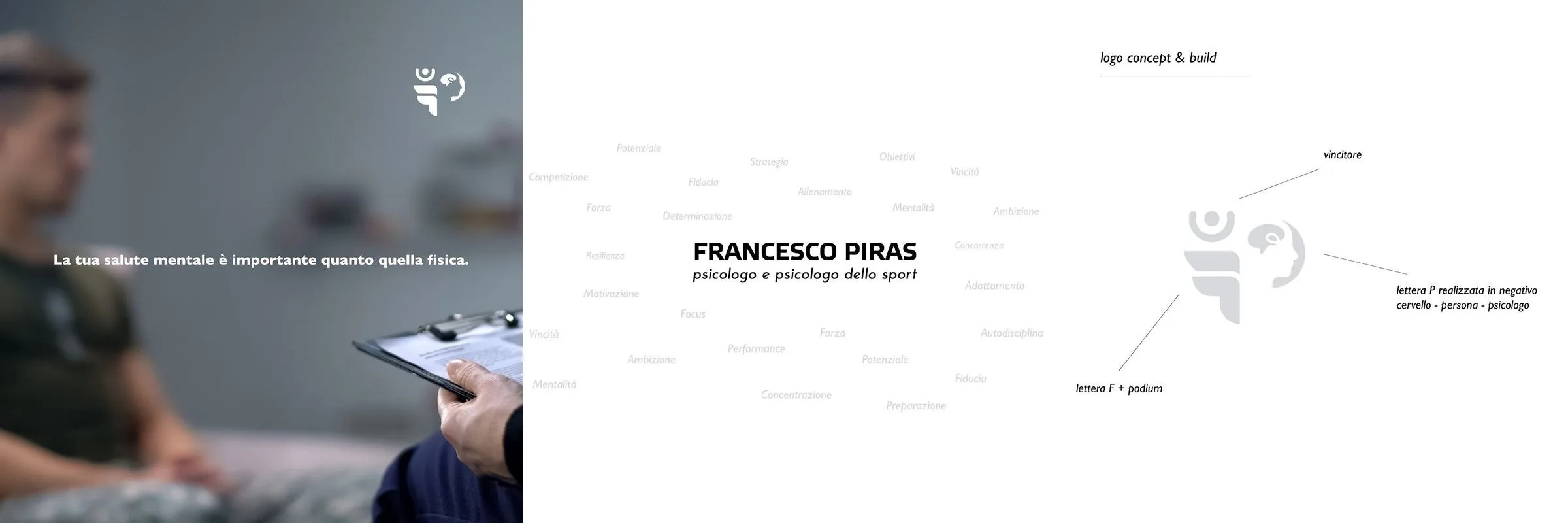
The mark. The F is a podium seen from the side. Inside it, in negative, the P draws a profile and a brain at once. The podium says sport, the profile says person, and they are one shape: not two symbols set side by side.
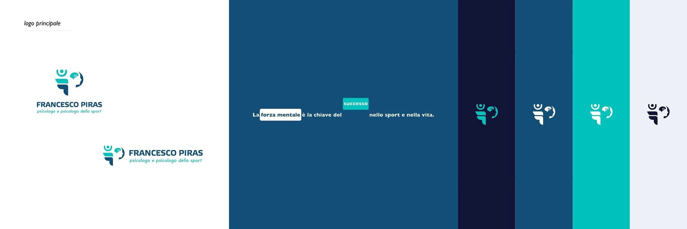
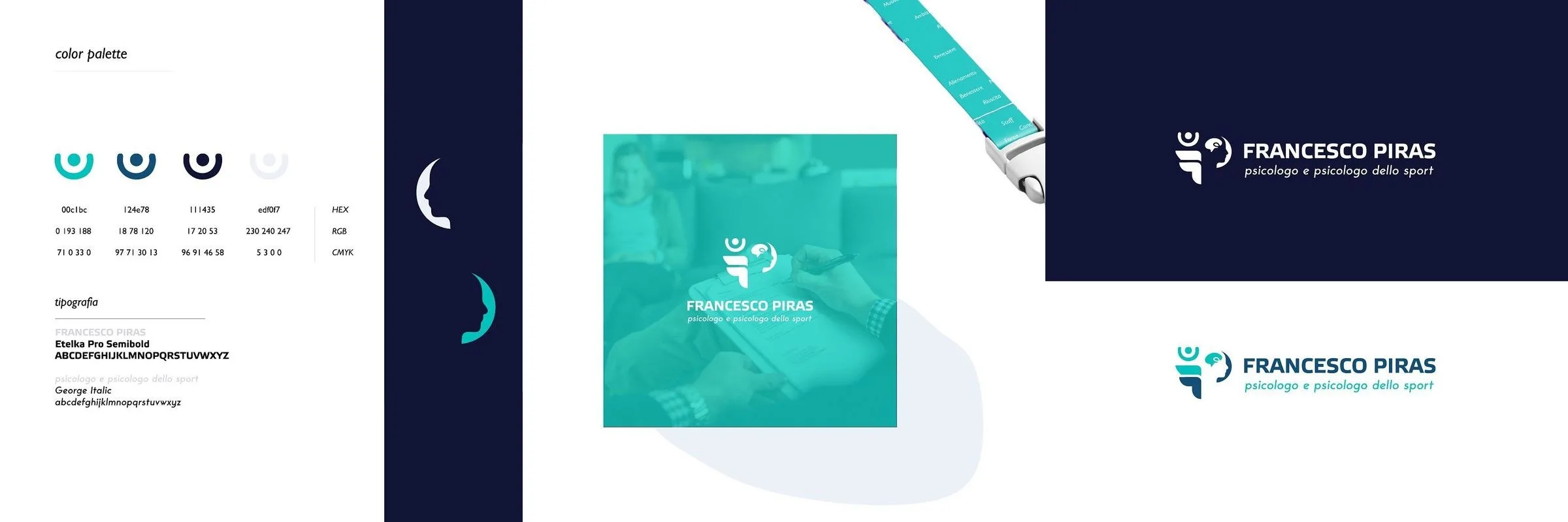
The colour. Four steps from night blue to turquoise. The blue carries the consulting room, the turquoise carries the field, and between them there is no border line, there is a scale.
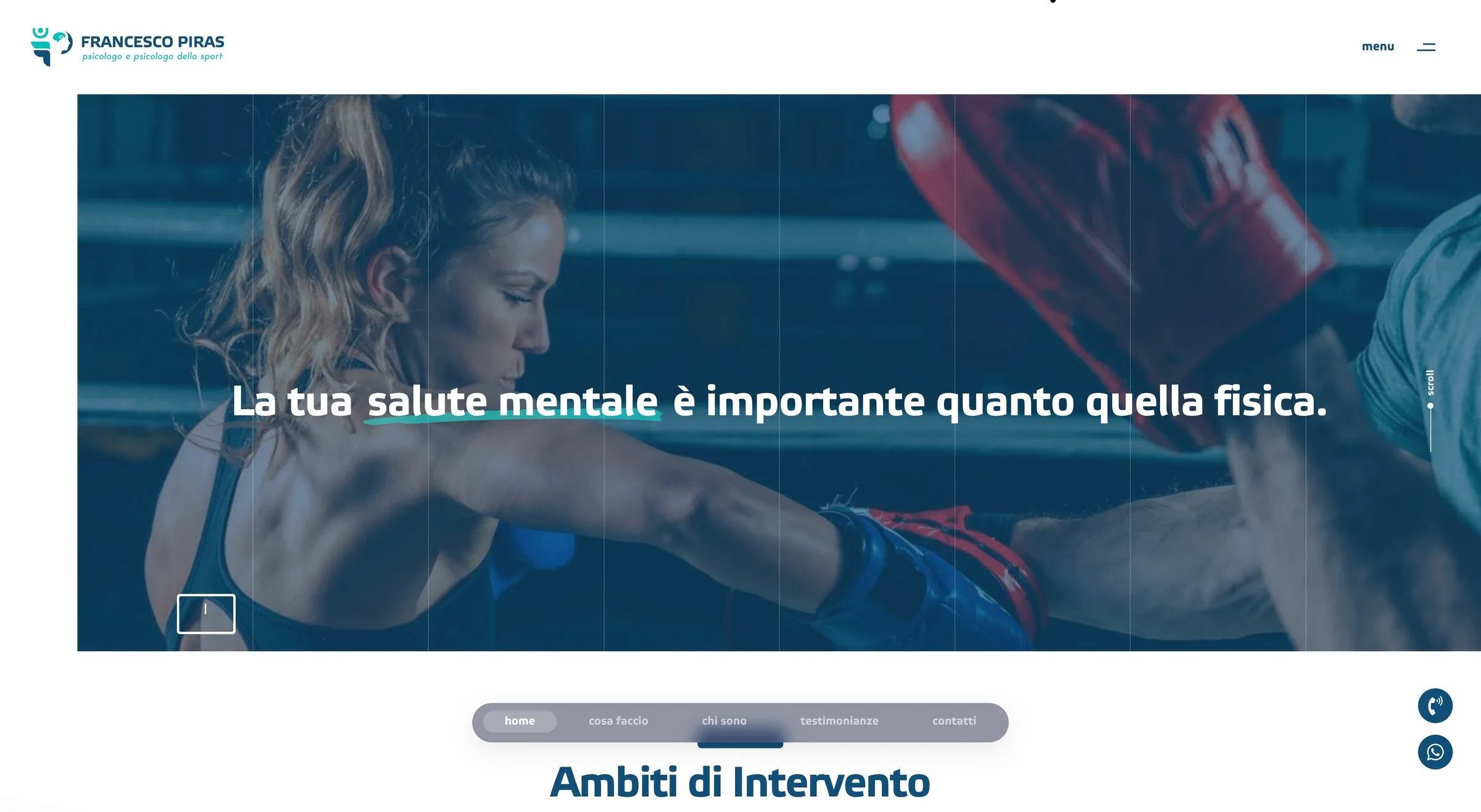
The words. Two lines, and neither of them names the method: «your mental health matters as much as your physical health» and «mental strength is the key to success in sport and in life».

Applications
Business cards in the four colour combinations, a badge on a lanyard, metal pins in gold and silver, a mug, a poster for the waiting room. And the hardest test for a mark this small: a hoarding on a building, where the symbol has to read from thirty metres.

The website
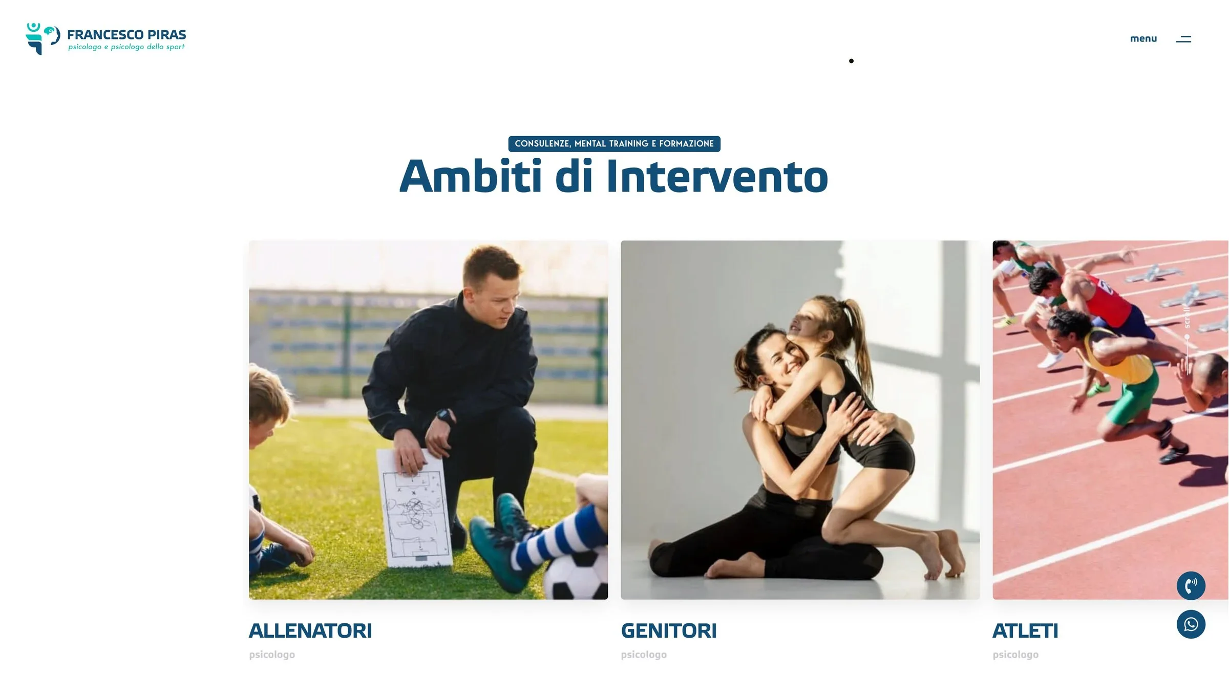
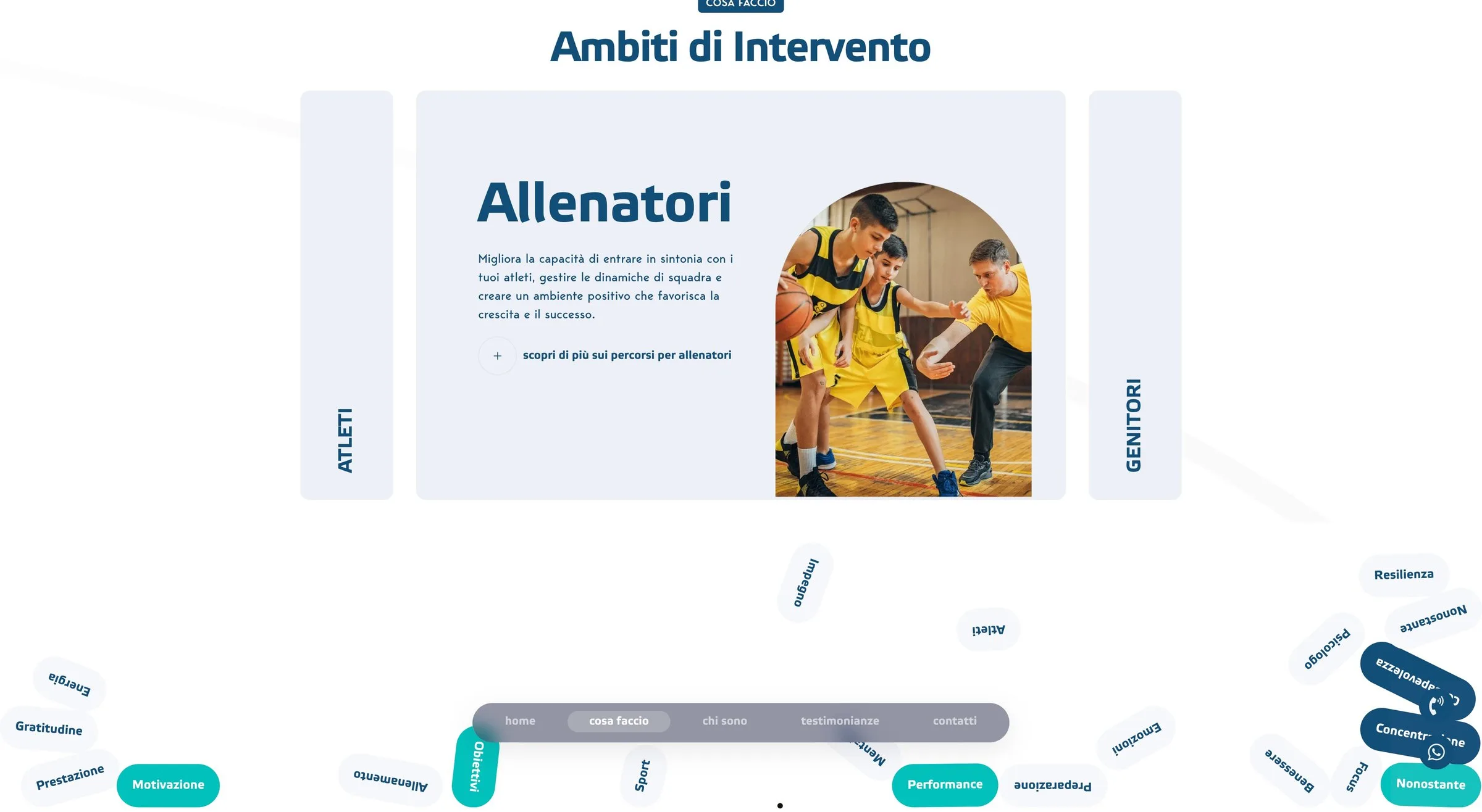
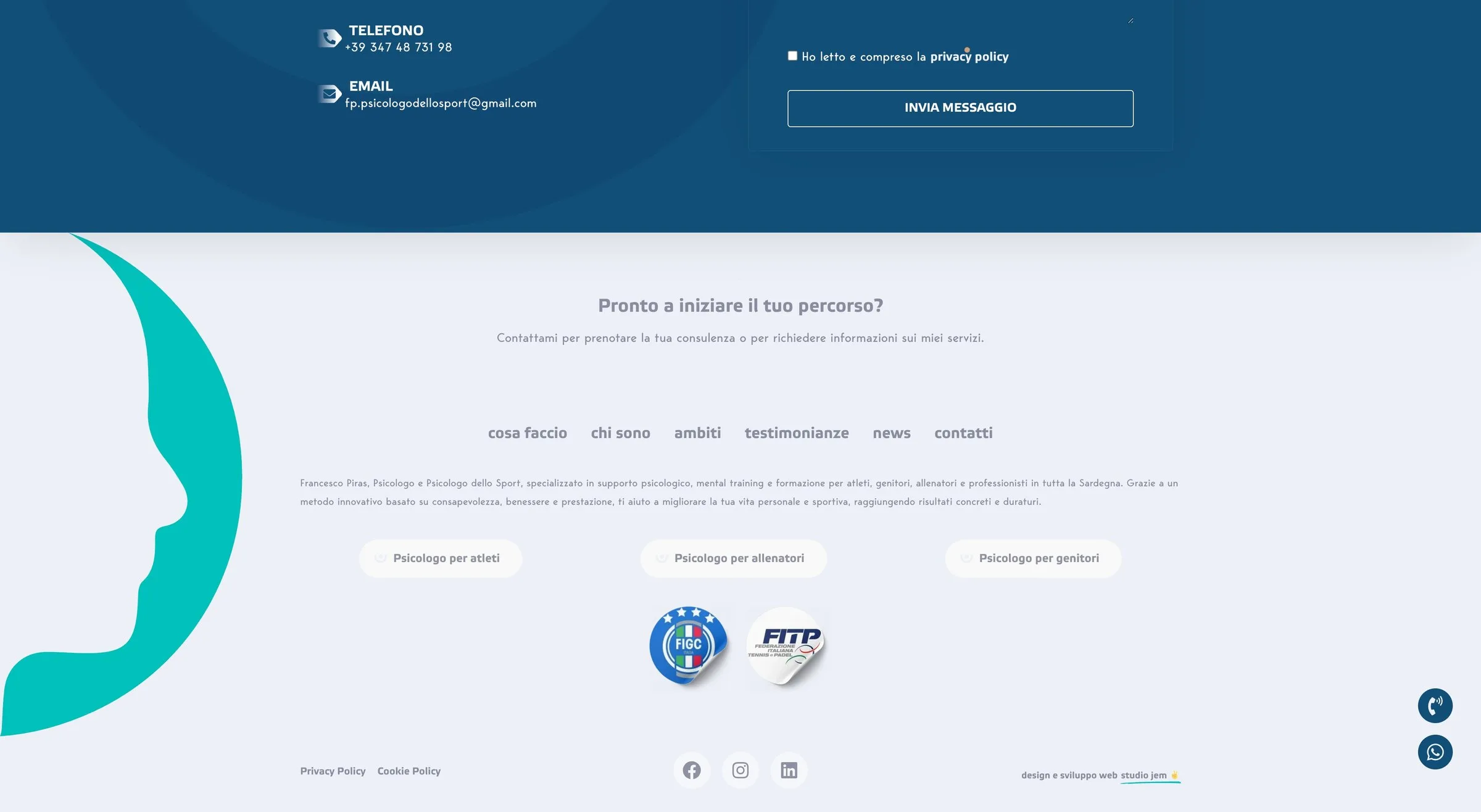
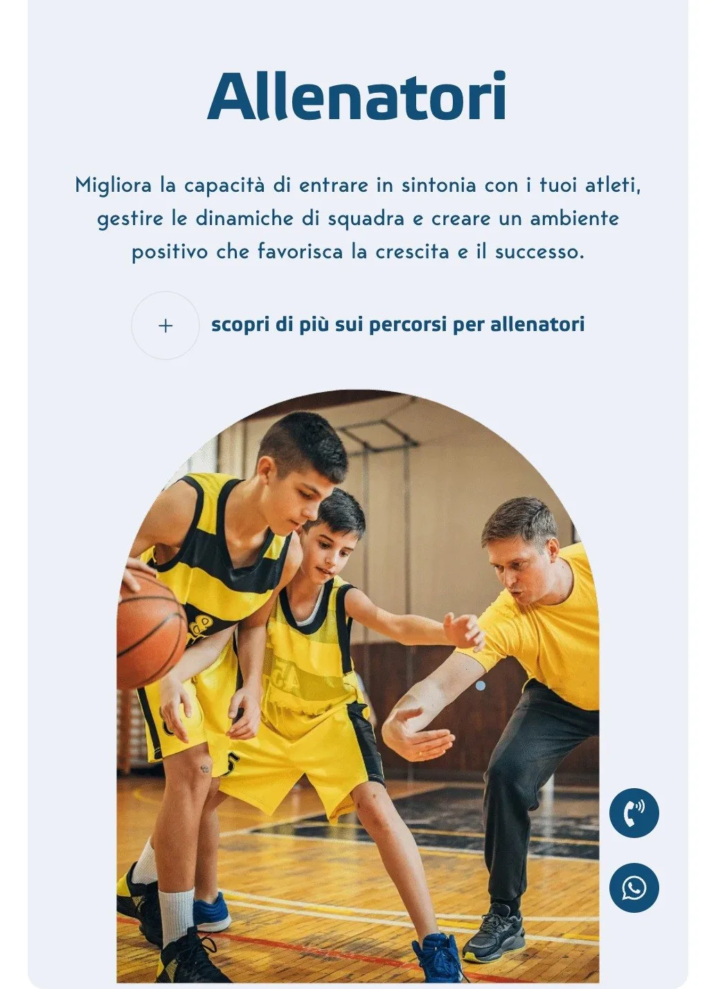
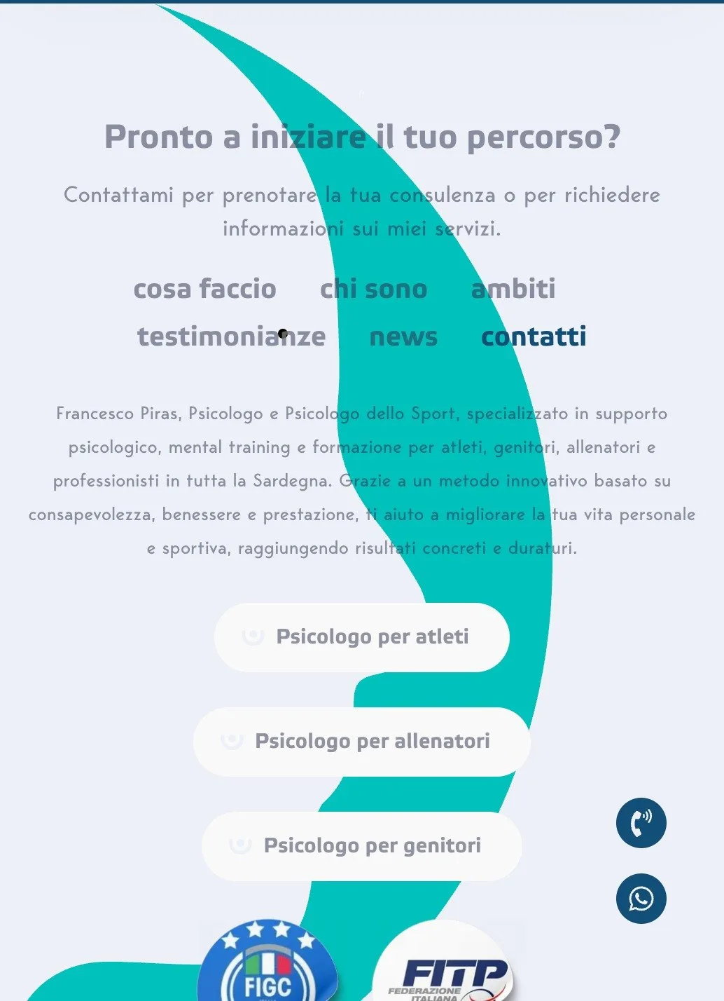
Three audiences, three doors. An athlete, a coach and a parent come to the same professional for reasons that look nothing like each other, and putting all three on one page means speaking to none of them. The site separates them from the start: three cards in the areas of work, three buttons at the end — psychologist for athletes, for coaches, for parents.
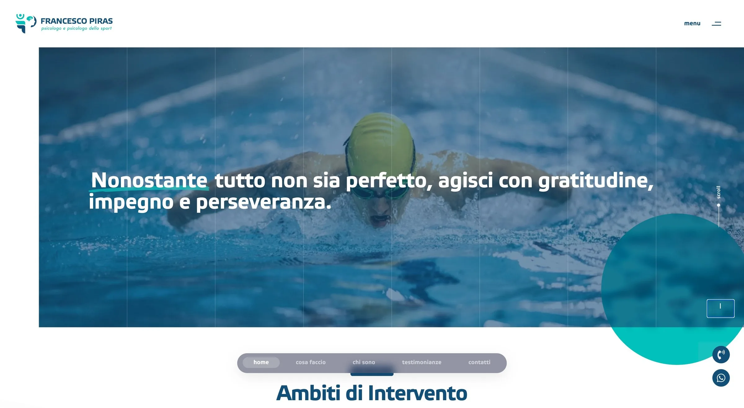
There are two openings, and both are sports photographs. A swimmer in the pool, a boxing session. Over them, the two lines of the identity: the one on mental health and the one on perseverance, with the word that counts picked out in turquoise — the same move the mark makes with the P.
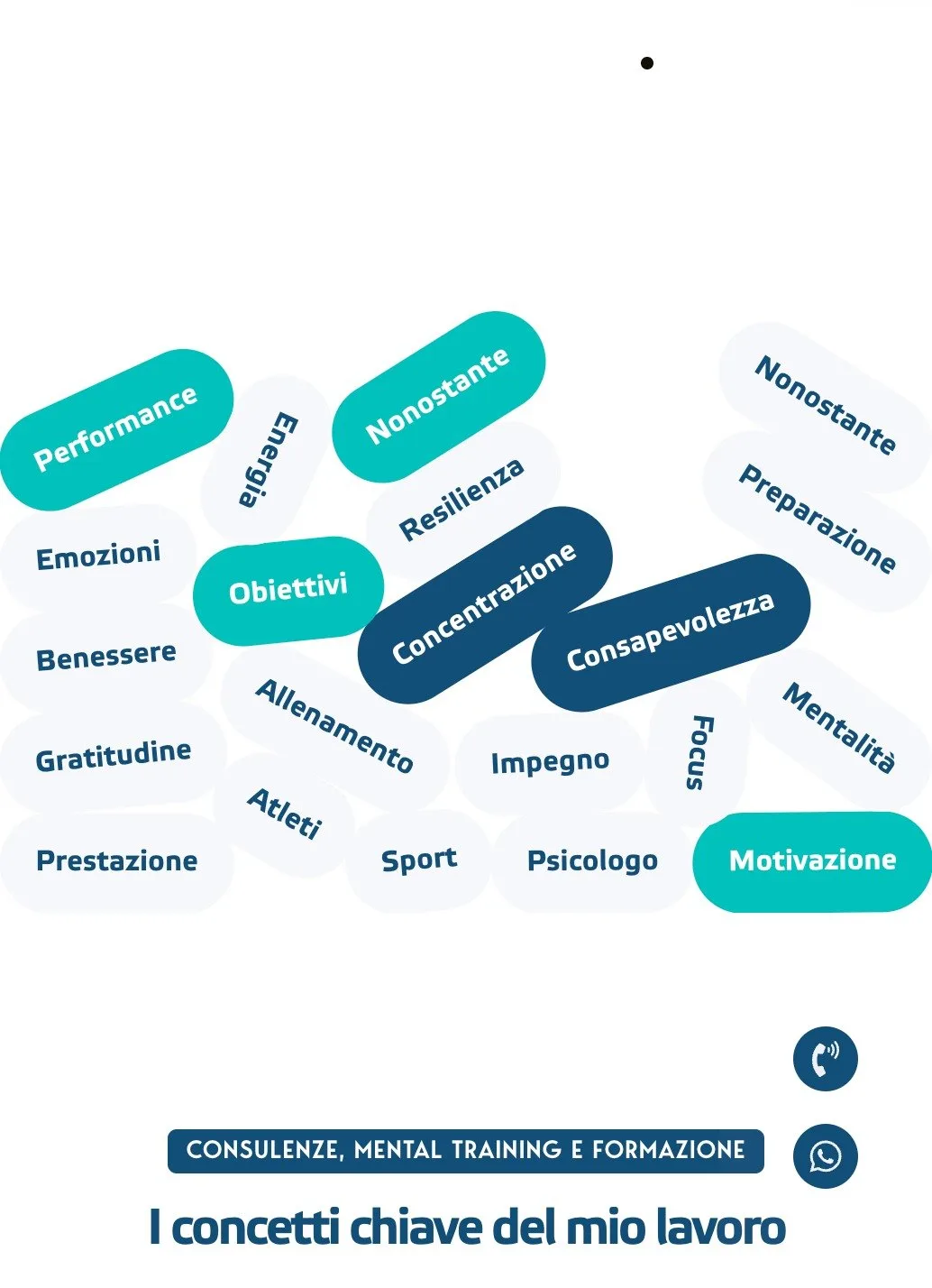
The words of the method are an object. Resilience, motivation, concentration, awareness: not a bulleted list but pills arranged in an arc, some solid and some in outline. On a phone they fall back into a column without losing the rhythm.
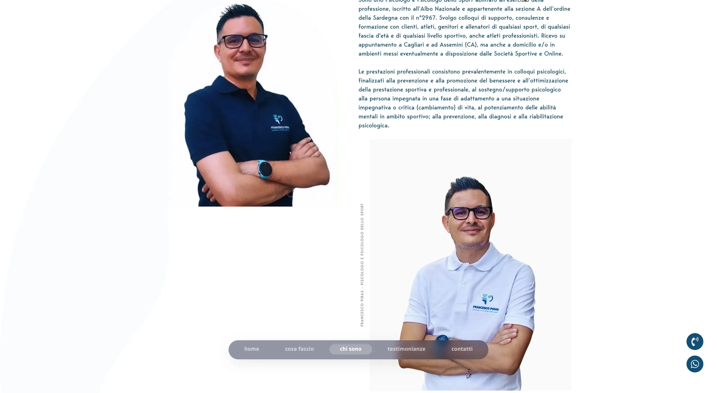
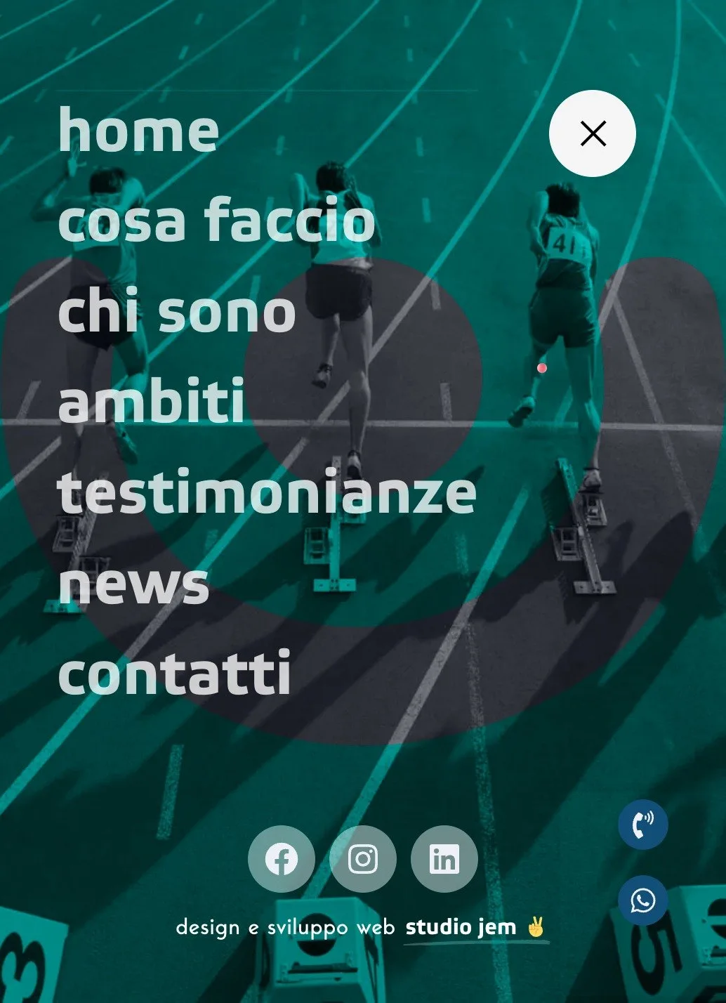
The phone is not the reduced version. Two floating buttons, call and WhatsApp, stay within thumb reach for the whole page: someone looking for a sport psychologist often does so from the pitch, and the contact form is four screens further down.

Screen by screen.