
- founded
- 2018
- projects delivered
- 200+
- clients in Sardinia and across Italy
- 65+
- nomination
- Awwwards
- projects for this service
- 12
We design brand identities for companies and professionals: logo, colours, typefaces and the rules to use them well, from business card to shop sign. Prices start from 450 €, and the project widens when needed: naming, brand book, stationery. The files and the rights to the mark are yours.
We design distinctive logos and complete visual identities. Creativity and strategy travel together: a beautiful mark that says nothing is not our product.
We work with founders starting from zero, companies due for a refresh, and professionals tired of looking like their competitors. Logo to brand book, business card to shopfront sign — coherent and built to last.
One rule holds on every project: the logo is part of the brand, not the brand. A mark works when every touchpoint — website, signage, label, social feed, email signature — says the same thing in the same way. That is what we design: a system, not a drawing.
Who we do it for.
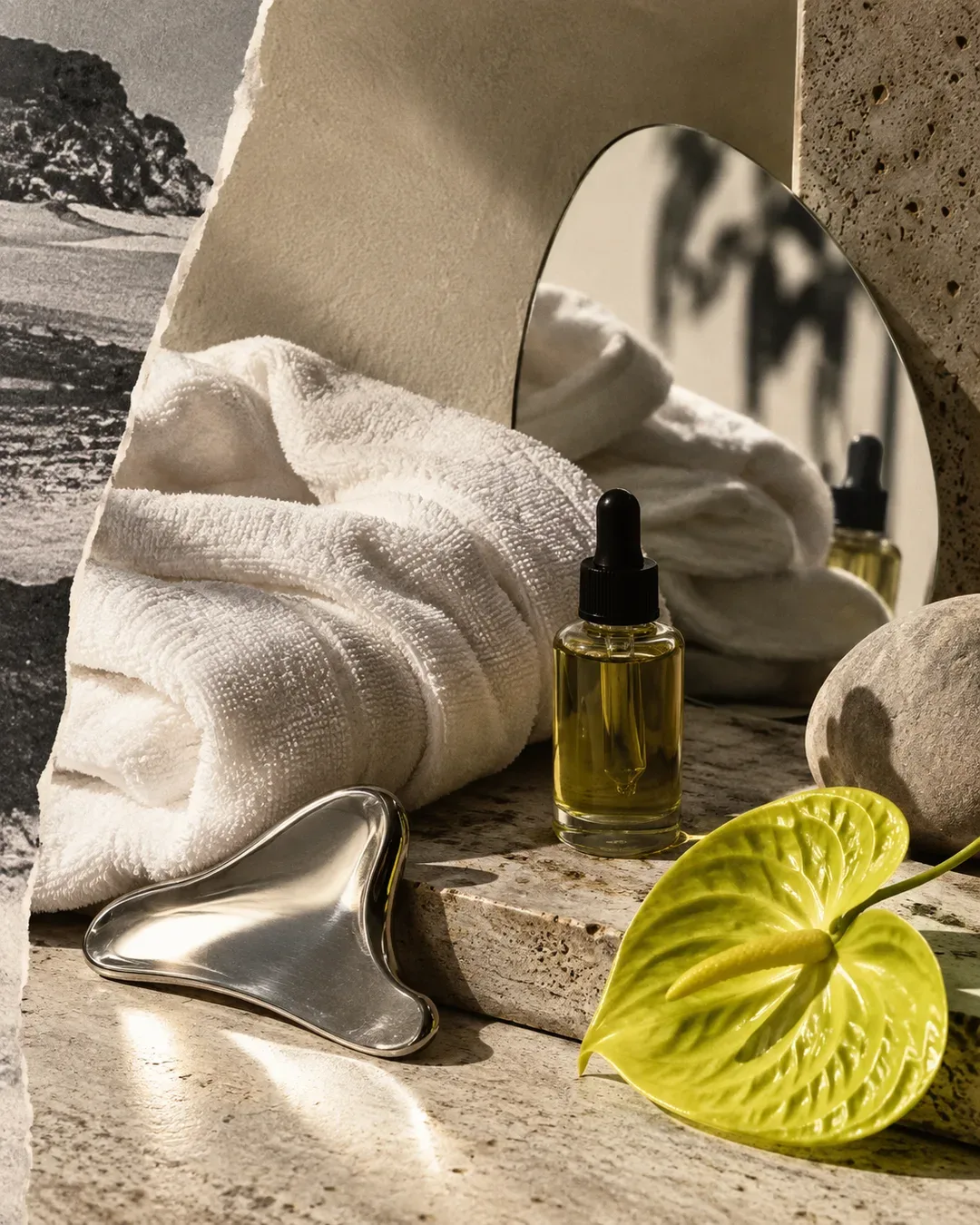 Wellness & BeautyA mark that holds up on signage, textiles and bottles, and looks the same in the room as it did online.
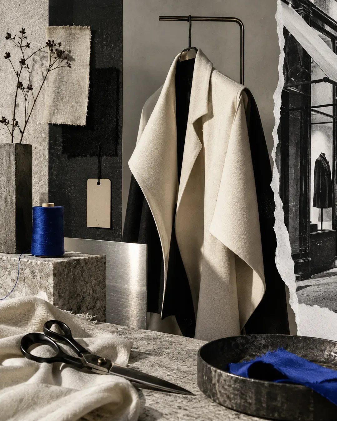 Retail & BoutiquesA sign that stays recognisable even when the name won't fit, on the price tag, on the boxes, in the window.
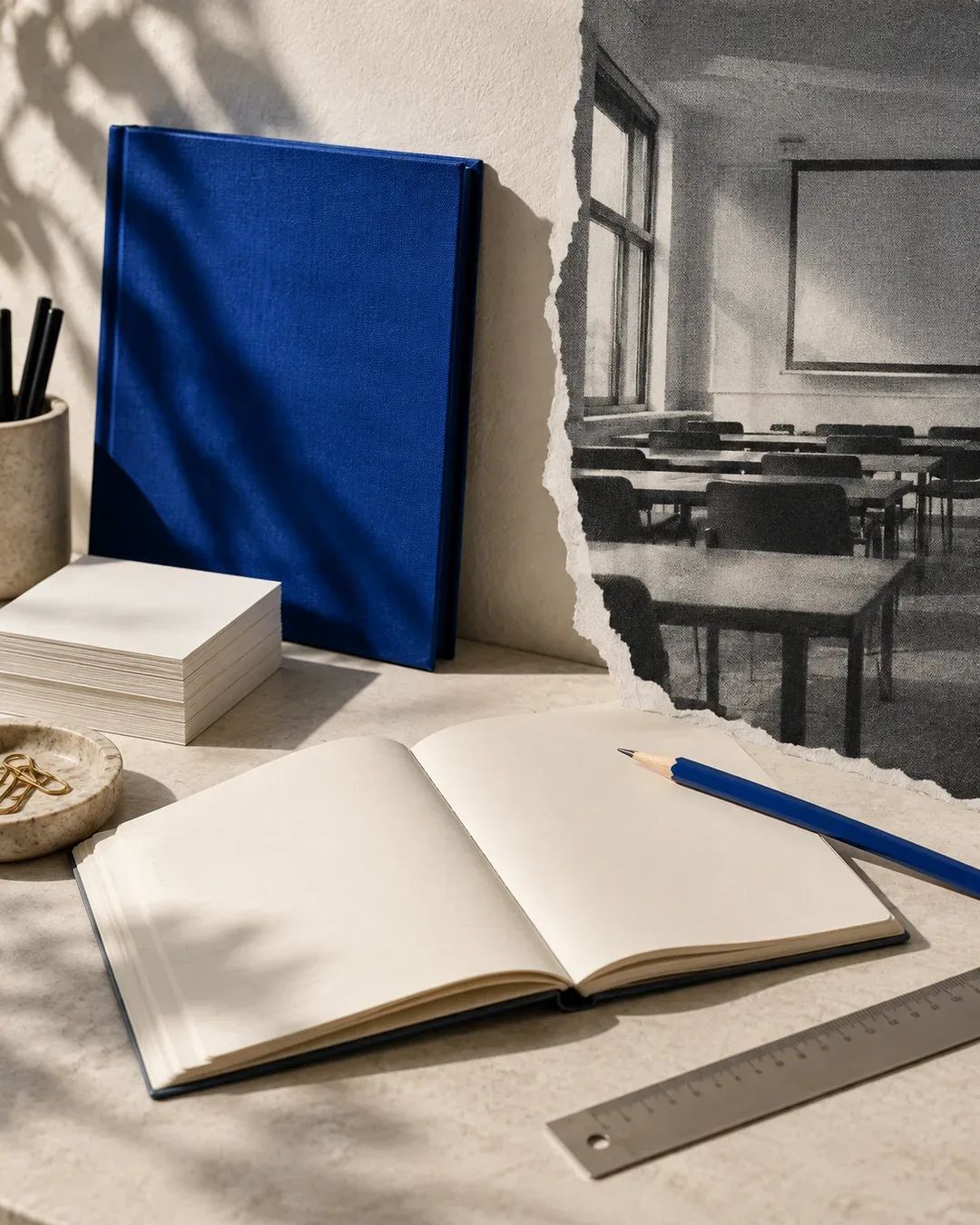 Training & EducationSymbol, typefaces and palette fixed in written guidelines, so every application, from badge to sign, comes out consistent.
We also do it for


What's included.
TRY IT
A logo is seen at the foot of an email more often than on a slide.
02
Logo and brand mark
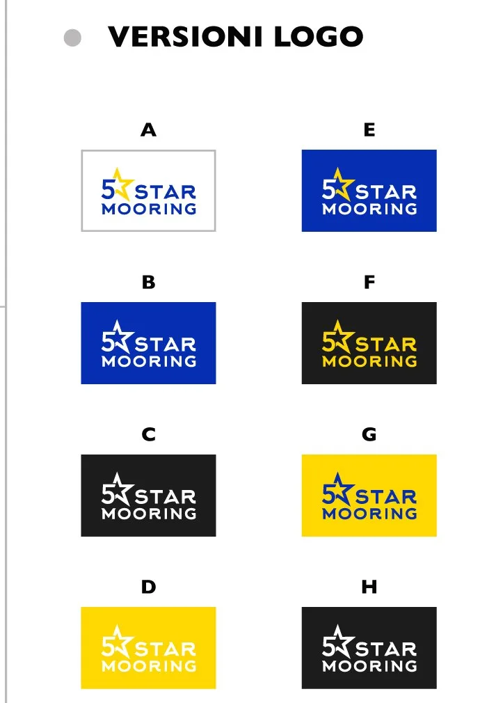
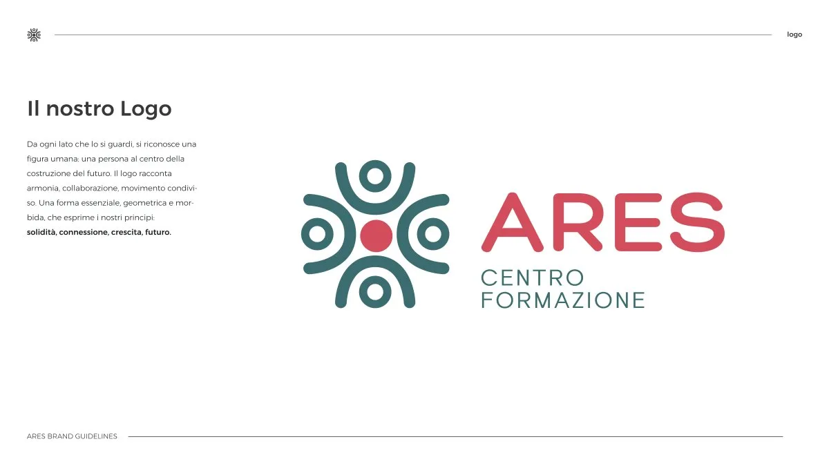
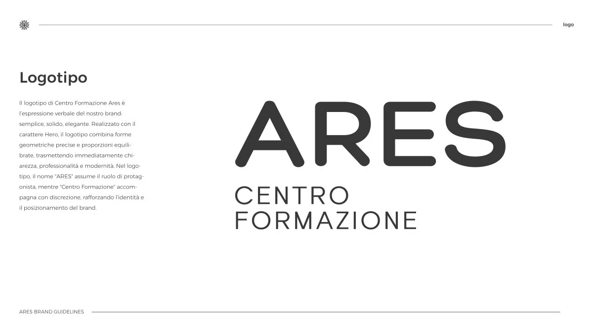
The brand's primary sign: logotype, pictogram or both. Designed to pass the hardest test — working small, in one colour, on light and dark backgrounds. Always horizontal and square, with variants for every background.
03
Visual identity system
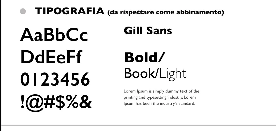
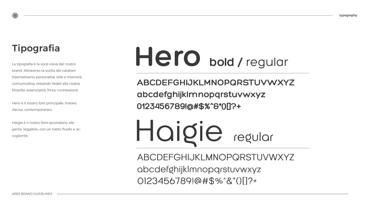
Colour palette with HEX/RGB/CMYK/Pantone codes, primary and secondary typography, photographic and icon style, composition rules. The grammar of the brand — what makes a post recognisable before anyone reads the name.
04
Naming
The first branding decision and the hardest to undo: sector analysis, alternatives, domain and pronunciation checks, a preliminary screen for similar trademarks. A good name is spelled the way it sounds and leaves the business room to grow.
05
Rebranding
Renewing an existing mark is a different job from creating one: there's a history to respect and customers who must keep recognising you. We decide what to keep and design the transition, not just the destination.
06
Brand book
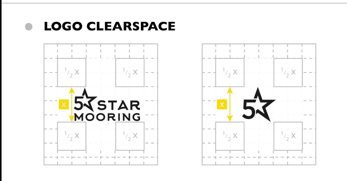
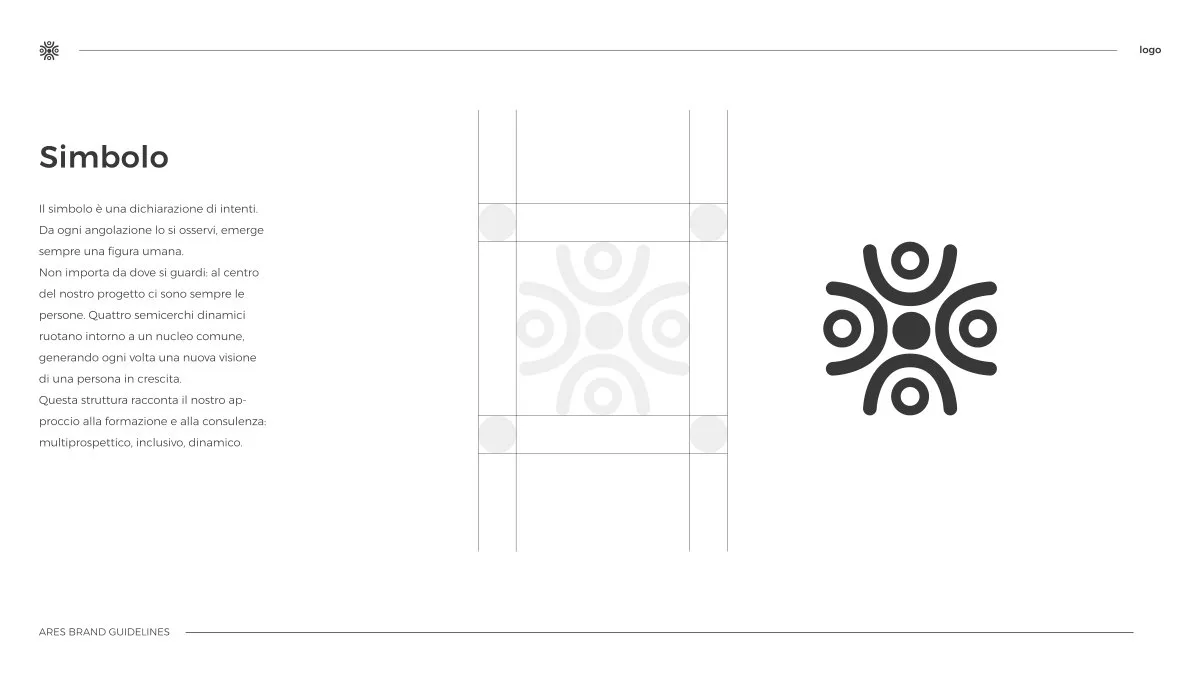
The manual that holds everything together once the project changes hands: logo construction, clear space, minimum sizes, correct and incorrect uses, applied examples. The printer, the social media manager and the developer all need it.
07
Stationery and applications
Business cards, letterheads, email signatures, presentation and social templates — the point where the identity stops being a PDF and starts working. On physical products it continues with labels and packaging.
Brief and research
What you do better than your competitors, who you're talking to, where the mark will live — sign, shelf, screen, uniform. A brand is also designed by difference: knowing what everyone does is how you avoid doing it.
Concepts
Two or three creative directions, each with a stated logic, presented in real contexts — the shopfront, the profile, the card — never floating on white. A logo is judged where it will live.
System development
Final artwork, variants, palette, typography, usage rules. Revisions are included and agreed before we start, so the project moves without going in circles.
Applications and brand book
The identity rolled out across the materials in the brief and locked into the manual — the phase that separates a delivered logo from a working identity. Written rules beat a hundred verbal recommendations.
Delivery and rights
Every file — SVG, PNG, PDF, EPS — organised by use, plus the sources. And the rights: the mark is yours, forever, royalty-free. In two years we start from the sources, not from scratch.
What we build it with.
Every mark is born as vector artwork in Illustrator — the only way it scales losslessly from an app icon to scaffolding wrap. Digital applications are built in Figma, where the system becomes a library of reusable components. Critical colours travel as Pantone references with controlled CMYK conversion, because the green on your website and the green on your sign have to be the same green. We're fussy about typography twice over, choice and licence: fonts with clear web and print licences, so you never discover a year in that you've been using a typeface you weren't allowed to. And if the project continues with a website, the identity arrives already translated into design tokens.
- Adobe Illustrator
- Figma
- Pantone
- InDesign
- Photoshop
- Design tokens
- WCAG contrast
The mistakes that age a brand early
Across our projects since 2018, four mistakes come up more than any other.
Chasing the trend of the moment
This year's gradient, the lettering you've seen everywhere: a mark drawn on a trend is dated at delivery. An identity is designed to last ten years, not one season.
Designing only the big version
The logo that looks perfect on a slide turns illegible as a favicon, a stamp, embroidery on a polo shirt. We test every mark at minimum size and in one colour before presenting it.
Choosing on personal taste
The mark doesn't have to please you; it has to work for your audience and set you apart. That's why every proposal comes with its logic in writing — what it communicates, why, against whom.
Stopping at the logo
A mark without palette, typography and usage rules produces mismatched materials within months: every supplier invents their own version. The brand book is what protects the investment.
The real test is off-screen
An identity isn't judged in a slide deck. It's judged where it ends up: on a surface, on a price tag, on a bottle.
On surfaces
Signage, tote bags, water bottles, towels, interiors: a visual foundation holds when dozens of different applications stay recognisable without anyone having to explain them.
On the product
For Istedda Gioielli the five-petal flower is the sign that stays when the name won't fit: on the price tag, on the key ring, on the boxes.
On the shelf
Rosella Corda has made cosmetics in Sardinia since 1994, in a crowded category. The monogram with the four-leaf clover and the founding year makes it recognisable without dressing it up as someone else.
Real projects.
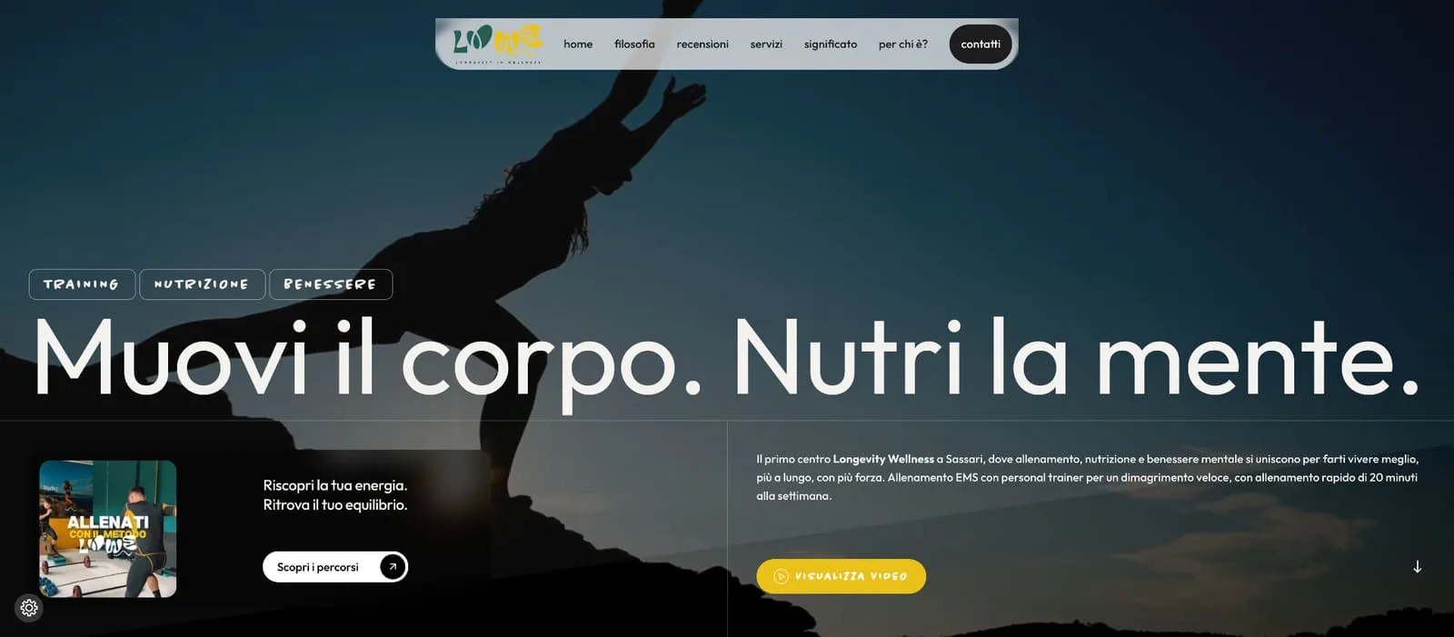
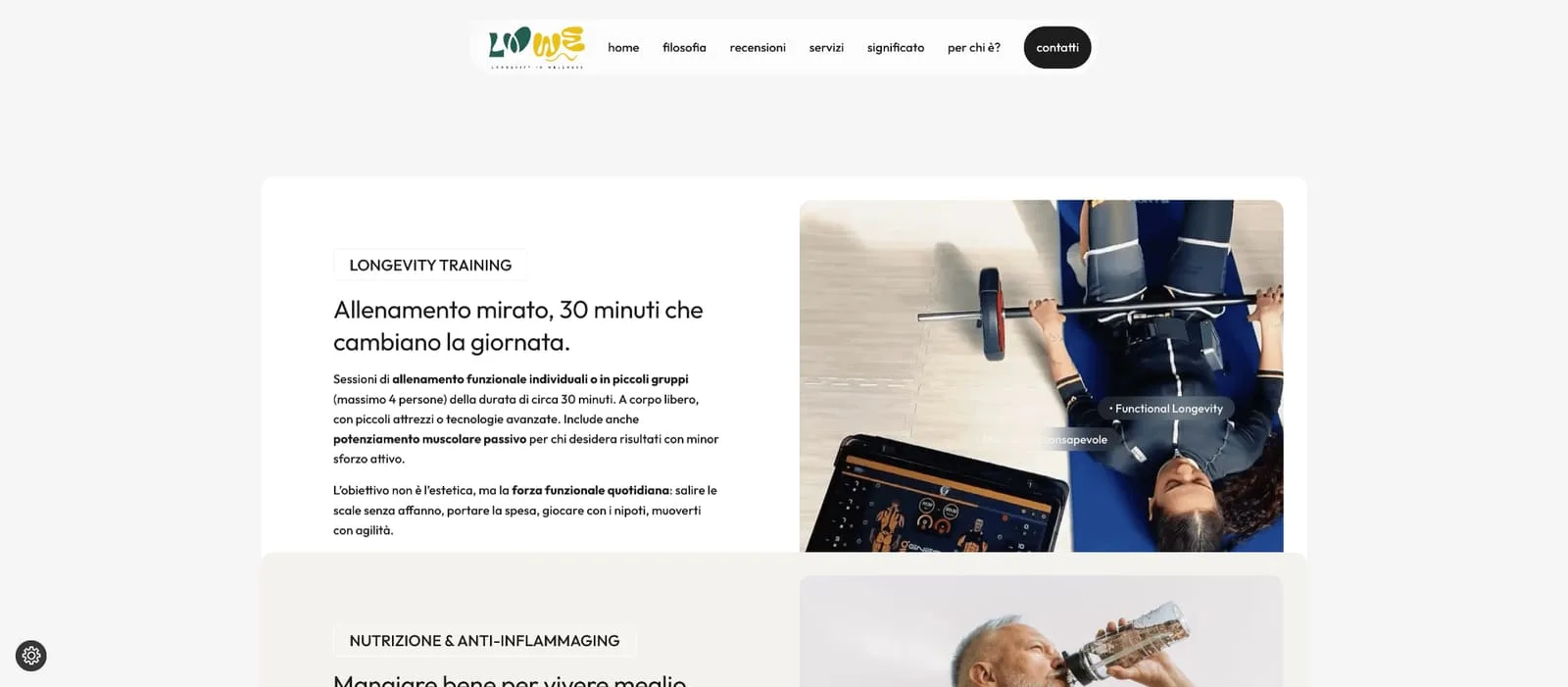
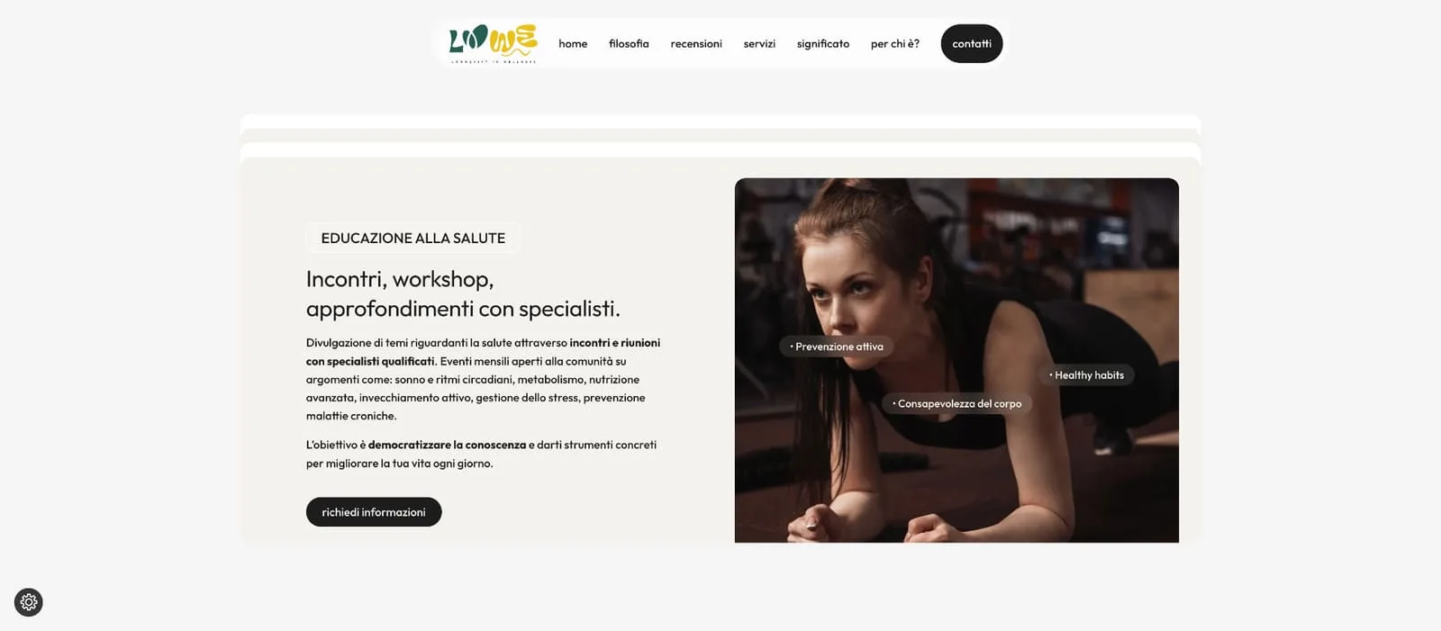
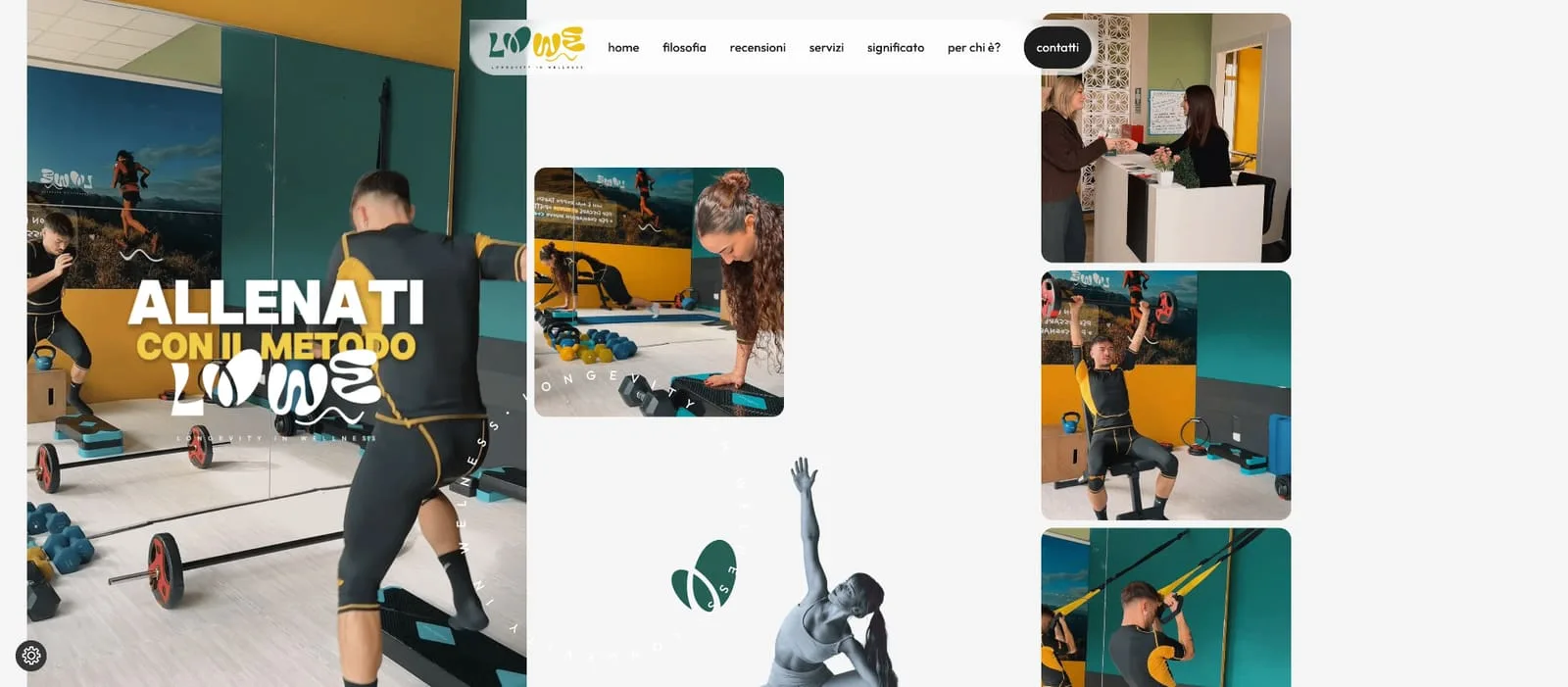
LOWE — Longevity in Wellness
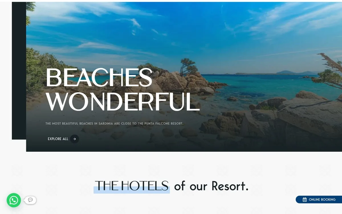
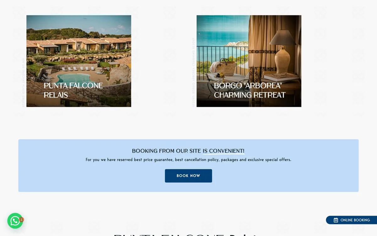
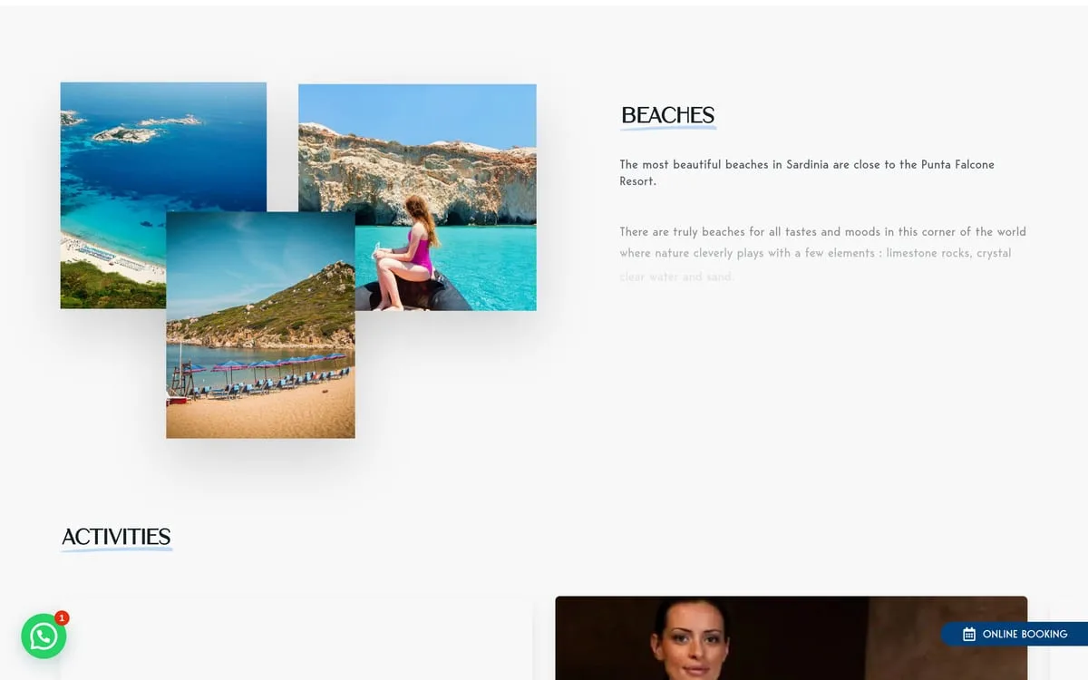
Mark, identity and website conceived together from day one: an organic two-colour lettering rolled out across signage, textiles and interiors. Walk in and you find exactly what you saw online.
What clients say.

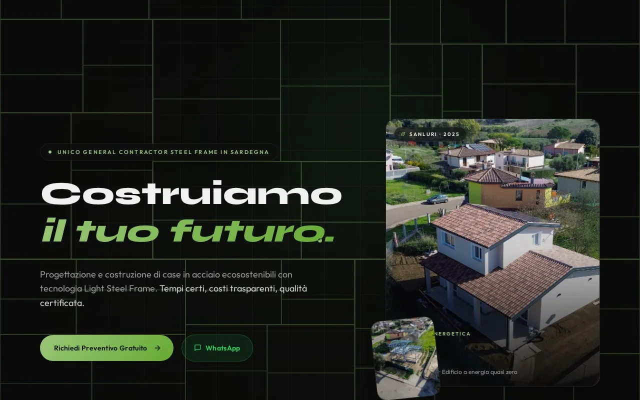
Sanluri is not just a building site. It is the first demonstration that in Sardinia you can build differently — faster, more sustainably, more safely.
Green Tech Costruzioni

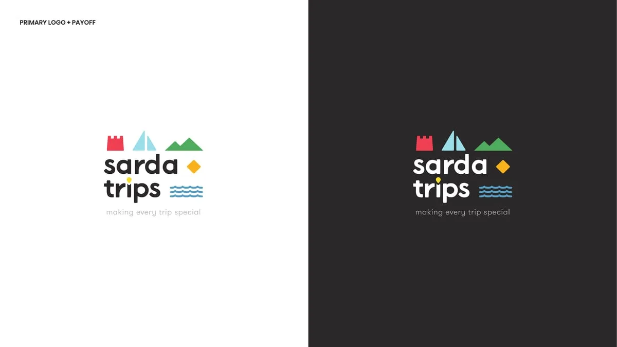
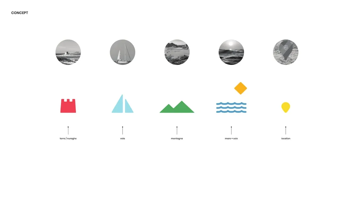
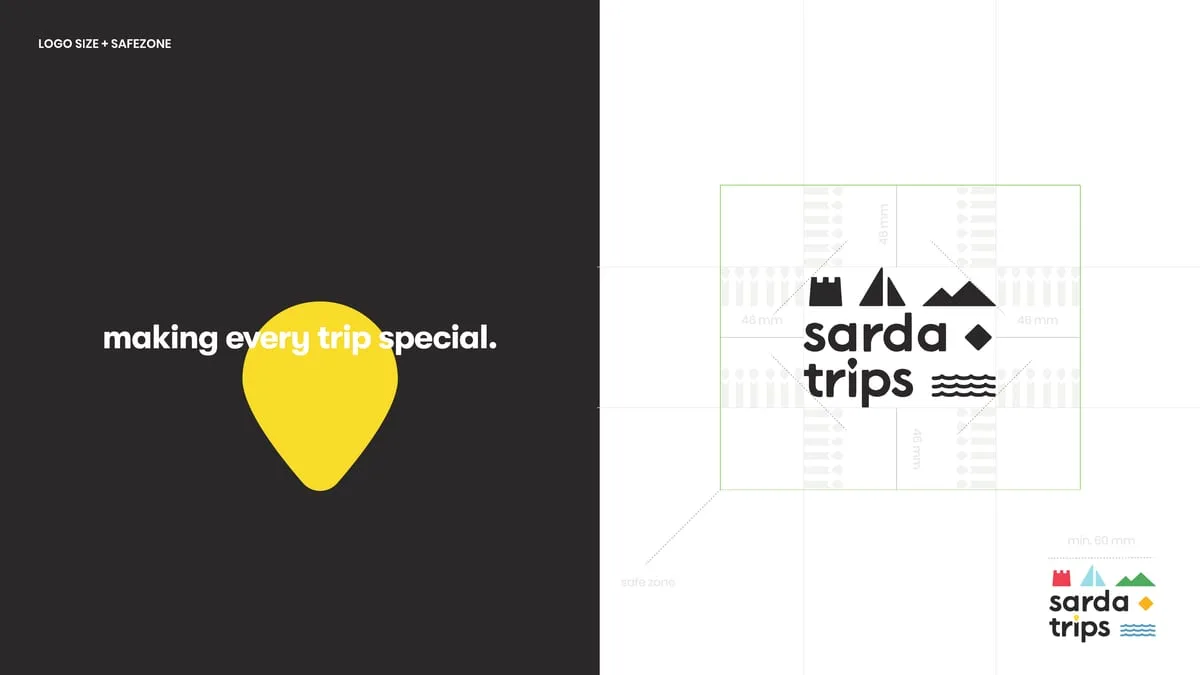
Telling Sardinia without falling into the usual tourist clichés was our real challenge. This brand and the visual identity we built with the team have tremendous strength and breathe the authentic soul of the island.
Sarda Trips


We needed a Sardinian listing platform that highlighted both stays and local experiences, giving owners visibility without punishing fees. With Avoy we have the right tool: fast, organised by category, and without crazy commissions strangling the business.
AVOY
With three wine shops on the Costa Smeralda we needed an online meeting point that did justice to our labels. Now whoever is looking for the right wine finds the way home straight away.
In Vino Veritas

Management software for restaurants and hospitality has to be concrete help between the tables, not an IT nuisance. This software turned our internal organisation around, cutting errors to zero and letting us work with a clear head.
hoopit

Before launching the app for our Pilates classes, between Porto Cervo and the digital side we lost hours coordinating chats and phone calls. Now our clients manage live and on-demand classes on their own, and we finally get to enjoy the work.
Flow Porto Cervo
Launching a sustainable streetwear e-commerce with print-on-demand was a complex bet. Now the shop runs perfectly, the graphics stand out at their best, and we can focus on creativity alone without the stress of warehouse stock.
Fionard

In our line of work roadside assistance allows no waiting, and the workshop has to be a byword for total reliability. Having such a direct digital point of reference lets customers find exactly the seriousness we put on the road every day.
CDA Servizi Auto
Managing eight lodgings between San Teodoro and Porto San Paolo without handing a small fortune to the big booking platforms seemed a pipe dream. Since we have had our own direct channel, margins can breathe again and guests reach us without intermediaries.
Ambra Holiday Rooms
In Sassari we wanted to position ourselves as the Longevity Wellness centre of reference, stepping out of the usual patterns. The new brand and the web platform literally jump off the screen, communicating pure innovation.
LOWE
In the world of bilingual yacht charter, the first impression on the web is worth everything. Now our platform is fast, elegant, and provides all the technical details it takes to bring clients on board without a worry.
Your Charter
We wanted our beauty suite to convey elegance and relaxation from the very first moment. With this new identity and the integrated booking system, clients walk in already in the right frame of mind for wellness.
Estetica Valeria
In our restaurant in Olbia the care for the kitchen goes hand in hand with the guest's experience. Between the digital menu and smart reservations, whoever comes to see us enjoys dinner without a hitch, starting from the choice of table.
La Sartoria del Gusto
Our physical studio in Porto Cervo needed a website as polished as our rooms. Now managing schedules and classes is smooth, and whoever steps in online finds themselves immersed in our very atmosphere.
Flow Studio Pilates
Our floral installations live on detail and immediate visual impact. Having such a well-kept digital gallery lets us show clients our value straight away — and they often give us carte blanche.
Ketty Flowers Designer
At our polyclinic in Palau we care for patients of every nationality, so a multilingual welcome in no fewer than eight languages is vital. Having a perfectly structured website has removed any misunderstanding and sped up access to appointments.
Medica Palau
As a creative studio we were tired of having a sloppy image. We finally have a website and a portfolio worthy of our capabilities, which speak plainly to anyone who means business.
Wonder Creators
Companies we've worked with.






- Your Charter
- Estetica Valeria
- Fondazione di Sardegna
- Avoy
- Fionard
- Cantine Antigori
- Tenuta Stalder Guiso
- Nanumoru
- Hopfenberg
- Versilia Weimar
- Sa Republica Sarda
- Sud Delivery
- Impresa Restaura
- Green Tech
- Studio Legale Senis
- Avvocato Zuddas
- Manufatti Vinci
- Viapixel
- Tecnicoffee
- Saditappo
- Academia de su Sardu
- Agenzia Labix
- Been Energia
- Il Redentore
- Studio Foto Immagine
- CDA
- Osua
- Punta Falcone Resort
- 5 Star Mooring
- IVV
Frequently asked.
A brand identity starts from 450 €. From there the project widens to what you need: naming, brand book, stationery. The quote is written and free: after a call, or from the configurator at /en/quote/ in a few questions.
Usually 1-2 weeks for the first concepts, then 2-3 weeks for the final version, revisions included.
Your logo in horizontal and square versions, variants for light and dark backgrounds, a colour palette with HEX/RGB/CMYK/Pantone codes, and every format — SVG, PNG, PDF, EPS — ready for web and print.
You do. At delivery we transfer all rights: use it anywhere, forever, with no royalties and no strings.
Branding and logo
The mark people recognise before they read your name.
The price goes up with naming, a full rebrand, the brand book as a project of its own and printed stationery. The quote is written and free, with phases and deliverables in black and white.
WHAT'S INCLUDED
- Logo design and brand mark
- Brand identity and brand book
- Naming and rebranding
- Business cards and stationery
- Packaging and labels
- Social media graphics