
Wonder Creators
Website for a social media, photo, video and drone agency, with services and figures.
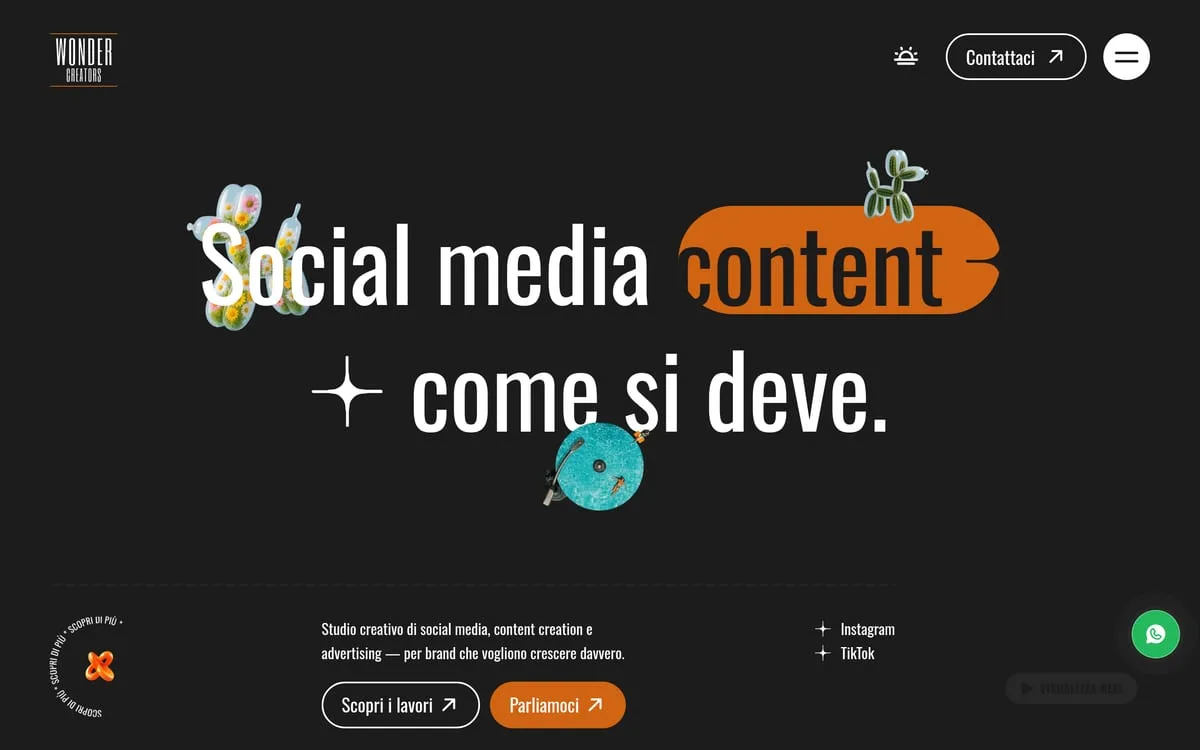
A site for an agency doing social media management, photography, video and drone footage: editorial identity, four services numbered like chapters, the studio's figures on a grid, and photographic collage set inside the lettering.
- Sector
- SaaS & Digital Products
- Role
- Art direction, UI design, Front-end development
Context
Wonder Creators is a communication agency: social media management, content creation, photography, video and drone footage, advertising. Their trade is making other people look good on social, which makes their own site the hardest job on the list: it is the proof. An ordinary site for a creative studio is not an ordinary site, it is a contradiction.
Challenge
The risk in this category is the brochure site that says "we're creative" and then shows a template. And there is a second, opposite one: the site so creative that nobody works out what they sell. It had to read as made on sight, and stay legible to someone shopping for a supplier with four tabs open.
Strategy
We treated the site as a piece of social work, not a brochure: strong hierarchy, blocks that read in three seconds, one thing per screen.
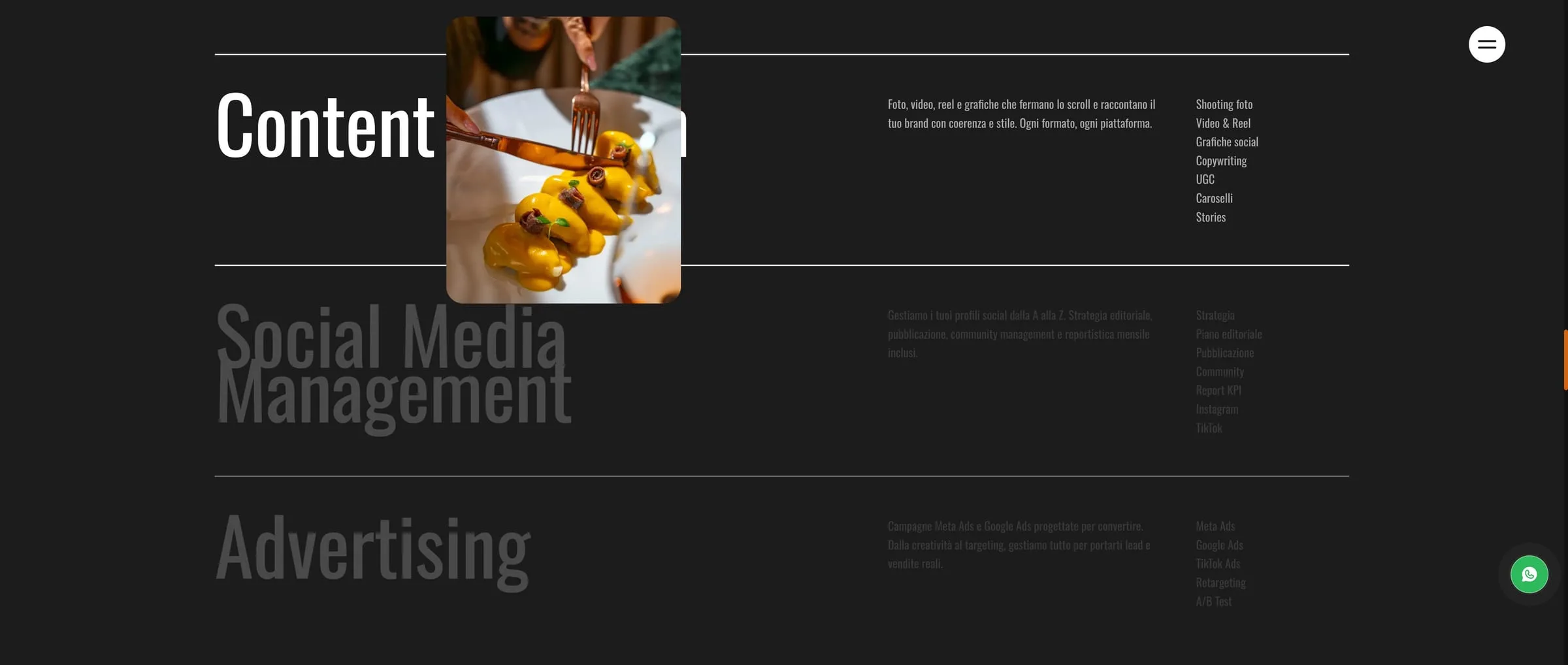
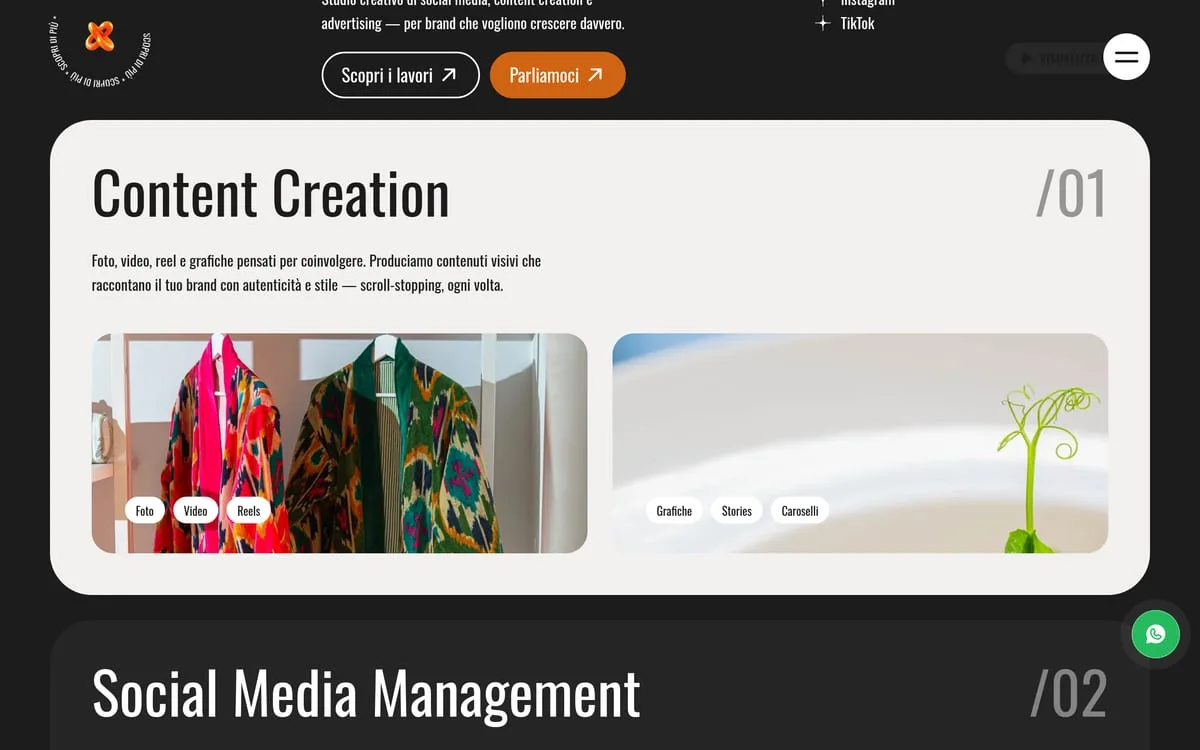
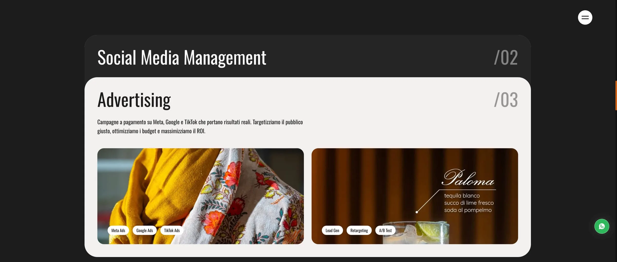
The services are numbered — /01 Content Creation, /02 Social Media Management, /03 Advertising, /04 Branding & Web — because that is how an index reads, and a price list does not. Each carries the real formats next to its name: photo, video, reels, graphics, stories, carousels. Whoever arrives knows what they get, not what we promise.

Design
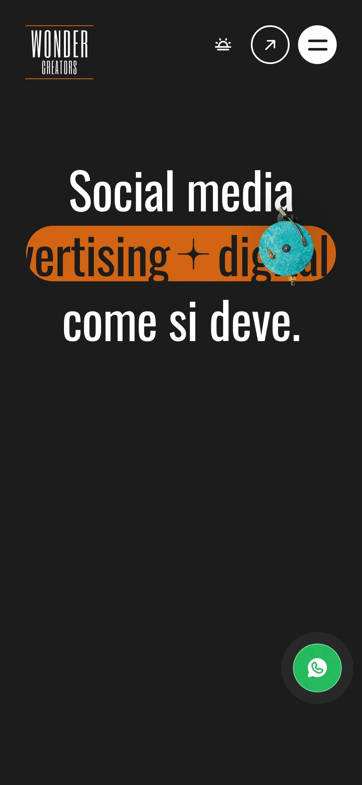
The identity is editorial and unembarrassed: the home page headline has photographic collage inside the lettering, cut-out objects spilling out of the letters. It is the gesture that states the trade without writing it down — someone who does content creation shows it in the first line.
Dark ground and a single warm accent, so the work photography holds the stage without fighting the interface. Type does the rest: decisive weights, large sizes, no ornament.
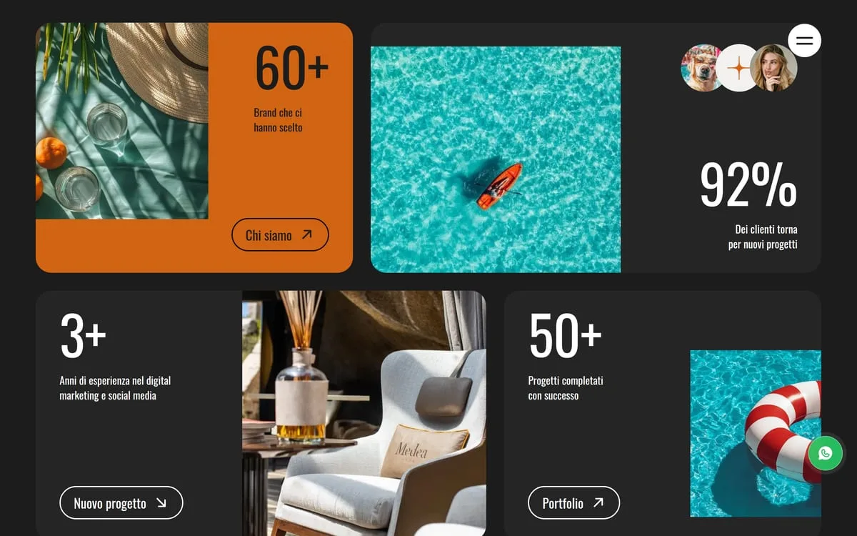
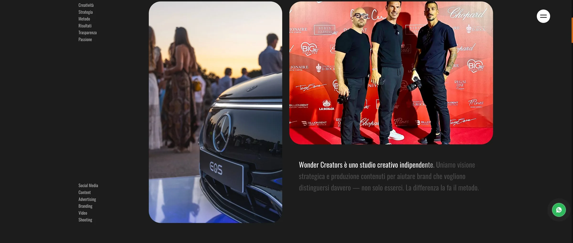
The studio's figures sit in a grid of differently sized tiles — 60+ brands, 92% returning clients, 3+ years, 50+ projects — alternating with photographs. It is not a counter: it is a block you scan the way you scan a feed, which is the right form for someone who sells feeds.
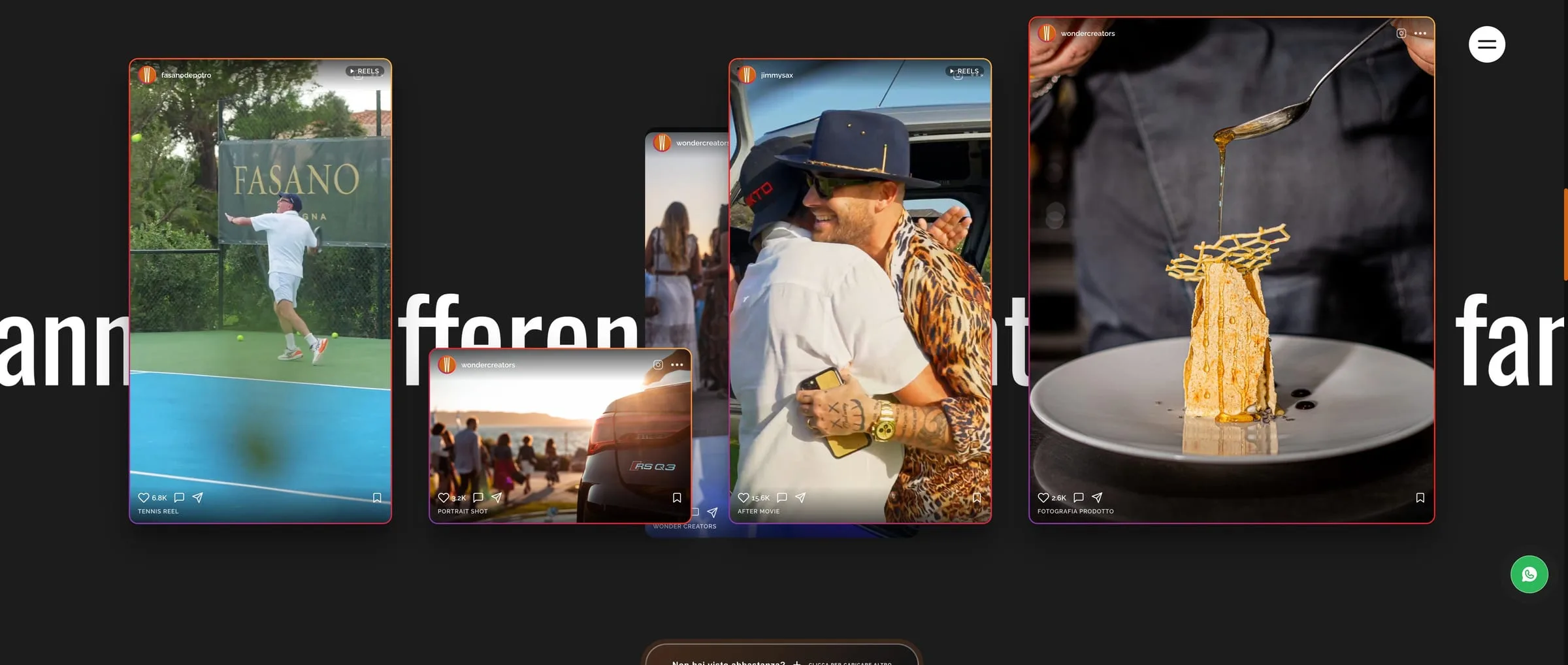
The portfolio carries that idea all the way. It is not a grid of thumbnails: they are the real posts, mounted the way they land on Instagram — handle, likes, the save icon — scattered over a line of type that scrolls. A tennis reel, the after movie of an evening, a shot of a plate. The work is shown in the format the work lives in, and someone shopping for a supplier sees in three seconds whether that format is what they need.
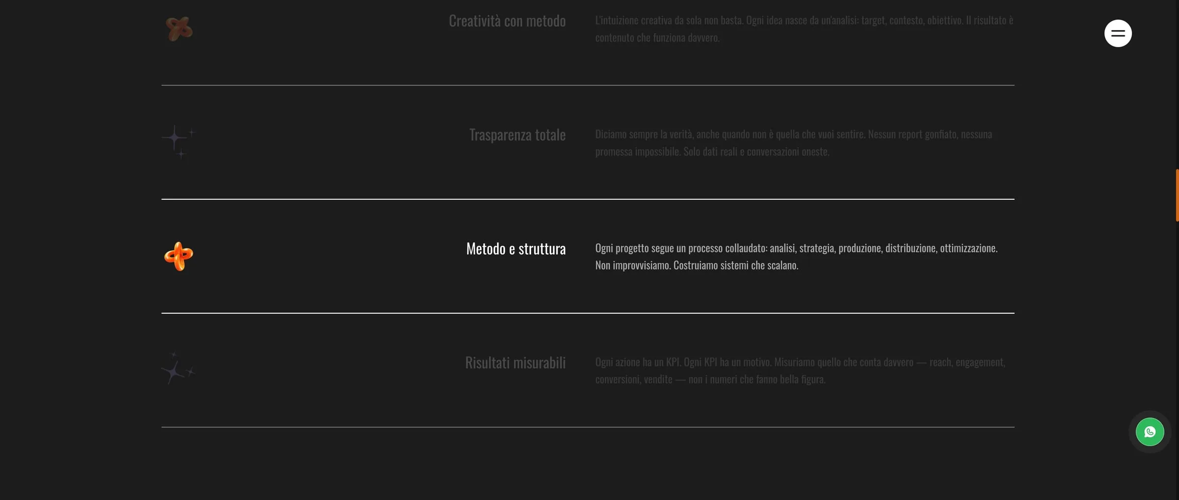
The four things they promise sit one per line, separated by hairlines, and the one being read lights up: creativity with method, full transparency, method and structure, measurable results. Each says how, not only what — "no padded reports", "every KPI has a reason". It is the part a category site writes to fill space, and here it is the part people read.

Build
Next.js. Images served at their real sizes, entrance animations governed
by prefers-reduced-motion, and a mobile-first build checked screen by
screen: on a site about vertical content, the phone is not the fallback,
it is where people look.
- Next.js

- Numbered services
- 4
Results
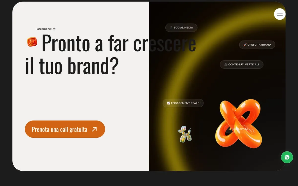
Wonder Creators has a site that stands next to what they produce for clients. The services read at a glance, the figures come before the ask, and the close asks for a free call rather than a generic "get in touch".
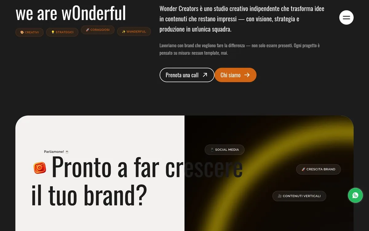
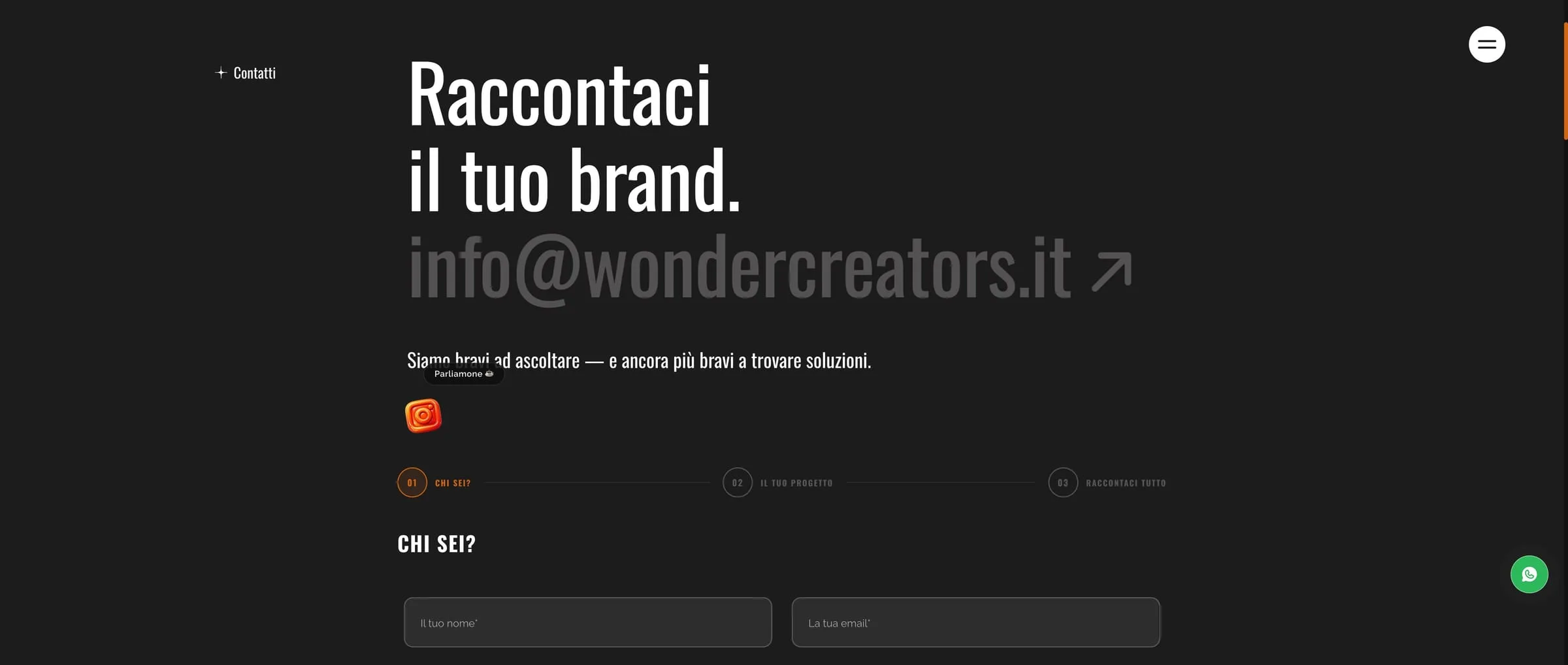
The ask itself is built the same way: three numbered steps — who you are, your project, tell us everything — instead of one ten-field form. It starts with a name and an email, and goes on only if you want it to. Whoever writes arrives having already said something, and the first reply starts from there rather than from "so what do you need?".
Live at wondercreators.it.
Screen by screen.
“As a creative studio we were tired of having a sloppy image. We finally have a website and a portfolio worthy of our capabilities, which speak plainly to anyone who means business.”
SaaS & Digital Products