
Packaging and label design
A label gets three seconds on the shelf. We design so three is enough.
- founded
- 2018
- projects delivered
- 200+
- clients in Sardinia and across Italy
- 65+
- nomination
- Awwwards
- projects for this service
- 4
We design packaging for food, wine, beer, cosmetics and jewellery: boxes, cartons, sleeves and labels, from concept to a checked first run. Prices start from 300 €, and the project adapts to your range and your quantities. The print-ready files stay yours: reprint with any printer.
Packaging is the only piece of communication your customer actually holds. On a crowded shelf, a label has a few seconds to get picked — and no second chance.
We design packaging and labels for the people who live off that moment: wineries, craft breweries, dairies, food producers, product brands. From concept to final artwork to a managed print run. We work from Sardinia, where the product is often extraordinary and the pack rarely does it justice.
On packaging we hold one firm belief: beautiful is not enough — it has to be recognisable. Beauty makes someone pick up the bottle once. Recognition makes them buy it again. And if the product also sells online, the work carries on with the shop: the box that lands at home is often the most photographed part of the brand.
Who we do it for.
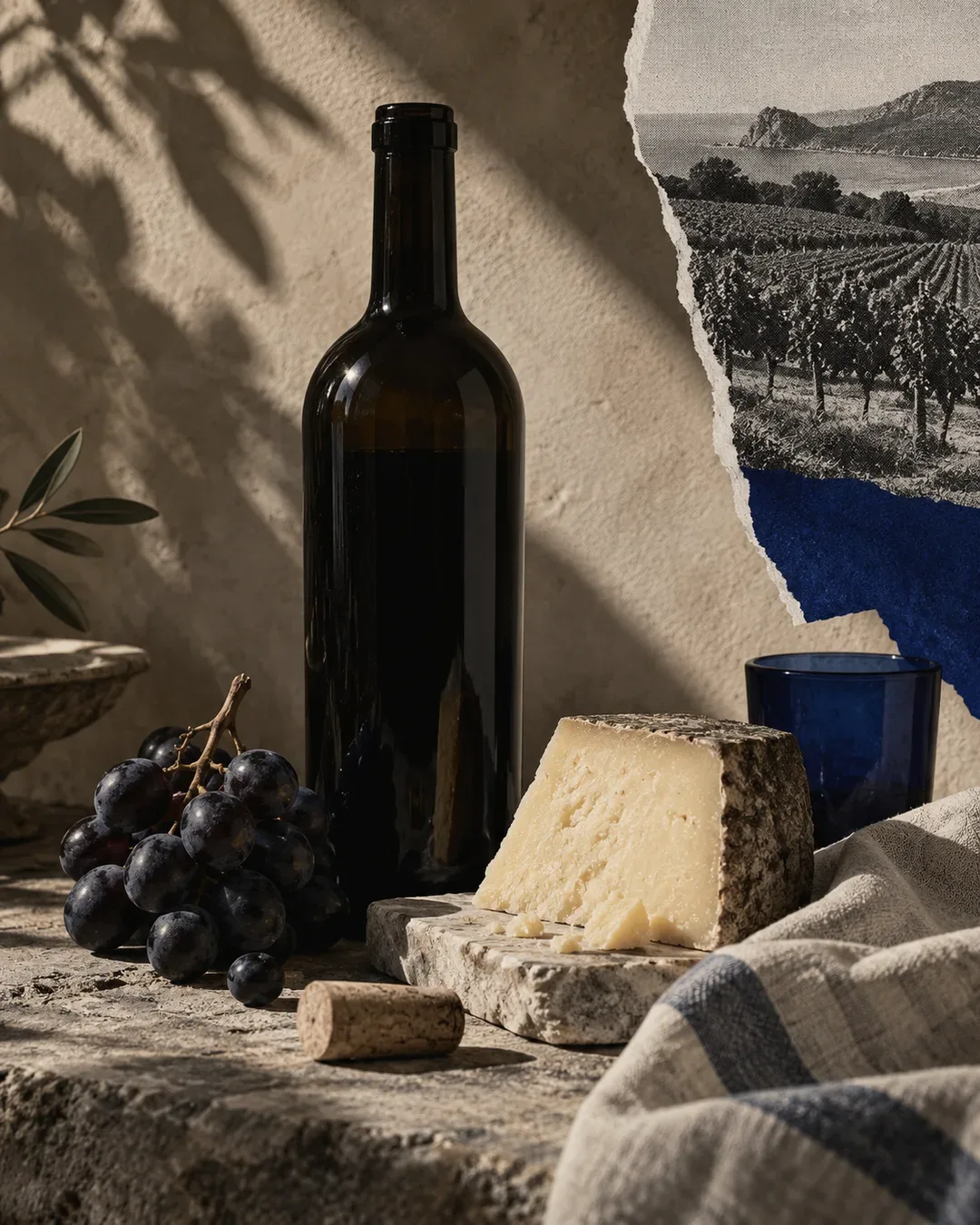 Food & WineriesLabels and boxes designed for the whole range and for the real shelf, from the village wine shop to the courier to the mainland.
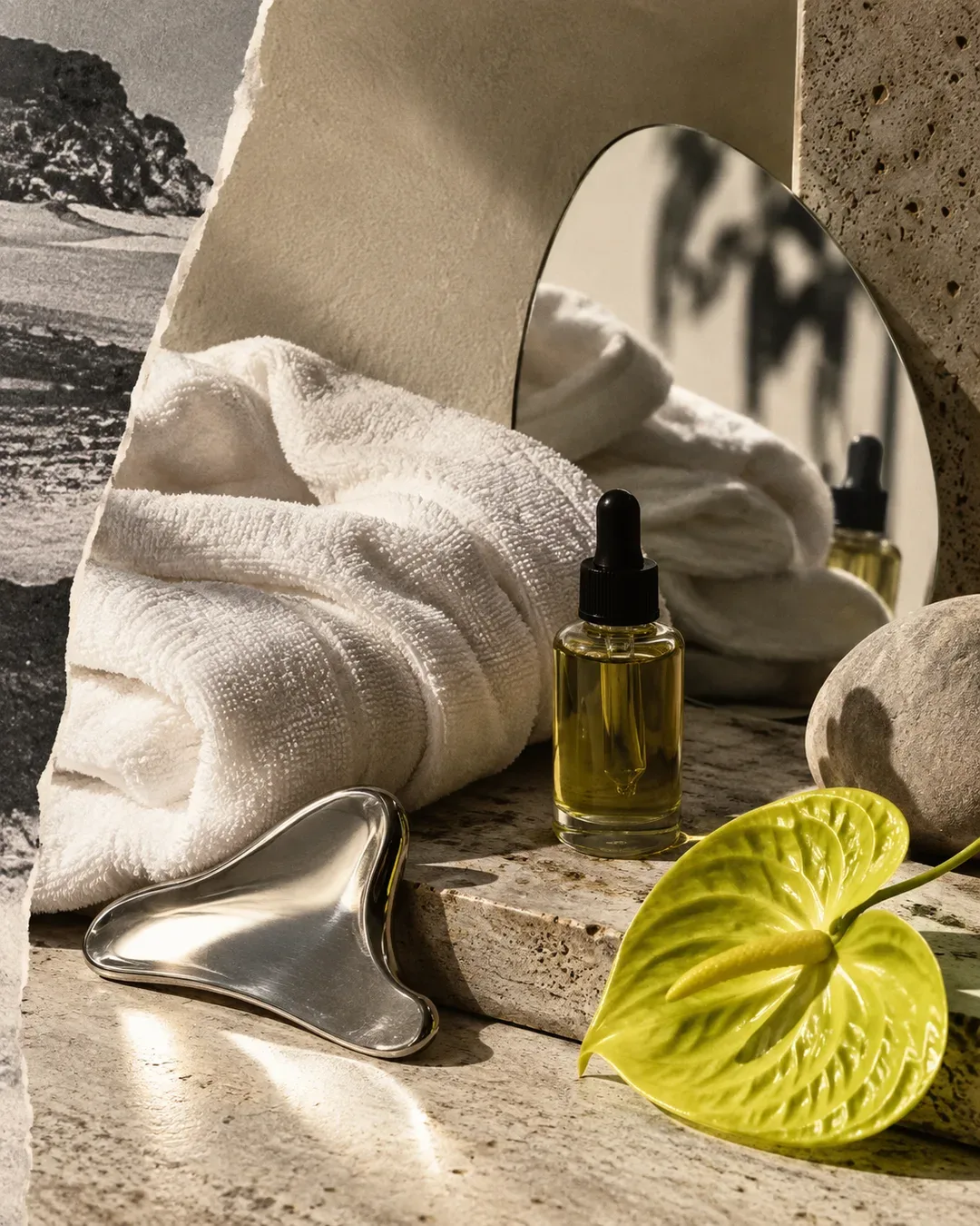 Wellness & BeautyBottles and packs that stand out in a crowded category without dressing up as something else, in step with the brand.
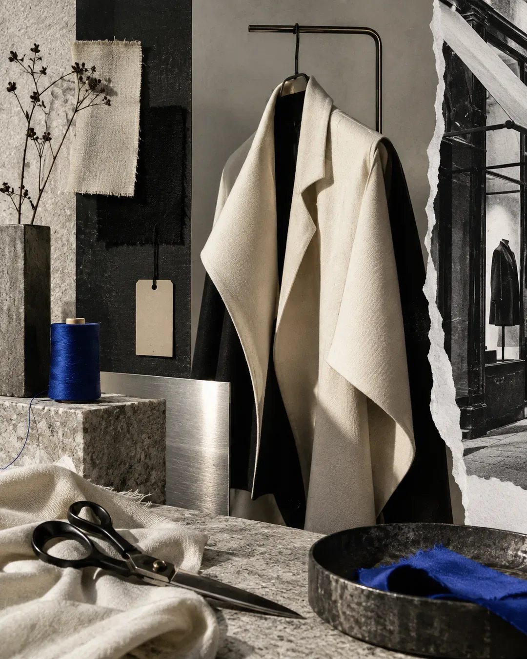 Retail & BoutiquesBoxes, shopping bags and tags that come out of the same project as the brand, in its colours.
We also do it for
What's included.
TRY IT
The file starts on your printer’s die line, not on a mockup.
02
Labels for wine, beer and food
Front, back and capsule for wine. Can and bottle for beer. Jars, wraps and packs for cheese, preserves and baked goods. One label or the full range, with a system that keeps each product distinguishable at a glance.
03
Primary and secondary packaging
Boxes, cartons, sleeves, pouches, bags, gift packs. The primary pack protects and presents; the secondary one ships, stacks and gets gifted. We design them together, because your customer sees them together.
04
Coordinated stationery
Business cards, letterhead, email signature and printed materials aligned with the brand. If the label says one thing and the business card another, the brand breaks.
05
Print-ready artwork
Die-cut paths, bleeds, overprint, separated Pantone inks, finishing specs. Final artwork is where good designs fail — we prepare it to your printer's specifications, not to a generic template.
06
Print management
If you want, we run the whole flow: printer selection, quotes, colour proofs, first-run check. One contact from brief to delivered pallet.
Brief and constraints
Format, material, print run, budget, sales channels. Plus the mandatory information your consultant has defined — ingredients, alcohol content, lot — because it belongs in the layout from day one, not the last.
Research and concept
We go look at the actual shelf, where your product will compete. Two or three creative directions, mounted on mockups of the real format, never on an abstract rectangle.
Development
Typography, illustration or photography, information hierarchy, back label, roll-out across the rest of the range. Revisions are included and agreed before we start.
Artwork and proof
Files to the printer's specifications: die-cut, bleeds, spot colours, finishes. Then a colour proof. That is where problems surface — better on one proof sheet than on ten thousand labels.
Print and delivery
We coordinate the printer through to delivery and check the first run. You receive the open files and the print-ready PDFs: reprinting is yours, with no dependency on us.
What we build it with.
Projects are built in Illustrator for vector paths and die-cuts, Photoshop for imagery, InDesign for multi-page coordinated materials. Critical colours travel as Pantone inks, with controlled CMYK conversion. You evaluate the design on 3D mockups at real scale — the bottle with your label, the box open and closed — and the same renders work for your shop and social channels before the product is even printed. On the press side we use the finishes that give a label its texture: natural and embossed papers, hot foil, blind embossing, UV varnish. Never as decoration, only when the positioning earns them. A €30 wine on the shelf should also look like a €30 wine.
- Adobe Illustrator
- Photoshop
- InDesign
- Pantone
- 3D mockups
- Colour proof
- Hot foil
- Blind embossing
The mistakes that shorten a label's life
After years of food and beverage work, we keep seeing the same four.
Designing on screen, printing blind
A label approved on a backlit monitor is a bet: colours shift, paper absorbs, the real format is smaller than it looked. That's why we insist on real-scale mockups and a colour proof.
Filling every centimetre
The urge to say everything — history, territory, awards, pairings — produces labels that say nothing. Hierarchy wins: one element that hooks from a distance, the rest legible up close.
Copying the category leader
If your Vermentino looks like the best-selling Vermentino, you just paid to be mistaken for someone else. Category codes exist to be understood, so you know where to break them.
Treating the range as separate labels
Every new product designed in isolation erodes the system. We design the first label with the tenth in mind: one structure, recognisable variants, room to grow.
The shelf is the test
Packaging isn't judged in a presentation — it's judged with the product sitting among its competitors, and as part of a wider brand system.
Sardinian products, crowded categories
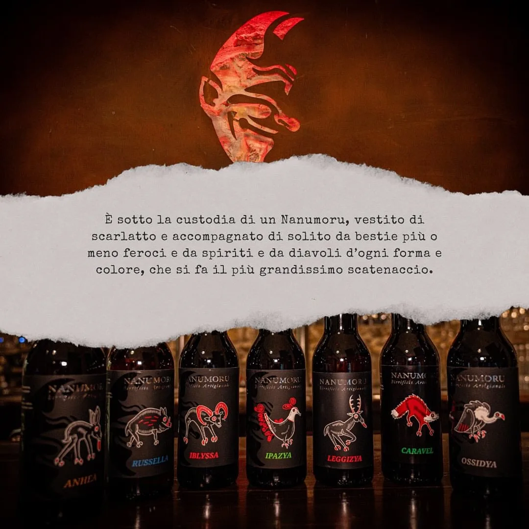
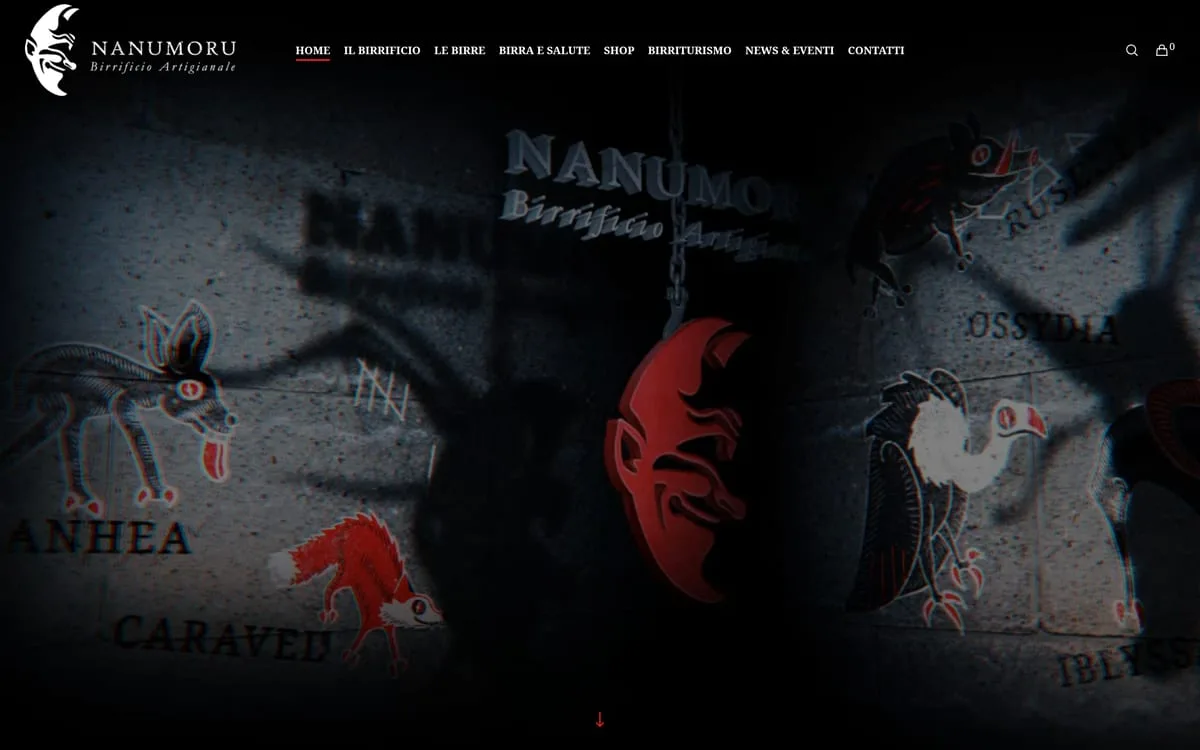
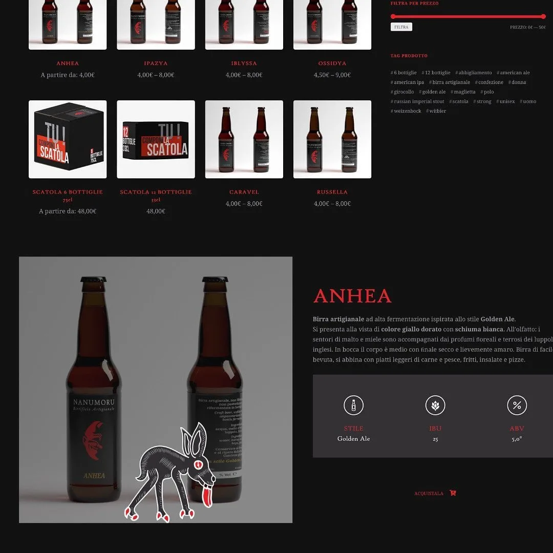
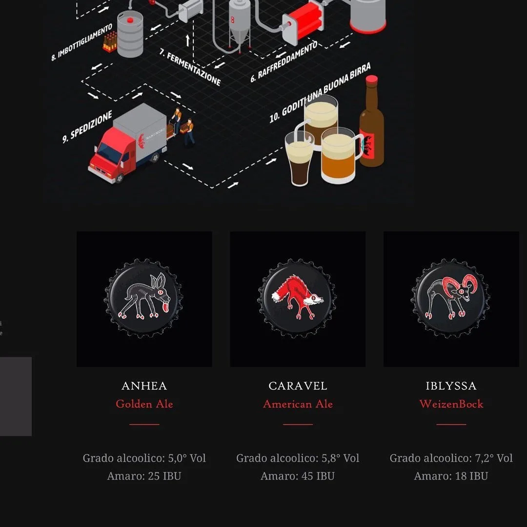
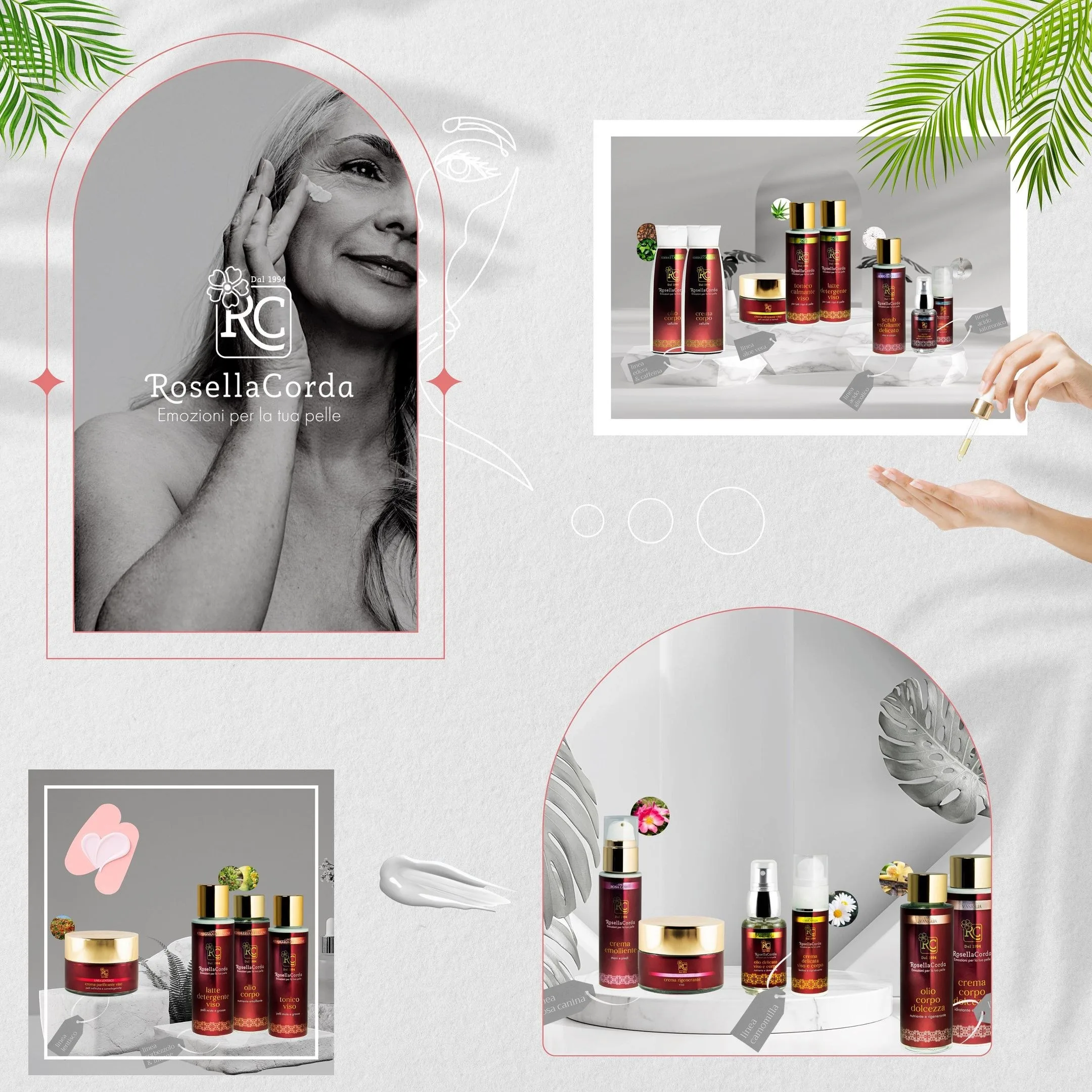
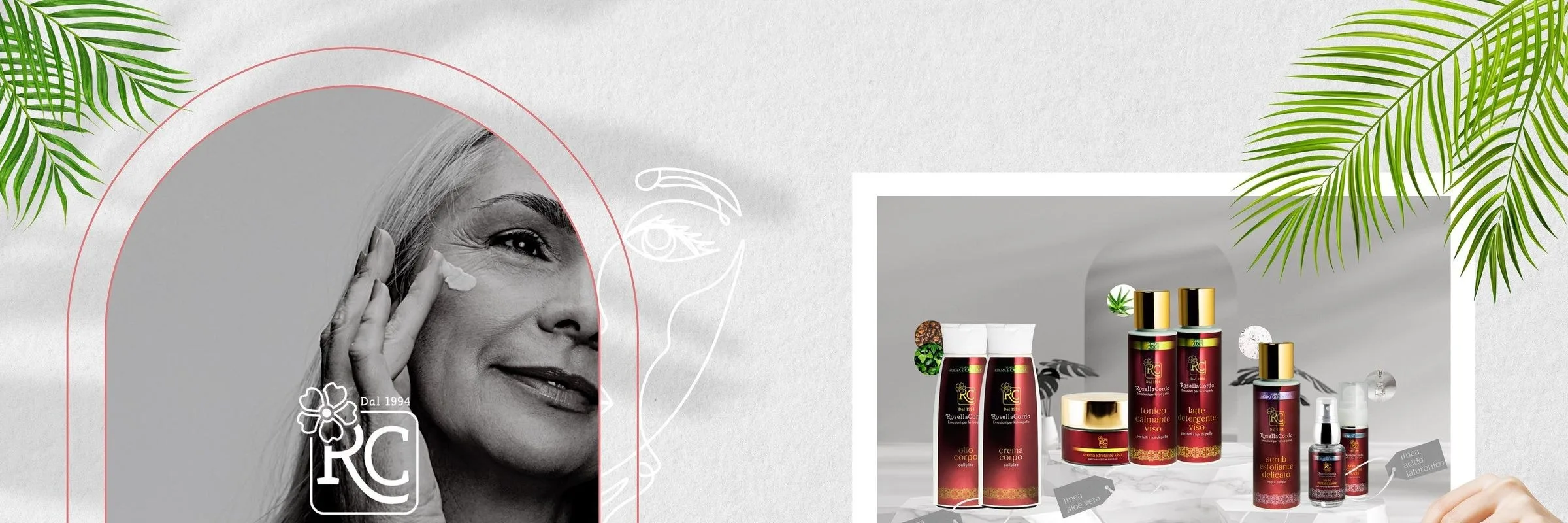
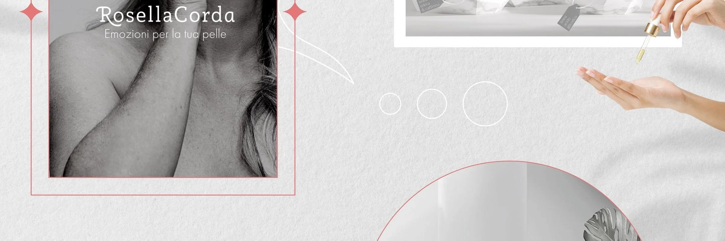
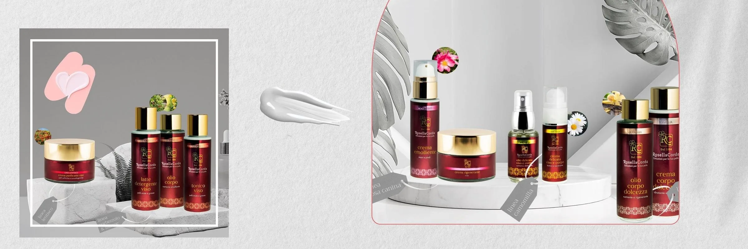
The labels of Nuraghe Antigori, the craft beer of Birrificio Nanumoru, the bottles of Rosella Corda: same problem, standing out without dressing up as something else.
Packaging inside the identity
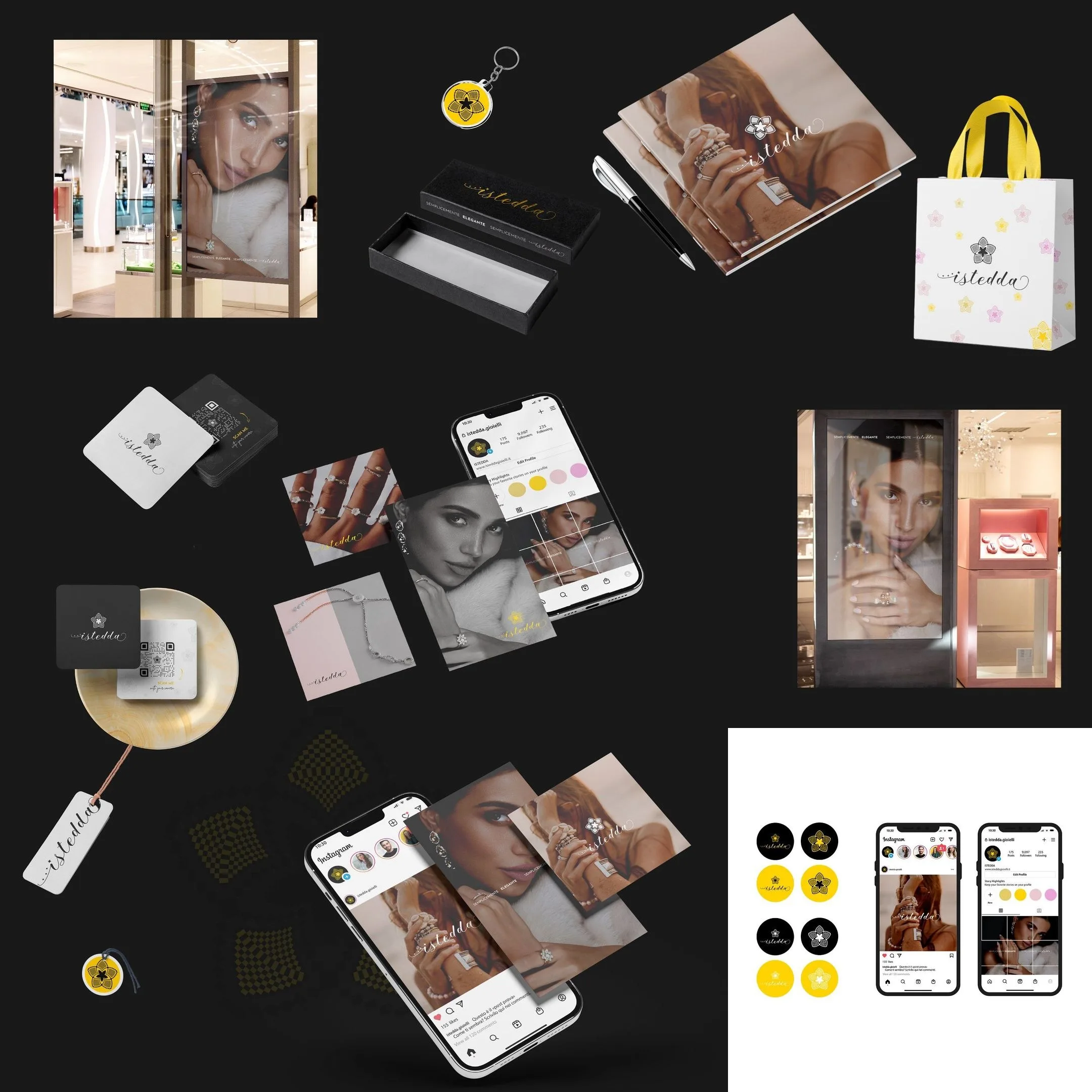
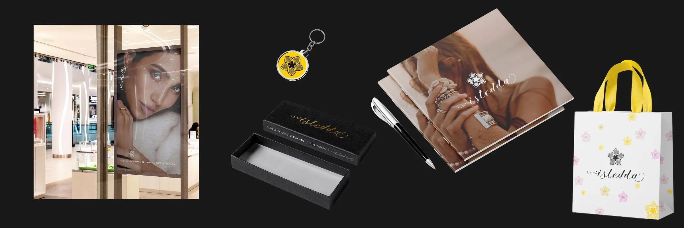
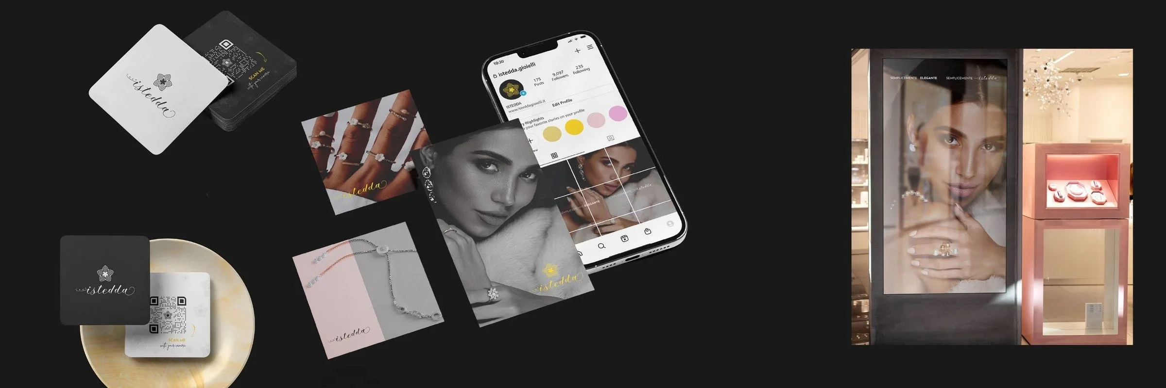
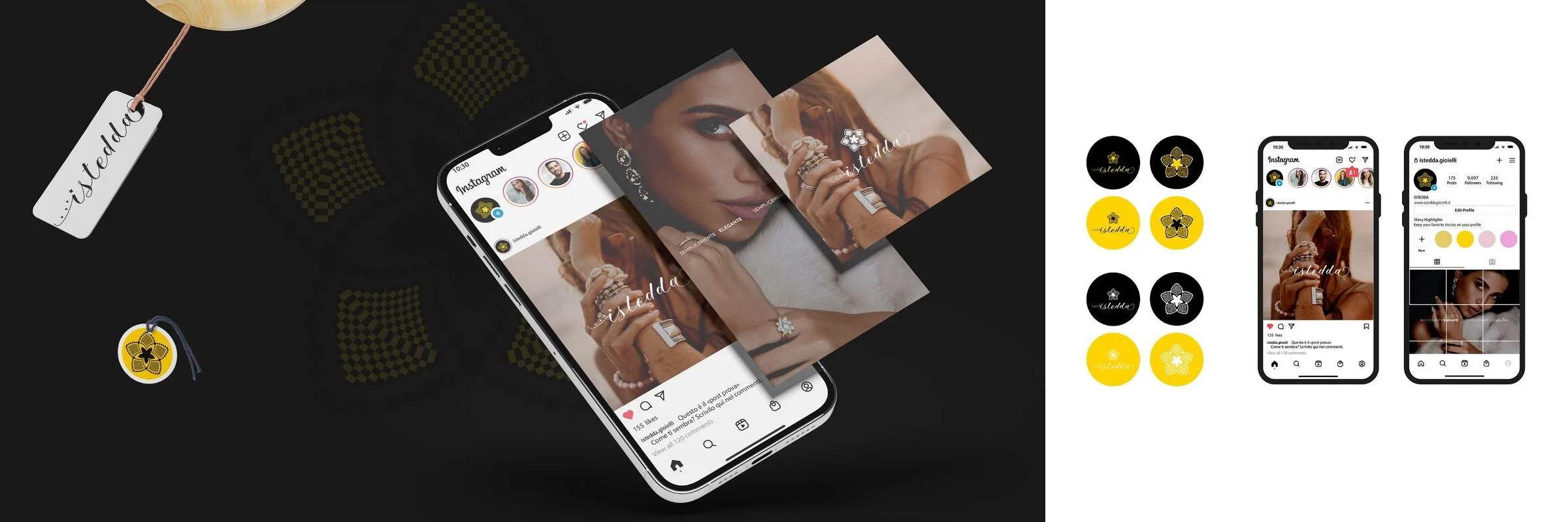
For Istedda Gioielli the four brand colours are the same as the flowers scattered on the white boxes. Boxes, shopping bags and tags weren't added to the identity later: they came out of the same project as the logotype.
The brand first, the label after
If the brand doesn't exist yet, start with branding and logo. The other way round means building your label on temporary foundations.
Real projects.
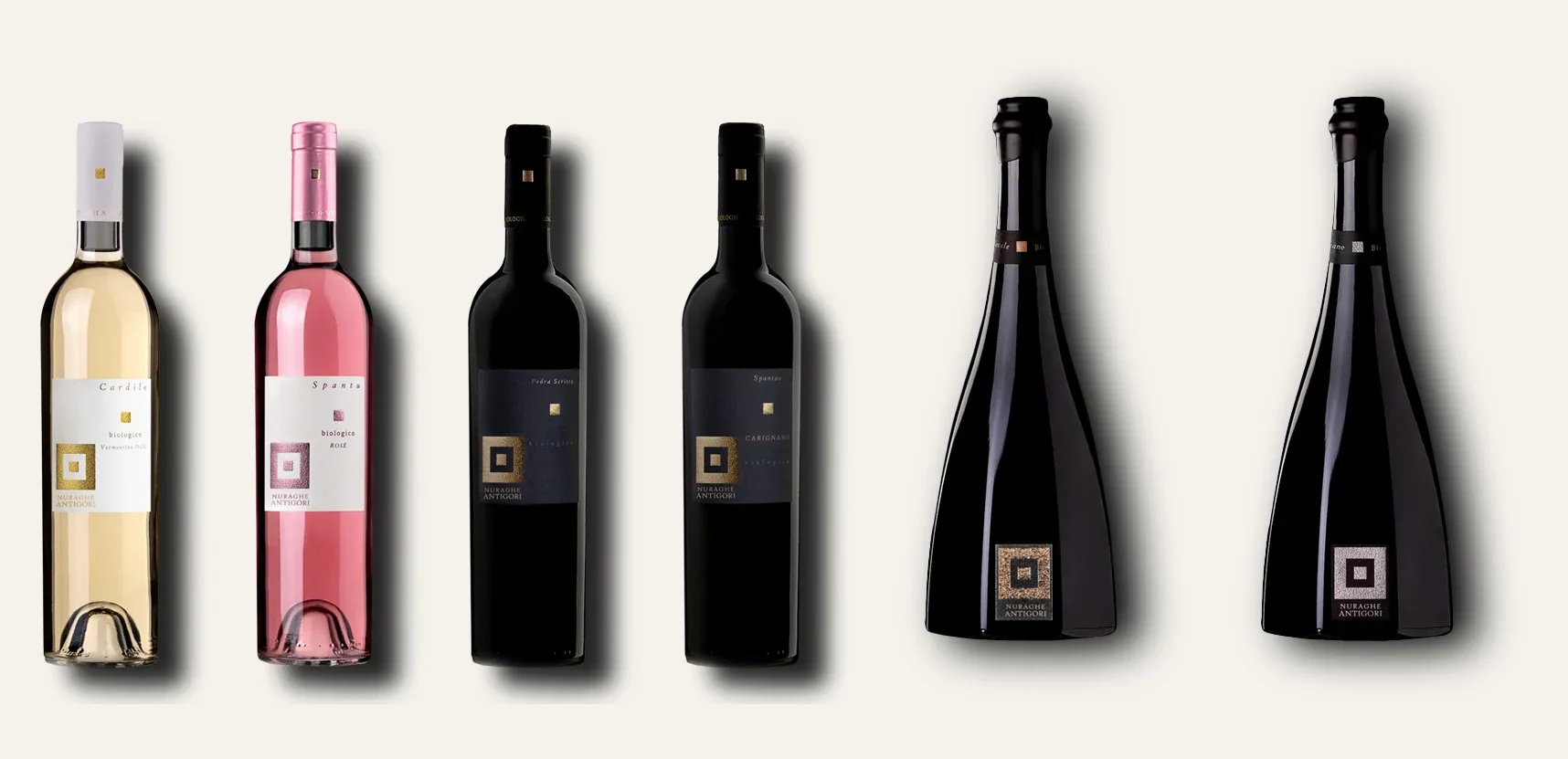
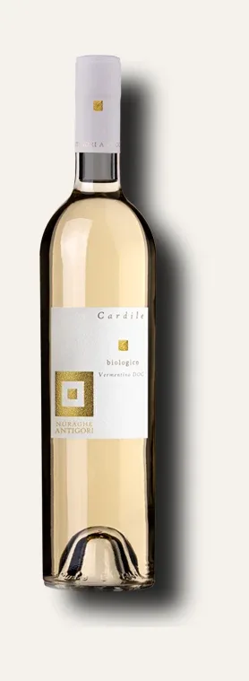
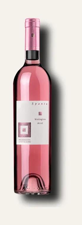
Nuraghe Antigori
Six organic references and two bottle formats held together by a single mark: the square returns on every label in two sizes and changes metal with the wine, instead of changing design.
What clients say.

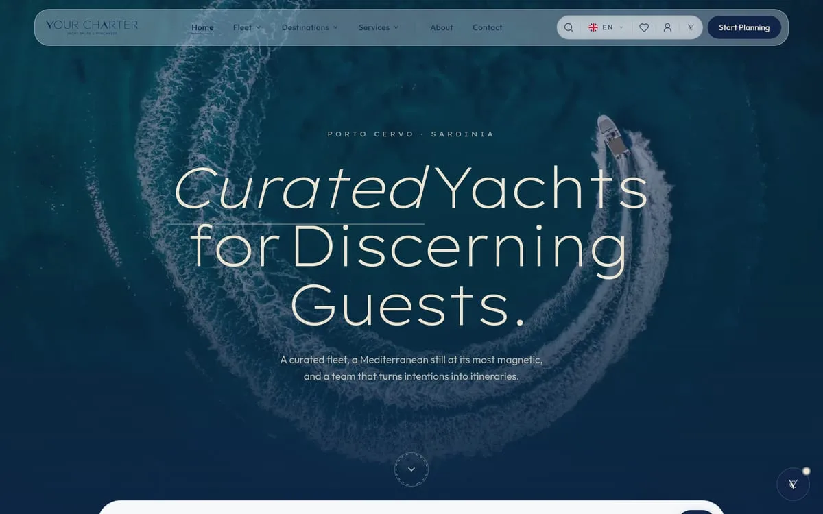
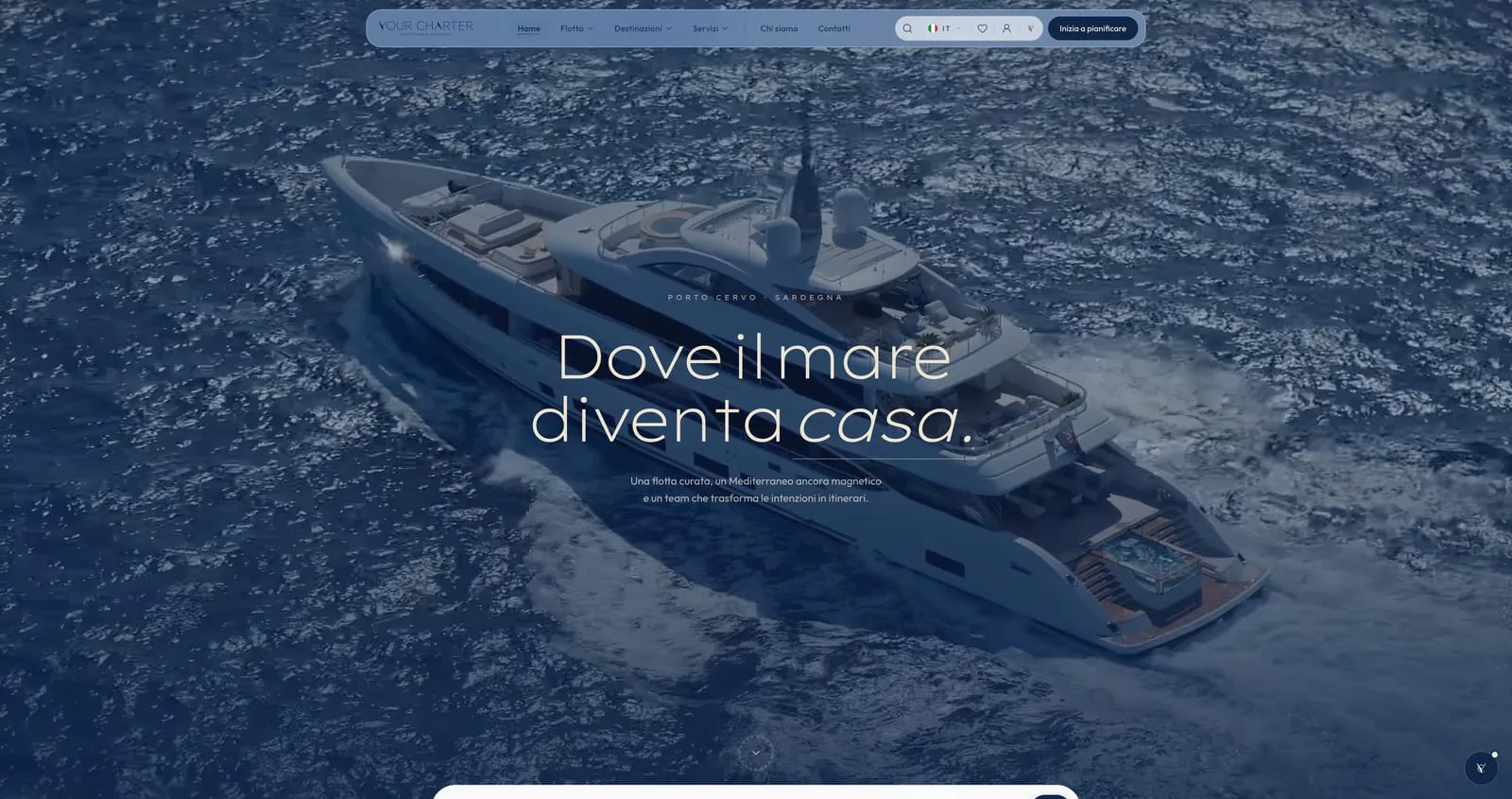
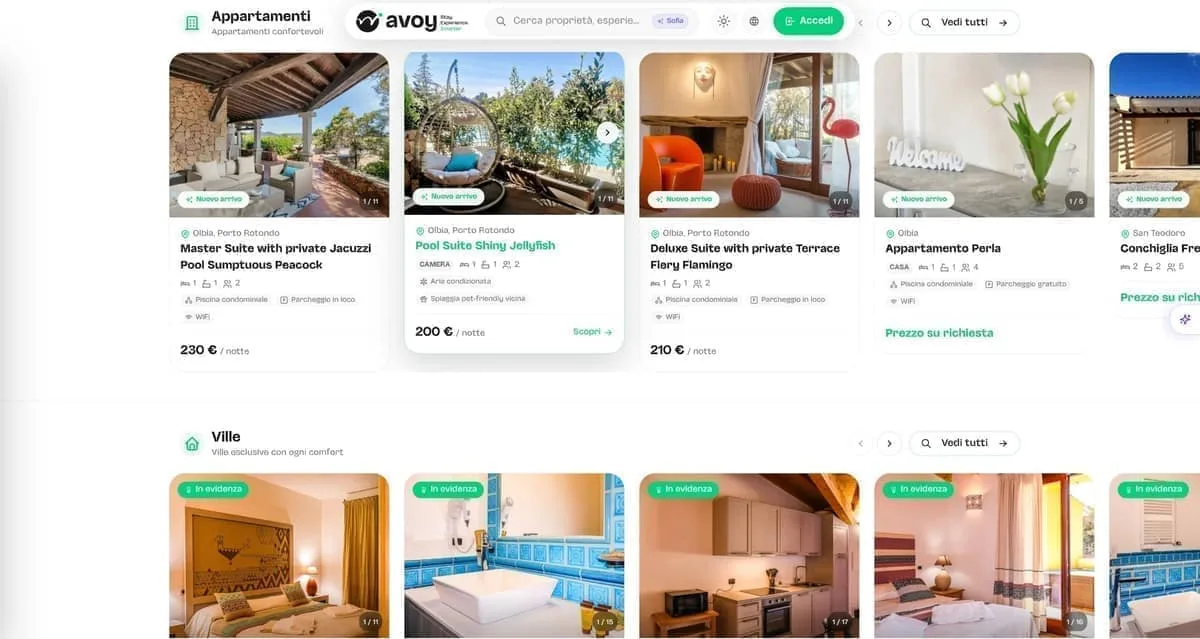
In the world of bilingual yacht charter, the first impression on the web is worth everything. Now our platform is fast, elegant, and provides all the technical details it takes to bring clients on board without a worry.
Your Charter

Sanluri is not just a building site. It is the first demonstration that in Sardinia you can build differently — faster, more sustainably, more safely.
Green Tech Costruzioni

We wanted our beauty suite to convey elegance and relaxation from the very first moment. With this new identity and the integrated booking system, clients walk in already in the right frame of mind for wellness.
Estetica Valeria
In our restaurant in Olbia the care for the kitchen goes hand in hand with the guest's experience. Between the digital menu and smart reservations, whoever comes to see us enjoys dinner without a hitch, starting from the choice of table.
La Sartoria del Gusto

Our physical studio in Porto Cervo needed a website as polished as our rooms. Now managing schedules and classes is smooth, and whoever steps in online finds themselves immersed in our very atmosphere.
Flow Studio Pilates

Our floral installations live on detail and immediate visual impact. Having such a well-kept digital gallery lets us show clients our value straight away — and they often give us carte blanche.
Ketty Flowers Designer
At our polyclinic in Palau we care for patients of every nationality, so a multilingual welcome in no fewer than eight languages is vital. Having a perfectly structured website has removed any misunderstanding and sped up access to appointments.
Medica Palau

Telling Sardinia without falling into the usual tourist clichés was our real challenge. This brand and the visual identity we built with the team have tremendous strength and breathe the authentic soul of the island.
Sarda Trips
Managing eight lodgings between San Teodoro and Porto San Paolo without handing a small fortune to the big booking platforms seemed a pipe dream. Since we have had our own direct channel, margins can breathe again and guests reach us without intermediaries.
Ambra Holiday Rooms

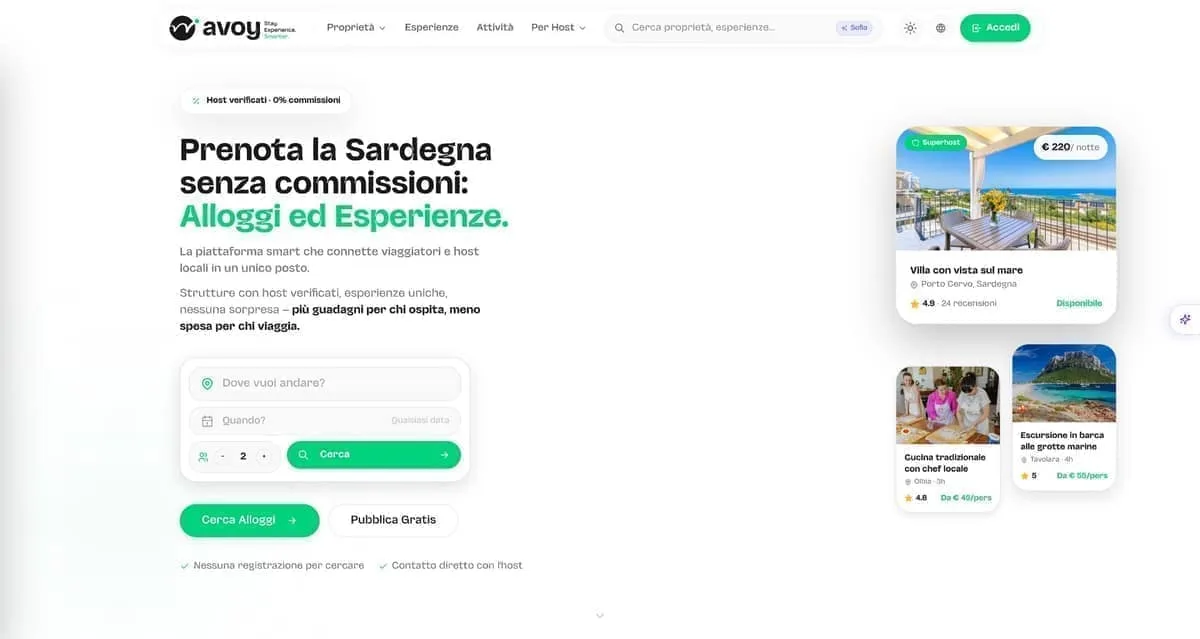
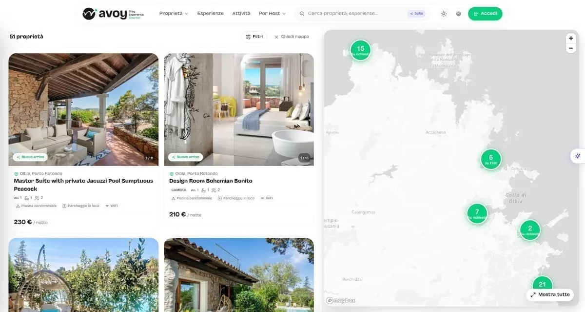
We needed a Sardinian listing platform that highlighted both stays and local experiences, giving owners visibility without punishing fees. With Avoy we have the right tool: fast, organised by category, and without crazy commissions strangling the business.
AVOY
In Sassari we wanted to position ourselves as the Longevity Wellness centre of reference, stepping out of the usual patterns. The new brand and the web platform literally jump off the screen, communicating pure innovation.
LOWE
With three wine shops on the Costa Smeralda we needed an online meeting point that did justice to our labels. Now whoever is looking for the right wine finds the way home straight away.
In Vino Veritas
Management software for restaurants and hospitality has to be concrete help between the tables, not an IT nuisance. This software turned our internal organisation around, cutting errors to zero and letting us work with a clear head.
hoopit
Before launching the app for our Pilates classes, between Porto Cervo and the digital side we lost hours coordinating chats and phone calls. Now our clients manage live and on-demand classes on their own, and we finally get to enjoy the work.
Flow Porto Cervo
Launching a sustainable streetwear e-commerce with print-on-demand was a complex bet. Now the shop runs perfectly, the graphics stand out at their best, and we can focus on creativity alone without the stress of warehouse stock.
Fionard
In our line of work roadside assistance allows no waiting, and the workshop has to be a byword for total reliability. Having such a direct digital point of reference lets customers find exactly the seriousness we put on the road every day.
CDA Servizi Auto
As a creative studio we were tired of having a sloppy image. We finally have a website and a portfolio worthy of our capabilities, which speak plainly to anyone who means business.
Wonder Creators
Companies we've worked with.









- Your Charter
- Estetica Valeria
- Fondazione di Sardegna
- Avoy
- Fionard
- Cantine Antigori
- Tenuta Stalder Guiso
- Nanumoru
- Hopfenberg
- Versilia Weimar
- Sa Republica Sarda
- Sud Delivery
- Impresa Restaura
- Green Tech
- Studio Legale Senis
- Avvocato Zuddas
- Manufatti Vinci
- Viapixel
- Tecnicoffee
- Saditappo
- Academia de su Sardu
- Agenzia Labix
- Been Energia
- Il Redentore
- Studio Foto Immagine
- CDA
- Osua
- Punta Falcone Resort
- 5 Star Mooring
- IVV
Frequently asked.
Packaging design starts from 300 €. From there the project adapts to your range: how many products, which formats, whether a new die-cut is needed. Printing is paid to the printer, with quotes you see first. The quote is written and free: after a call, or from the configurator at /en/quote/.
Design takes 2–4 weeks: brief, concept, development and revisions, final artwork. Printing adds 1–2 weeks depending on the printer, materials and finishes. If you have a deadline — harvest, trade fair, launch — it goes into the plan on day one.
Yes. We work with selected printers in Sardinia and across Italy: we collect quotes, follow the colour proofs and check the first run. If you already have a printer you trust, we prepare the artwork to their specifications and deal with them directly.
The mandatory content — ingredients, allergens, alcohol content, lot number, legal references — is defined by you and your consultant, because it varies by product and market. We build it into the layout, respecting minimum sizes and legibility without sacrificing the design.
Yes. On delivery you get the print-ready PDFs and the open files, with usage rights transferred. Reprint whenever you want, with any printer you want — today or in five years. If you change format or add a product, we adapt the files without starting over.
Packaging and labels
A label gets three seconds on the shelf. We design so three is enough.
The price goes up with the products in the range, a custom die-cut and a project that starts from the logo. Printing is paid directly to the printer, with quotes shown before proceeding: no hidden markup.
WHAT'S INCLUDED
- Labels for wine, beer and food
- Primary and secondary packaging — boxes, cartons, pouches
- Coordinated stationery and printed materials
- Print-ready artwork files
- Mockups and colour proofs
- Print management with selected printers