Sarda Trips
Brand identity for a Sardinian tour and experience operator.
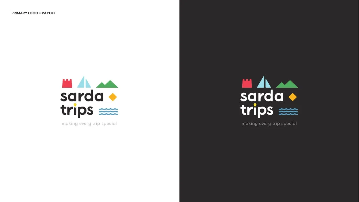
Full brand identity for a Sardinian experience operator: five pictograms drawn from photographs of the island, an eight-colour system, typography, pattern and applications — from merchandise to social posts.
- Sector
- Tourism & Experiences
- Role
- Brand concept, Wordmark and pictogram system, Colour system and typography, Pattern and applications, Brand book
Context
Sarda Trips sells experiences in Sardinia to people looking for more than a week by the sea. It is a crowded, uniform market: the same white-sand photograph, the same turquoise, the same round typeface. Look at ten operators in a row and you remember none of them.
Challenge
Sardinian tourism almost always tells its story with a photograph. But everyone has a beautiful photograph and nobody owns one: the same beach is in twenty competitors' material. What was needed was a mark that works without the photograph — on a tote bag, on a mug, on a watch face — and that stays recognisable small.
Strategy
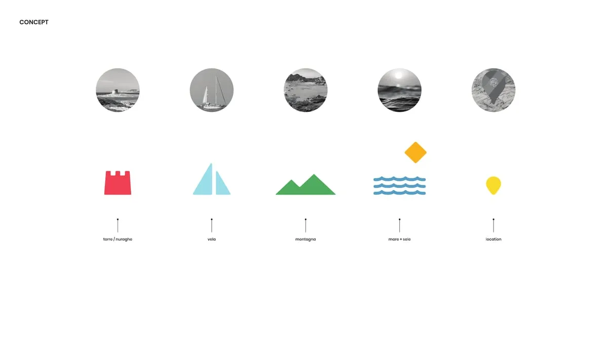
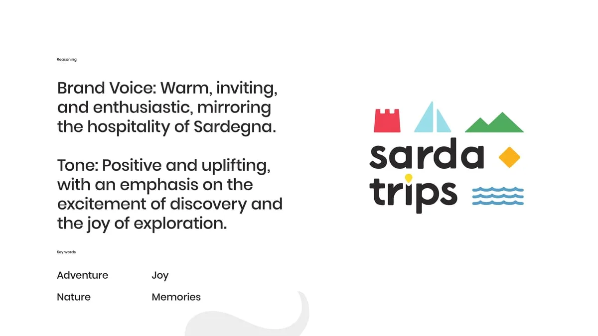
We started from what a trip to Sardinia actually contains, not from how it photographs. Five things: the nuraghe, the sail, the mountain, the sea, the place. Each became a pictogram, and each pictogram comes from a real photograph reduced to its minimum form — the concept page shows the pair, photo and sign, side by side.
They are five signs, not one logo with five variants. Together they make the mark; apart they make the pattern, the merchandise, the app icon. That is the difference between a logo and a system.
The payoff — making every trip special — stays in English: Sarda Trips's customer comes from abroad, and translating it would have made it smaller.

Design
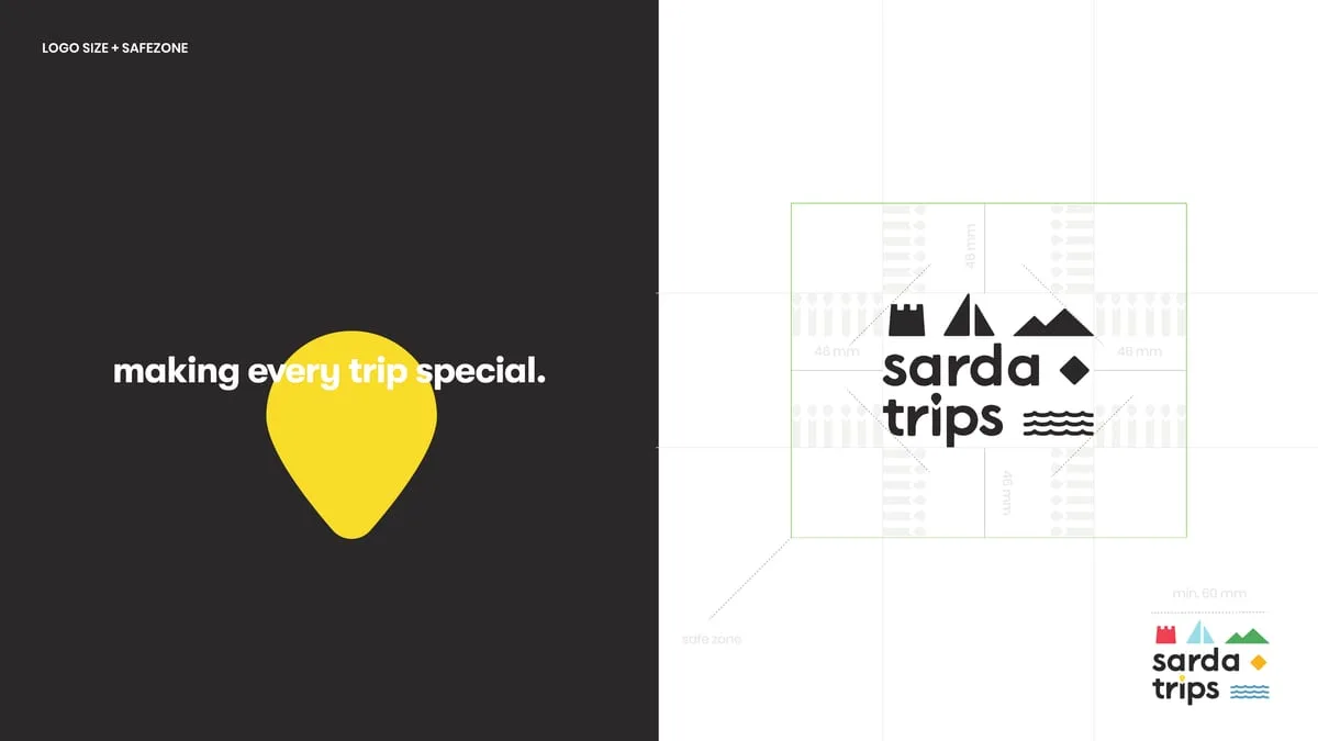
The mark. Lowercase wordmark on two lines, with the pictograms set around it like a horizon. Grid construction and safe zone documented, a reversed version, and a version without the payoff for small sizes.
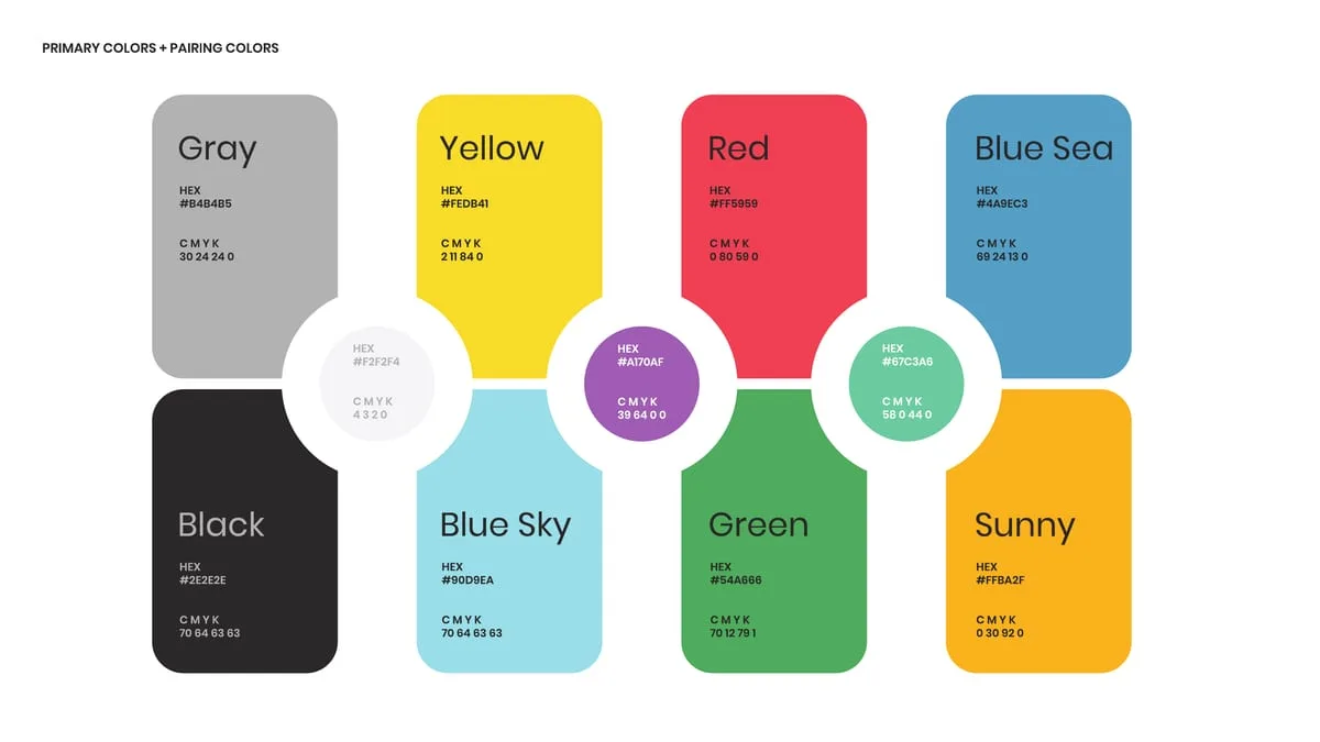
The colour. Eight entries — grey, yellow, red, blue sea, black, blue sky, green, sunny — each with hex and CMYK, and the pairings that are allowed. It is not a cheerful palette for the sake of being cheerful: every colour belongs to a pictogram, so the colour system and the sign system are the same thing.
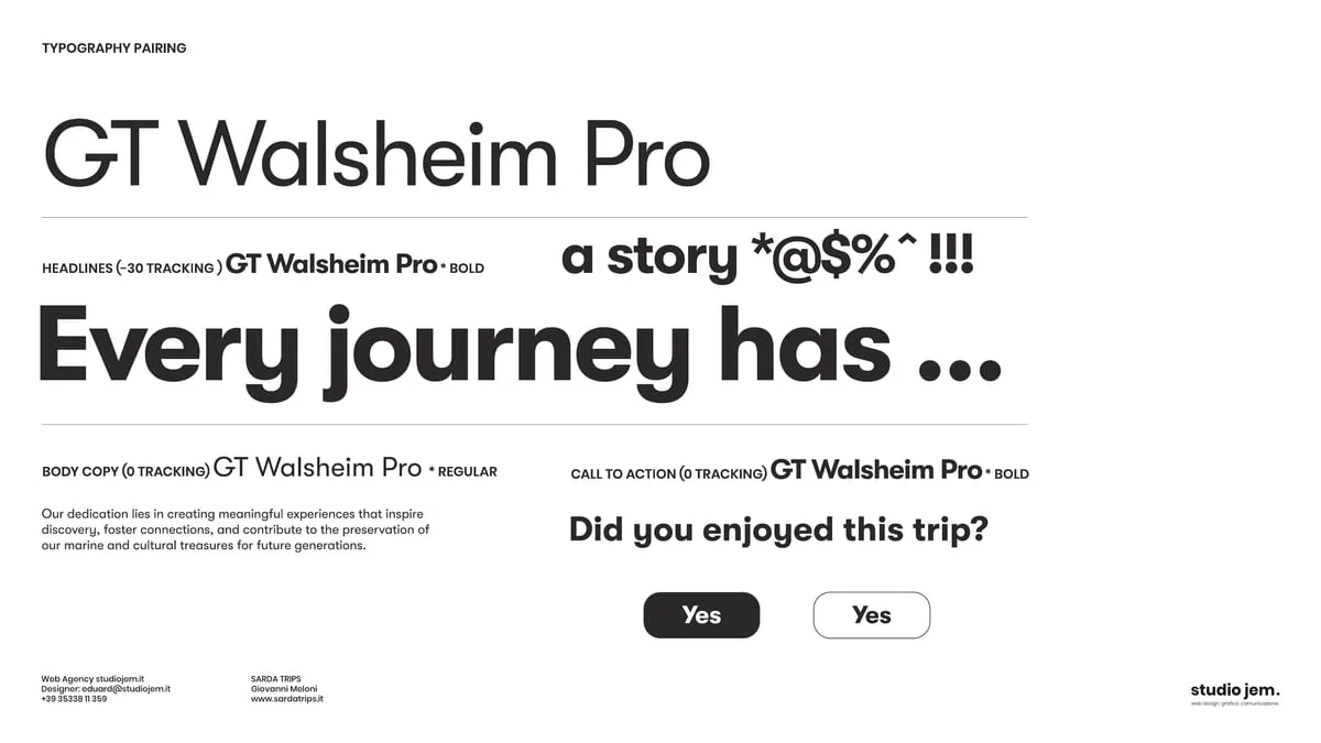
The type. GT Walsheim Pro, two weights and three declared tracking values: headline, body, call to action. A geometric face with soft terminals — it sits next to the pictograms without arguing with them.
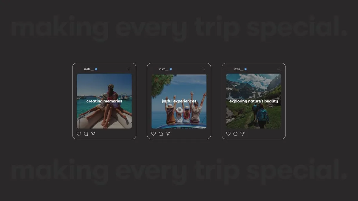
The tone. Warm, inviting, enthusiastic: the tone of Sardinian hospitality. Four keywords govern it — adventure, nature, joy, memories.

Applications
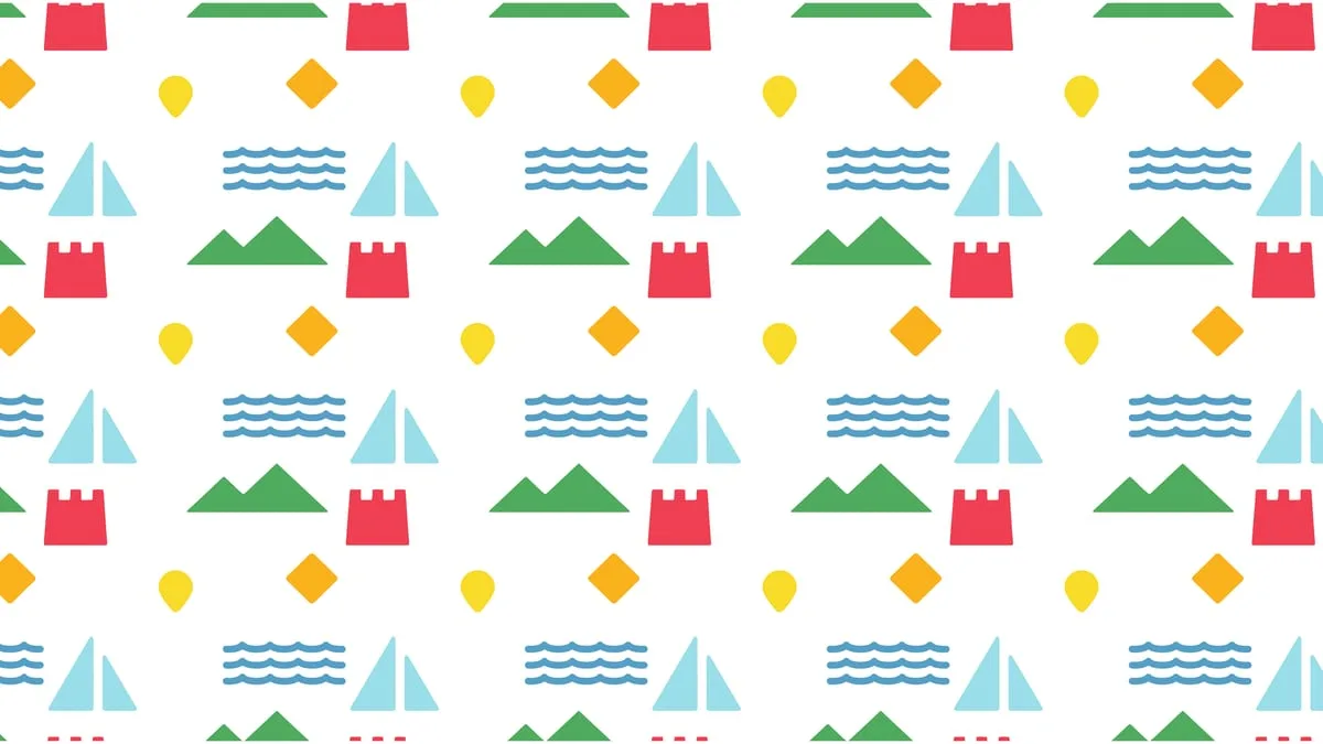
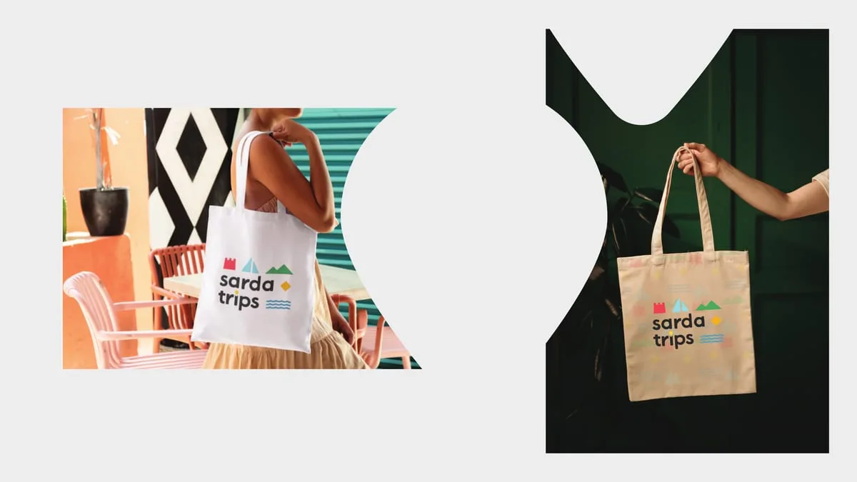
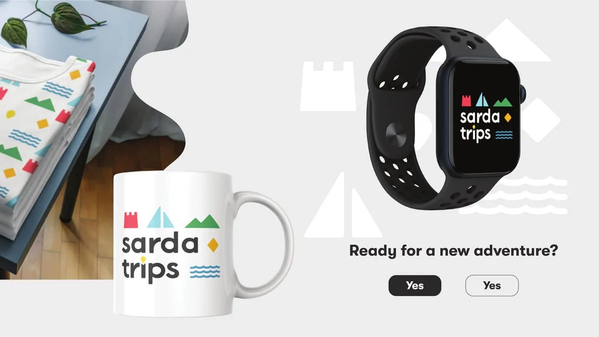
The brand book does not stop at the logo, which is where almost all of them stop. It carries on into the pattern, the merchandise — bottle, t-shirts, mug, stickers, smartwatch face — the tote bags photographed in use, the website banner and the social posts. Whoever receives the document knows what to do the next day, without calling us.
- Pictograms from the island
- 5
- Colours in the system
- 8
Results
Sarda Trips has an identity that holds up outside the photograph: it reads on a tote bag as well as on a screen, and it grows without asking permission — a new pictogram joins the system instead of breaking it.
Board by board.

“Telling Sardinia without falling into the usual tourist clichés was our real challenge. This brand and the visual identity we built with the team have tremendous strength and breathe the authentic soul of the island.”
Tourism & Experiences