
5 Star Mooring
Brand identity for a mooring and docking service in Olbia.
Brand identity for a mooring and docking service in Olbia: the five that becomes a star, a three-colour palette, eight brand versions with guaranteed contrast and the full kit for web and social.
- Sector
- Yachting & Marine
- Role
- Visual naming and mark, Colour system and typography, Web and social icons, Instagram profile kit
Context
5 Star Mooring provides mooring and docking services in Olbia, where boats arrive from all over the Mediterranean and competition is played on trust: whoever hands over their mooring wants to see at first glance that a serious service is on the other side.
Challenge
The name already carries the promise — five stars — and the risk was wasting it: any star next to any number. It needed a single sign holding the 5 and the star together, and a system disciplined enough to work on the dock, on a line, on a social profile.
Design
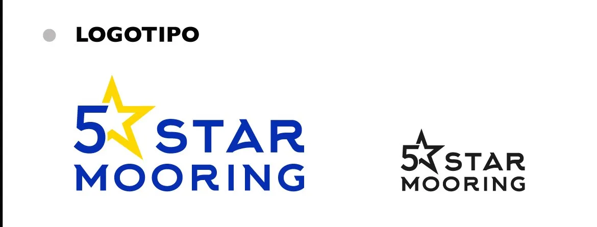
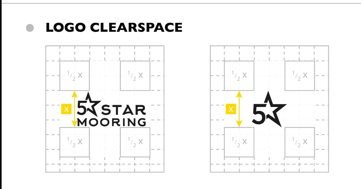
The mark. The 5 and the star are one sign: the yellow star locks into the number and becomes its side. Wordmark in Gill Sans, with the compact version — the starred 5 alone — for small sizes and icons.
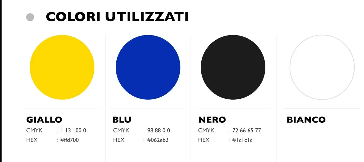
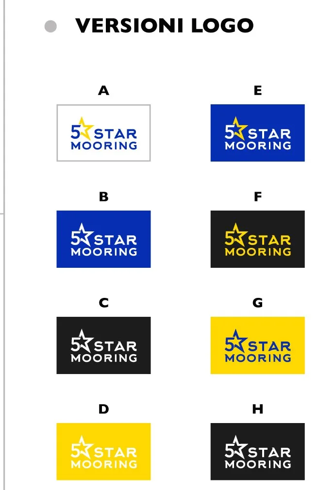
The colour. Three solids, no half tones: the yellow of the star, the blue of the sea at night, black. Eight declared brand versions, A to H, each with its pairing — so contrast never depends on the good sense of whoever lays out the page.
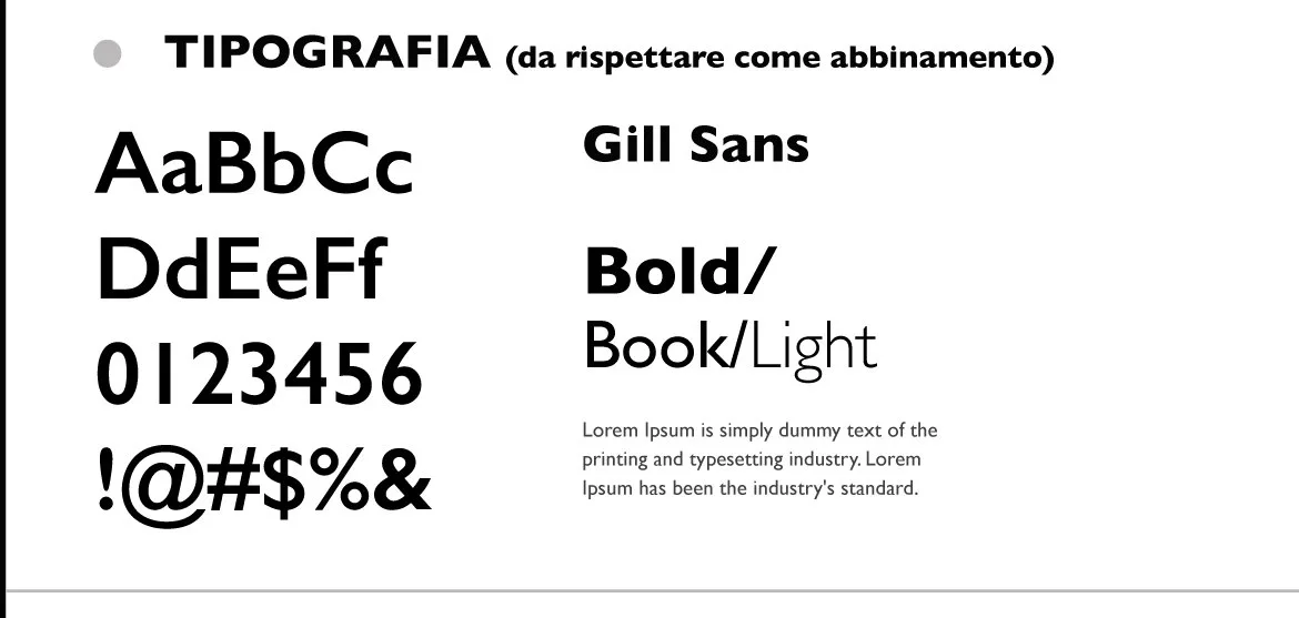
The typography. Gill Sans in three weights, bold for headings, book and light for the rest: a solid humanist that sits well at sea without playing the sailor.

Applications
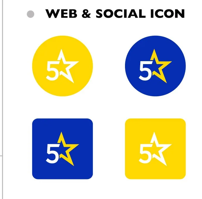
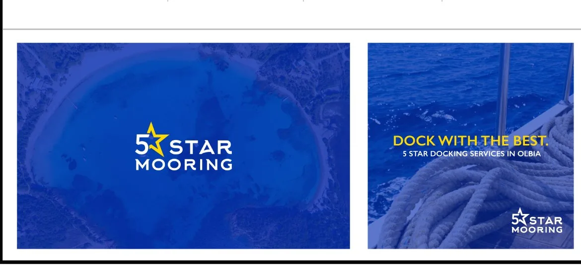
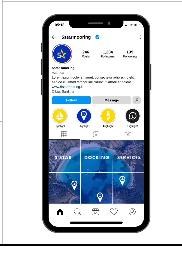
The kit covers what the service actually uses: the web and social icons — round and tile, in yellow and in blue — the channel covers with the Dock with the best claim, and the Instagram profile set up with avatar, highlights and the grid of the first posts. Whoever opens the profile finds a service already in order, before even calling.

The brochure
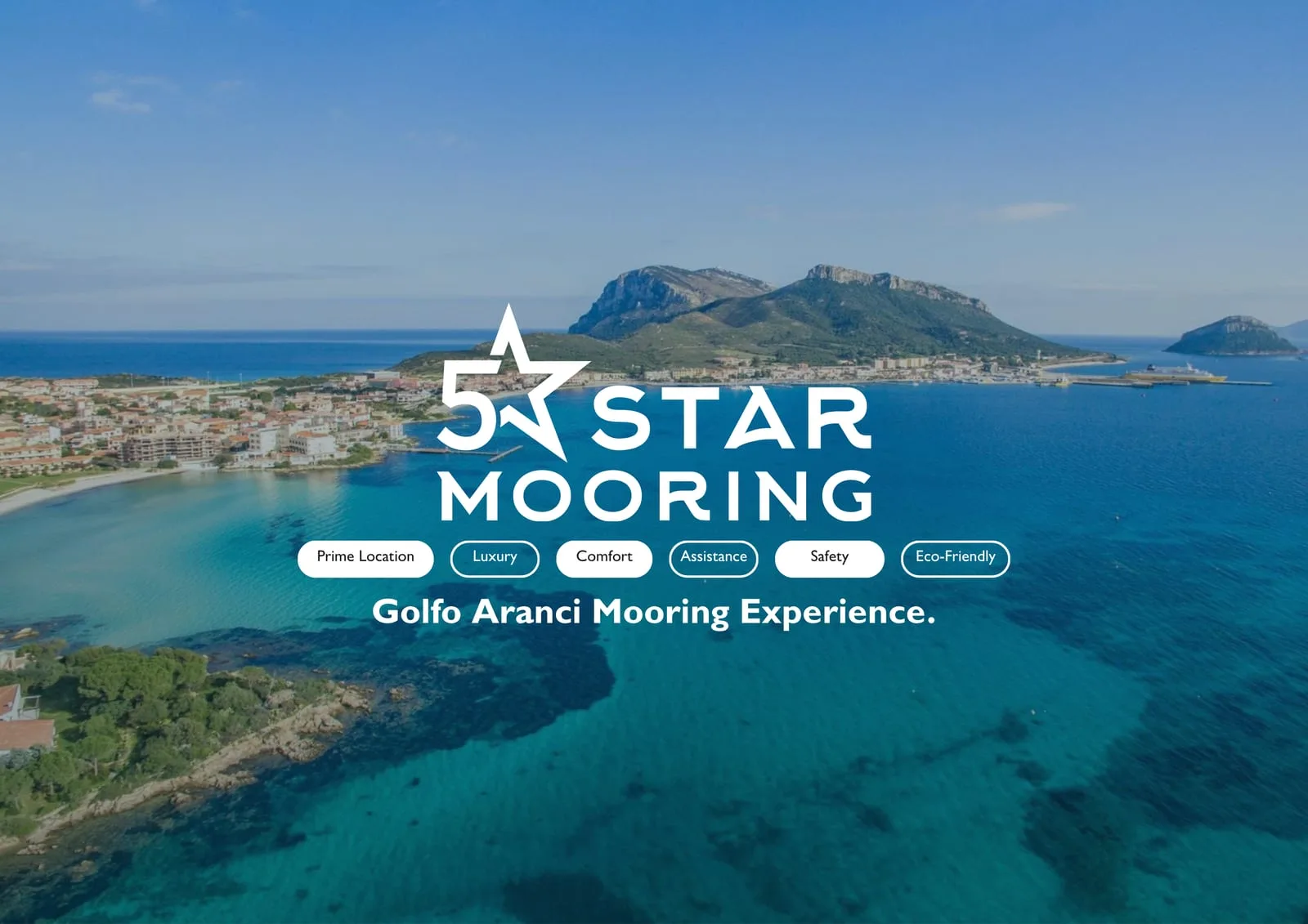
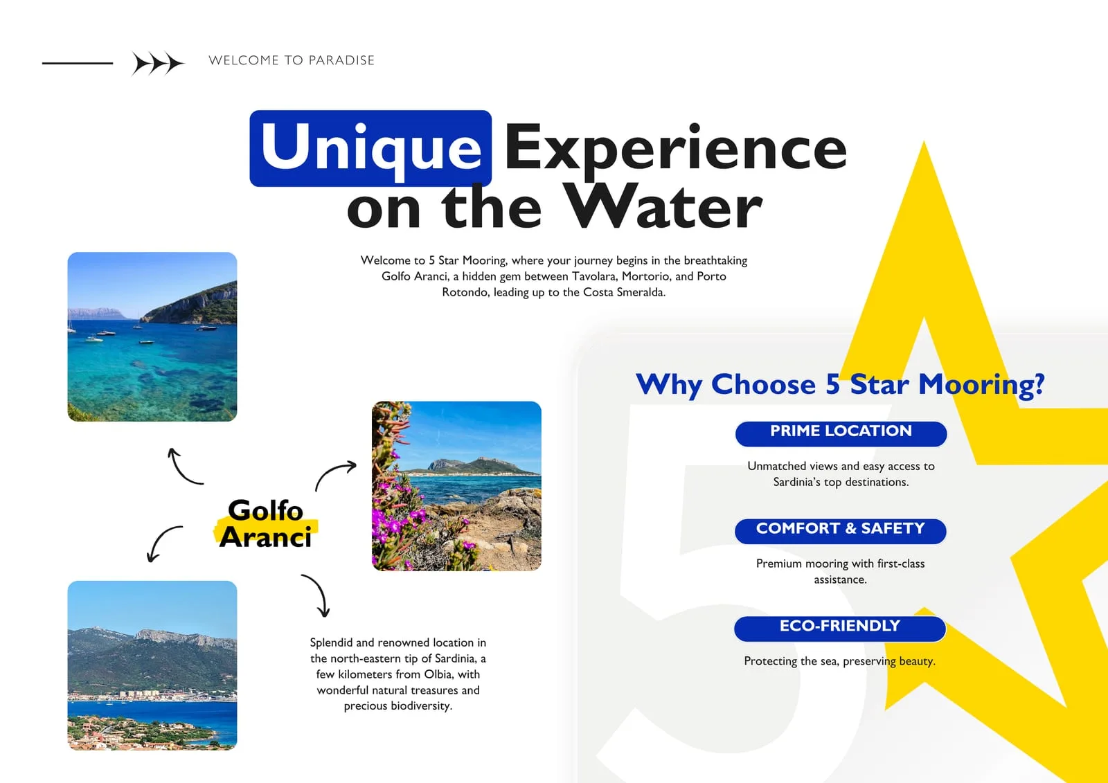
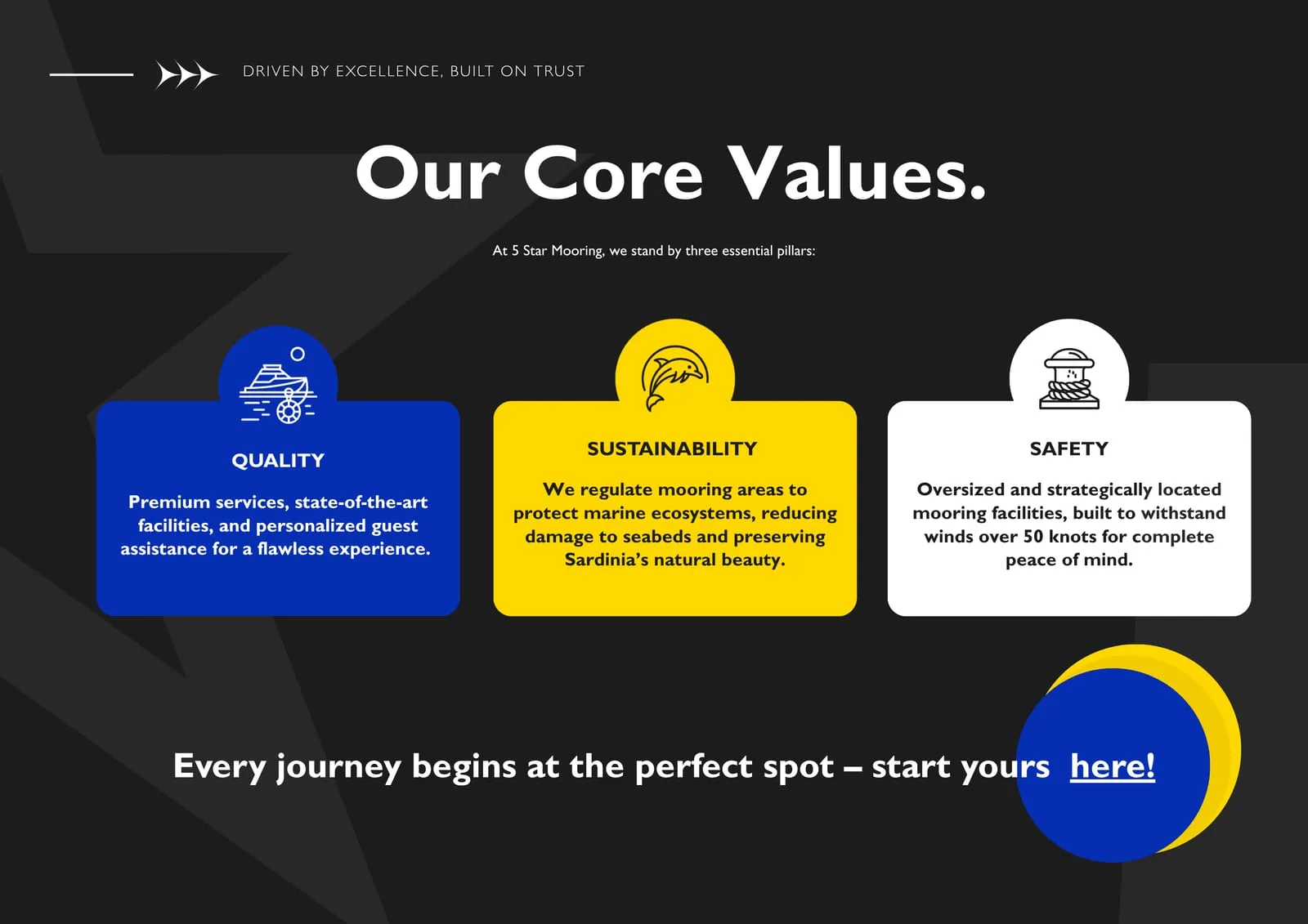
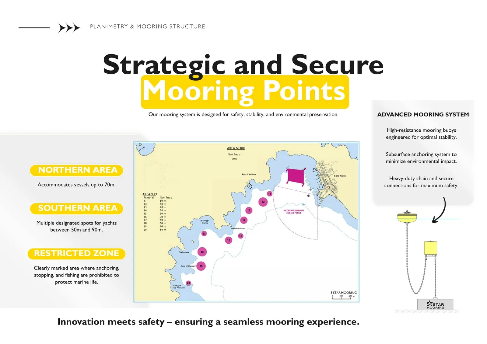
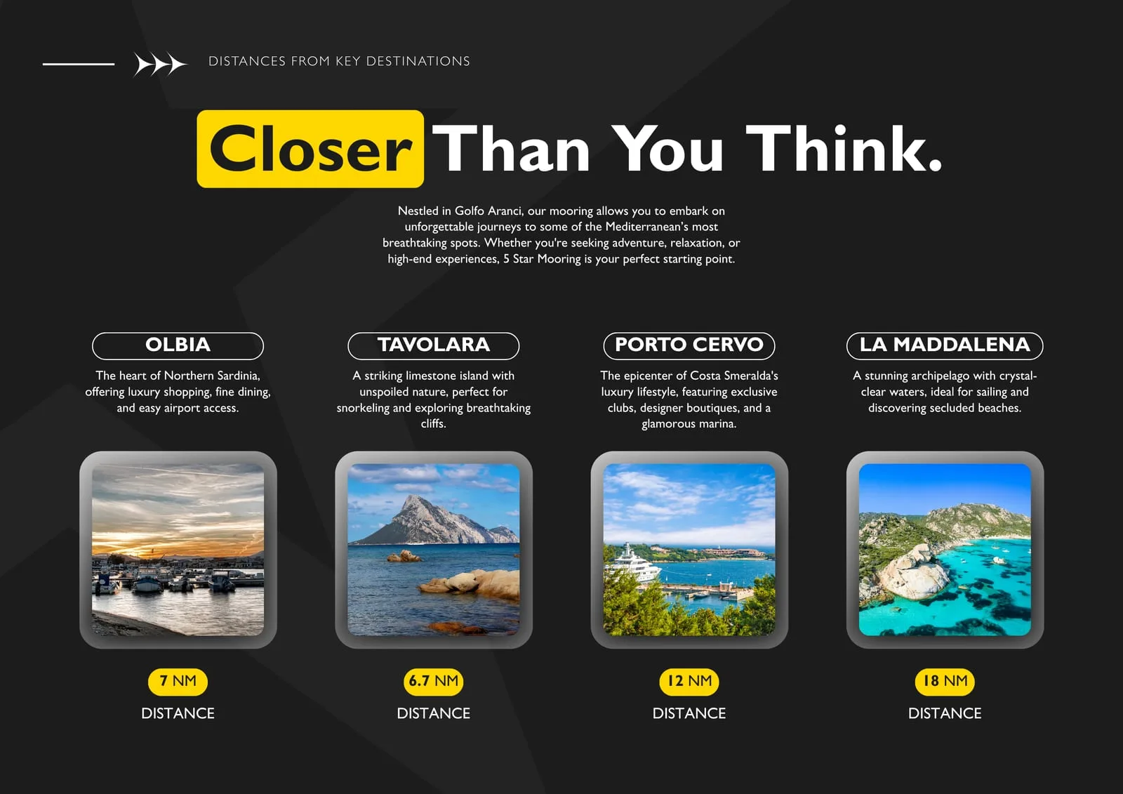
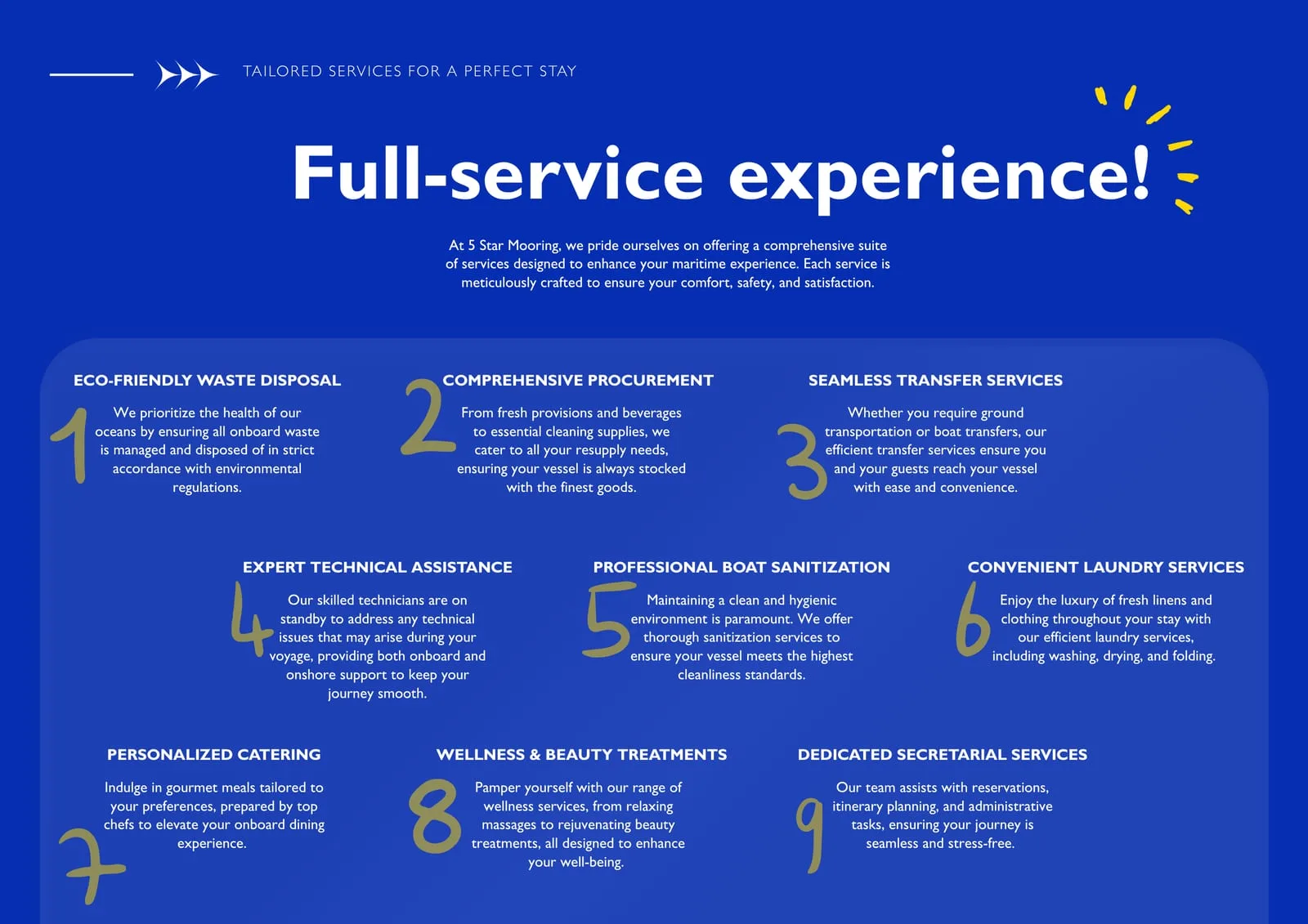
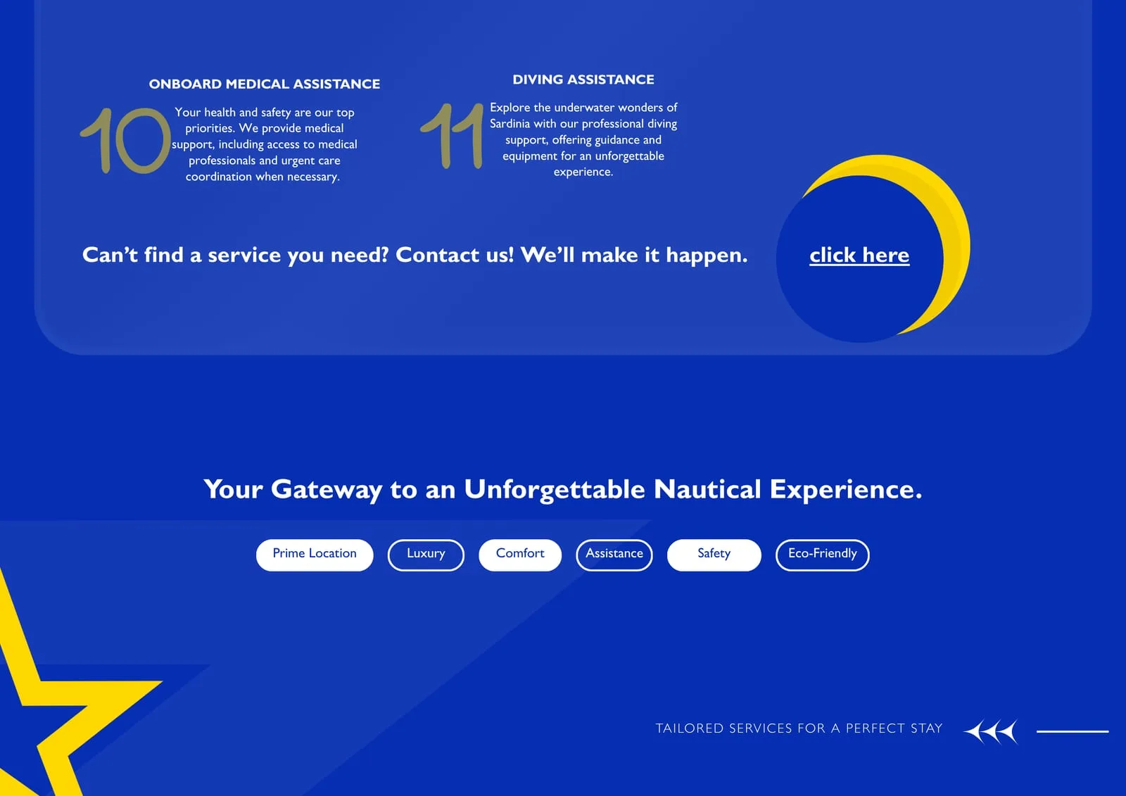
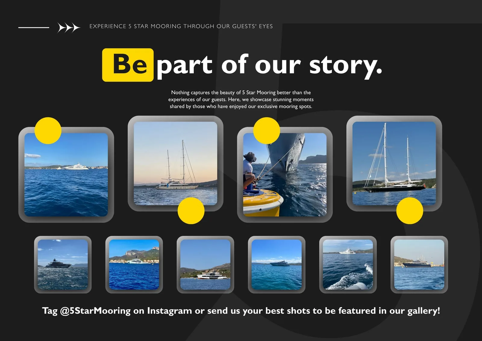
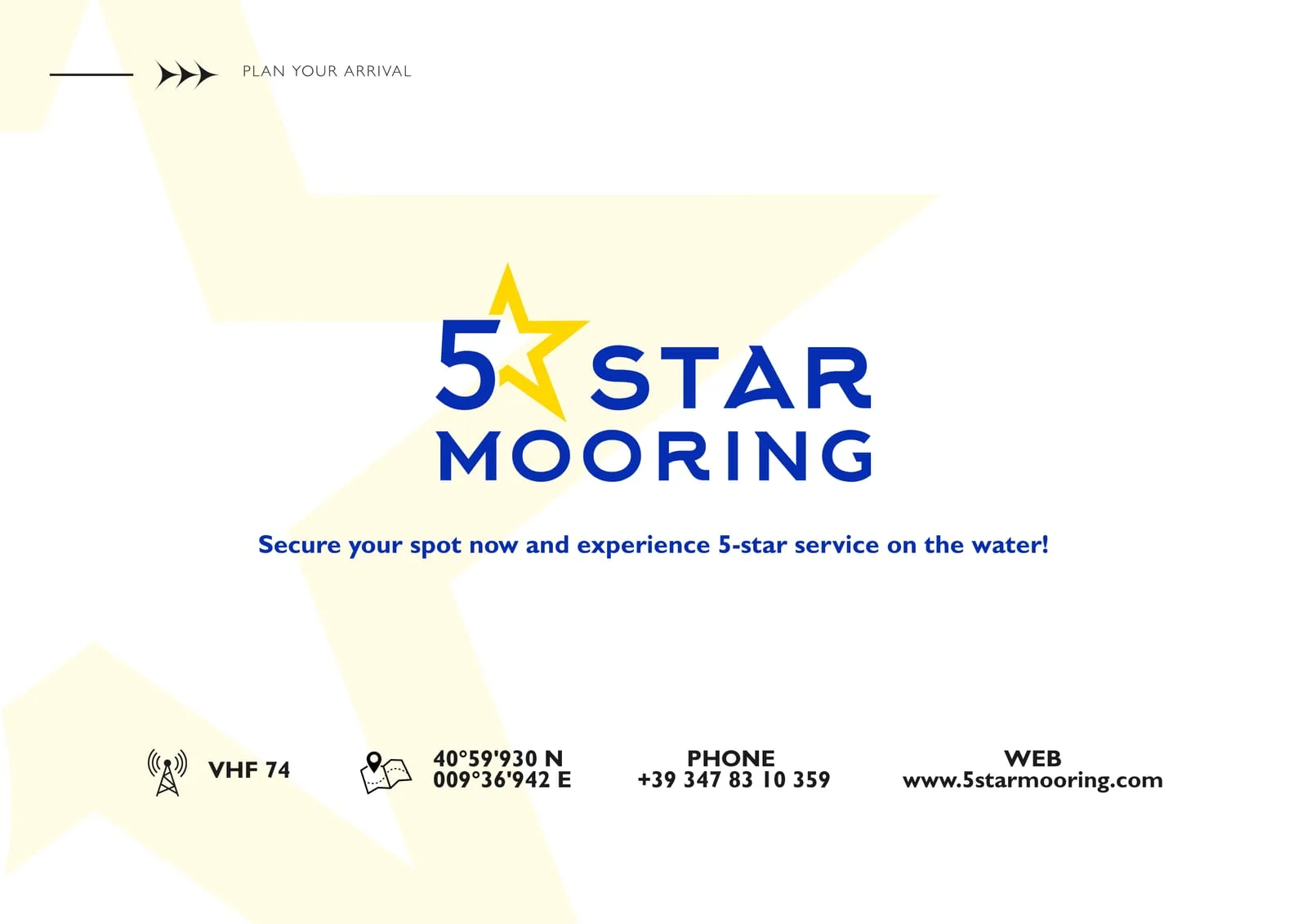
Nine pages for people who choose where to moor before they cast off. It opens on the aerial view of the gulf and closes on what is actually needed — VHF channel, coordinates, phone number. In between: where the mooring field is and why to choose it, the three pillars of the service, the plan of the moorings with the restricted zone marked, distances in miles to the nearby destinations, the eleven onboard services numbered one by one, and the wall of guest photographs.
The layout uses the system as it is: the three solid colours, the star entering the highlighted headings, Gill Sans in its three weights. No exception invented for print — which is the proof that the mark holds up off screen.
- Brand versions, contrast guaranteed
- 8
- Solid colours — yellow, blue, black
- 3
Results
A mark you recognise from afar like a mooring light: three colours, one sign, eight safe combinations. An identity ready to board any support — from the dinghy to the sponsored post — without asking for adjustments.
Board by board.