LOWE — Longevity in Wellness
Brand, identity and website for the first Longevity Wellness centre in Sassari.
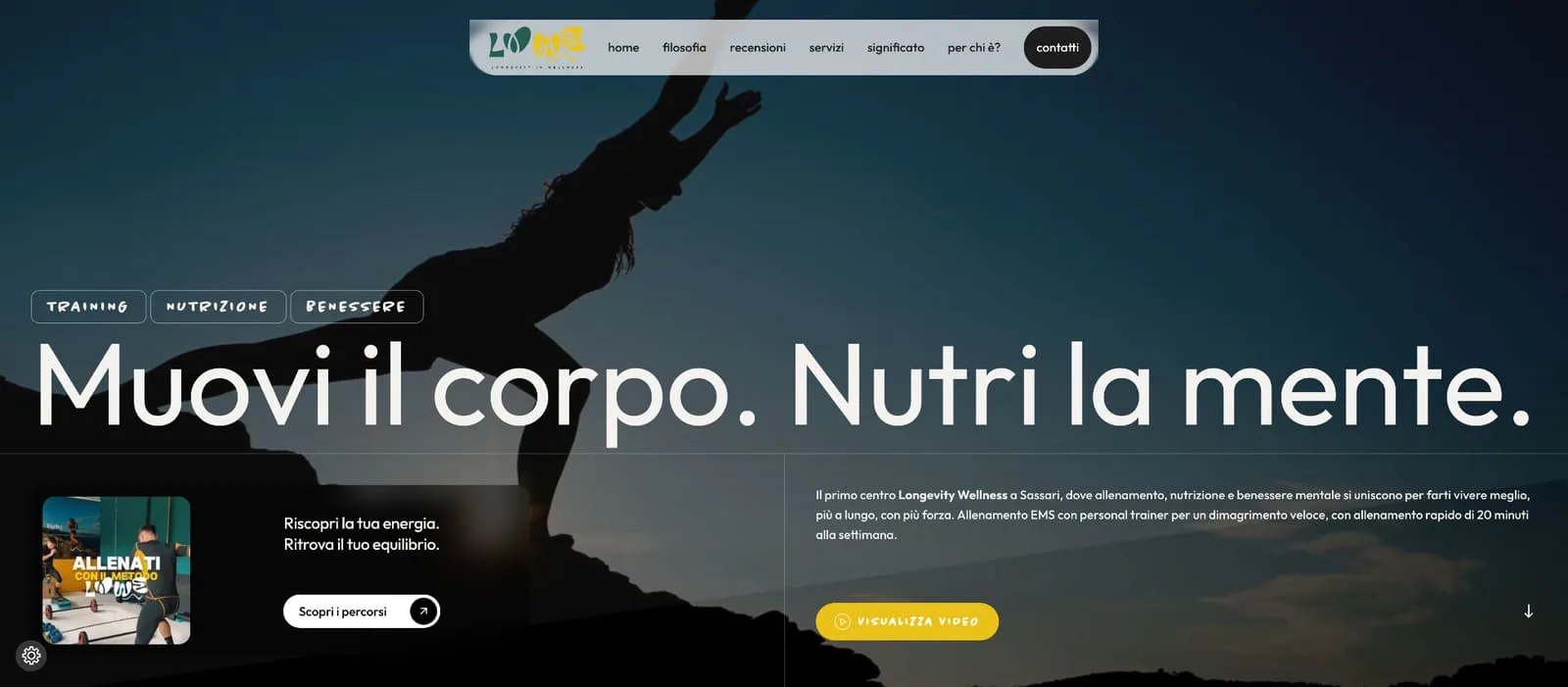
Full brand and website design for LOWE, Sassari's first Longevity Wellness centre: an expressive green-and-yellow logo with organic shapes, an identity system applied to signage, merchandising and interiors, and an editorial website telling the story of EMS training, anti-inflammaging nutrition, recovery, mind and longevity.
- Sector
- Wellness & Beauty
Context
LOWE is Sassari's first Longevity Wellness centre: EMS training, anti-inflammaging nutrition, recovery, mind and longevity, with a gym and a yoga studio. A new concept for the city — and it needed everything built from scratch: logo, identity system and website, designed as one project from day one.
Challenge
Longevity is easy to get wrong: too clinical, or too gym-brochure. The brand had to work everywhere — gym signage, tote bags, water bottles, towels, the yoga studio, the screen. And the website had to explain a layered method — training, nutrition, recovery, mind — without getting heavy.
Strategy
Brand first, then the site, same language throughout. We designed an expressive bichromatic lettering: green for longevity, yellow for energy, organic shapes suggesting movement, balance and vitality. Then we rolled it out across signage, packaging, merchandising and the physical spaces, and built the website as an editorial story of the LOWE method.

Design
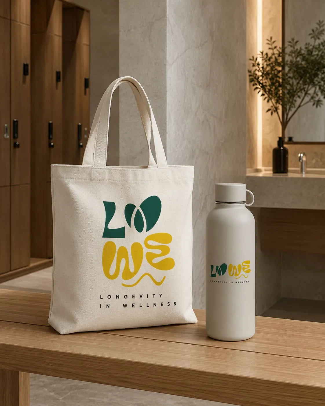
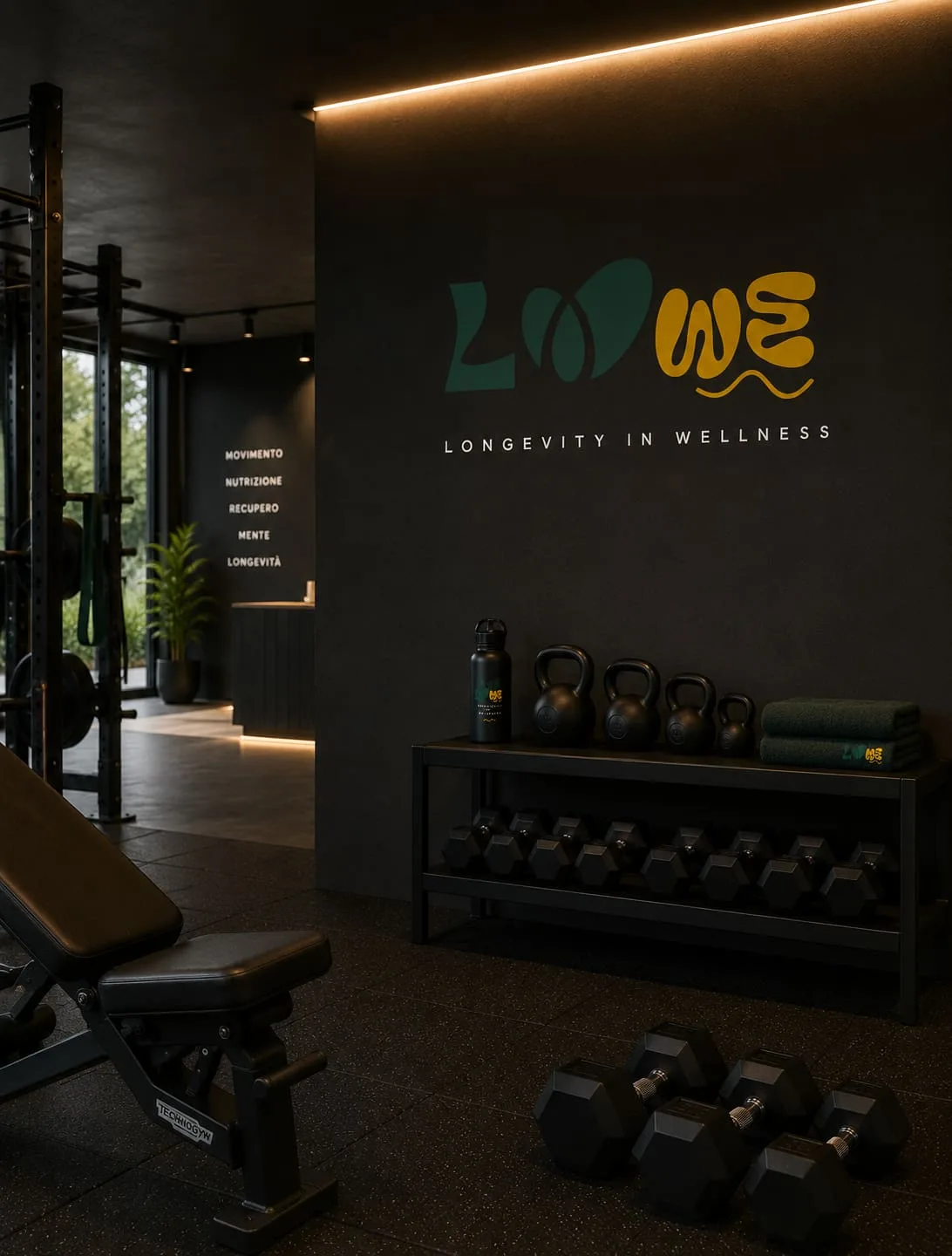
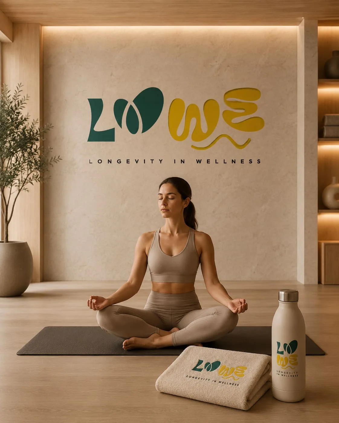
An original organic logotype in two colours — longevity green, energy yellow. We applied it across the whole centre: gym signage, packaging, merchandising — tote bags, water bottles, towels — and the interiors of both the training space and the yoga studio. One visual system, recognisable at every touchpoint, from a bottle to a wall.

Development
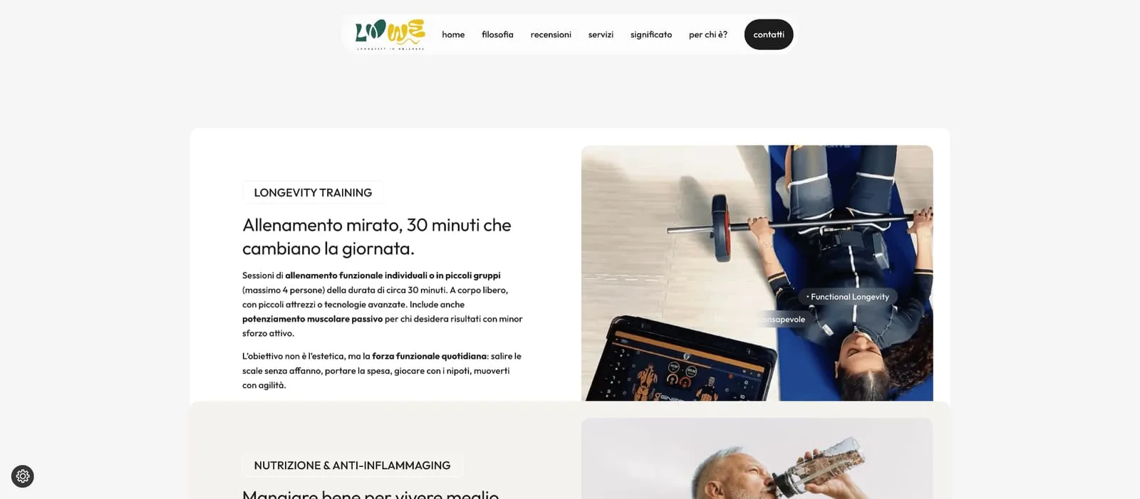
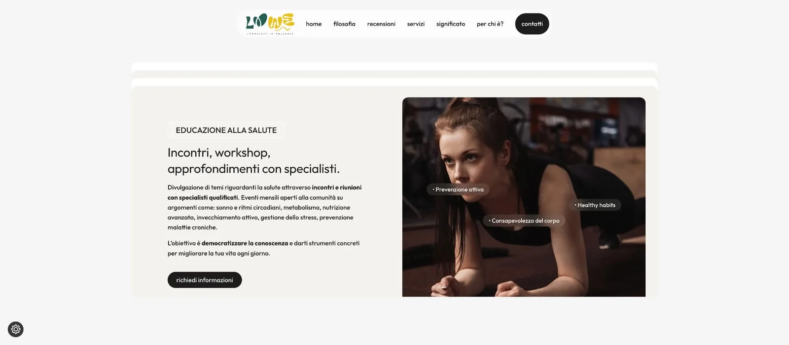
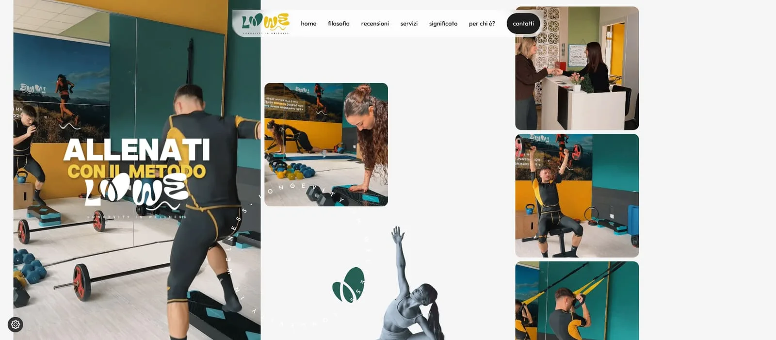
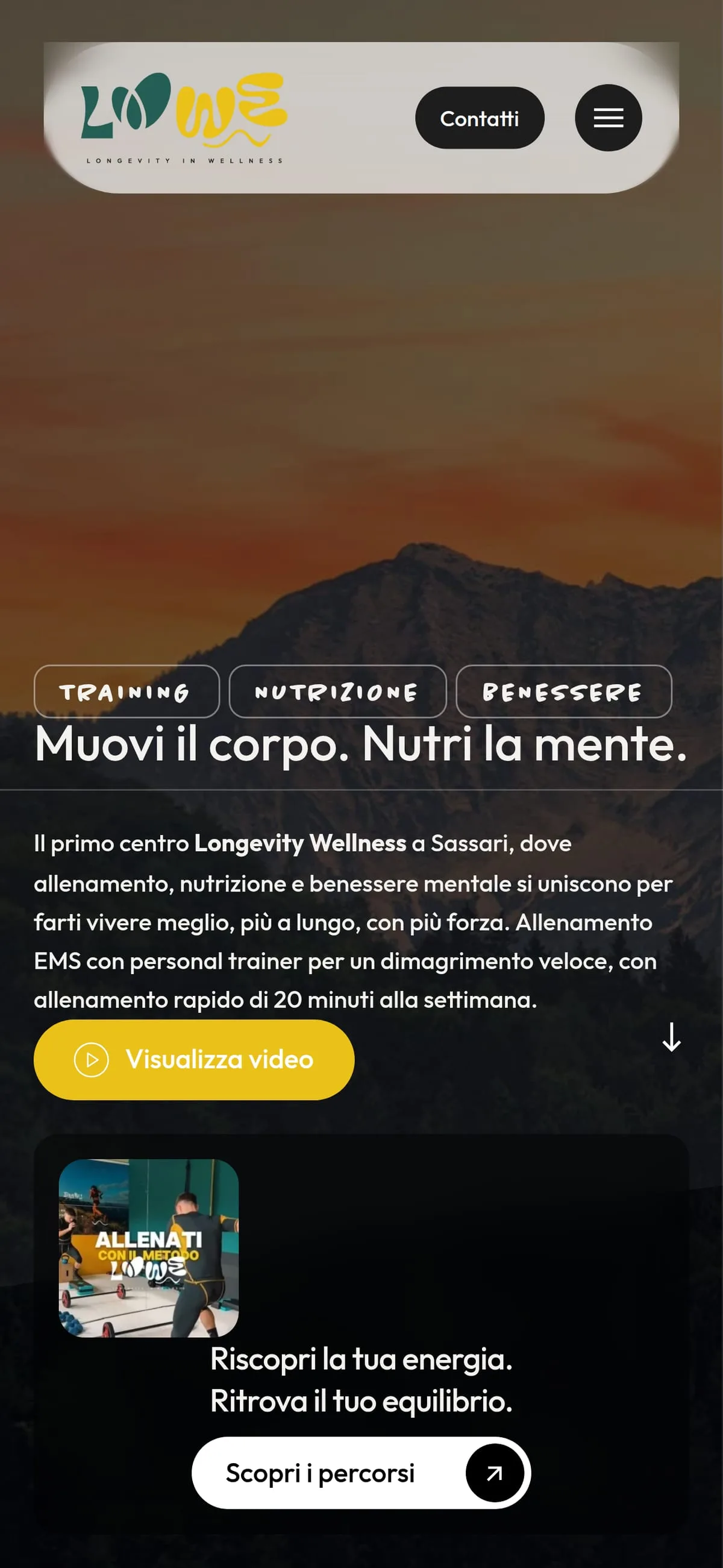
The website speaks the brand's language: cinematic hero, custom display typography, brand colours throughout. An editorial structure with dedicated sections — Longevity Training with the 30-minute EMS workout, Nutrition, Health Education — plus a gallery telling the LOWE method. Digital and physical read as one system.
- WordPress
In print
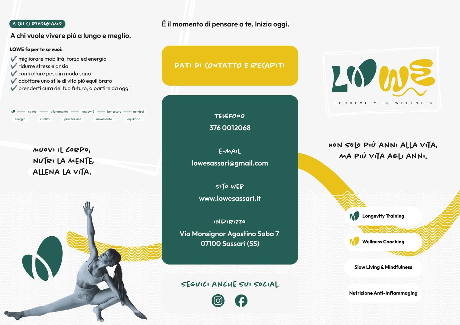
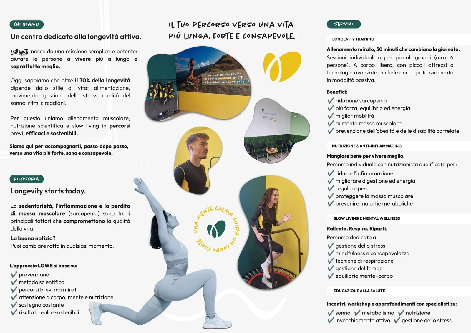
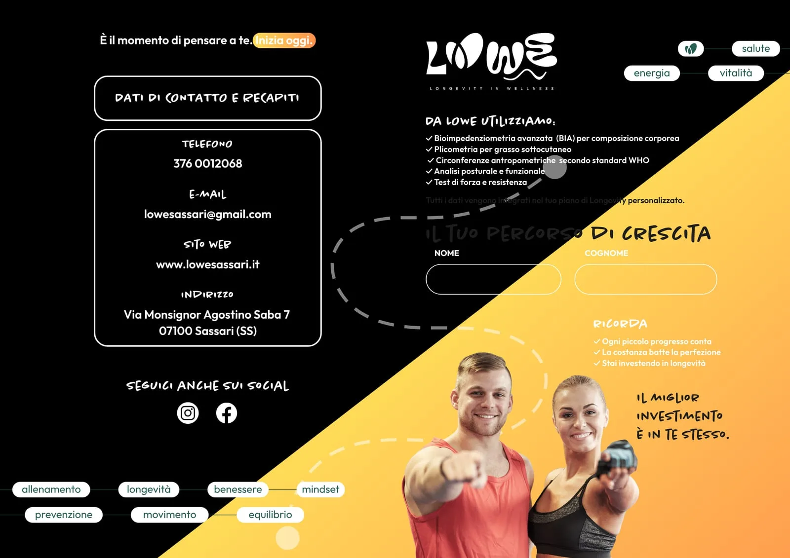
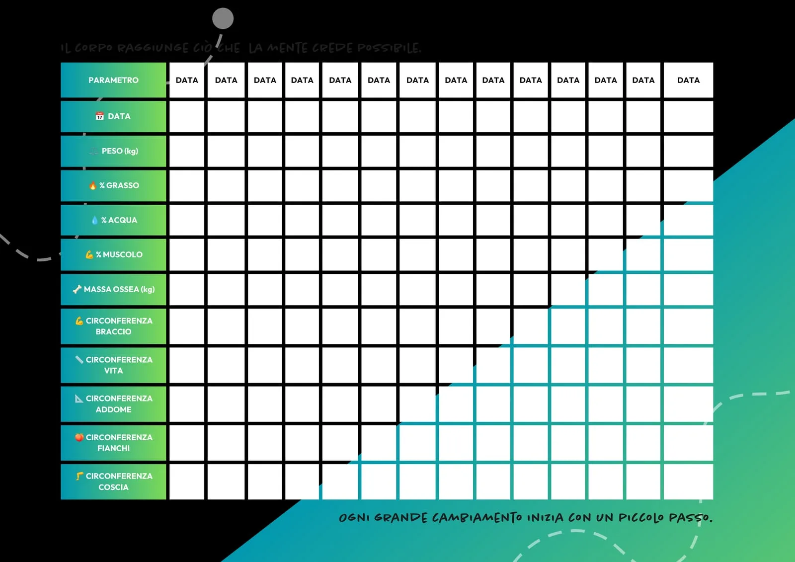
The mark went onto paper too, which is where a centre plays its first contact: the brochure — outside with what the programme gives back and the contact details, inside with the method across its four paths — and the training notes, the personal card where weight, girths and progress get written down session after session.
It is the part of the project that stays in the hands of whoever walks in. Same colours, same lettering, same organic shapes as the site: someone leaving with the card in their bag takes away the mark they saw on screen.
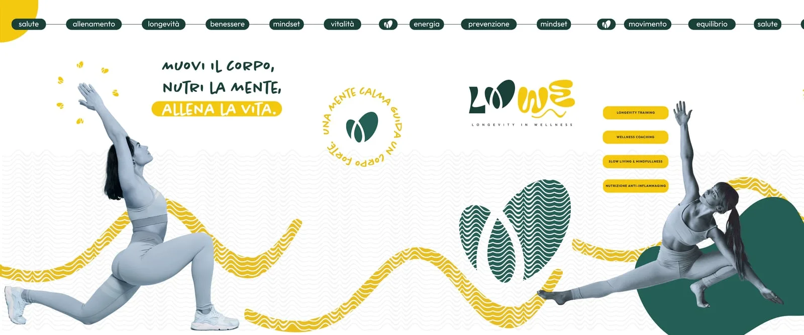
Outside, the mark takes the whole shopfront. The window graphics are the large version of the same system: the ribbon of words running along the top — health, training, longevity, wellbeing — the wave pattern filling the lower band, the lettering and the cut-out athletes. It is the first piece of identity you see from the street, and it has to read while you walk past.
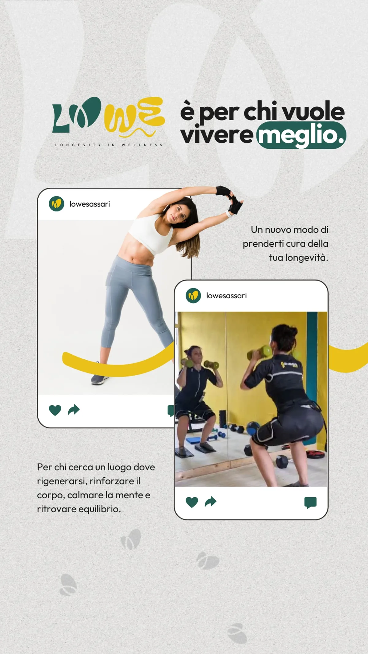
The same system holds at the smallest size there is: the feed post, where the cards overlap on the brand pattern and there is one line only — LOWE is for anyone who wants to live better.
- Minutes of EMS training
- 30
Results
LOWE now has a complete identity: a mark that works on a wall as well as on a water bottle, and a website that explains the method before you walk in. Brand and digital were born together — and it shows: enquiries for treatments come in through the site. Live at lowesassari.it.
Board by board.


“In Sassari we wanted to position ourselves as the Longevity Wellness centre of reference, stepping out of the usual patterns. The new brand and the web platform literally jump off the screen, communicating pure innovation.”
Wellness & Beauty