Punta Falcone Resort
Brand and website with direct booking for a resort in Santa Teresa Gallura.
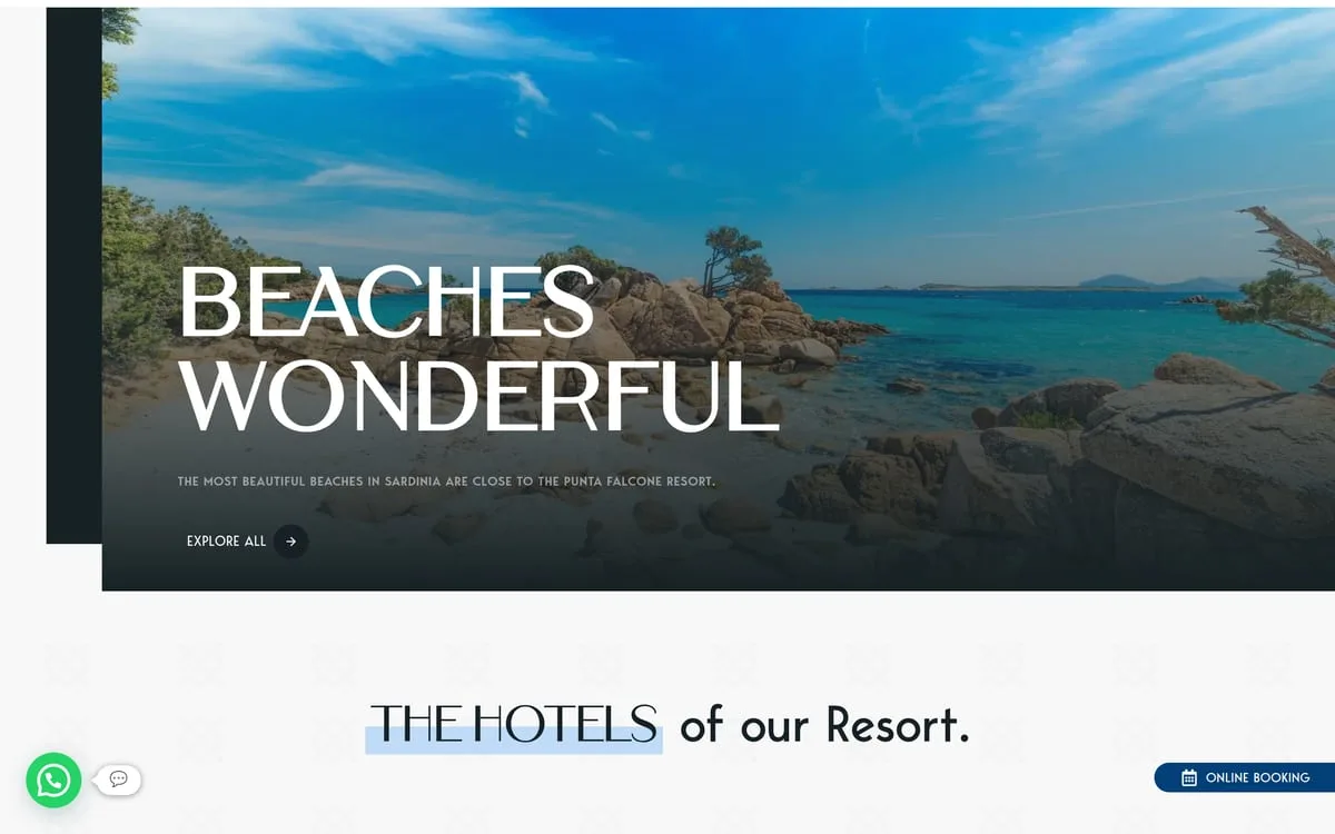
Brand identity and direct-booking website for a four-star resort in Santa Teresa Gallura: the falcon mark, a documented Mediterranean palette, and an English-language site that brings bookings home instead of leaving them to the OTAs.
- Sector
- Hotels & Resorts
- Role
- Brand identity and logo, Colour system and typography, Website with online booking
- Year
- 2023
Context
Punta Falcone Resort sits in Santa Teresa Gallura, on the northern tip of Sardinia, and brings together two properties: the Relais and the Borgo 'Arborea'. The clientele is international, the season is short, and the online agencies take a commission on every night sold.
Challenge
Give the resort a brand of its own — not another seaside photo with a generic typeface on top — and a website able to turn the visit into a direct booking, without going through the OTAs. Two different properties had to live under one identity without blurring into each other.
Design
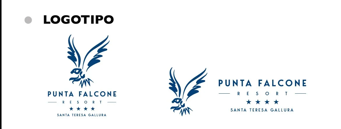
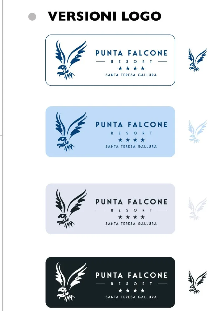
The mark. A falcon, for the name and for the headland: drawn in a single stroke, it works alone at small sizes and above the wordmark in the extended version. Construction and clear space are documented, with versions on light, Columbia Blue, Lavander and Eerie Black backgrounds.
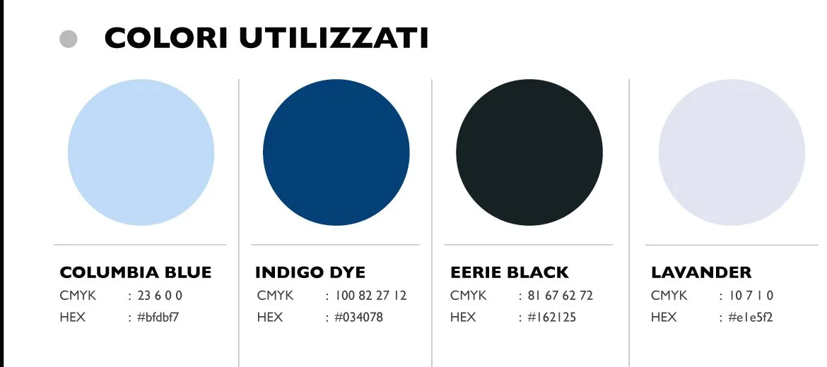
The colour. A Mediterranean palette without the postcard: Columbia Blue, Indigo Dye, Eerie Black and Lavander, each with CMYK and hex values. The deep blue holds the elegance, the light tones give it air.
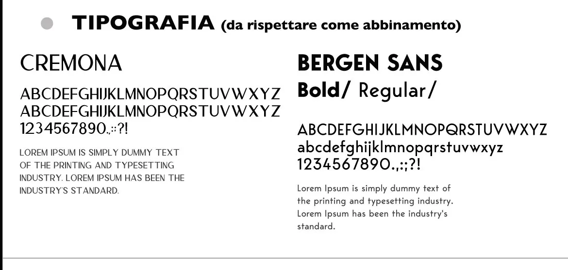
The typography. Cremona for headings, Bergen Sans bold and regular for everything else: a pairing declared in the brand book, to be used as it is.

The website
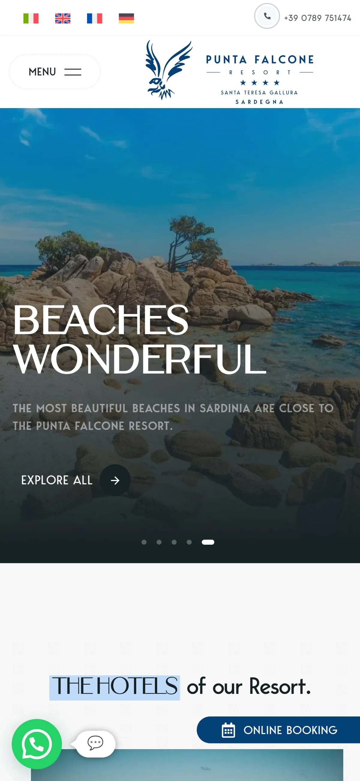
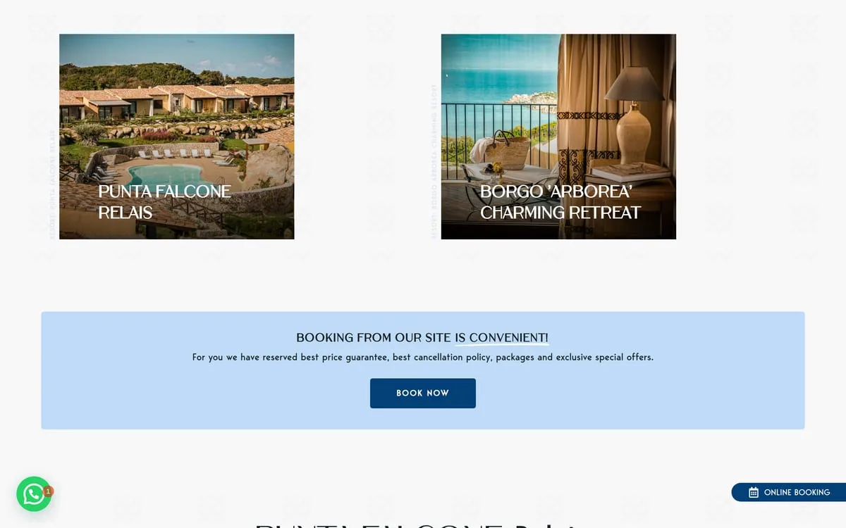
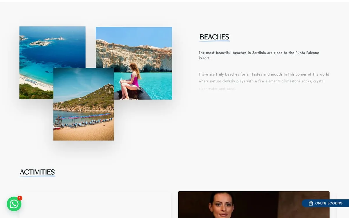
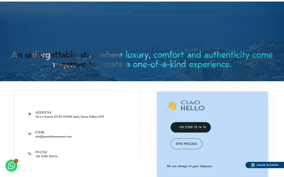
In English, because that is the language of the guests. The home opens on the beaches — the real reason for the trip — then presents the two properties, the activities and the contacts, with WhatsApp always in view. Booking happens on the site, with best price guaranteed and clear conditions: the "booking from our site is convenient" band sits in the middle of the page, not hidden in a menu.

Social and content
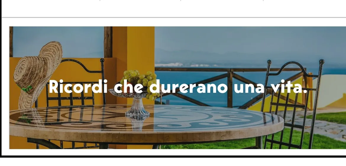
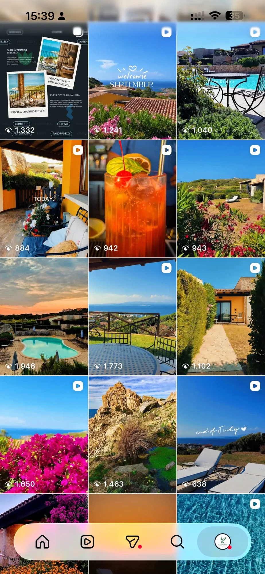
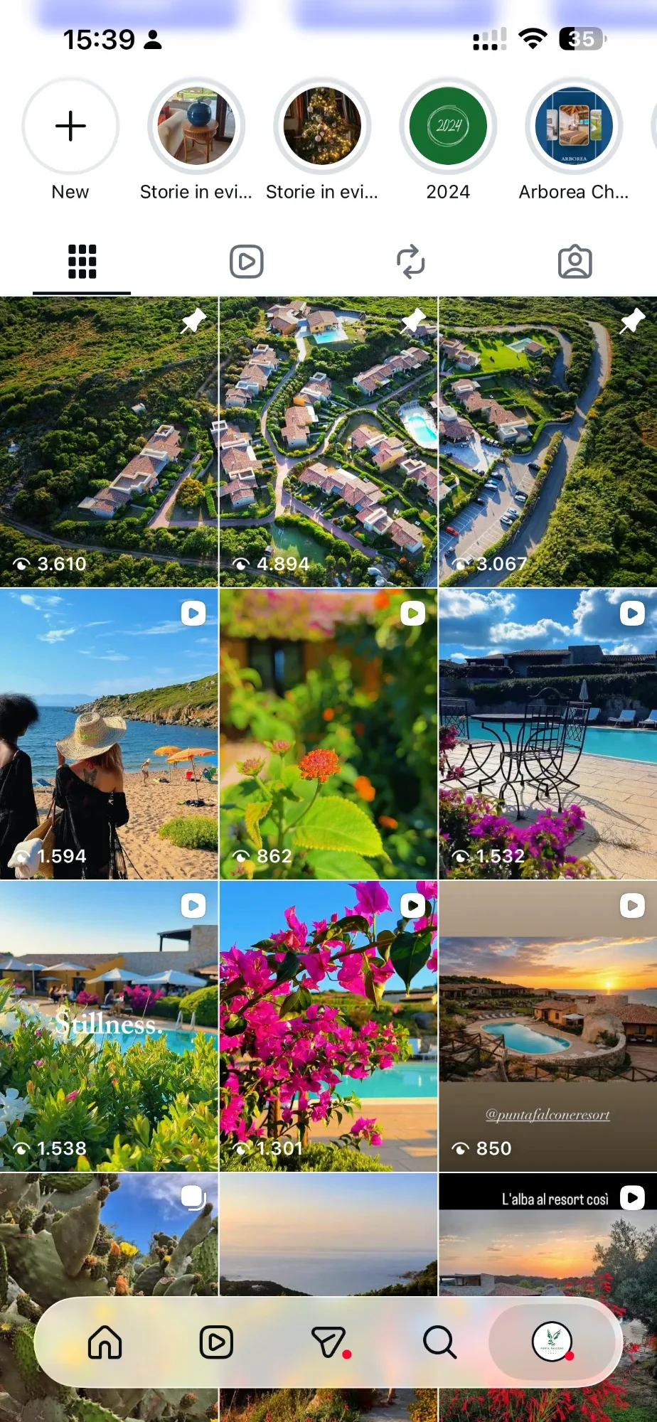
The work continues on the resort's social channels: editorial plan, photos and videos shot on site, Instagram management. The feed sells the season — pools, sunsets, the Santa Teresa coastline — with our own material rather than stock, and speaks the brand's visual language. No postcard here either.

- Resort in Santa Teresa Gallura
- 4★
- Properties under a single brand
- 2
Results
The resort has a documented identity that holds from the beach sign to the social profile, and a direct booking channel in its own house. Two properties, one brand, no commission on nights sold from its own site.
Board by board.