Ambra Holiday Rooms
Website with direct booking for eight holiday rooms in San Teodoro and Porto San Paolo.
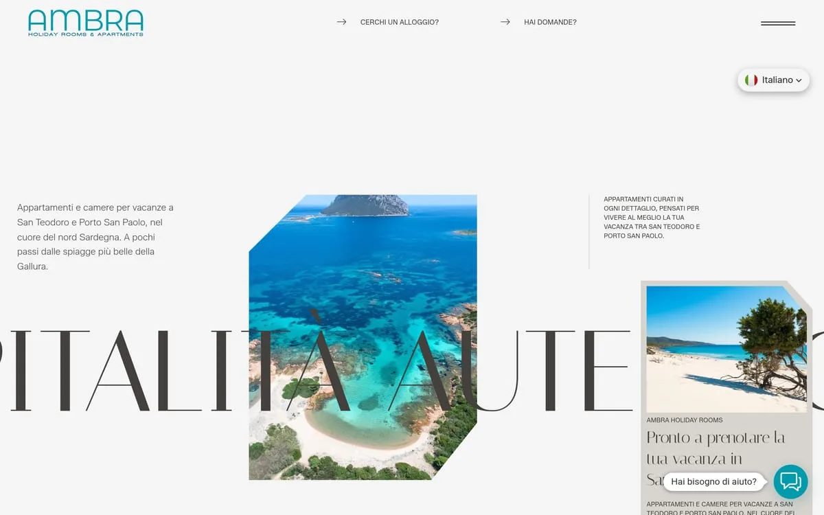
A site for a scattered hospitality business in Gallura: eight places between San Teodoro and Porto San Paolo, each with its own card, an editorial layout on a light ground, and direct booking instead of the platforms.
- Sector
- Hotels & Resorts
- Role
- Art direction, UI design, Front-end development
Context
Ambra Holiday Rooms is eight rooms and apartments split across two towns in Gallura: San Teodoro and Porto San Paolo. It is not a hotel and it is not a single apartment — it is a scattered business, and on the web that is the hardest shape to explain in ten seconds.
Challenge
Anyone looking for a summer place in Sardinia almost always arrives from a platform, where every property is a card identical to the others and the commission walks away. To make people book direct you have to give them what the platform gives them — square metres, guests, bed types, where it is — and on top of that what the platform cannot: why that place is worth it.
The second problem is choice: eight places across two towns. Presented badly they are a confusing list; presented well they are an offer.
Strategy
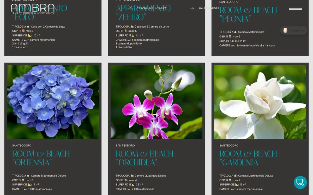
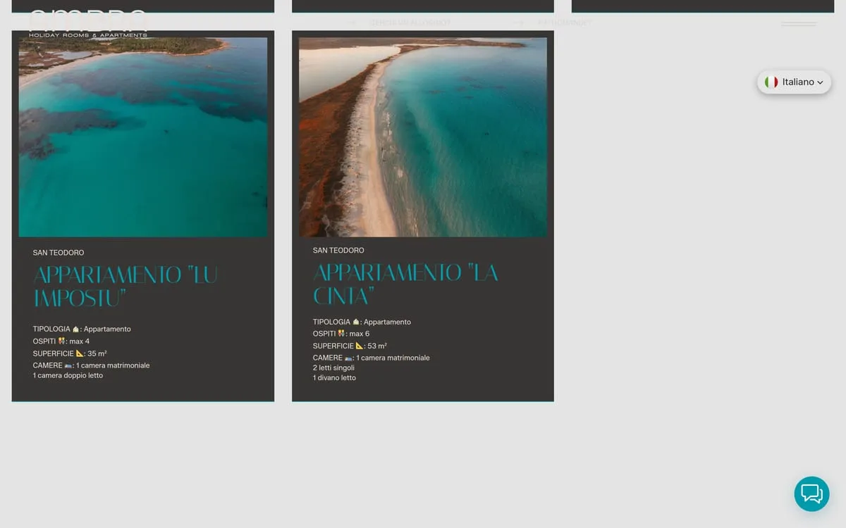
Every property has its own card carrying the facts that actually decide a booking, always in the same order: type, guests, floor area, rooms and beds. Someone comparing two apartments compares the same lines in the same place — the thing platforms do well and direct sites almost always get wrong.
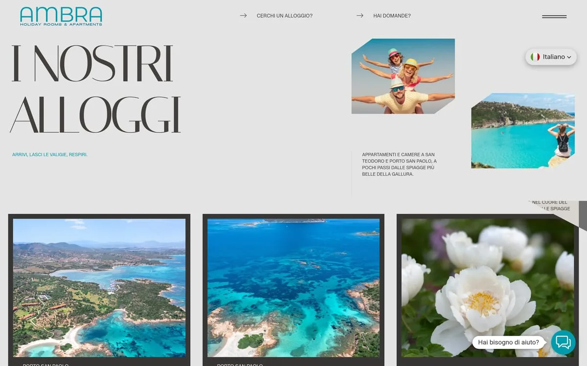
The properties are grouped by town, and each carries the name of the beach or spot it belongs to — Lu Impostu, La Cinta, Peonia, Ortensia. It is the first thing a guest looks for, and on a platform it is not there.

Design
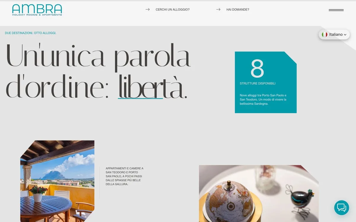
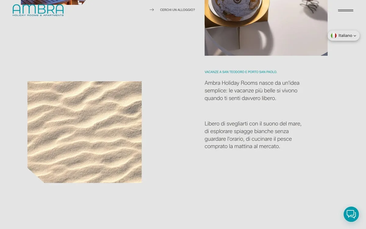
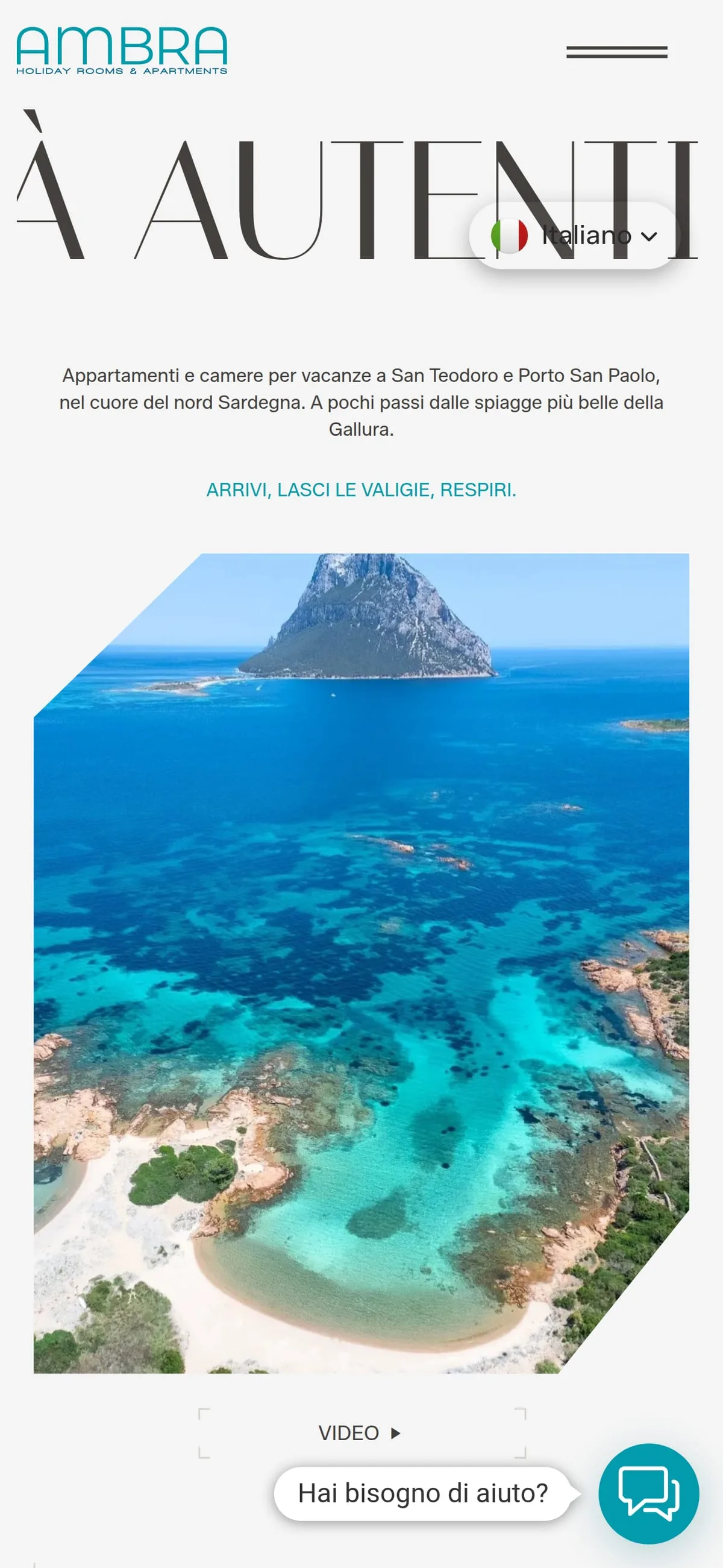
Light ground and an editorial layout: a tall, narrow display face for the headings, photographs of the area in staggered frames rather than a grid. The property cards are dark tiles with a single photograph and the facts in a column — readable while scrolling, without opening anything.
The middle section takes a position instead of listing services: one word only, freedom, with the count of the eight properties beside it. That is the business's positioning, and it comes before the prices.

Build
Multilingual, mobile-first, with photography optimised for the connection people have on holiday rather than the one they have at the office. Direct contact always within reach — WhatsApp, email, phone — because in this market the conversation comes before the booking.
- WordPress
- Lodgify

- rooms and apartments
- 8
- locations, San Teodoro and Porto San Paolo
- 2
Results
Ambra Holiday Rooms has a site that does what a platform does — compare eight properties in a minute — and tells you about the place as well. Live at ambraholidayrooms.it.
Screen by screen.
“Managing eight lodgings between San Teodoro and Porto San Paolo without handing a small fortune to the big booking platforms seemed a pipe dream. Since we have had our own direct channel, margins can breathe again and guests reach us without intermediaries.”
Hotels & Resorts