Istedda Gioielli
Brand identity, packaging and social media for a jewellery brand.
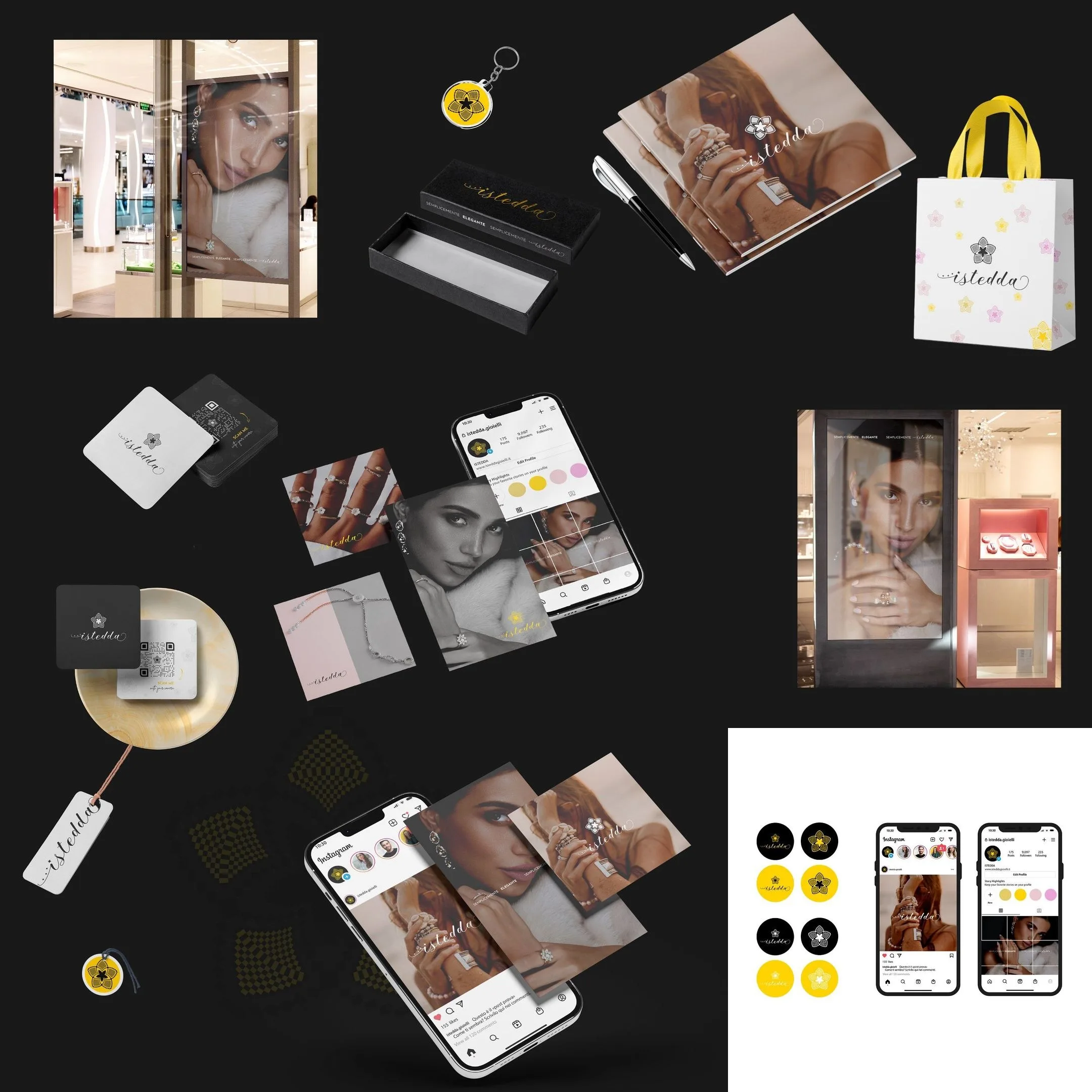
Complete identity for a jewellery brand: the script wordmark with the five-petal flower, the yellow and black palette, the packaging, the black-and-white campaign and the shop window. Twenty-one boards made to be read together on the profile.
- Sector
- Retail & Boutiques
- Year
- 2022
Context
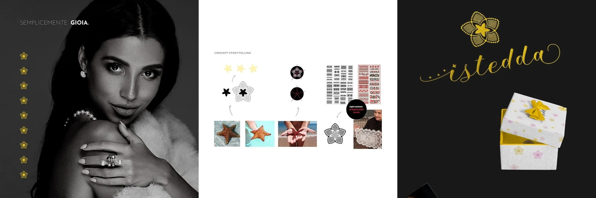
Istedda sells jewellery: rings, earrings, bracelets with the flower on them. The name is a Sardinian word — star — and the brand had to say it without explaining it.
Challenge
A jewellery brand is decided in two places that look nothing alike: the shop window and the phone. The window needs the piece, the phone needs the mark, and the two have to be the same thing.
Design
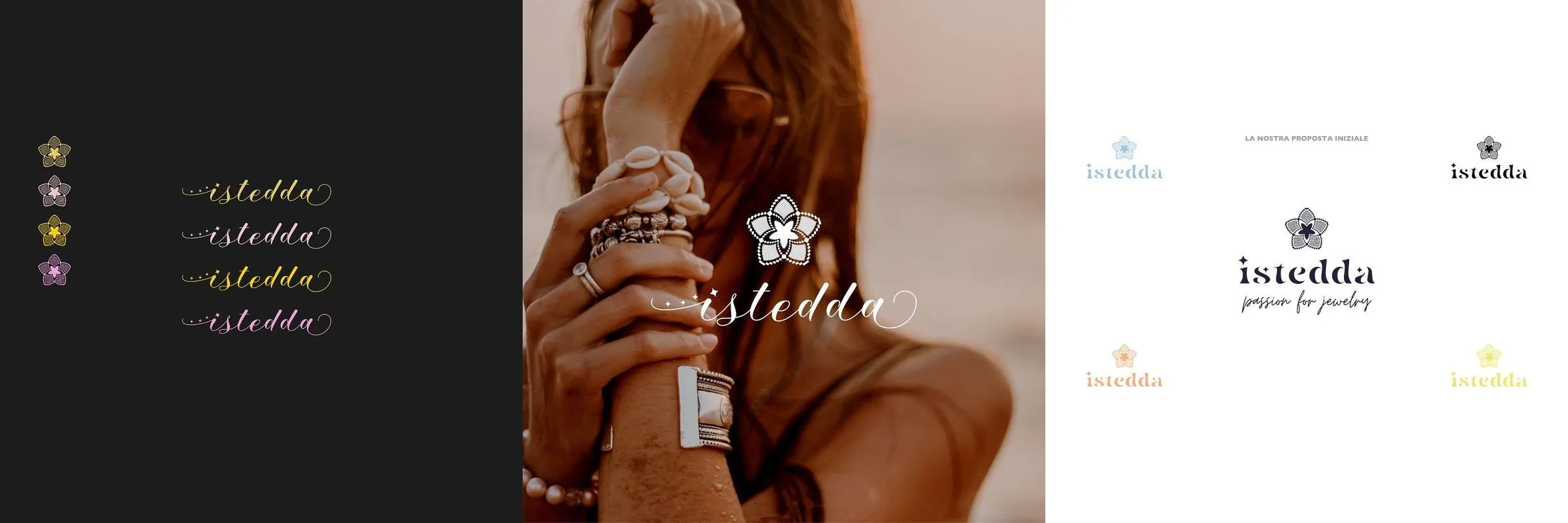
The wordmark. Istedda in script, written by hand, with three dots in front of it, as if the sentence had already started. Above the i, in place of the dot, the five-petal flower.
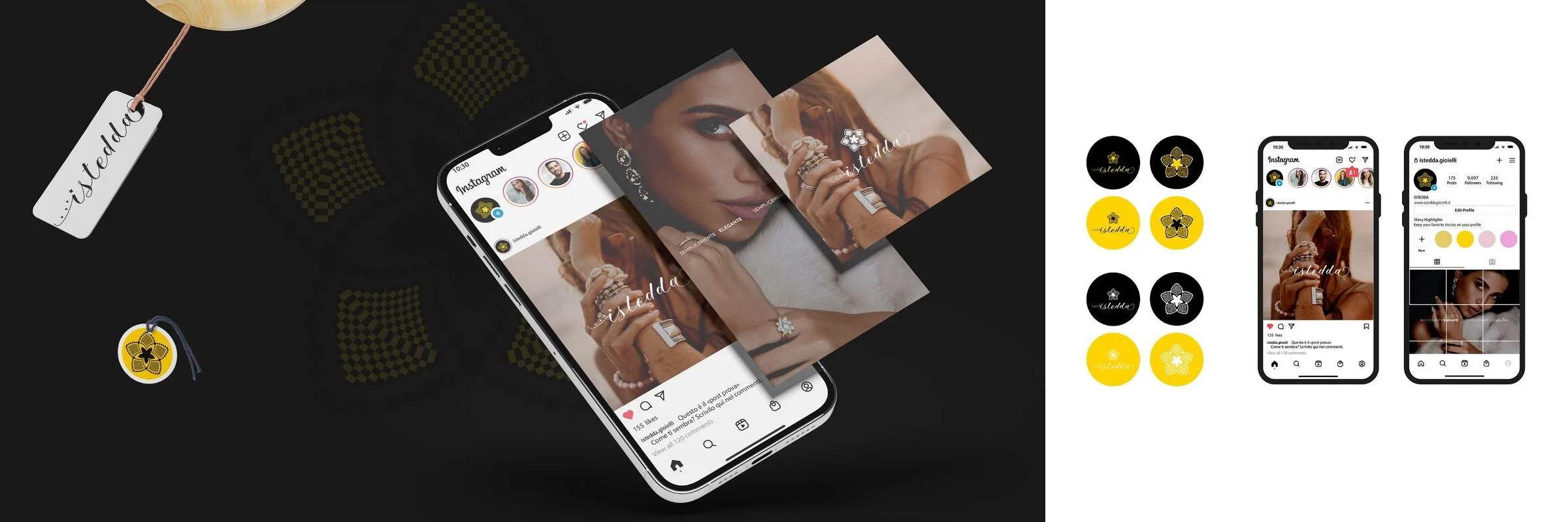
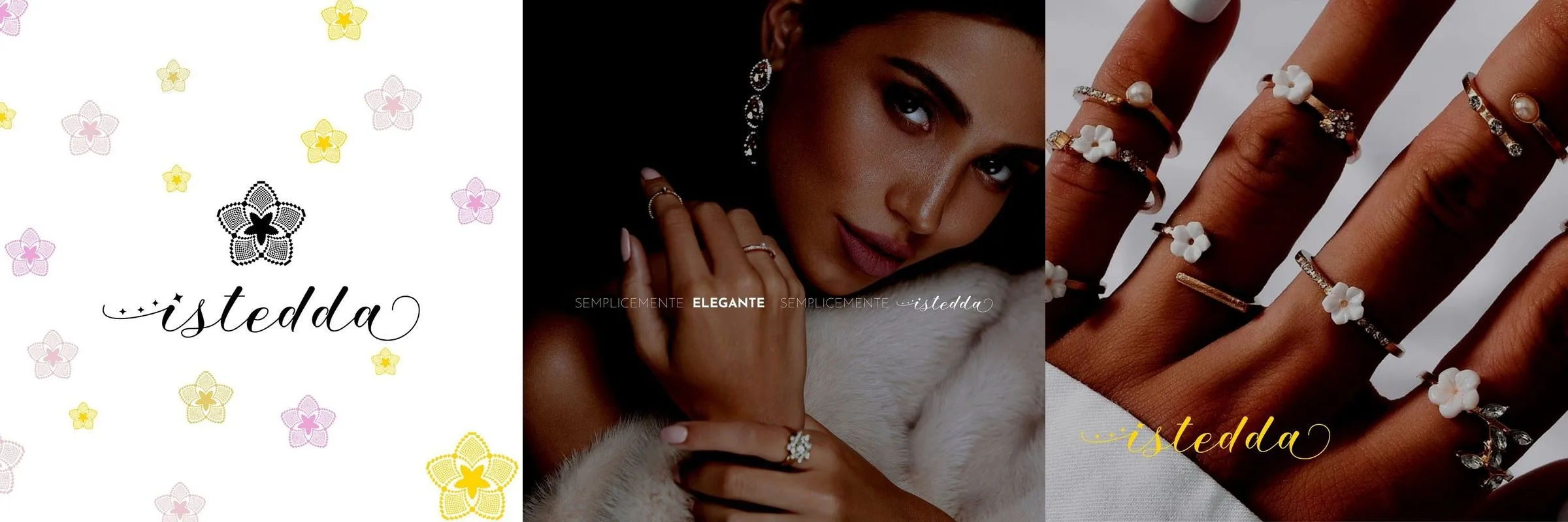
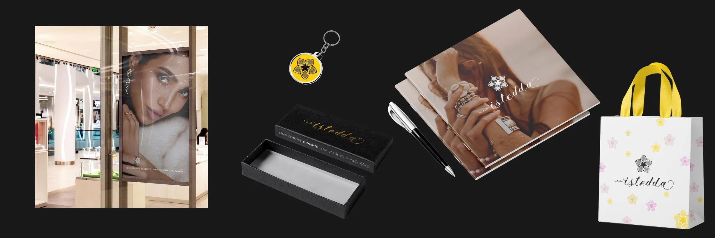
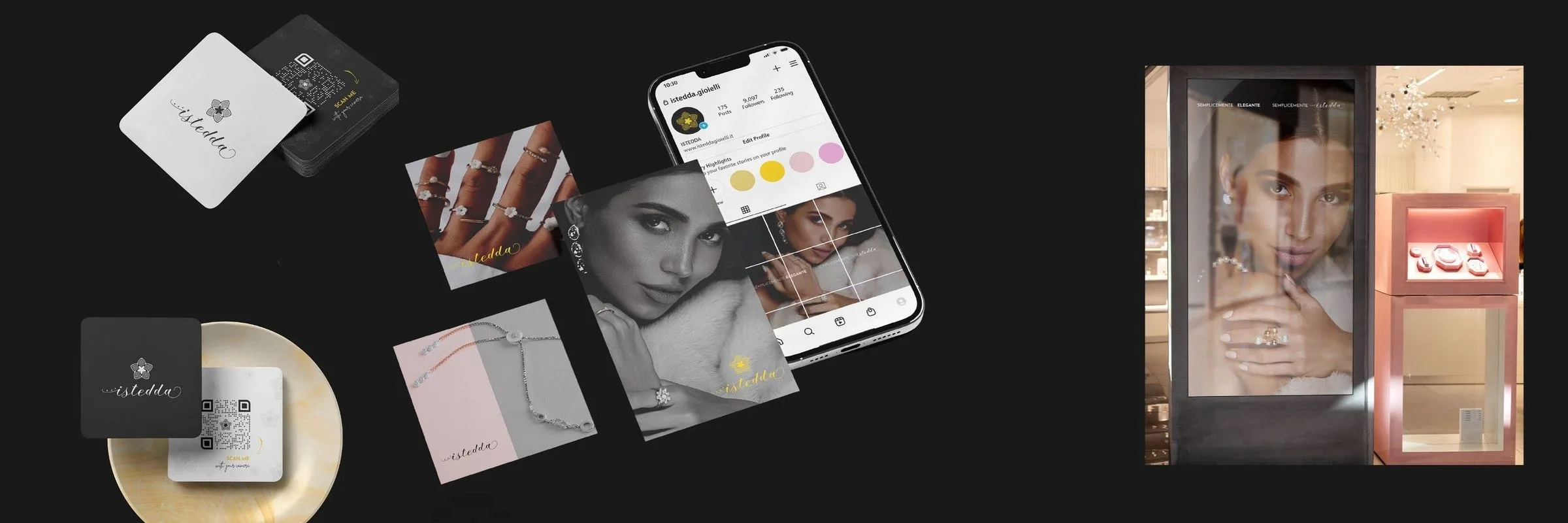
The flower. It is the sign that stays when the name does not fit: on the tag, on the highlight cover of the profile, on the keyring. Four tints — black, yellow, pink, lilac — and not one of them is an accent added afterwards: they are the same as the flowers scattered over the packaging.
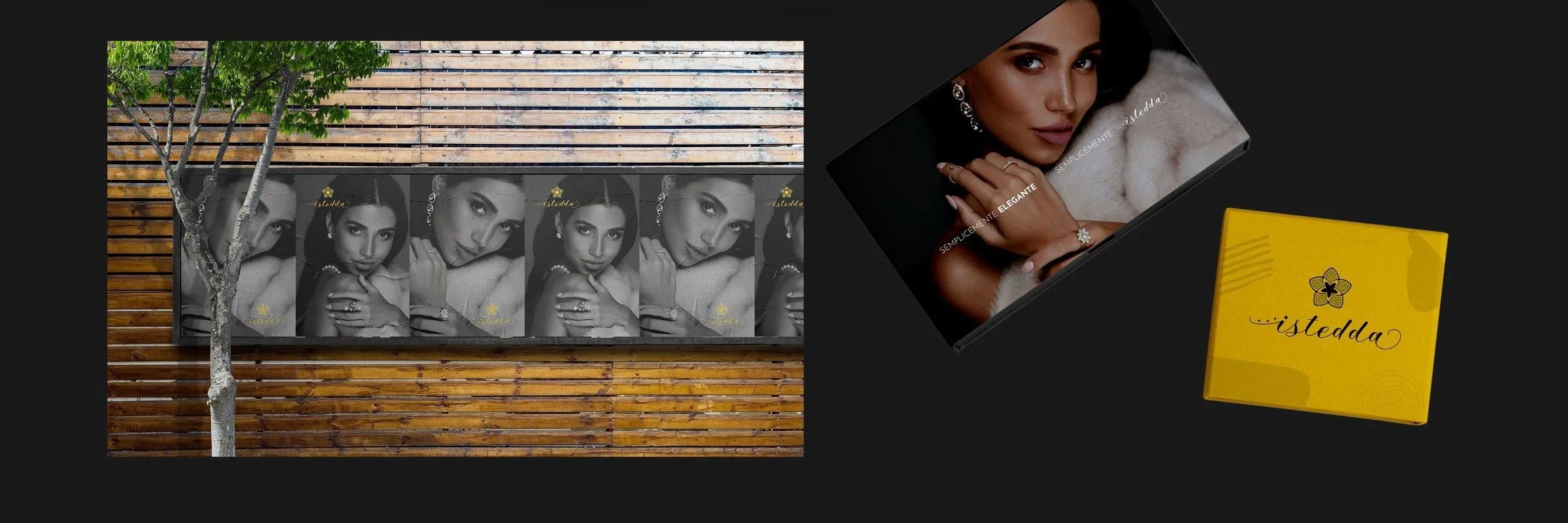
The campaign. Portraits in black and white, fur and hands, the jewel that shows because nothing else has any colour. Two lines only: semplicemente gioia, semplicemente elegante — simply joy, simply elegant.

Applications
White boxes with the flowers scattered over them and boxes in solid yellow, shoppers, tags, business cards with the QR, a pen, a keyring. Then the things that stand outside the shop: the posters pasted on a wooden fence, the same portrait repeated in a row, and the window with the lit display case.

Board by board.