Rosella Corda
Image, packaging and social media for a Sardinian cosmetics line since 1994.
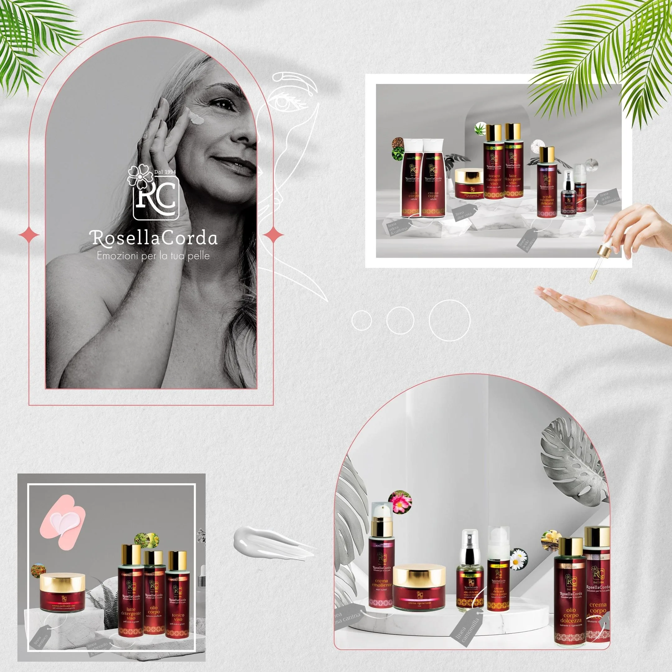
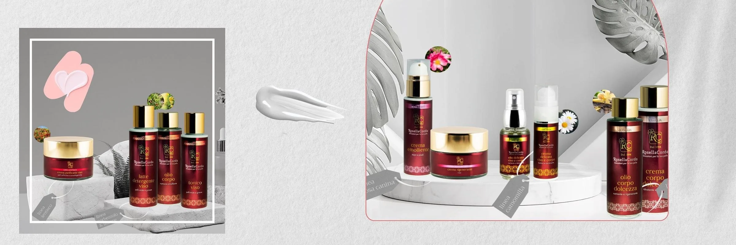
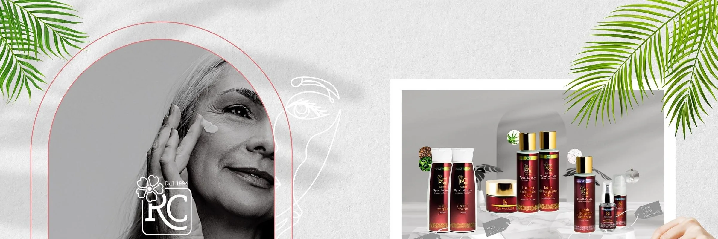
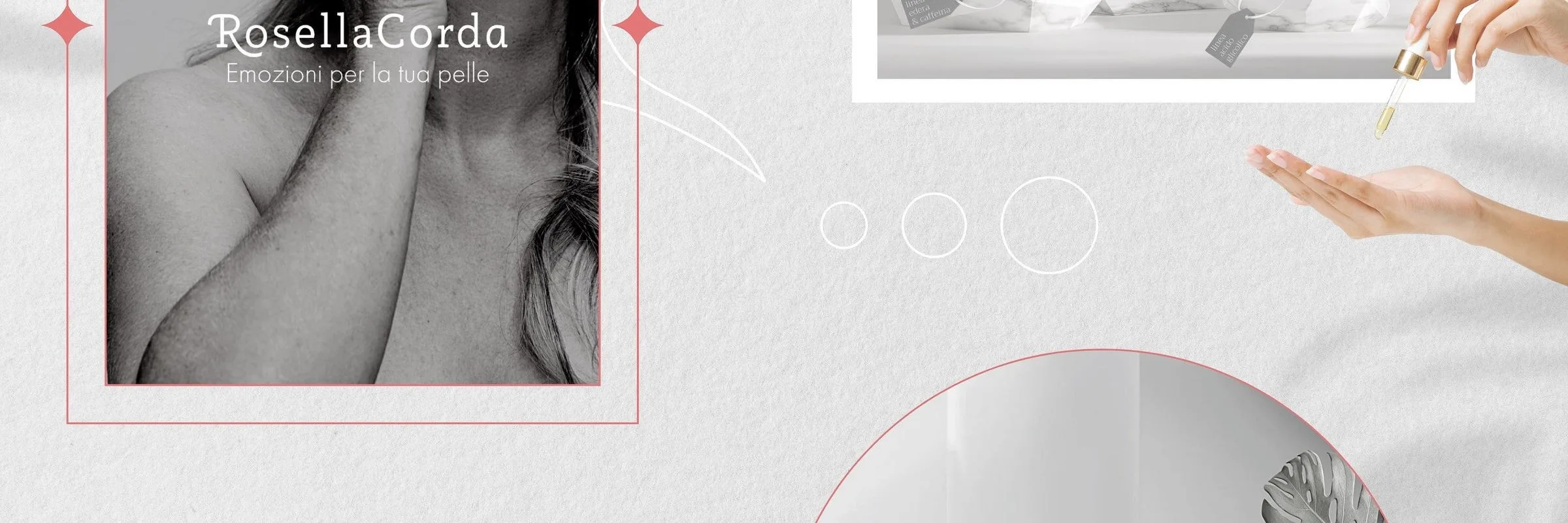
Brand image and formats for a Sardinian skincare line: the monogram with the four-leaf clover, the arch that crosses the tiles and the range photographed on marble. Nine boards that make a single drawing on the profile.
- Sector
- Wellness & Beauty
- Year
- 2023
Context
Rosella Corda has been making skincare in Sardinia since 1994: creams, oils, toners. A family line, with the product names written in Italian and the raw materials declared on the tag.
Challenge
The profile was the catalogue. Nine separate posts had to read as one thing when seen together — and each one had to hold up alone as well, because that is how they reach anyone scrolling.
Design
The arch. A thin pink line draws an arc that begins in one tile and ends in another. It is the device that keeps the grid together: whoever opens the profile sees a drawing, whoever opens a post sees a composed photograph.
The monogram. RC inside a rectangle, with the four-leaf clover above and the founding date below. It sits on the opening image and on the products, at the same size.
The photography. Pale background, marble, palms and monstera. The bottles are burgundy and gold and need no other colour around them: everything else is grey, white and green.

Applications
The range shot all together and in close-up, the white frames that hold the products, the stroke of cream as a break between two compositions. And the tags hanging in every shot, naming the raw material: rosehip, chamomile.

Board by board.