Nuraghe Antigori
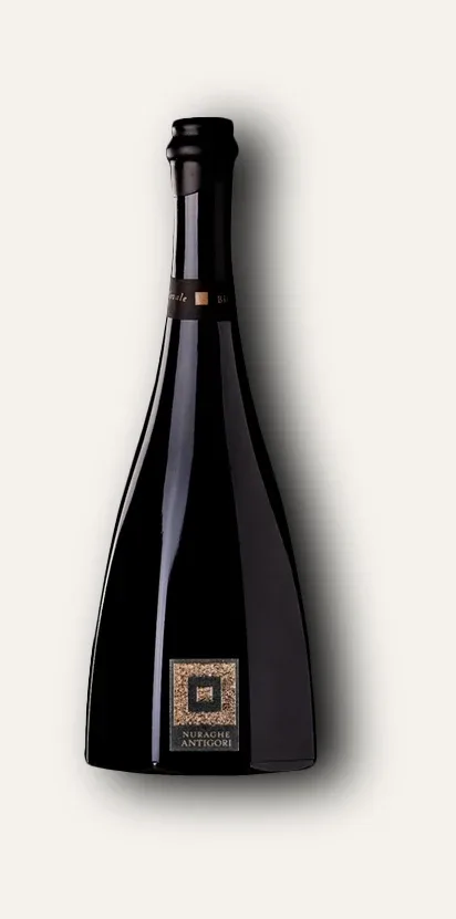
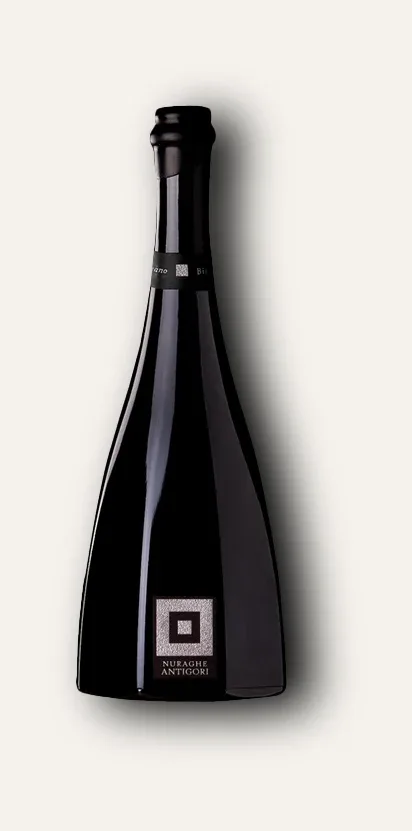
Labels for the six wines of an organic Sardinian winery.
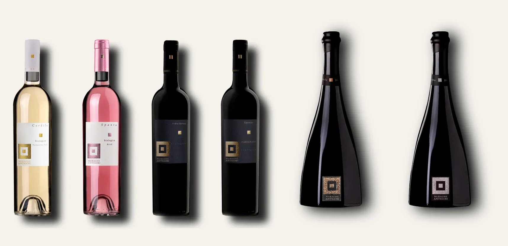
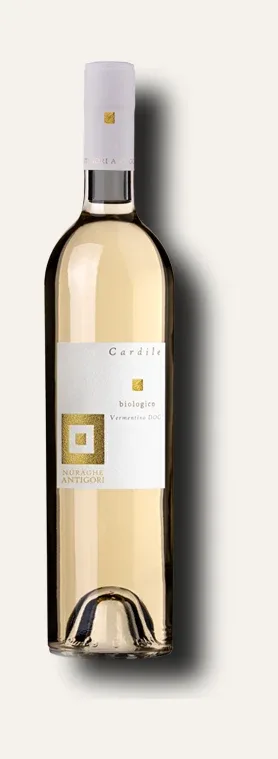
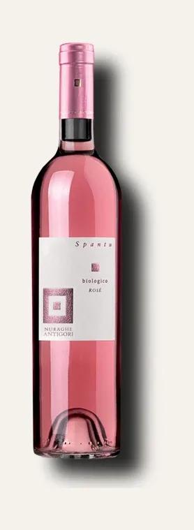
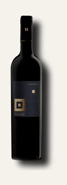
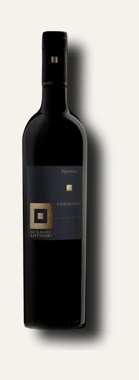
Labels for the range of an organic Sardinian winery: six references, two bottle formats, one single mark. The square inside the square returns on every reference in two sizes, and changes metal with the wine instead of changing design.
- Sector
- Food & Wineries
Cantine Nuraghe Antigori farms organically across an estate of more than five hundred hectares, twenty-one of them under vine. The range holds a Vermentino, two reds, a rosé and two references in octagonal bottles: different wines that have to share a shelf and read as one family.
One mark, two sizes
The system rests on a single element: a solid square inside a square frame, in metal on a solid ground. It returns on every reference in two sizes — small under the wine's name, large at the foot with the winery mark beneath it — and that double beat is what holds the range together from across the room, before anyone reads a name.
- References in the range
- 6
- Bottle formats
- 2
- Hectares under vine
- 21
The references differ in material, not in drawing
The label structure never changes: the wine's name in italics at the top, the small square in the middle, the word organic and the denomination, then the large square and the mark. What changes is the material. The white and the rosé live on pale paper; the reds on a midnight blue that lets the dark glass carry on where the label ends. And the metal follows the wine: gold on the Vermentino and the reds, rose copper on Spantu.
On the two octagonal bottles the large label disappears altogether: only the square and the winery name remain, straight on the glass. It is the proof that the mark holds on its own — when a bottle already has a shape of its own, the rest is surplus.
Board by board.