ARES Centro Formazione
Brand identity and guidelines for a training centre for businesses and young talent.
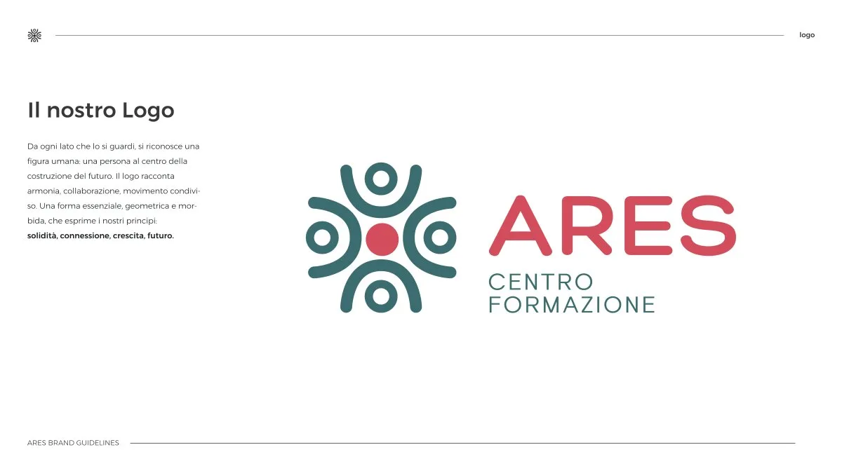
Complete brand guidelines for a training centre: the symbol of figures circling a red dot, the logotype, the Hero and Haigie type pairing, the green and coral palette, the pattern and the applications — from badge to building sign.
- Sector
- Training & Education
- Role
- Concept and symbol, Logotype and versions, Typography and colour, Pattern and applications, Brand guidelines
Context
ARES is a training centre: it walks entrepreneurs, young talents and new generations through personal and professional growth. Its story turns around one simple idea — growing together — and the visual identity had to say it before the words did.
Challenge
Training centres all look alike: a classroom, a handshake, an institutional blue. It needed a mark that spoke of people and connections without the usual photographs, and guidelines complete enough to govern every application — from a course badge to the sign on the building — without calling the studio at every doubt.
Design
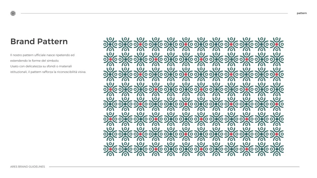
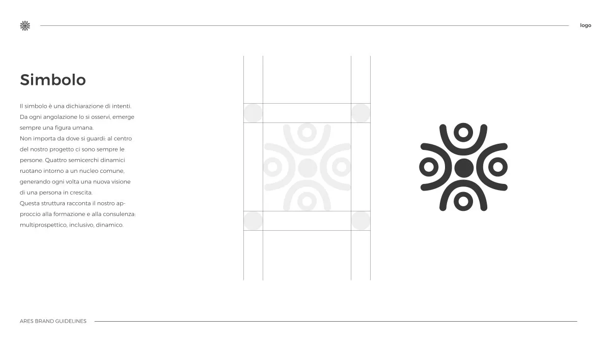
The symbol. Stylised figures arranged in a circle around a red dot: people around the centre of growth. Construction is on a grid, with proportions and clear space declared; the symbol holds alone at small sizes and generates the official pattern.
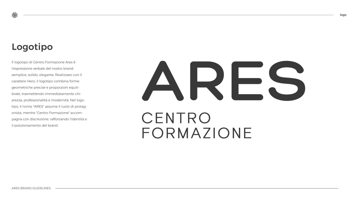
The logotype. ARES in full caps with the Centro Formazione descriptor: horizontal and vertical versions, and the allowed combinations on light and dark.
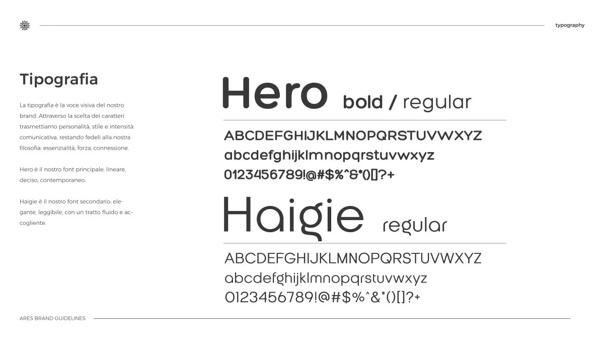
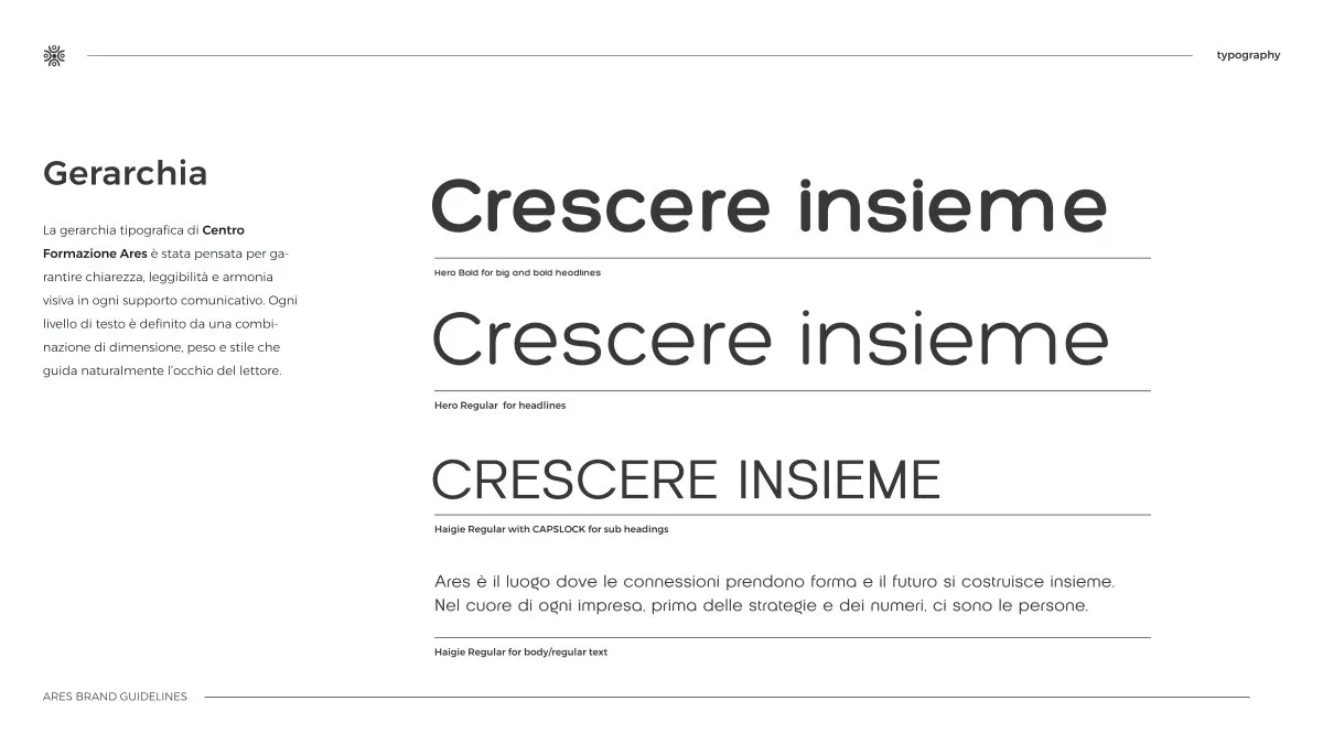
The typography. A declared pairing: Hero, bold and regular, for headings; Haigie regular for text. The hierarchy is documented on the Crescere insieme example — which is also the brand's phrase.
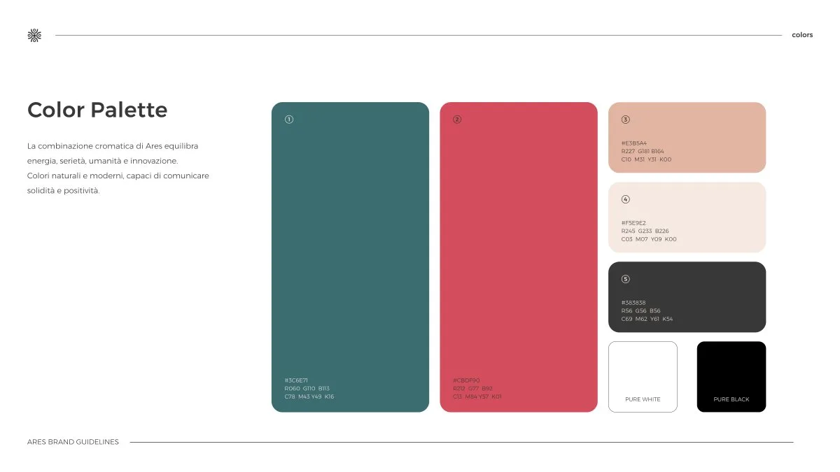
The colour. Deep green and coral, completed by cream and black: a warm palette that steps out of the category's institutional blue without losing seriousness.

Applications
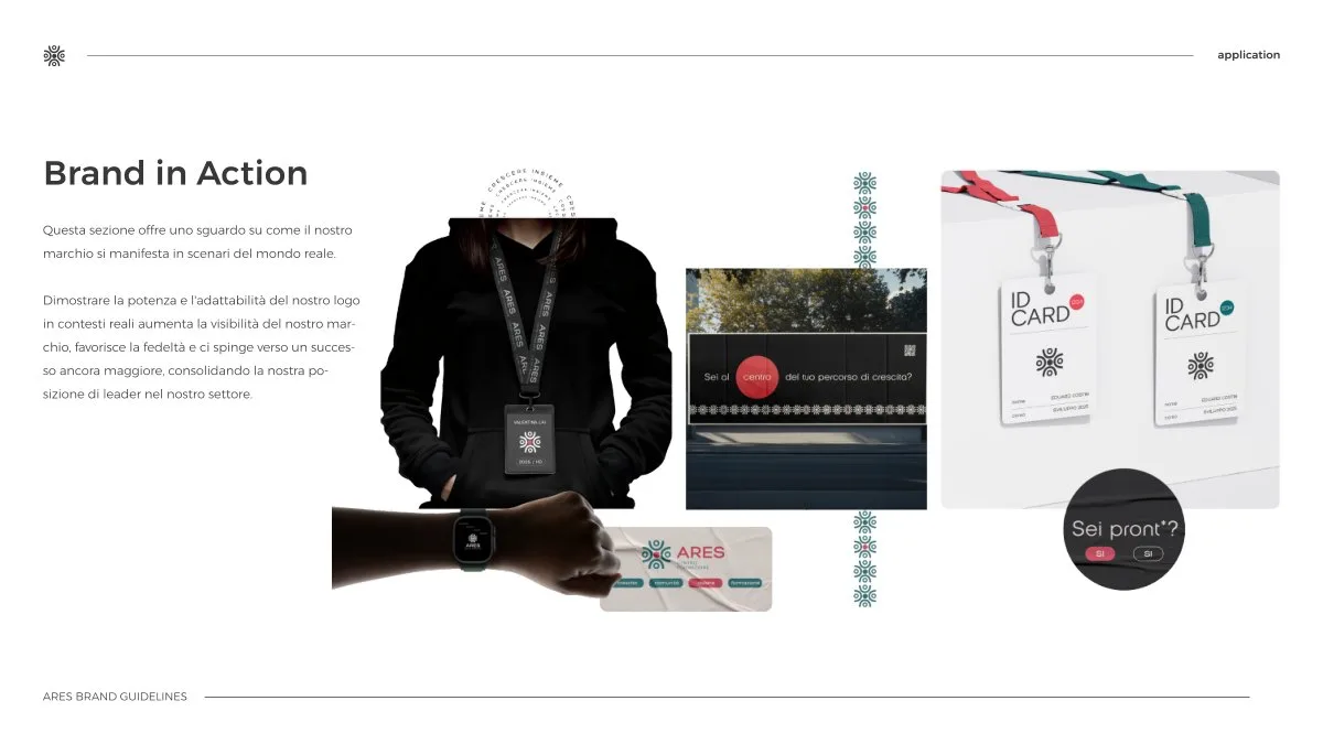
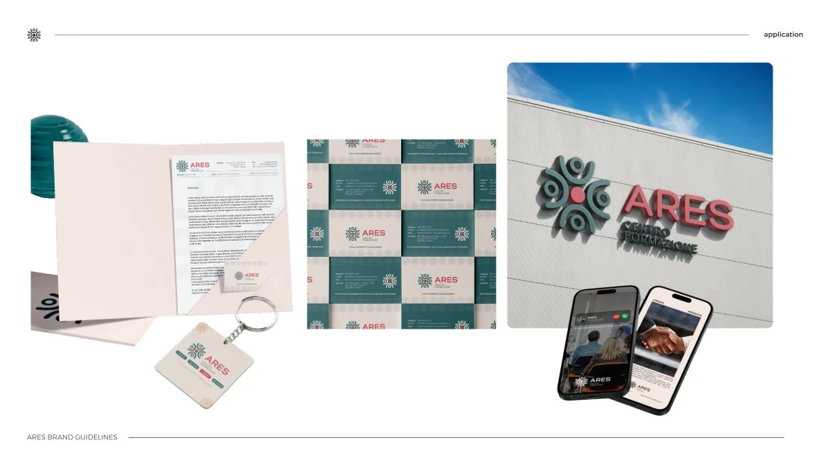
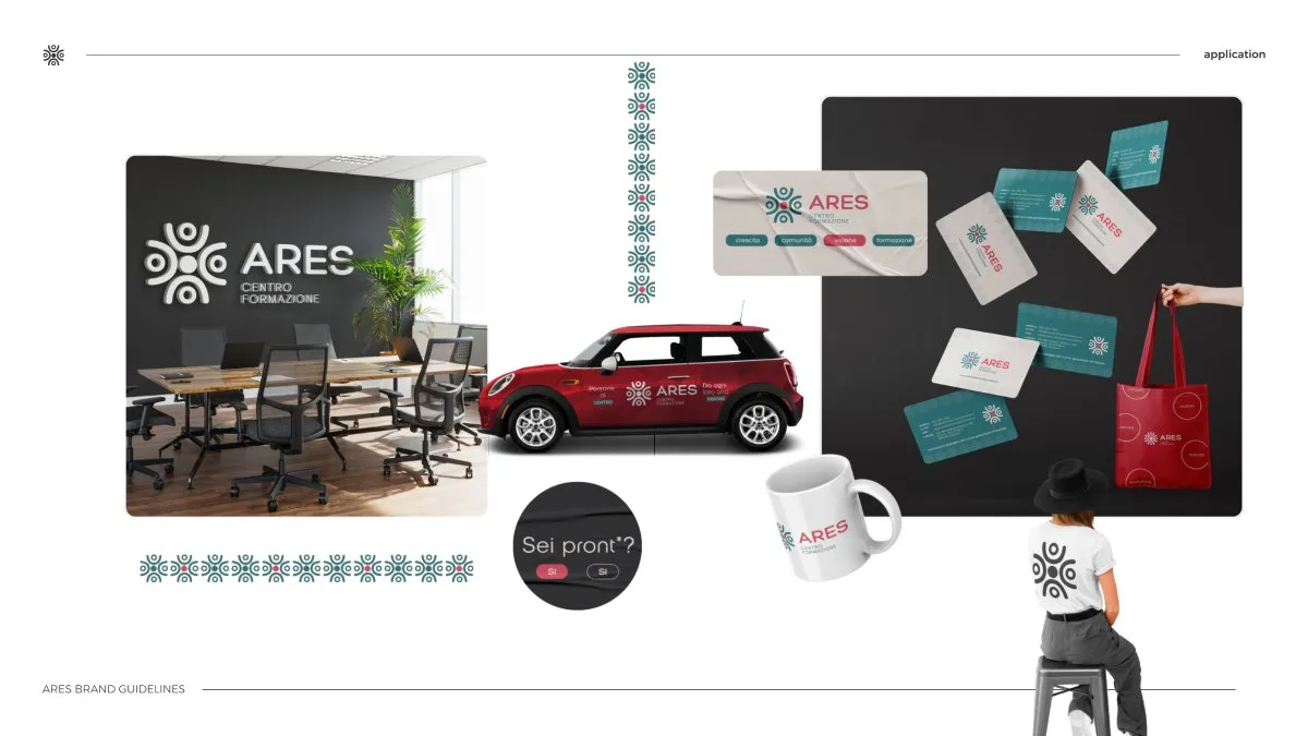
The guidelines close with the brand in action: hoodies and badges with lanyards, stationery, the sign, the centre's car, mugs and tote bags. Every page shows the application as it is, not as it might be: whoever produces a new piece has the reference ready.

- Pages of brand guidelines
- 23
- Chapters, from logo to applications
- 6
Results
Twenty-three pages of guidelines in six chapters: introduction, logo, typography, colour, pattern, applications. ARES has an identity that tells of people in a circle — and a document that lets anyone apply it well, even without us.
Board by board.