racconta.si
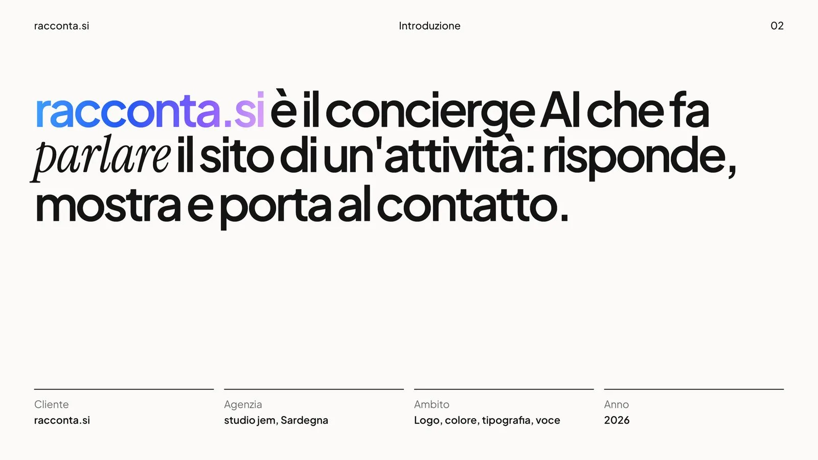
The brand of the AI concierge that makes business websites talk.
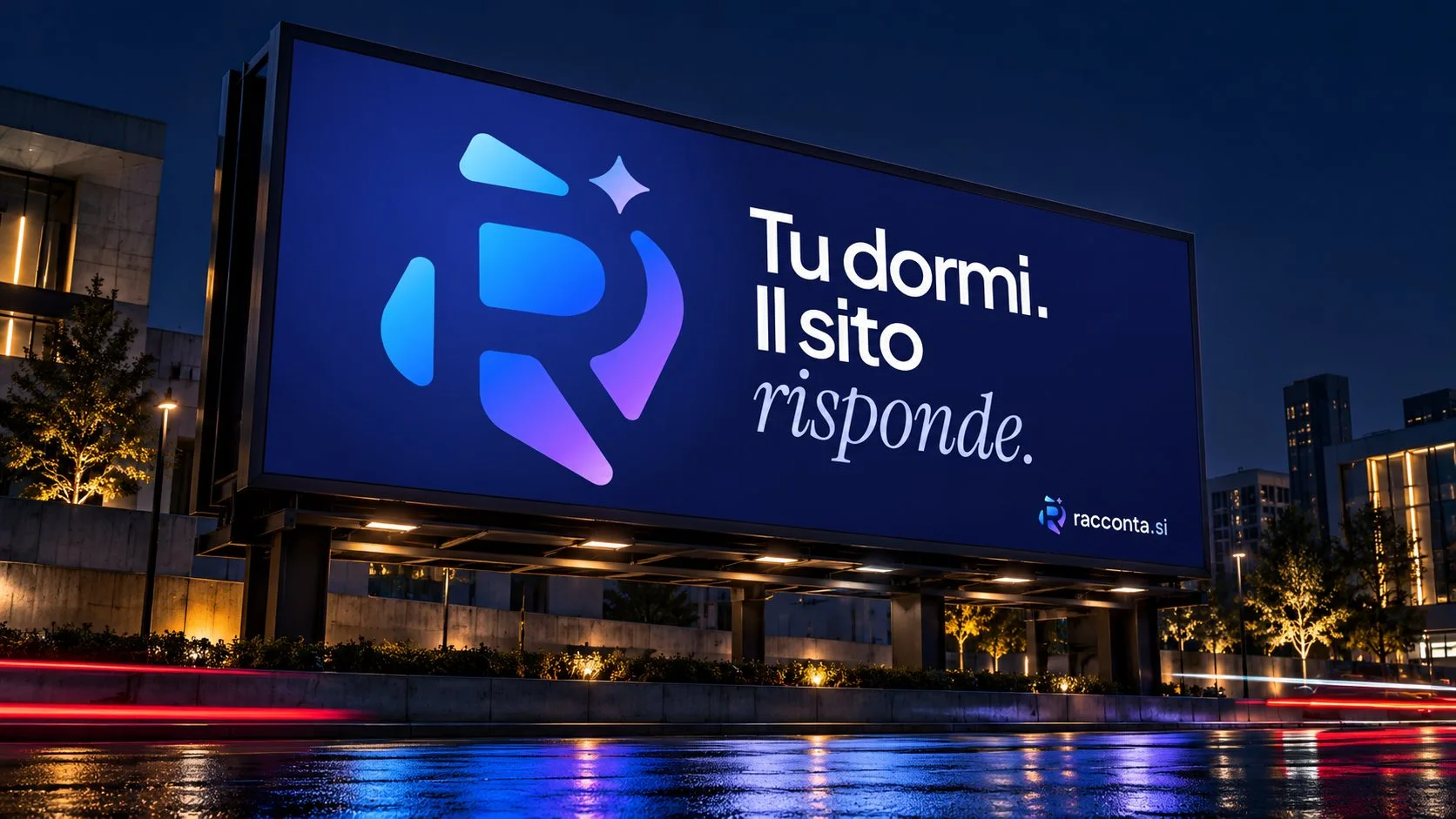
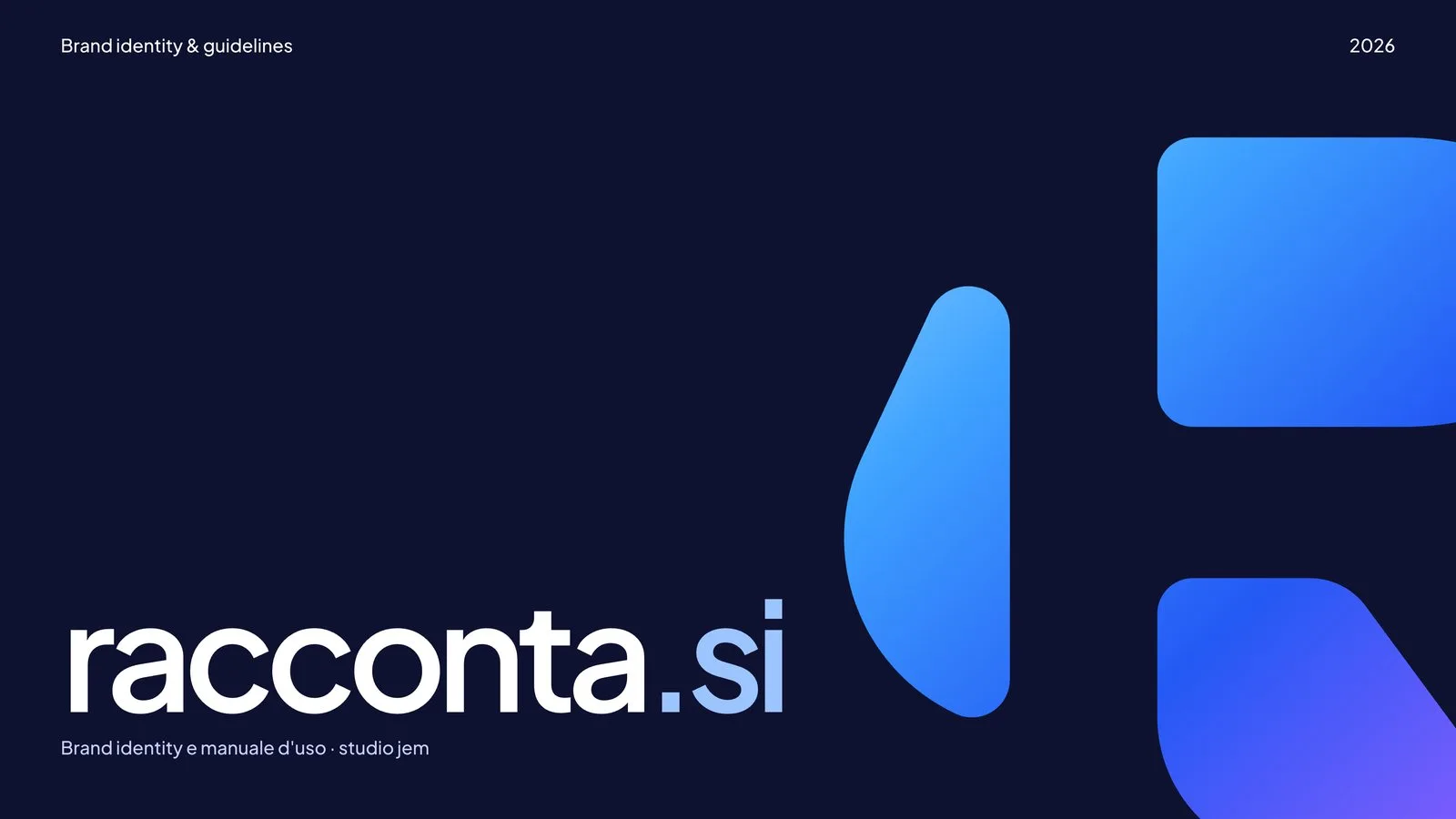
The identity of racconta.si, the AI concierge that answers visitors on the websites of hotels, restaurants and shops. An R built from five shapes, a star for artificial intelligence, a single gradient from ice to lilac. Full brand manual, digital kit and applications.
- Sector
- SaaS & Digital Products
- Role
- Mark concept, Vector drawing on a grid, Colour and type system, Tone of voice, Brand manual, Digital and social kit, Applications
- Year
- 2026
- Site
- racconta.si
Context
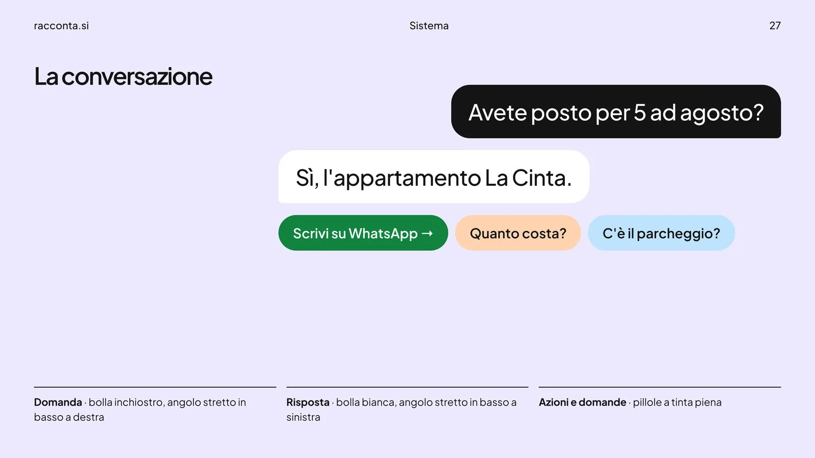
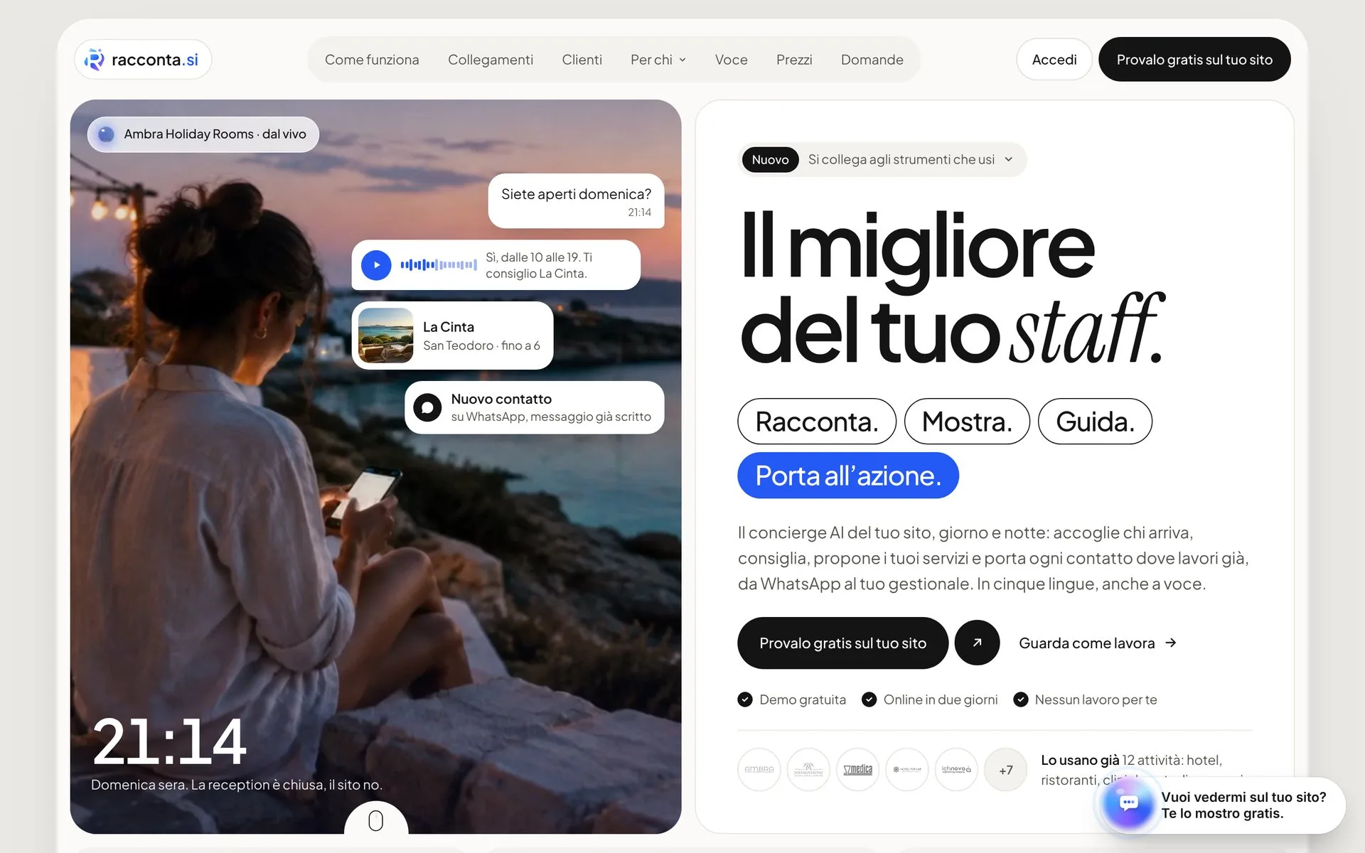
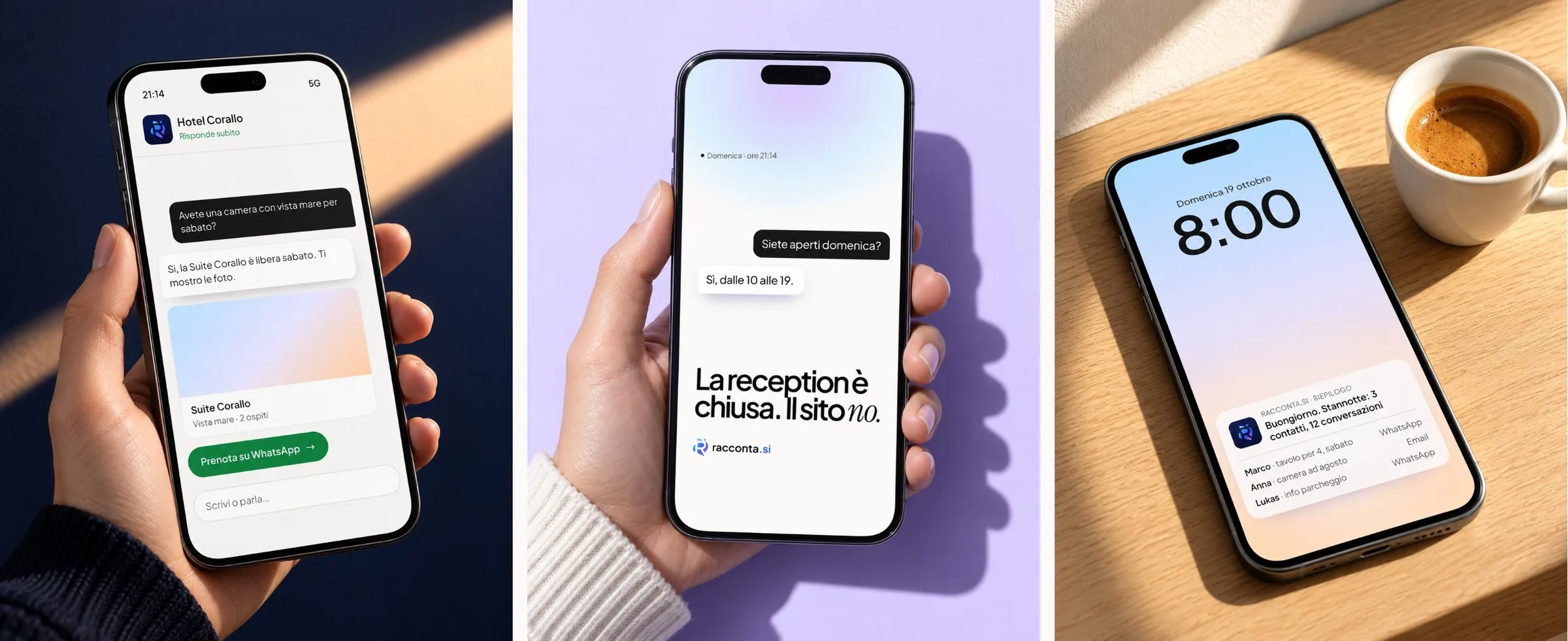
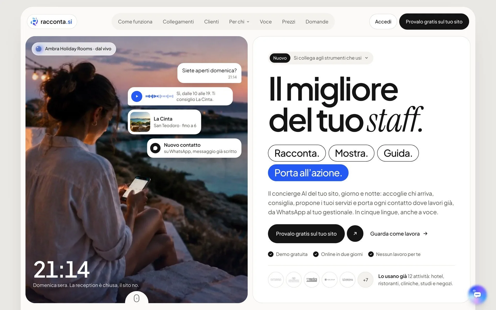
racconta.si is an AI concierge that sits on a business's website. It tells visitors about the business using its own content, shows the right cards, guides them to the room or the location they need and prompts action: WhatsApp with the message already written, a call, a booking, all the way into the management software. In five languages, by voice too.
The product existed; the brand didn't. We designed it from scratch: symbol, wordmark, colours, typefaces, voice, brand manual and every application.
Challenge
An artificial intelligence product can get its brand wrong in two ways. Either it looks cold and technical, and the owner of a B&B doesn't see themselves in it. Or it looks like a toy, and nobody trusts it with their customers' questions.
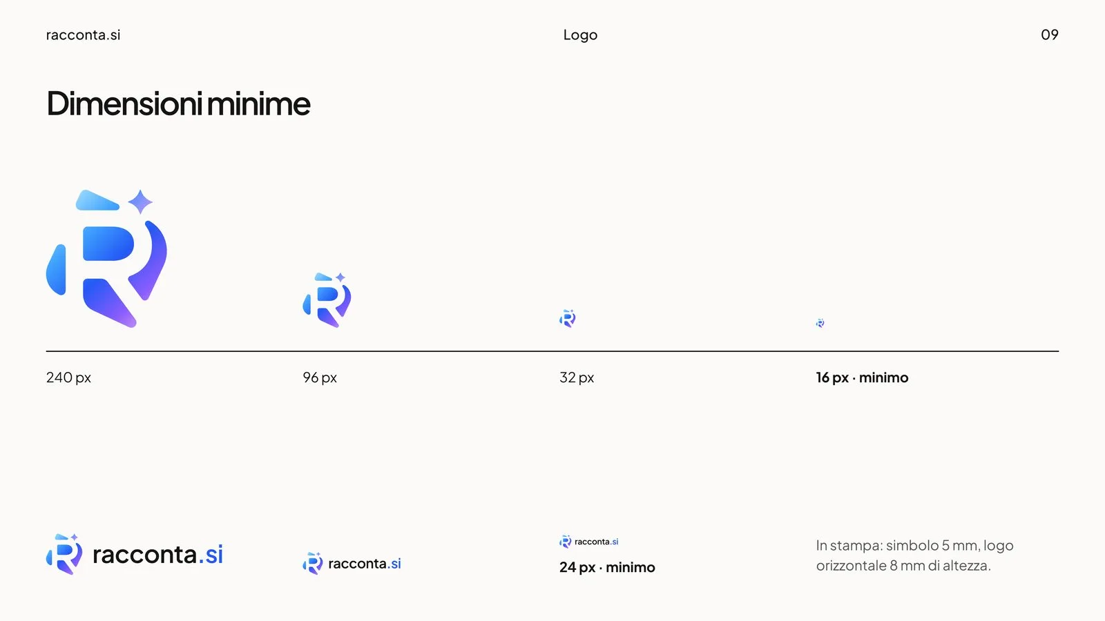
It needed a mark that was warm but precise, holding up from a 16-pixel favicon to a billboard, and a voice that speaks like the product: clear, close, honest about its limits.
The mark
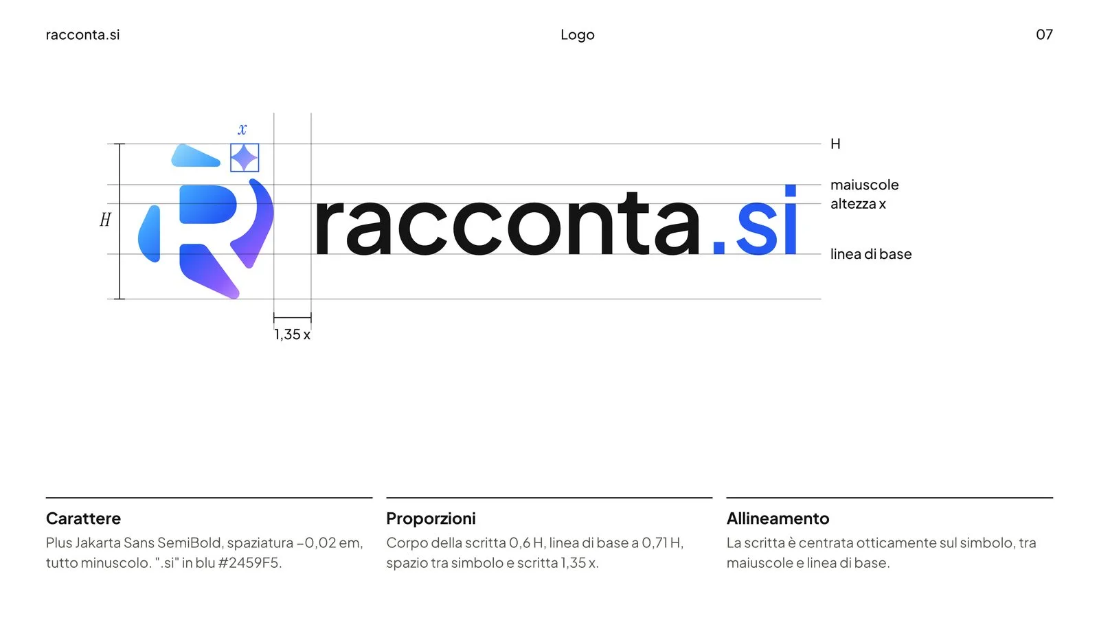
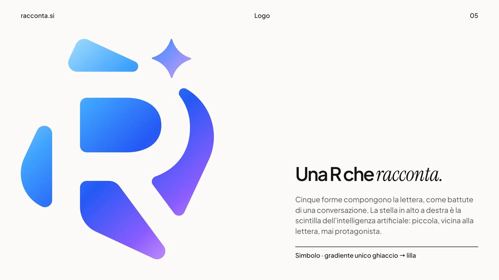
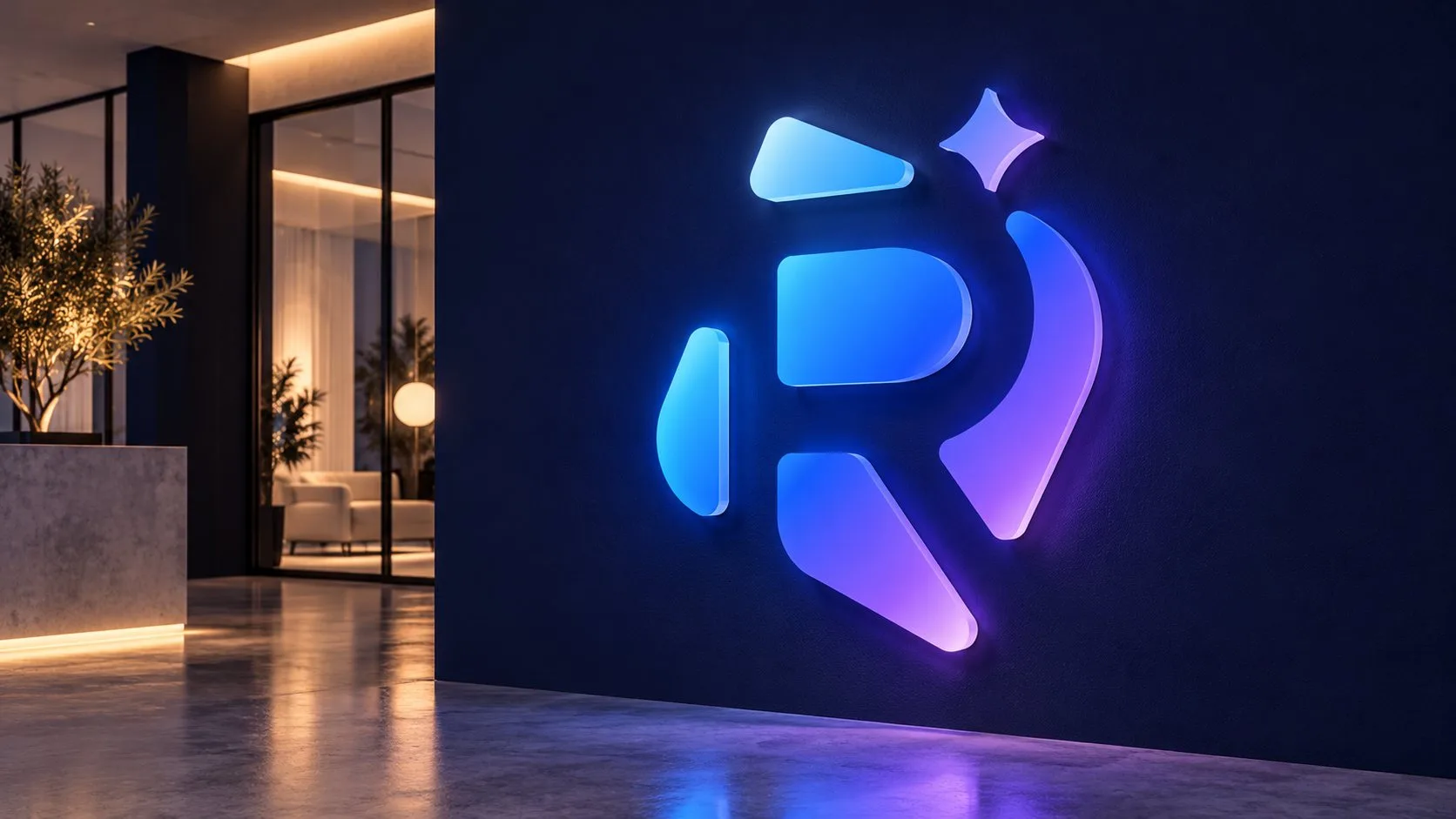
Five shapes. Bowl, leg, roof, arc and an opening on the left draw the R. They stay apart, like the lines of a conversation.
One star. Top right, small and close to the letter: the spark of artificial intelligence. It is never the lead.
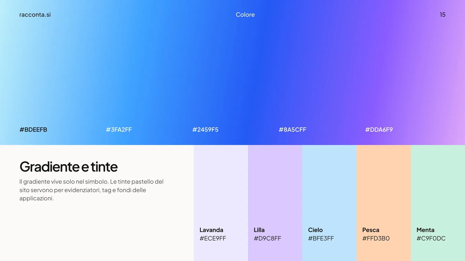
One gradient. From ice to blue, from violet to lilac, it runs through every shape like a single voice.

Construction
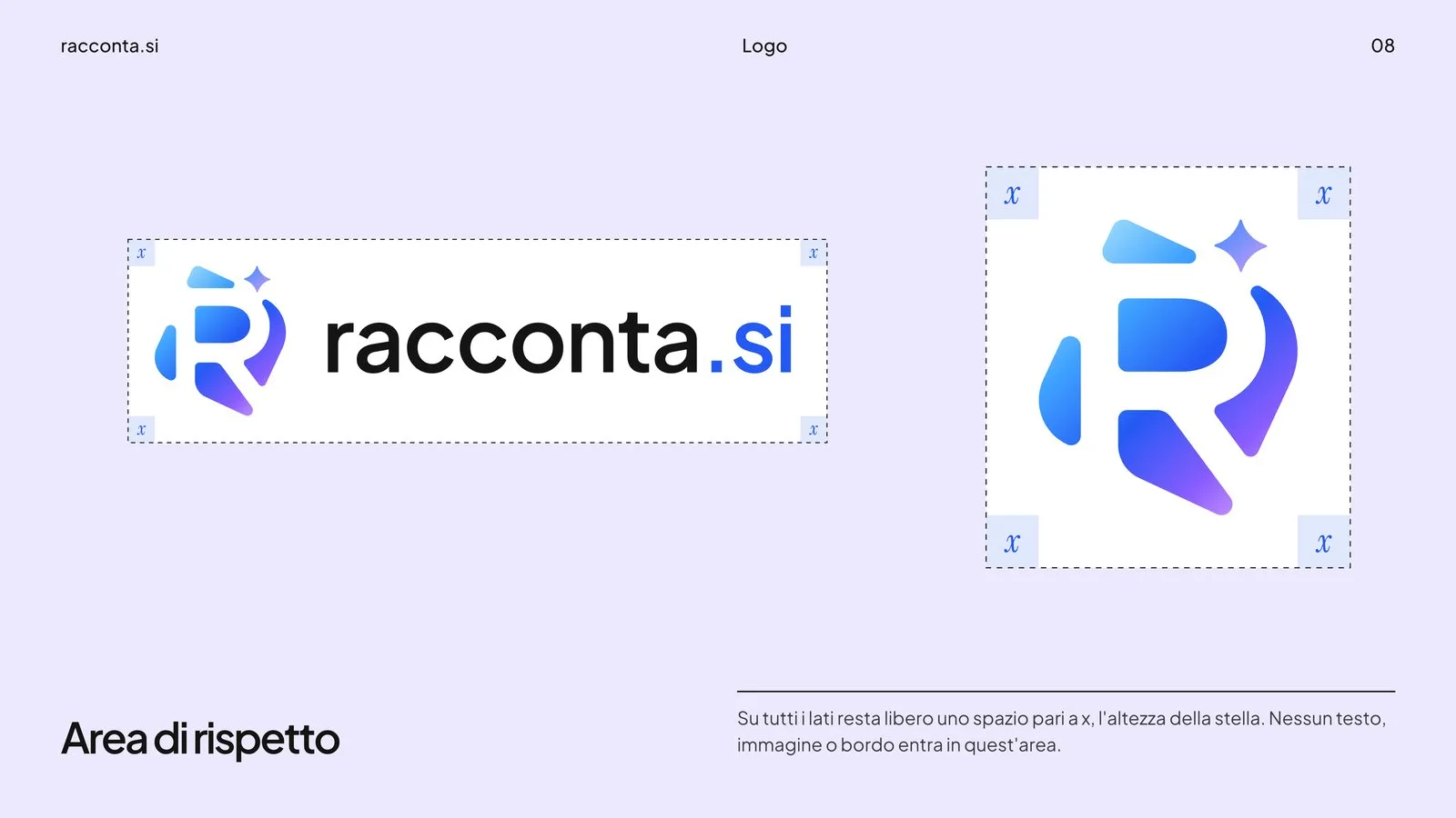
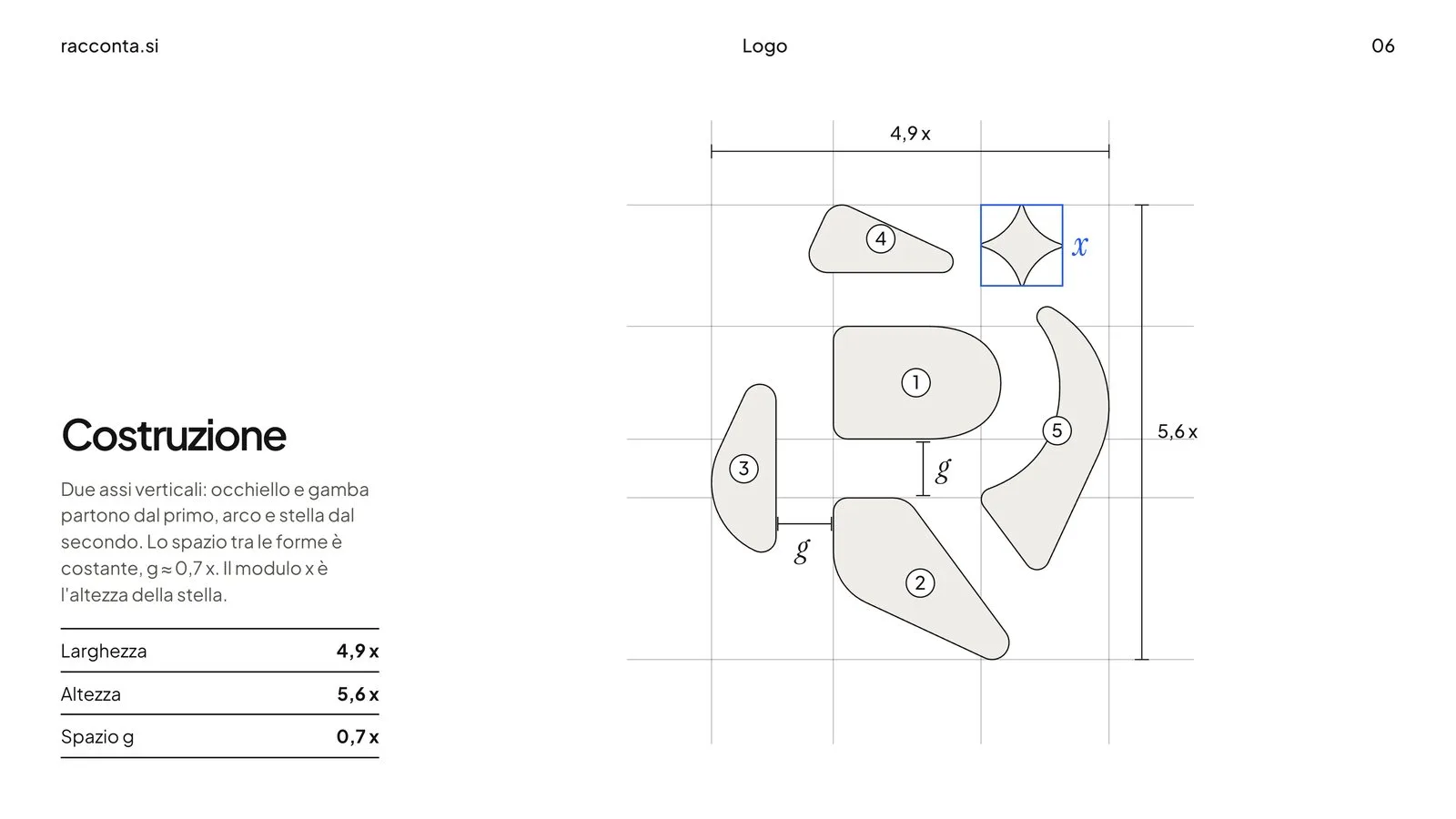
The symbol rests on two vertical axes: bowl and leg start from the first, arc and star from the second. The gap between the shapes is constant. The x module is the height of the star and measures the whole system: clear space, the distance between symbol and name, margins.
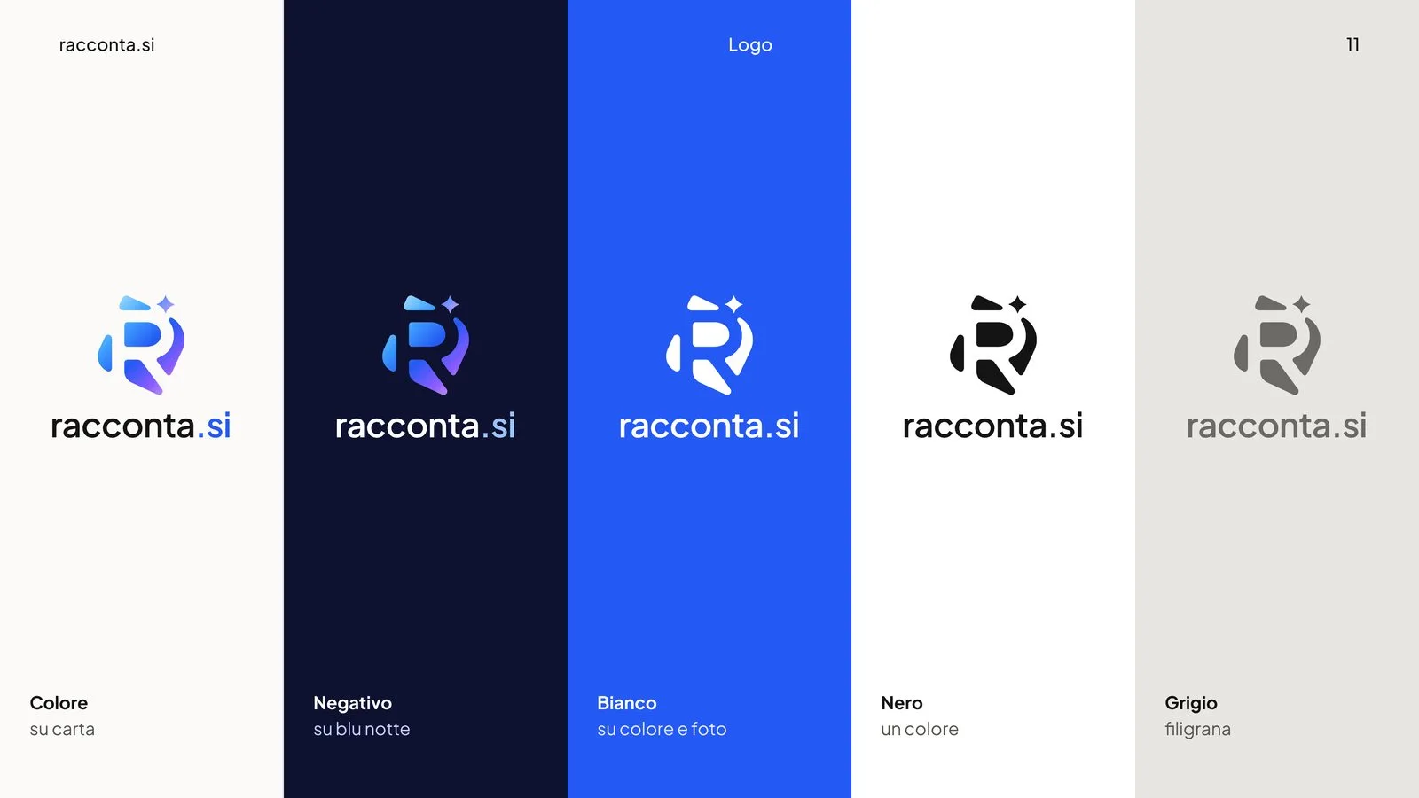
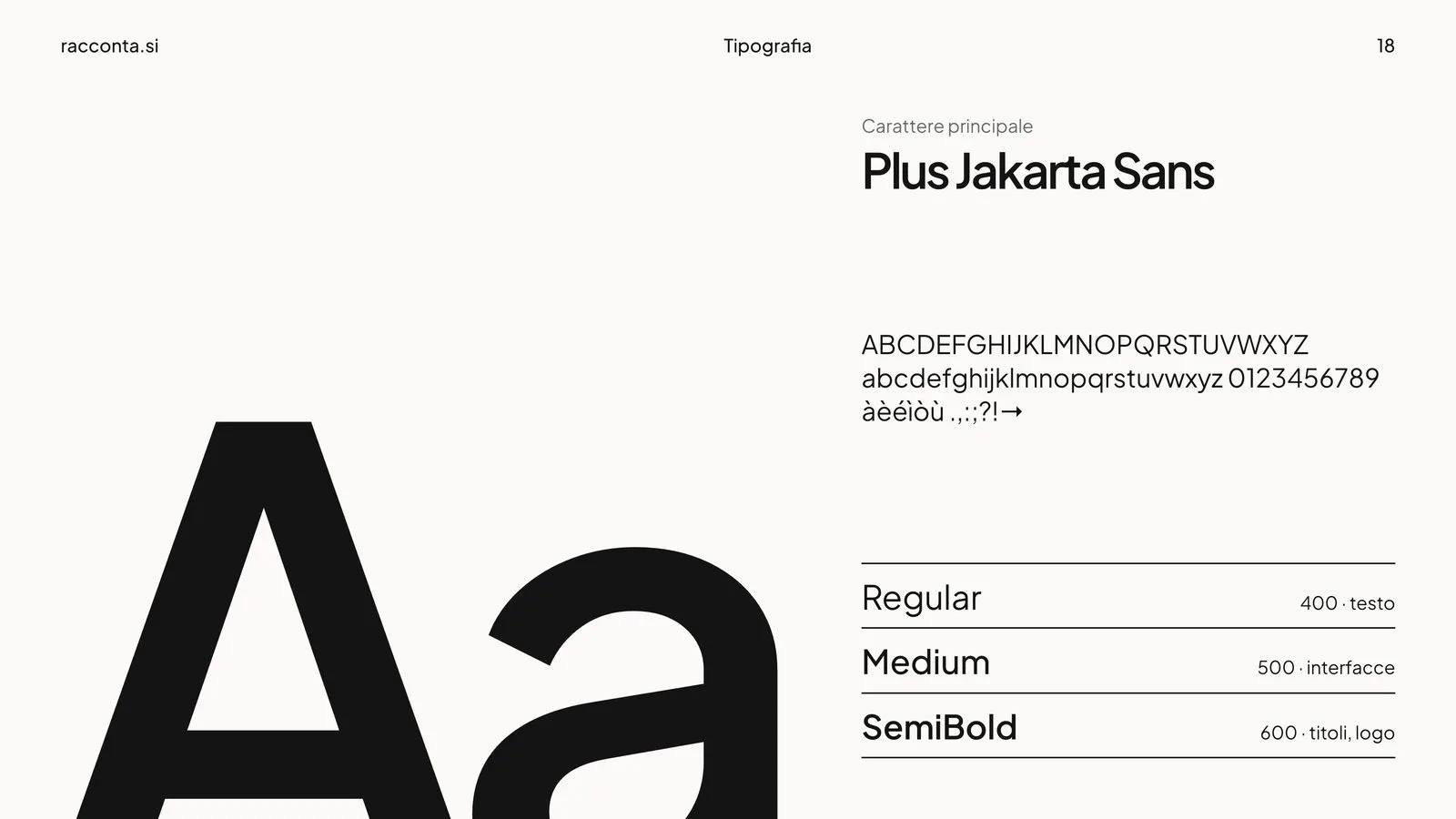
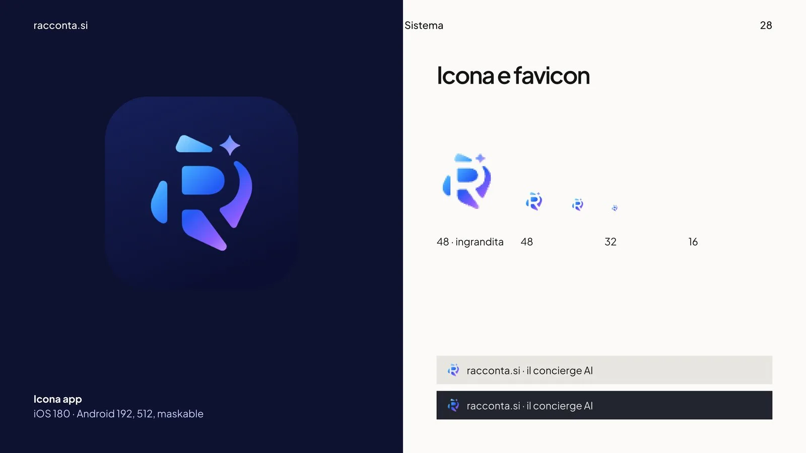
The name is set in Plus Jakarta Sans SemiBold, all lowercase, with ".si" in blue: it reads like a web address. The symbol still reads at 16 pixels.

Colour and type
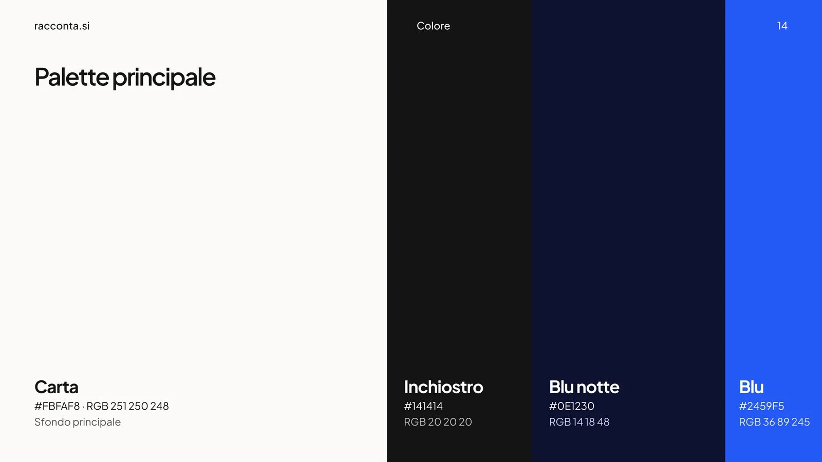
The base is bright: Carta for grounds, Inchiostro for text, Blu notte for depth and night. The gradient lives only in the symbol. The pastel tints of the site (lavender, lilac, sky, peach, mint) are for highlights and tags.
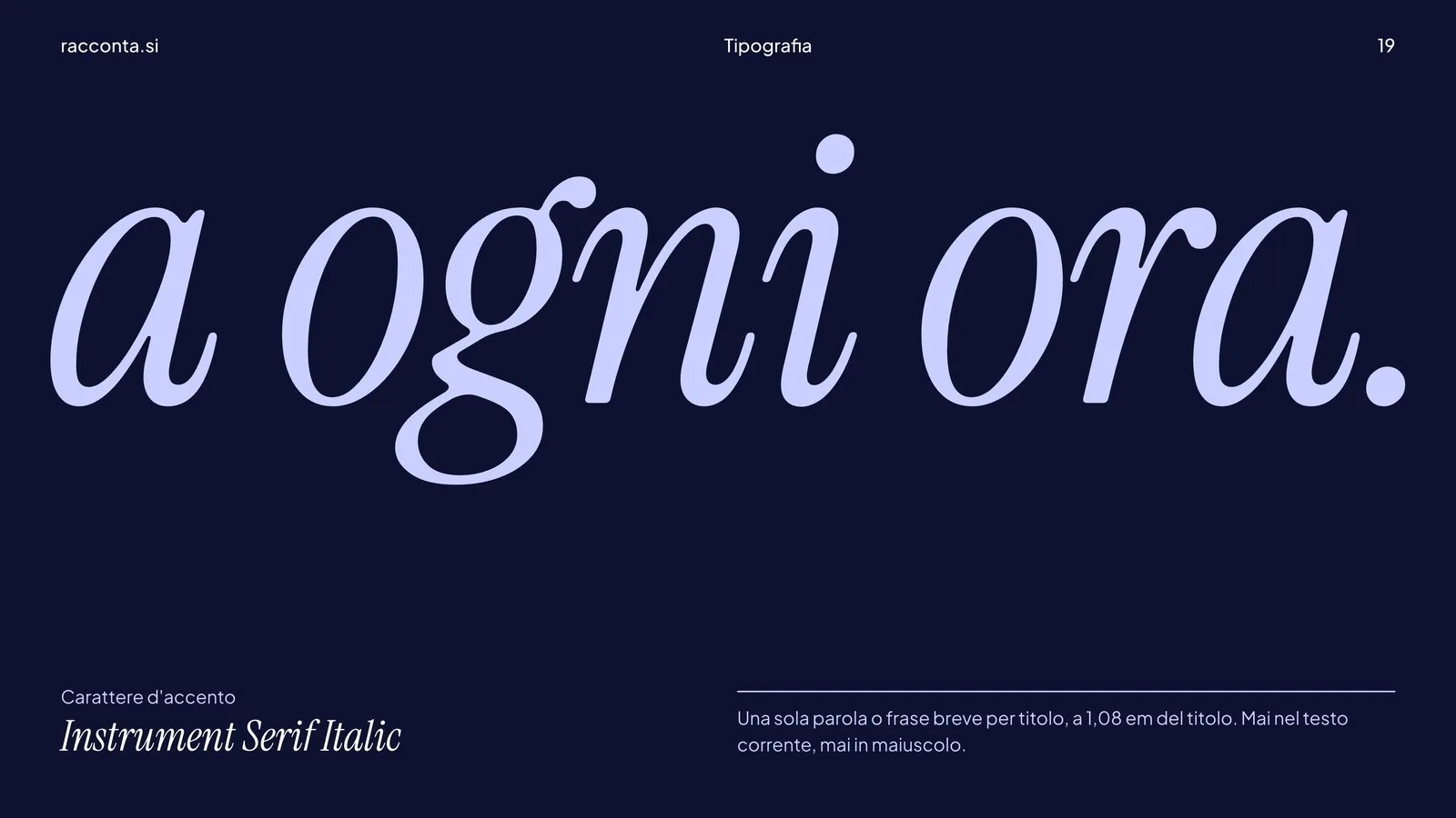
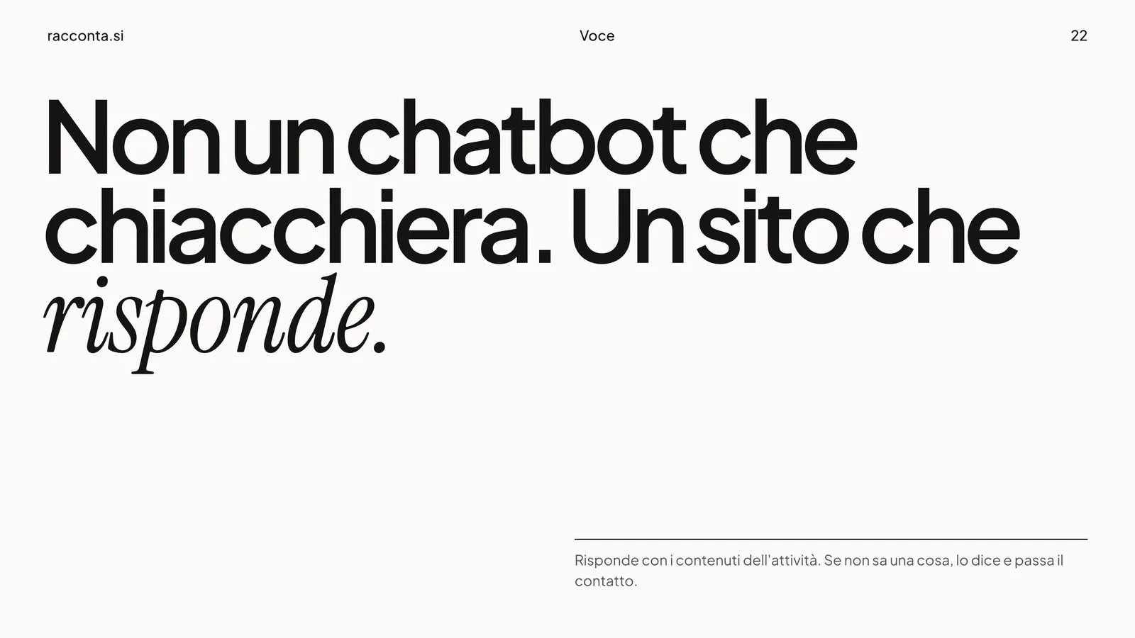
Two typefaces: Plus Jakarta Sans for headings and text, Instrument Serif italic for a single word per heading. That is where the brand changes its voice.

Voice
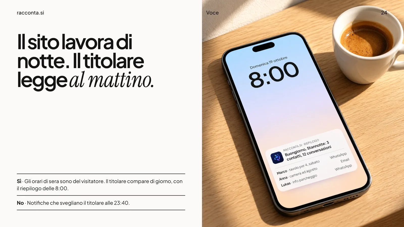
Informal address, short sentences closed by a full stop, concrete facts, honesty about limits: "It doesn't make things up. If it doesn't know, it says so." The tagline is Fai parlare il tuo sito, make your site talk. One rule above all: the site works at night, the owner reads in the morning.
- Shapes and a star make up the symbol
- 5
- The smallest size at which the symbol still reads
- 16 px
- Applications, from print to signage
- 23
Applications
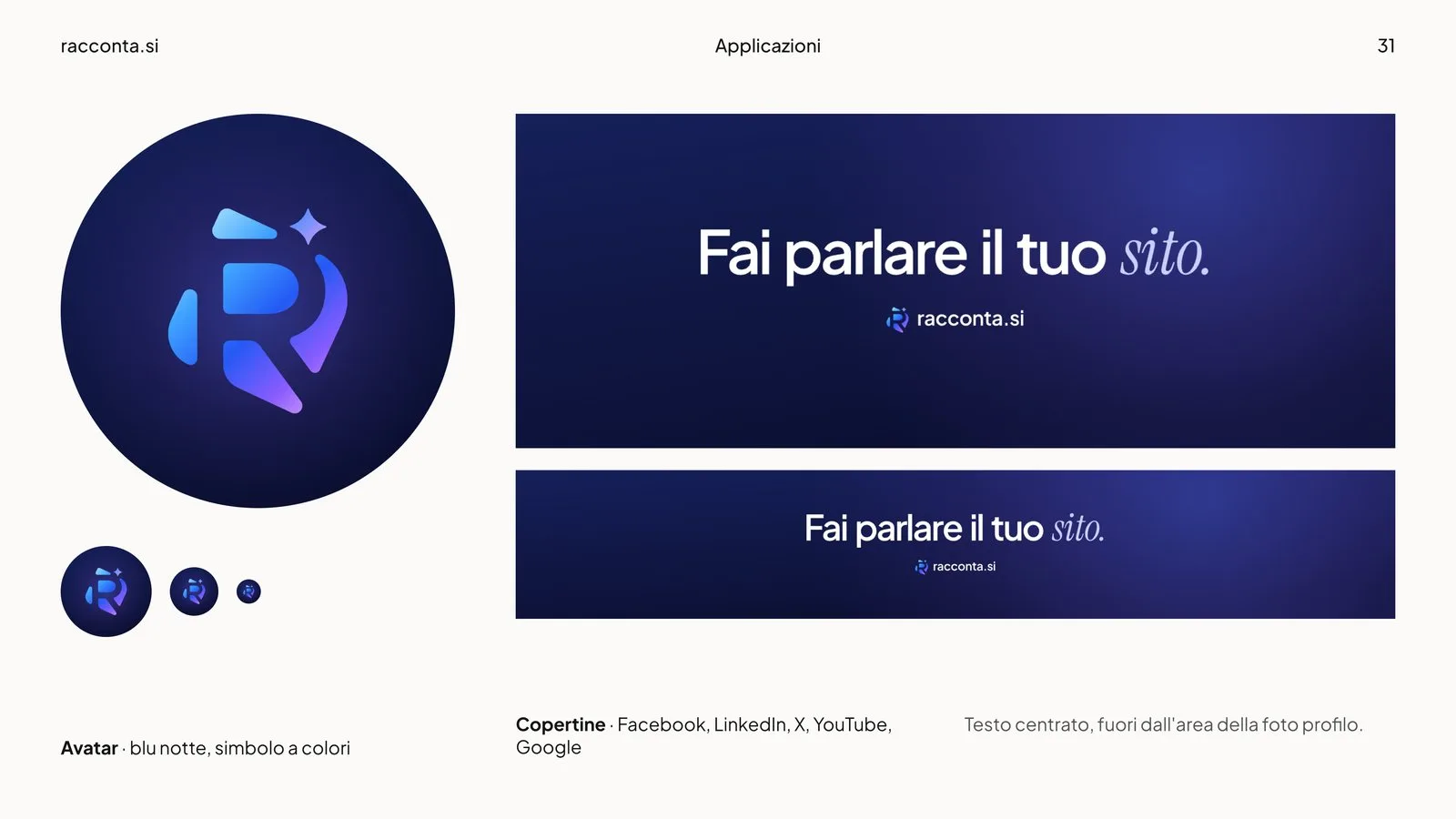
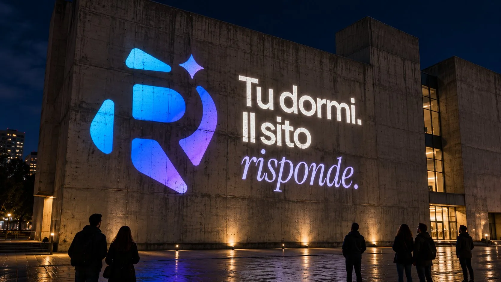
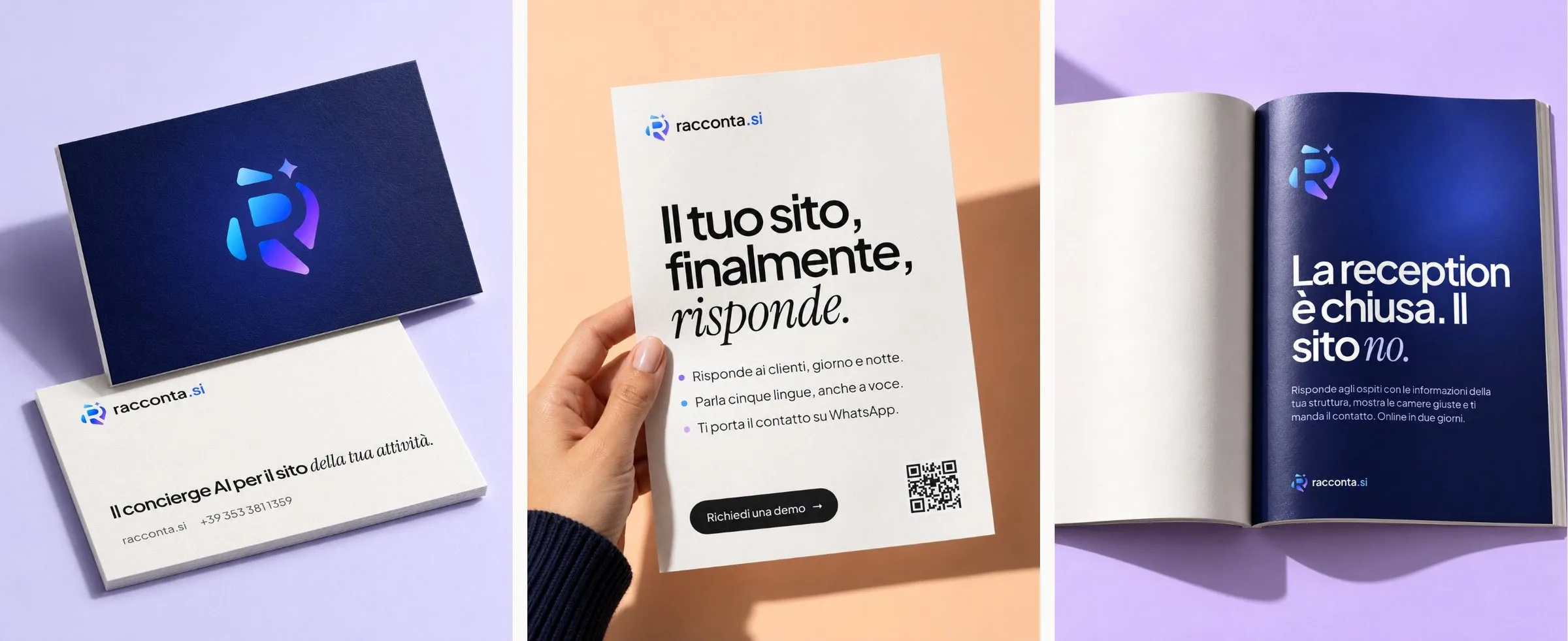
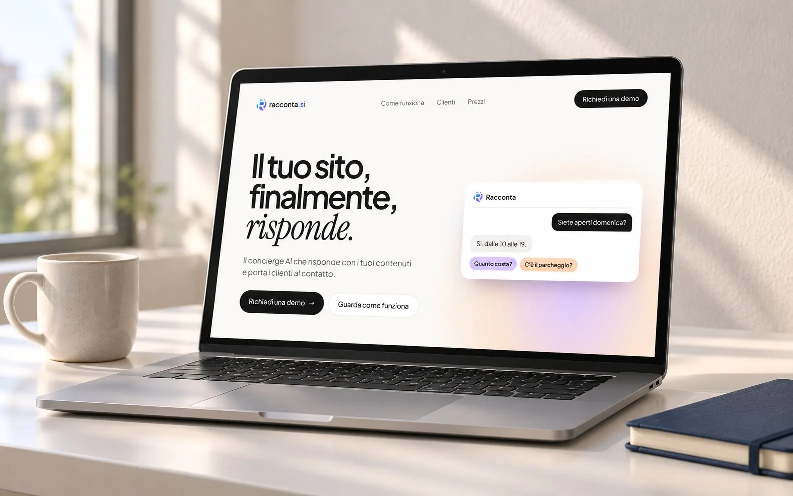
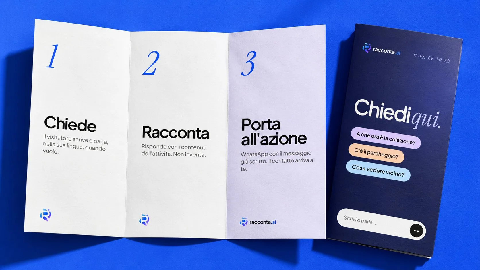
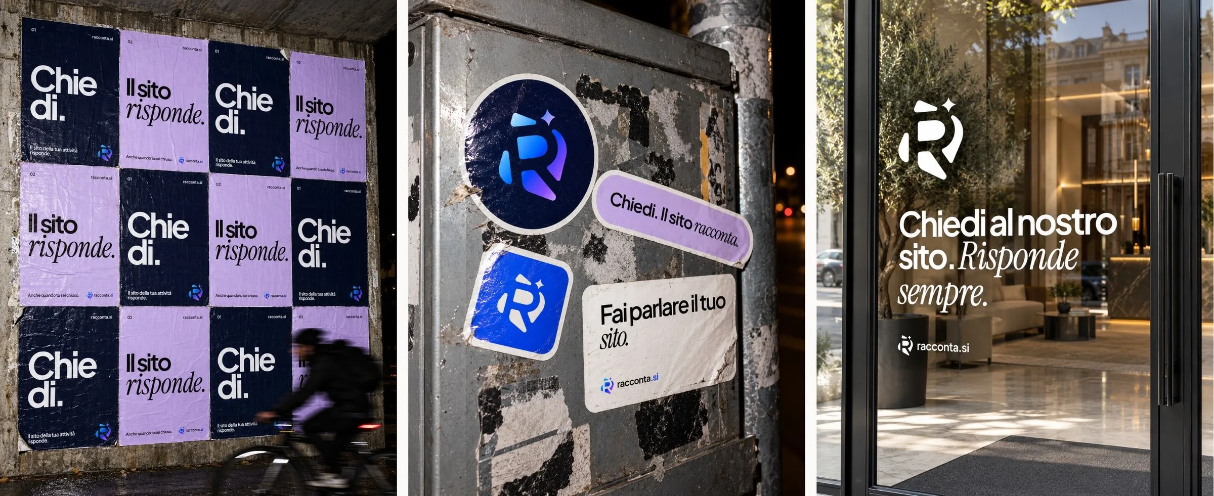
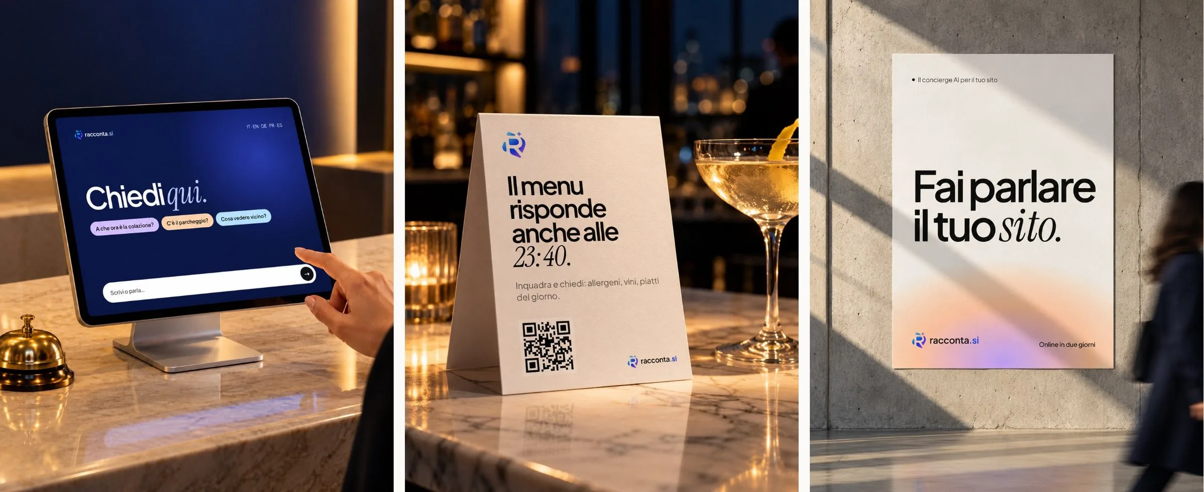
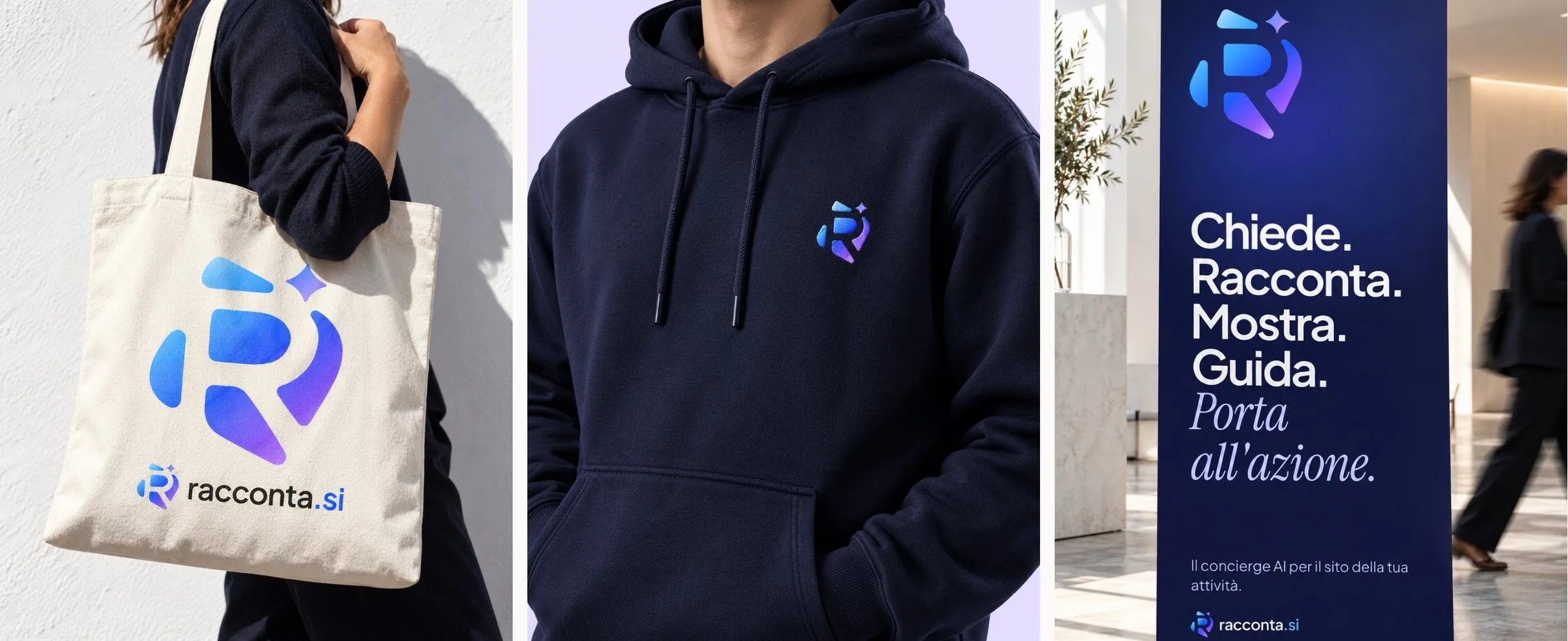
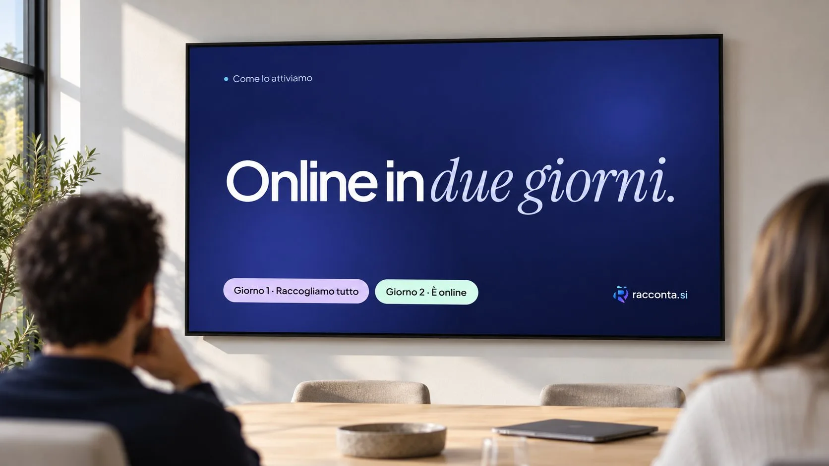
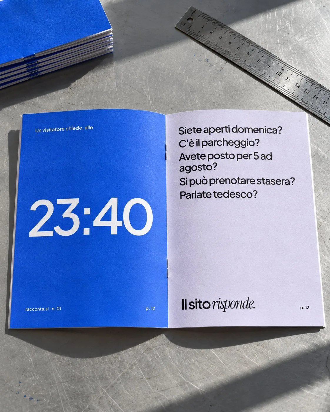
Business cards, flyer, three-panel brochure, magazine ad, poster, street posters, stickers, window decal, table tent, roll-up, backlit sign, projection. Then digital: website, phone chat, reception tablet, morning summary, story, presentations, favicon, app icons, avatar and social covers. And objects: tote, embroidered hoodie, fanzine.
The brand manual holds them together in fifty pages. We handed over the mark in SVG and PNG in every version, favicons, iOS and Android app icons, email signature, share image and social kit.
Board by board.





Brand guidelines