Casa Sardegna
Brand and identity for Casa Sardegna, a project of the Sardinia Region.
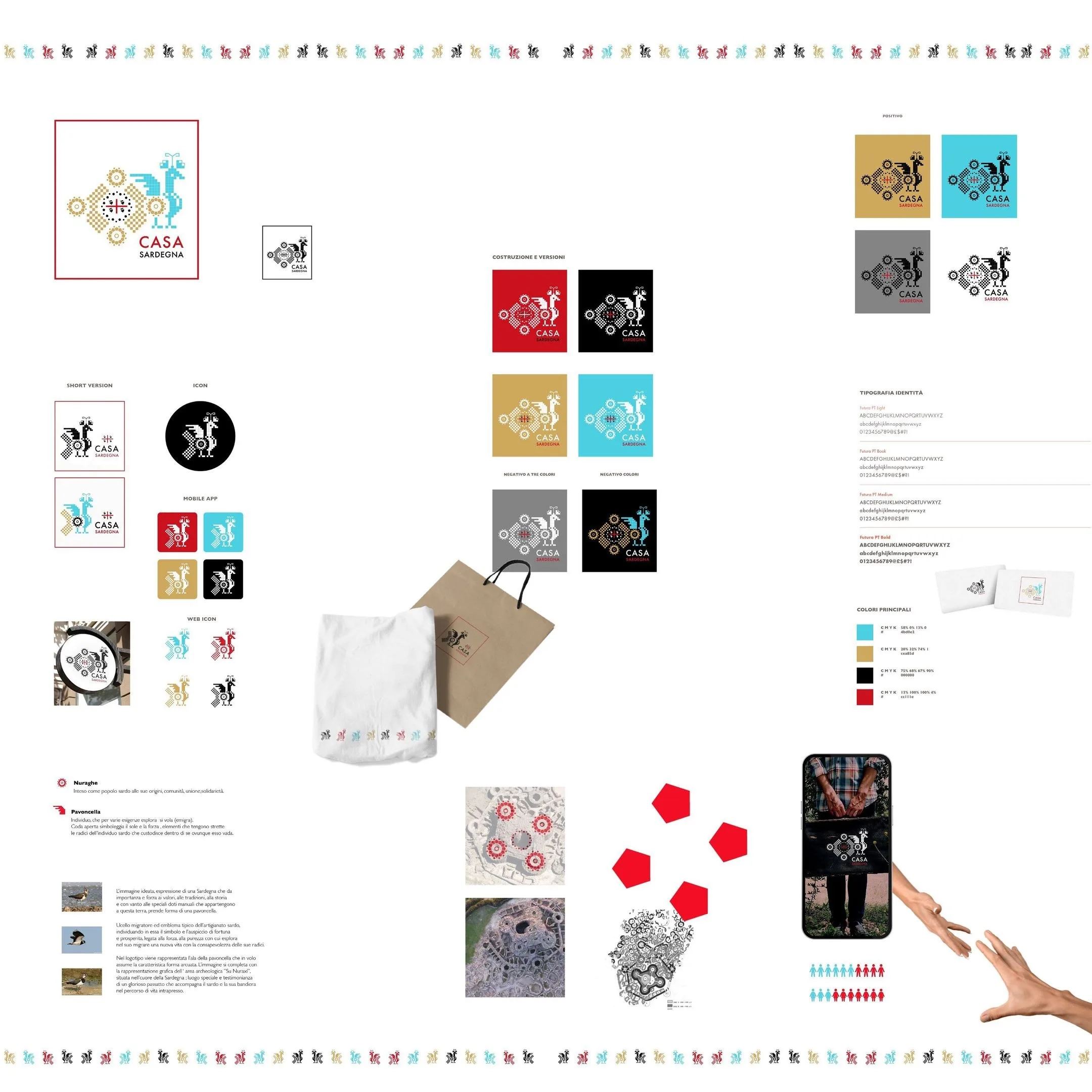
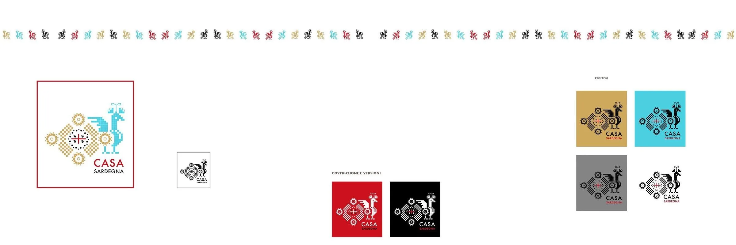
Mark and identity for Casa Sardegna: two symbols of the island built on the same grid as the embroidery, a palette of four tints and the whole set of versions, down to the app icon.
- Year
- 2022
Context
Casa Sardegna came out of an invitation-only call from the Regione Sardegna, the island's regional government. The mark had to say Sardinia to people who know it and to people who have never been, without turning into a postcard.
Challenge
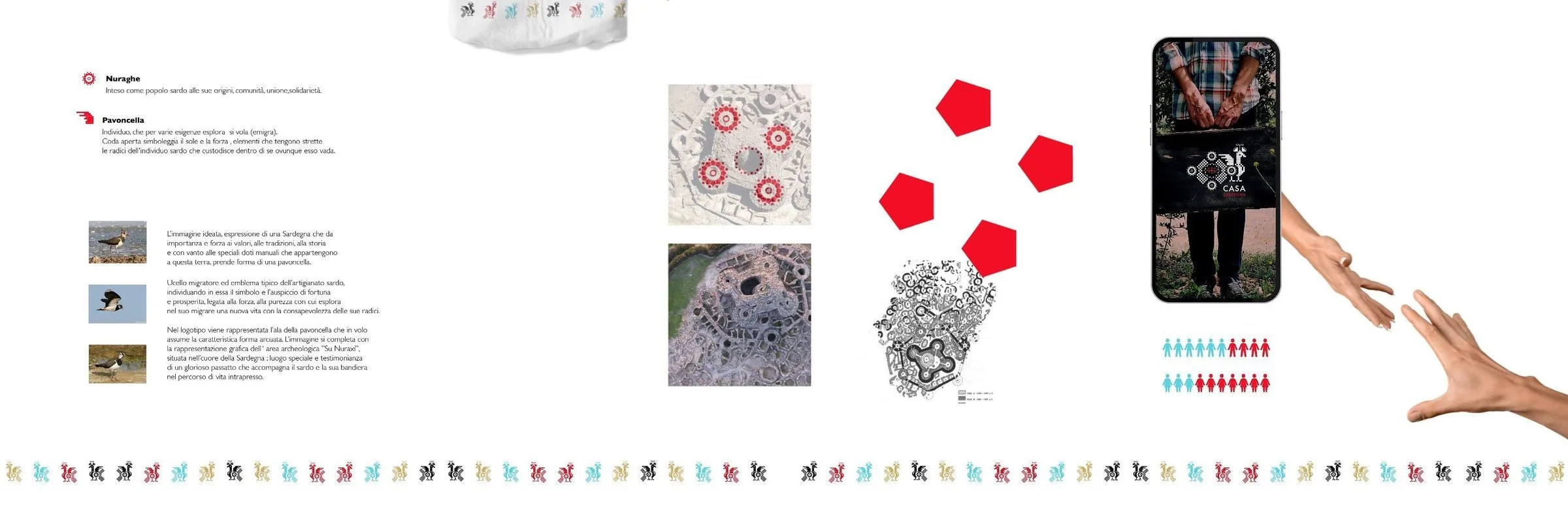
Sardinian symbols already belong to everyone: the nuraghe and the lapwing sit on thousands of things. Using them was not the problem — the problem was not drawing them the way everyone else draws them.
Design
The grid. The two symbols are not illustrated, they are built: every shape sits on a square grid, like a cross stitch. It is how cloth has been decorated in Sardinia since long before logos existed, and it is also why the sign holds up at one centimetre a side.
The two signs. The nuraghe is the people at their origin: community, union. The lapwing — the pavoncella — is the bird that comes back, so it is the tie to the land of those who leave.
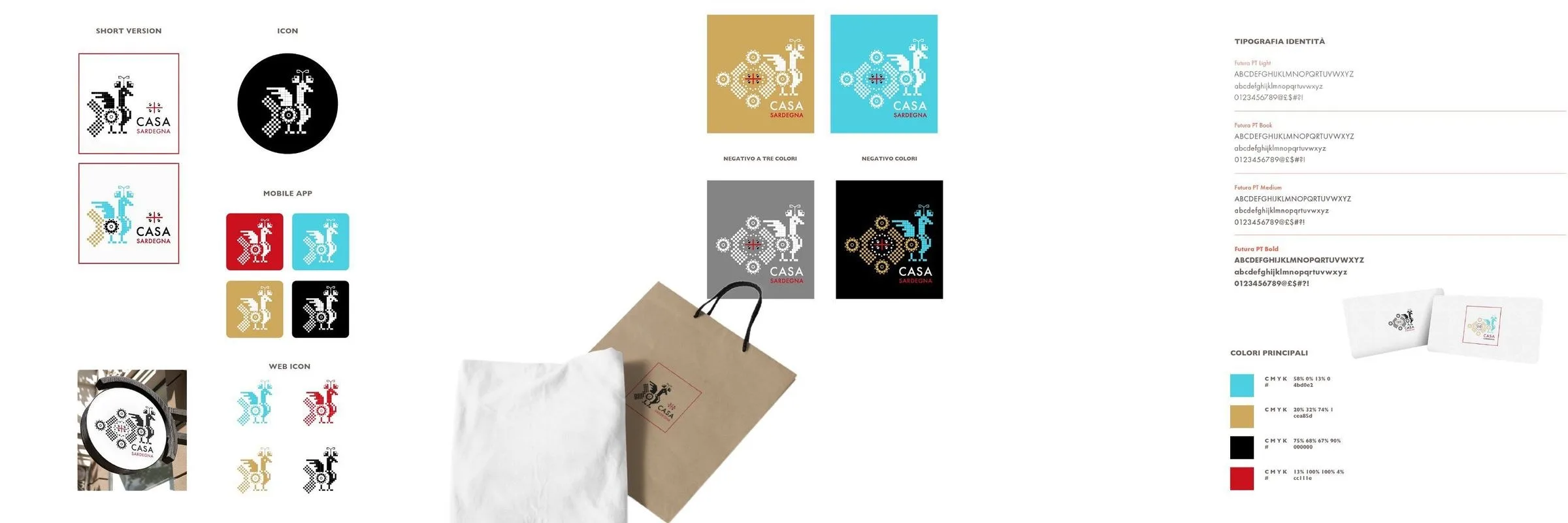
The tints. Light blue, ochre, black, red. Four of them, and never all together in the same application: the mark lives in positive on each and in negative on the two dark ones.

Applications
Short version, icon in a circle, icons for the mobile app and for the web. Then the things you can hold: the kraft paper shopper with its printed label, the cloth bag with the band of symbols along the bottom, the cards. The band is the part that survives reduction — when the mark is too small to read, the rhythm stays.
Board by board.