La Rosa Gentile
Brand identity for the La Rosa Gentile association: mark, colours, campaign.
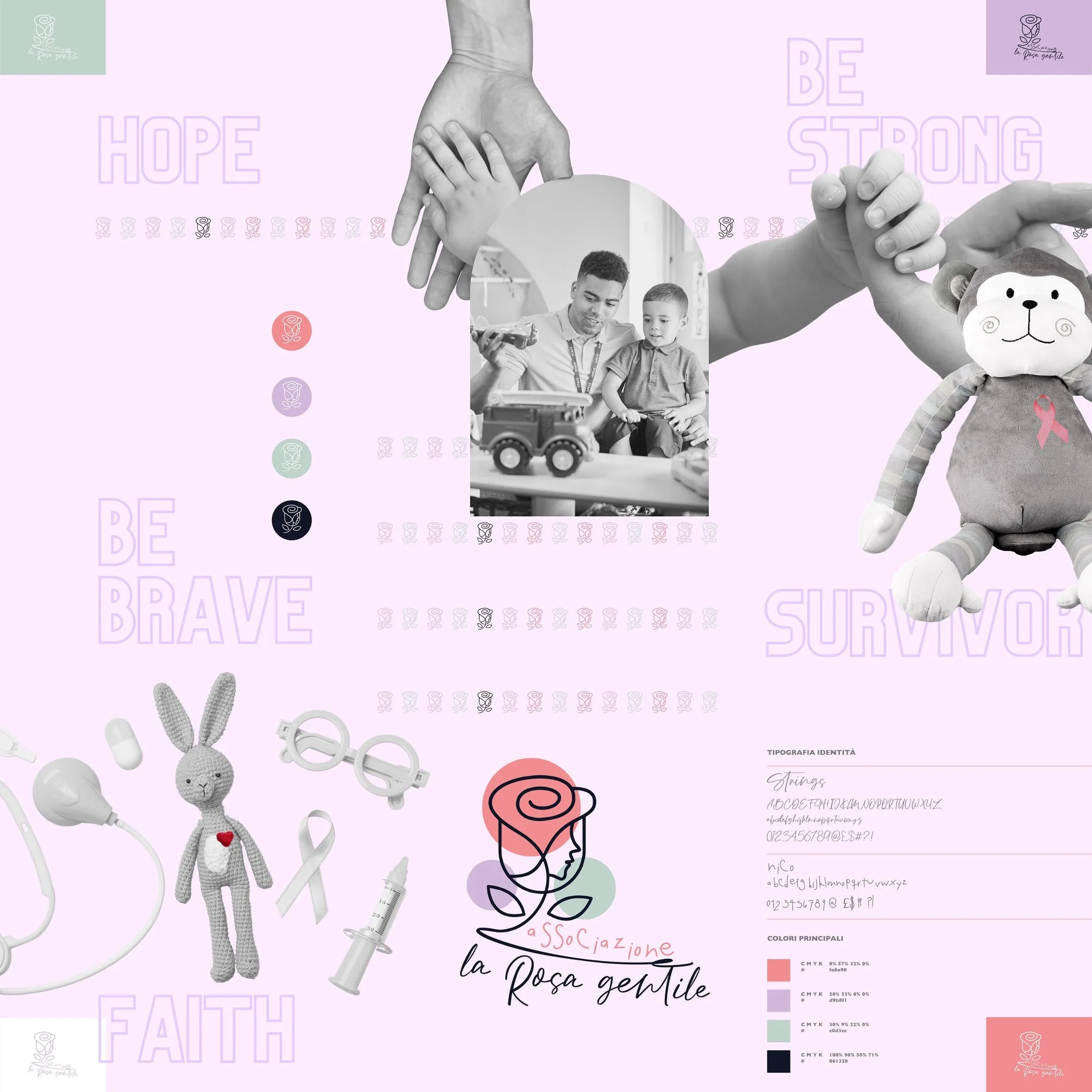
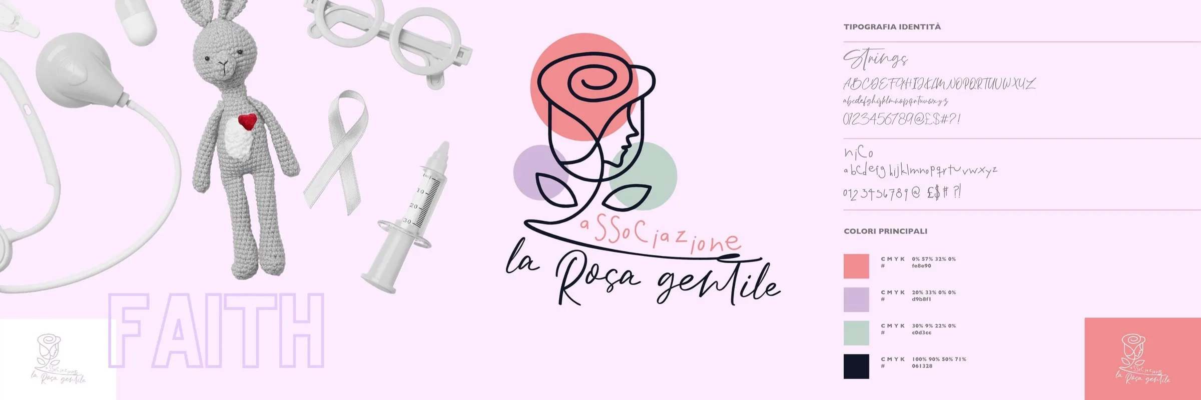
Brand identity for Associazione La Rosa Gentile: the mark where the petals draw a profile, a four-colour palette documented in CMYK and hex, two hand-drawn typefaces and a campaign of words in black and white, from hope to survivor.
- Role
- Mark and wordmark, Colour system and typography, Pattern and social kit
- Year
- 2022
Context
La Rosa Gentile is an association. The name already sets the tone: gentleness, care, a presence that keeps you company. It needed an identity that spoke to families and supporters without the grey of institutions and without the sugary pink that makes everything look the same.
Challenge
The risk with a rose is drawing a rose. Any flower, like a thousand other associations. It needed a sign remembered for a reason, and a system simple enough to be used by volunteers, not by designers.
Design
The mark. A rose drawn in one continuous line, where the edge of the petals becomes the profile of a face. Behind it, three pastel discs: coral, lilac and sage green. Below, the name handwritten in two typefaces: associazione in print, la Rosa gentile in script.
The colour. Four colours, each with CMYK and hex written on the board: coral, lilac, sage and a night blue for text. So the mark comes out the same from the printer and from the screen.
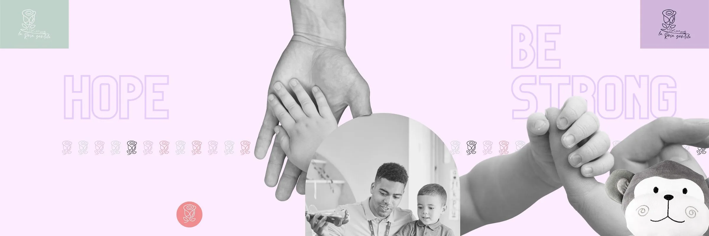
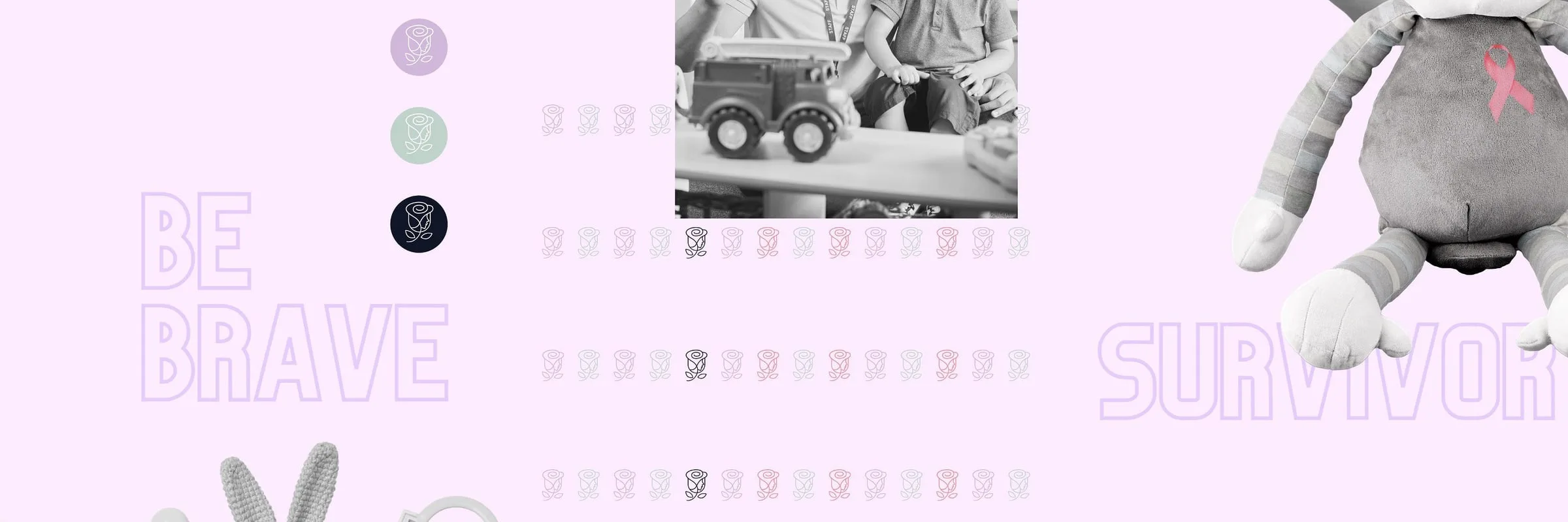
The pattern. The small rose, repeated in a row in the three colours, works as border and background: the simplest way to dress a post or a flyer without touching the mark.

Applications
The campaign is made of words, one per image: hope, be strong, be brave, survivor, faith. Large, in lilac outline on the pink ground, next to black and white photographs: hands holding each other, an adult playing with a child, a plush toy with the pink ribbon, a cloth rabbit with a toy doctor's kit. The Instagram grid was set up as nine tiles that read together.

- Colours, with CMYK and hex declared
- 4
- Campaign words, from hope to survivor
- 5
Results
A mark recognised for the face hidden in the rose, and a kit of colours, typefaces and pattern with which the association produces its own materials, keeping the hand we gave it at the start.
Board by board.