
UX/UI design for websites, apps and business software
An interface is judged by the person using it on a Tuesday morning, not by the presentation.
- founded
- 2018
- projects delivered
- 200+
- clients in Sardinia and across Italy
- 65+
- nomination
- Awwwards
- projects for this service
- 1
We do UX/UI design for websites, apps and business software: an audit of what you have, interface design, clickable prototypes and design systems. The work starts from the people who use the product every day and ends in files that your team, or ours, builds from without translating. We work with companies in Sardinia and all over Italy.
A digital product gets complicated one feature at a time. Each addition makes sense on its own, and after two years the screens no longer look alike, the menu has items nobody opens and support keeps answering the same three questions. The problem is not the people using it: it is the interface.
Our UX/UI design starts there. We watch who uses the product and what they are trying to do, then we design the shortest path and the screens that follow it. We have done it for a yacht broker with 180 yachts in its catalogue, for a communication app for people with ALS, and for an online Pilates platform with subscriptions and gift cards.
For us, user experience design is work that ends up online, not in a presentation. The same studio designs and develops: the interfaces we draw are the ones that go into production, and the UI design takes account from the start of what the code can do well.
We do UX/UI design in Sardinia and all over Italy. Here the products we design often live by the season: bookings, catalogues, fleets that in August are used ten times more than in February. An interface that handles the peak without confusing anyone is the same one that works for a company in Milan.
Who we do it for.
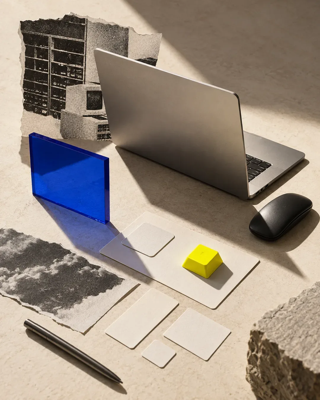 SaaS & Digital ProductsA product that grew feature by feature, with screens that no longer look alike: the design system puts things in order before the next release.
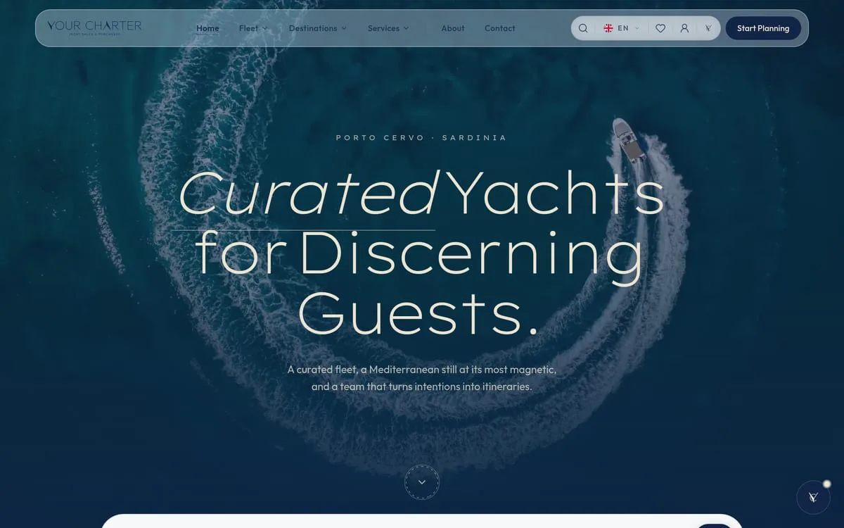
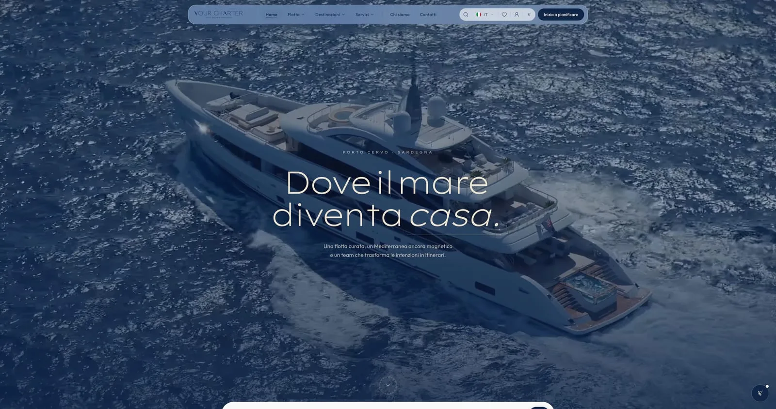
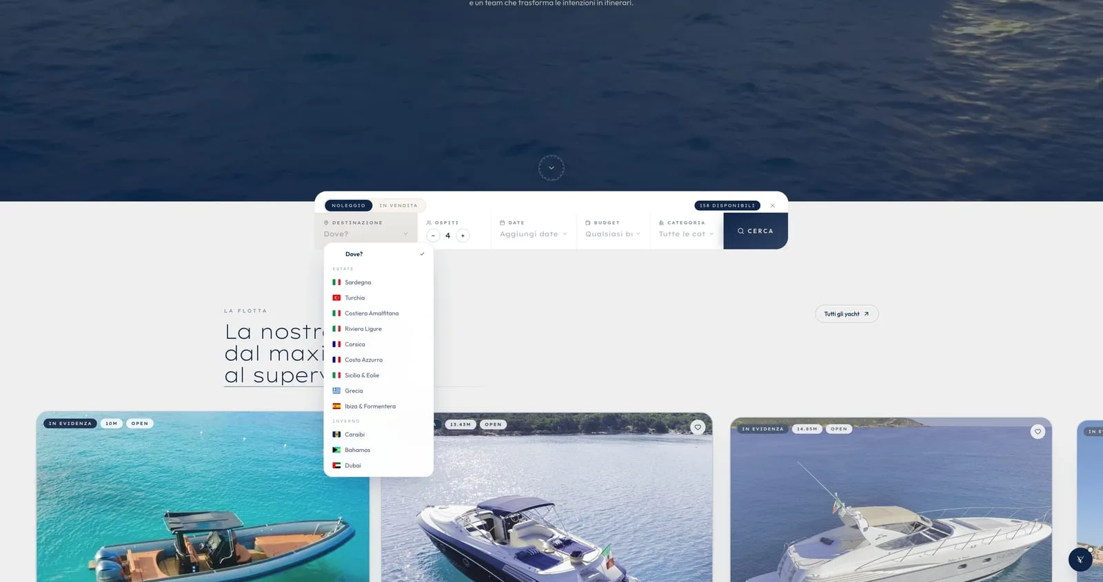
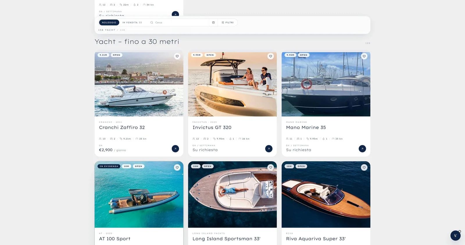
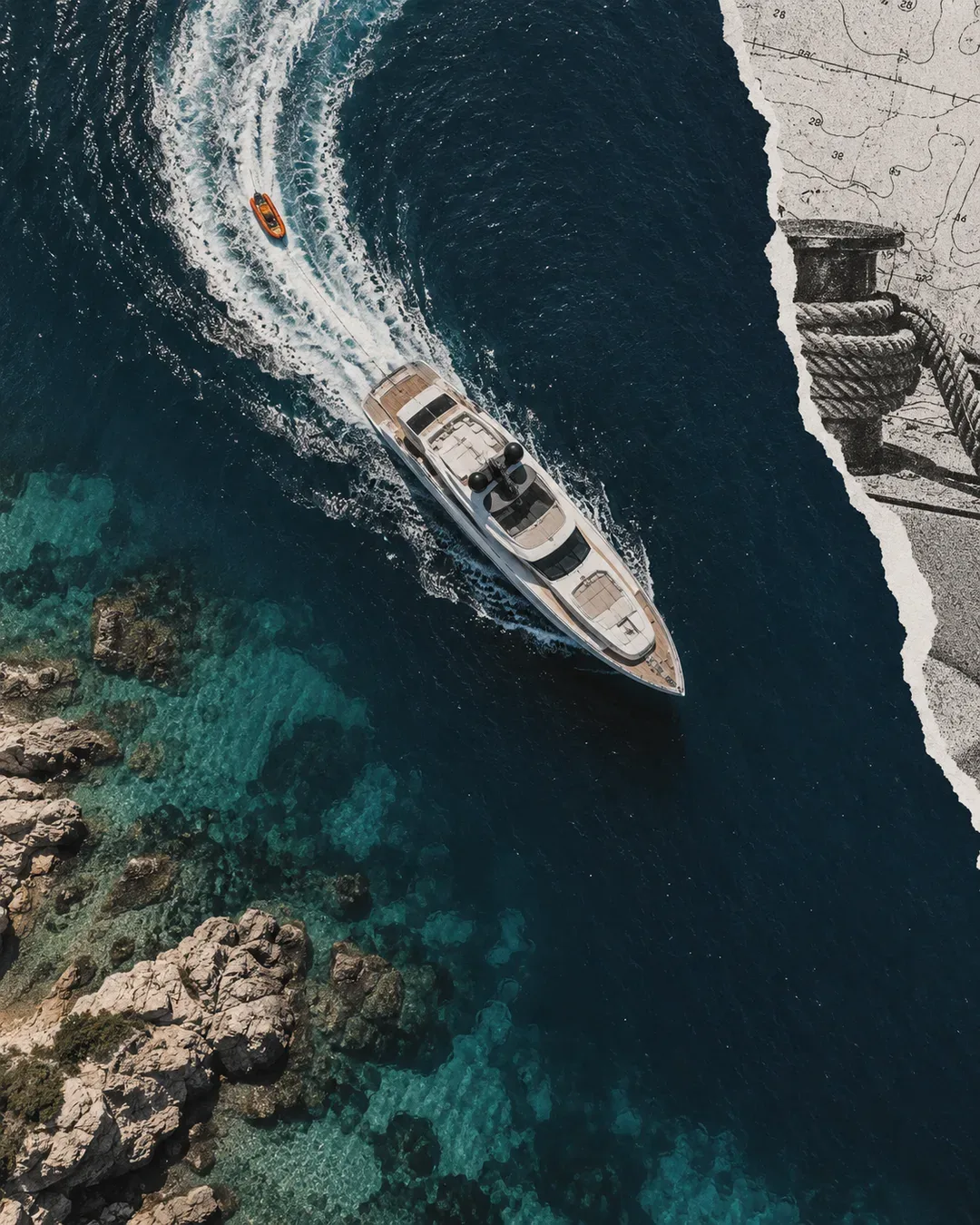 Yachting & MarineLarge catalogues to browse on a phone, on the quay: search, listings and enquiry within thumb's reach, as for Your Charter.
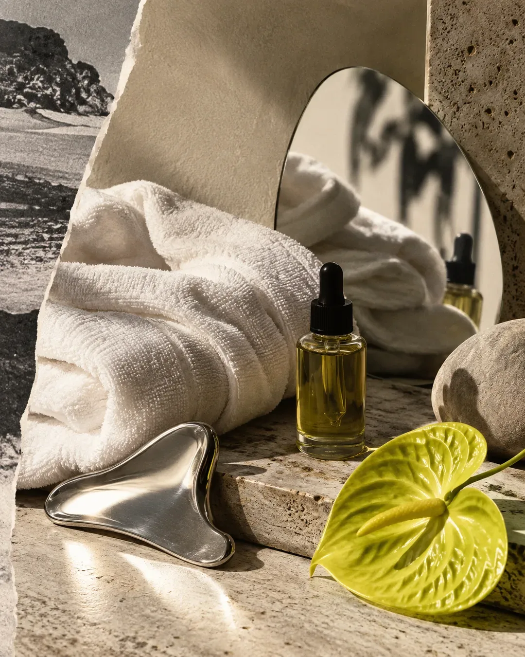 Wellness & BeautyBooking, paying for a package, sending a gift card: three actions that have to work first time, even for someone who opens the app once a month.
We also do it for
What's included.
TRY IT
The design comes from where people stop, not from what we like.
02
UX audit
We start from what is there: where people stop, where they go back, where they write to support because they can't find a button. The UX audit ends in a list of fixes in order of weight, not in an aesthetic verdict.
03
Interface design
Interface design begins with the most frequent action. For Flow Porto Cervo it was finding a class and starting; for business software it is entering a figure without hunting for the field. Everything else is arranged around it.
04
Prototypes on real cases
Clickable screens with your content, not placeholder text. The people who will use the product try it before it exists, and that is where you discover the menu item nobody understands.
05
Building a design system
Colours, typefaces, spacing and components with their rules, in one place. Building a design system pays off when several people design or develop the same product; we have written about when it is worth it and when it is a waste in our article on when you need a design system.
06
Accessibility
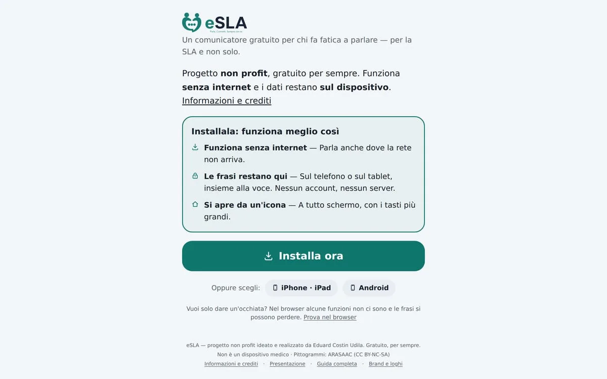
Contrast, button sizes, readable text, keyboard navigation. For eSLA every choice answered a single question: does it work when the hand shakes and the light is low?
Listening and data
Interviews with the people who use the product, analytics, support requests. The result is the list of real problems, with the weight of each.
Flows
The path of each task, step by step, before any screen: this is where a pointless step is removed without arguing about colours.
Prototype
Clickable screens with real content, tried by the people who will use the product. We correct here, when a change costs an hour.
Interfaces and system
The final screens for desktop and mobile, with the design system components and the states nobody draws: error, empty, loading.
Handover and checks
Specifications for development, a review of what goes live, a check on the numbers after launch.
What we build it with.
We design in Figma, with components and variants that match the ones in the code. When we do the development, the design system lives in the code as well, in React and TypeScript, with shared colour and size tokens. This site is built that way: a single design system, with components and rules we use every day.
- Figma
- FigJam
- React
- TypeScript
- Design tokens
- Google Analytics
Audit or redesign?
Not every awkward product needs redesigning from scratch. The difference lies in where the problem is.
When an audit is enough
The product works, but three or four points lose people: a form that is too long, an ambiguous menu. We fix those, in a few weeks.
When you need a redesign
Every added feature has its own logic, the screens no longer look alike and support keeps answering the same questions. There we start again from the flows.
When you need a design system
Several people work on the same product and each one remakes their own button. The system saves time from the second release onwards.
Real projects.
Your Charter
180 yachts across 11 destinations without reducing them to anonymous listings: a photographic interface, search and enquiry always within reach, a hierarchy that keeps a large catalogue in order.
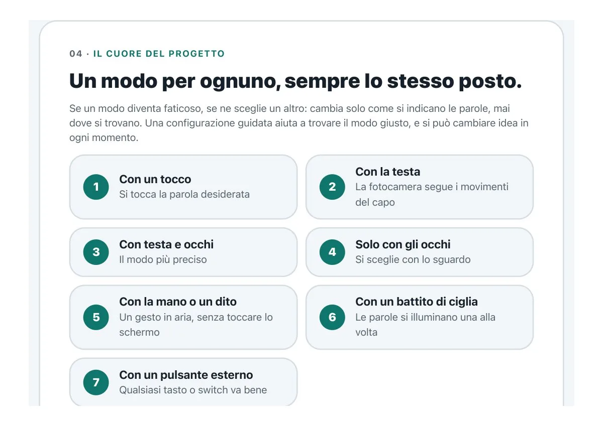
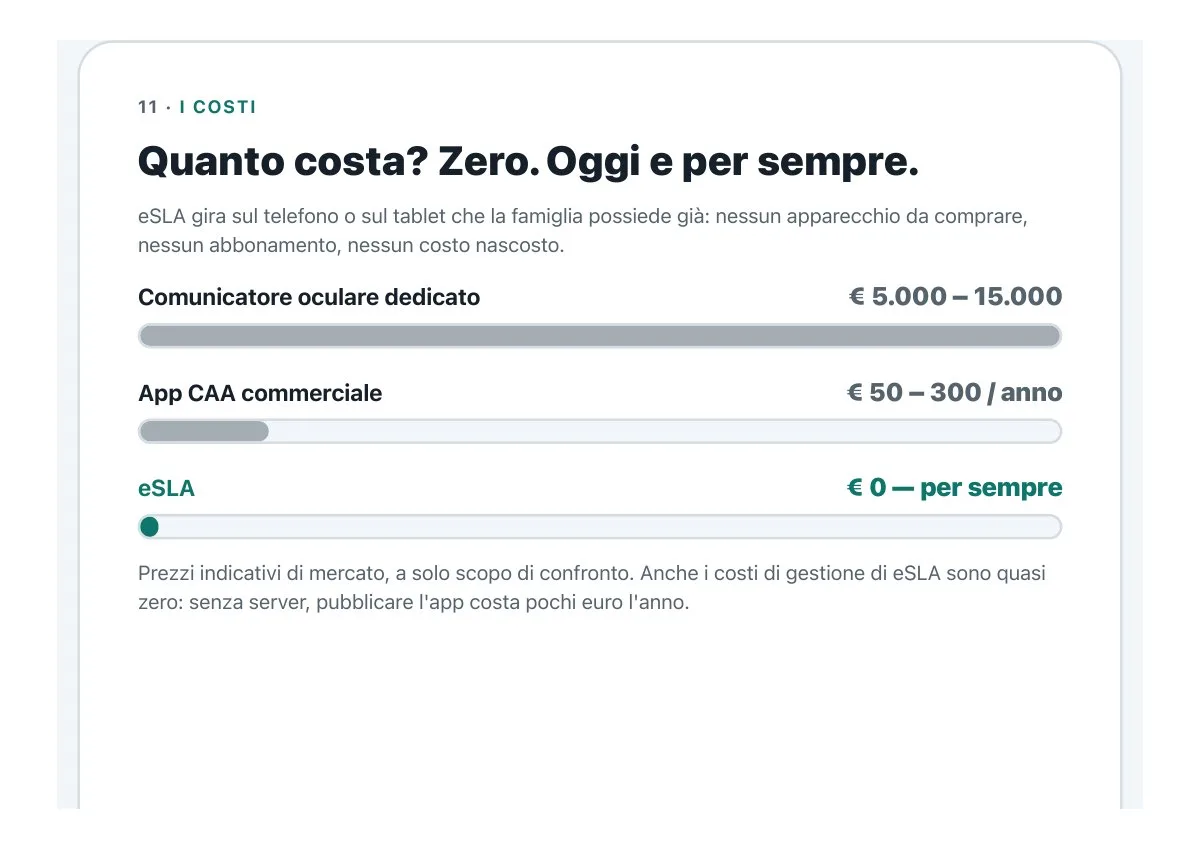
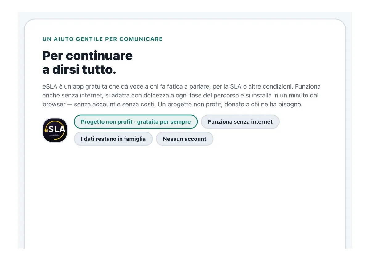
eSLA
A communication app for people with ALS: large buttons, high contrast, nothing to learn, and a calibration that guides the family step by step.
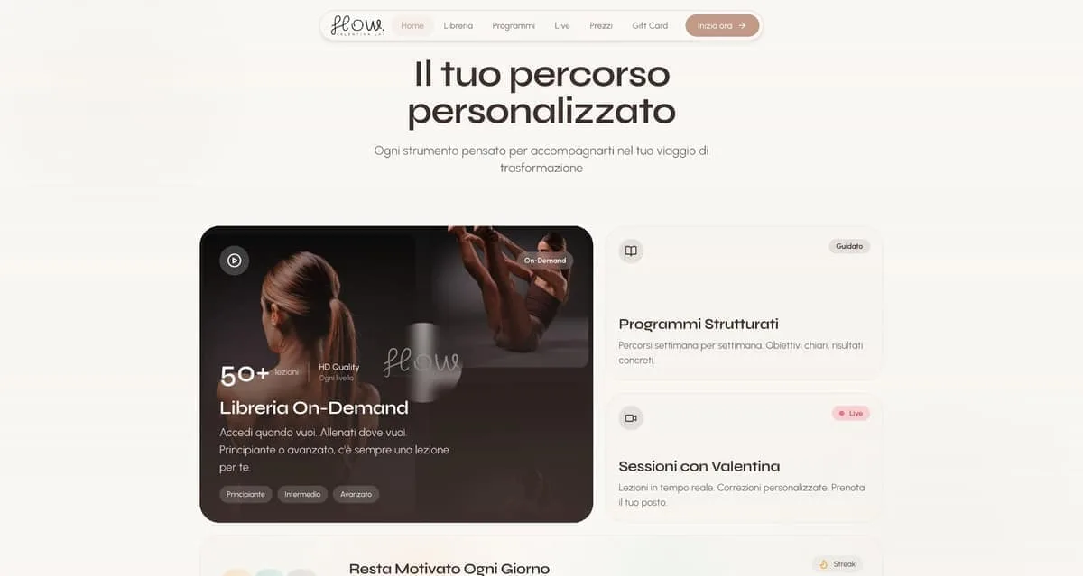
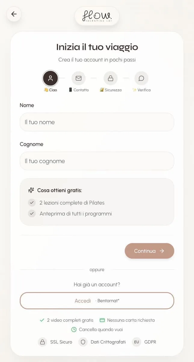
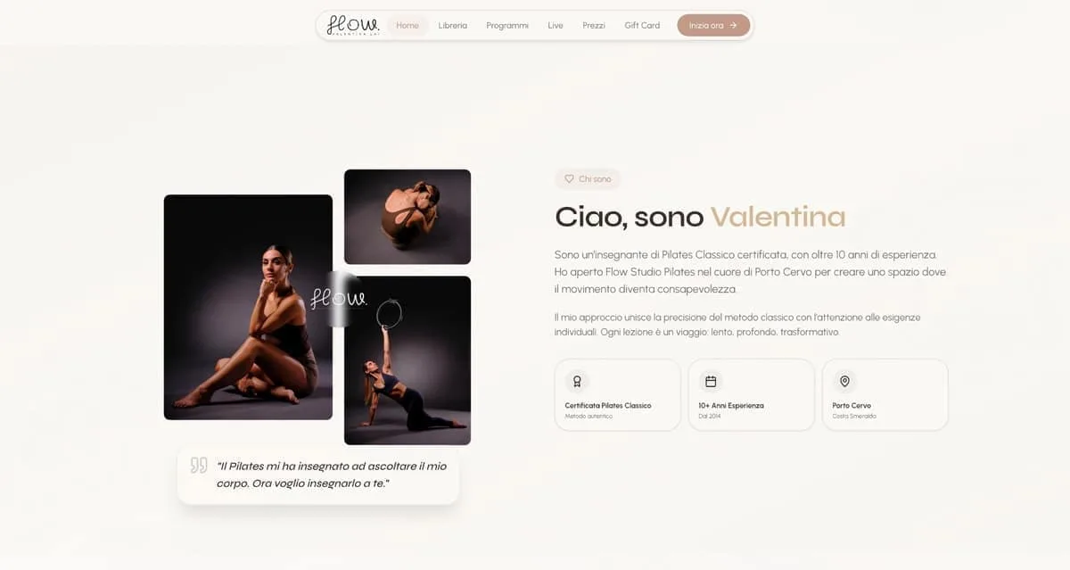
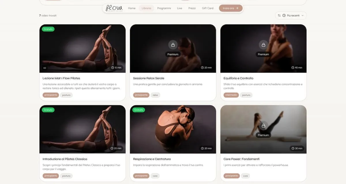
Flow Porto Cervo — Pilates Online
Online Pilates: the library scrolls in a few seconds, the three plans sit side by side with no ambiguity, the gift card can be seen before it is sent.
What clients say.

In the world of bilingual yacht charter, the first impression on the web is worth everything. Now our platform is fast, elegant, and provides all the technical details it takes to bring clients on board without a worry.
Your Charter

Sanluri is not just a building site. It is the first demonstration that in Sardinia you can build differently — faster, more sustainably, more safely.
Green Tech Costruzioni

We wanted our beauty suite to convey elegance and relaxation from the very first moment. With this new identity and the integrated booking system, clients walk in already in the right frame of mind for wellness.
Estetica Valeria
In our restaurant in Olbia the care for the kitchen goes hand in hand with the guest's experience. Between the digital menu and smart reservations, whoever comes to see us enjoys dinner without a hitch, starting from the choice of table.
La Sartoria del Gusto

Our physical studio in Porto Cervo needed a website as polished as our rooms. Now managing schedules and classes is smooth, and whoever steps in online finds themselves immersed in our very atmosphere.
Flow Studio Pilates

Our floral installations live on detail and immediate visual impact. Having such a well-kept digital gallery lets us show clients our value straight away — and they often give us carte blanche.
Ketty Flowers Designer

At our polyclinic in Palau we care for patients of every nationality, so a multilingual welcome in no fewer than eight languages is vital. Having a perfectly structured website has removed any misunderstanding and sped up access to appointments.
Medica Palau

Telling Sardinia without falling into the usual tourist clichés was our real challenge. This brand and the visual identity we built with the team have tremendous strength and breathe the authentic soul of the island.
Sarda Trips
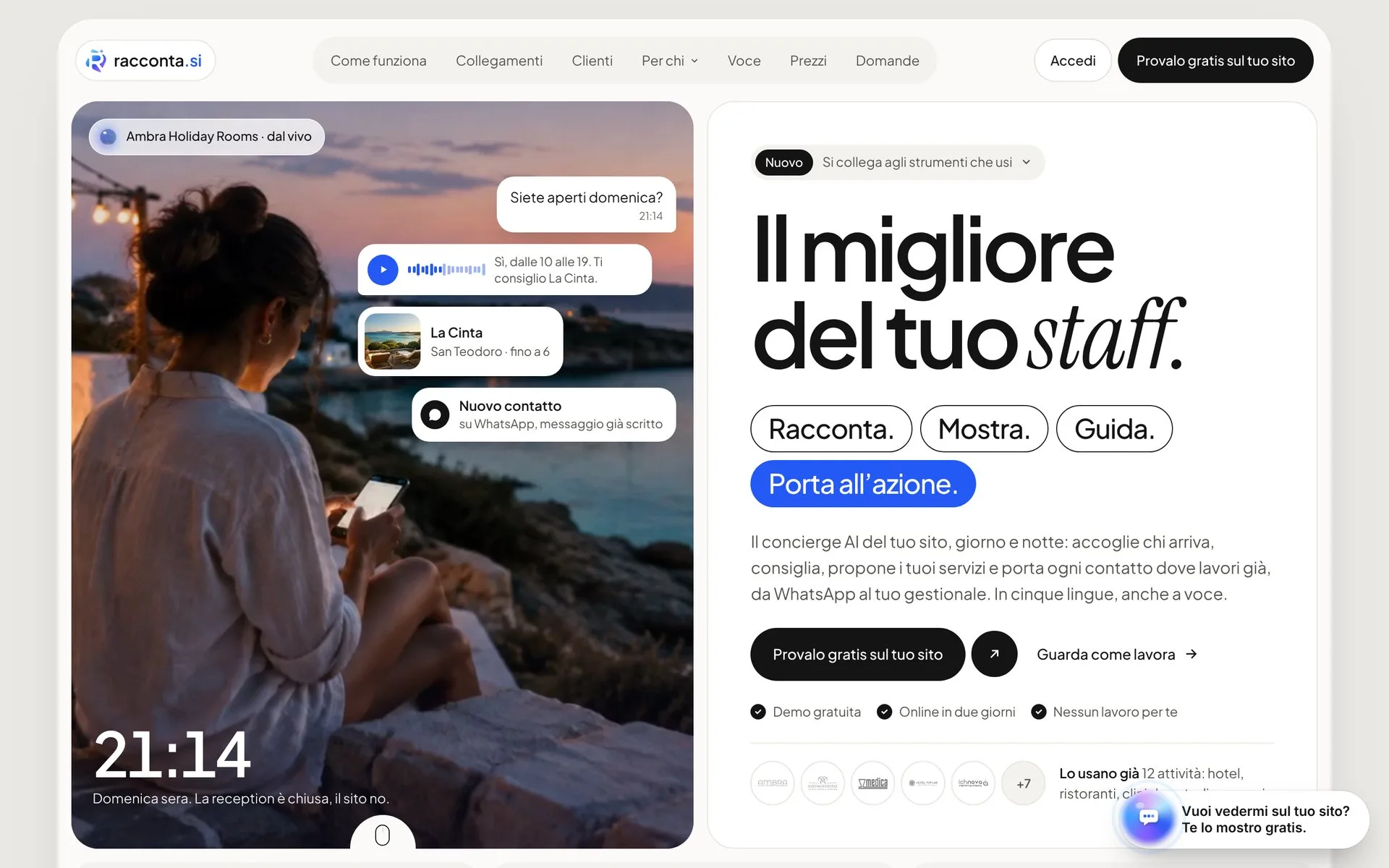
Managing eight lodgings between San Teodoro and Porto San Paolo without handing a small fortune to the big booking platforms seemed a pipe dream. Since we have had our own direct channel, margins can breathe again and guests reach us without intermediaries.
Ambra Holiday Rooms

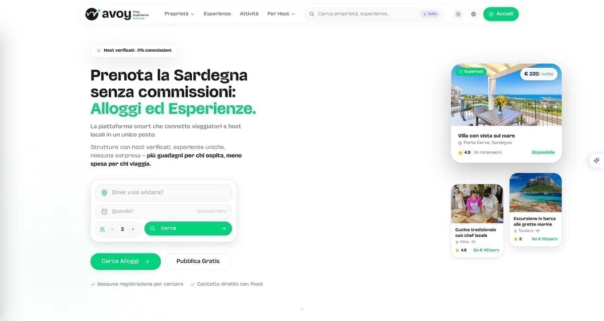
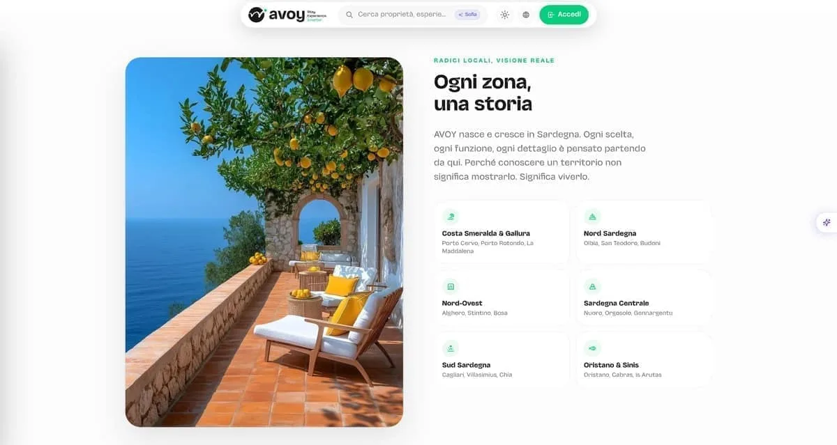
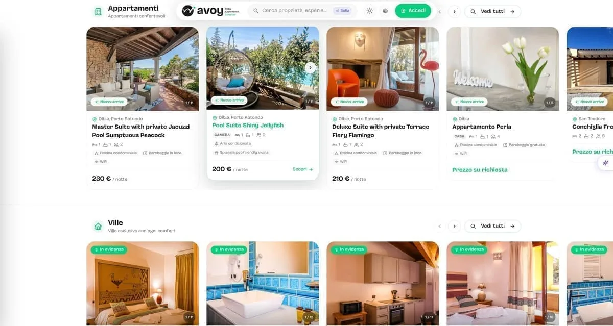
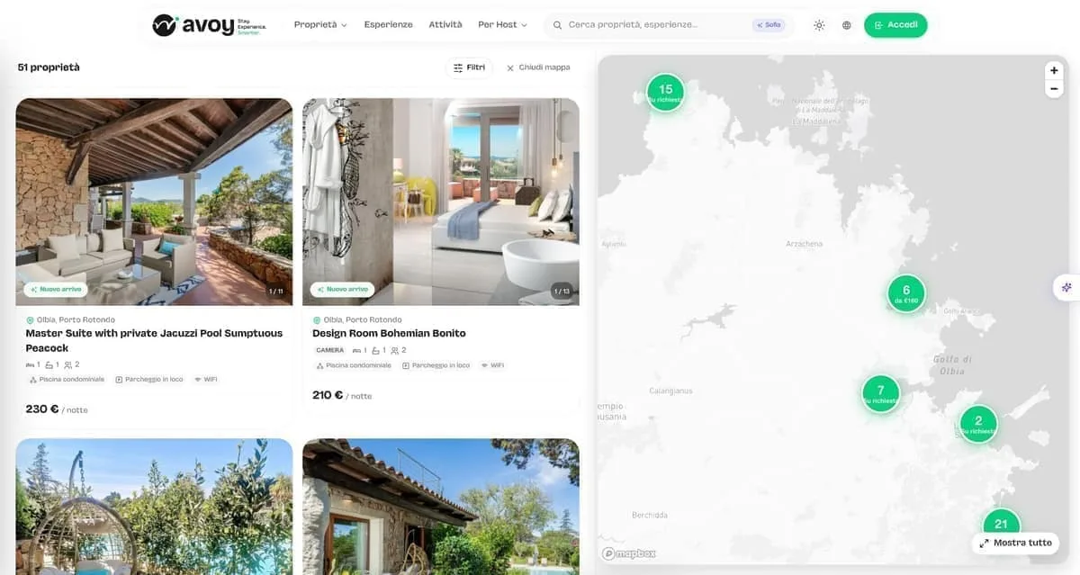
We needed a Sardinian listing platform that highlighted both stays and local experiences, giving owners visibility without punishing fees. With Avoy we have the right tool: fast, organised by category, and without crazy commissions strangling the business.
AVOY
In Sassari we wanted to position ourselves as the Longevity Wellness centre of reference, stepping out of the usual patterns. The new brand and the web platform literally jump off the screen, communicating pure innovation.
LOWE
With three wine shops on the Costa Smeralda we needed an online meeting point that did justice to our labels. Now whoever is looking for the right wine finds the way home straight away.
In Vino Veritas
Management software for restaurants and hospitality has to be concrete help between the tables, not an IT nuisance. This software turned our internal organisation around, cutting errors to zero and letting us work with a clear head.
hoopit
Before launching the app for our Pilates classes, between Porto Cervo and the digital side we lost hours coordinating chats and phone calls. Now our clients manage live and on-demand classes on their own, and we finally get to enjoy the work.
Flow Porto Cervo
Launching a sustainable streetwear e-commerce with print-on-demand was a complex bet. Now the shop runs perfectly, the graphics stand out at their best, and we can focus on creativity alone without the stress of warehouse stock.
Fionard
In our line of work roadside assistance allows no waiting, and the workshop has to be a byword for total reliability. Having such a direct digital point of reference lets customers find exactly the seriousness we put on the road every day.
CDA Servizi Auto
As a creative studio we were tired of having a sloppy image. We finally have a website and a portfolio worthy of our capabilities, which speak plainly to anyone who means business.
Wonder Creators
Companies we've worked with.







- Your Charter
- Estetica Valeria
- Fondazione di Sardegna
- Avoy
- Fionard
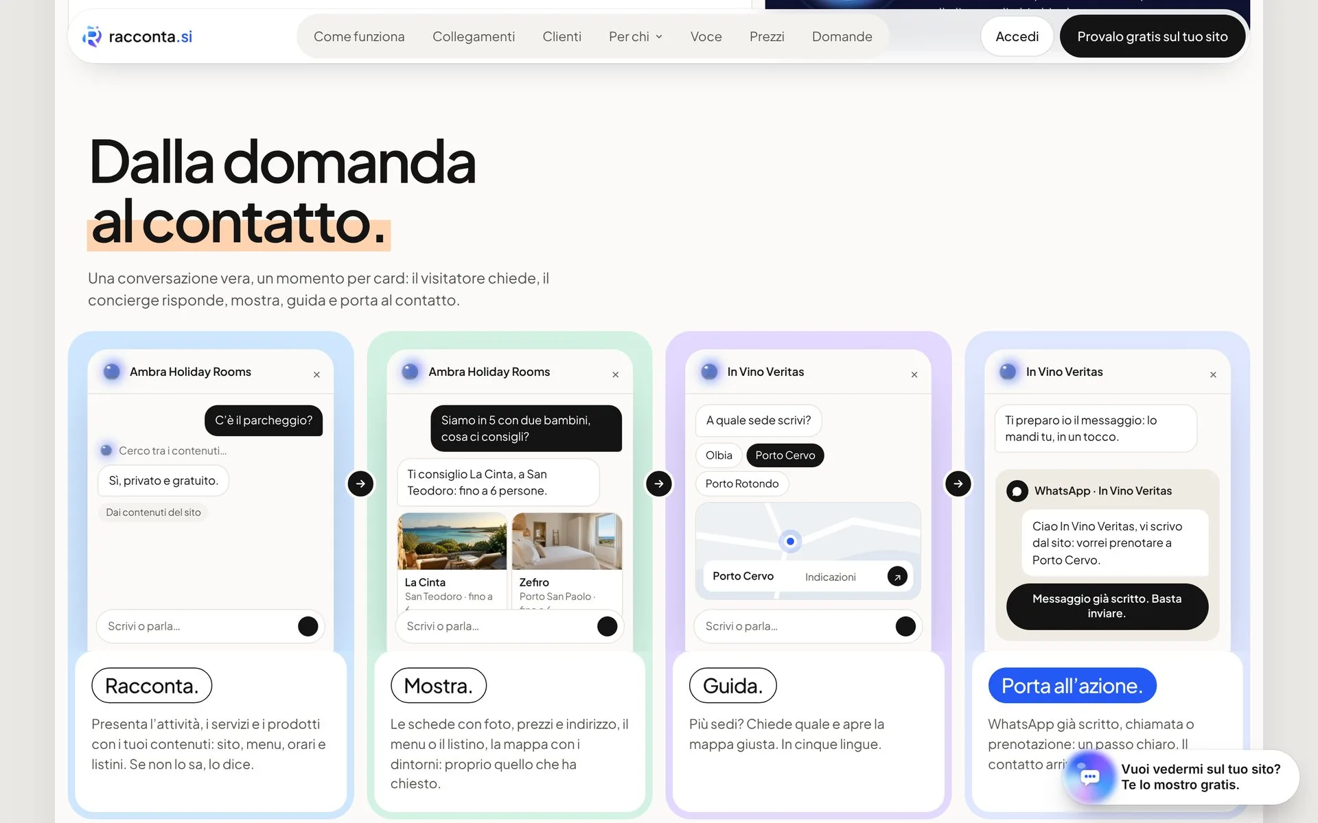
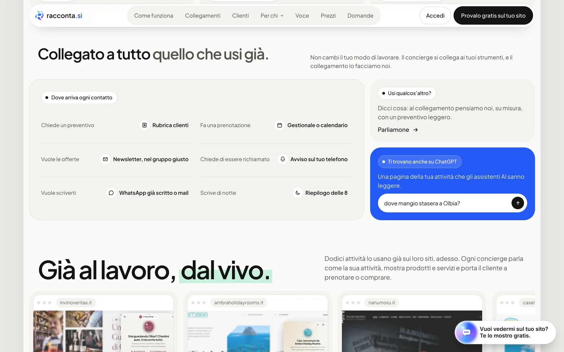
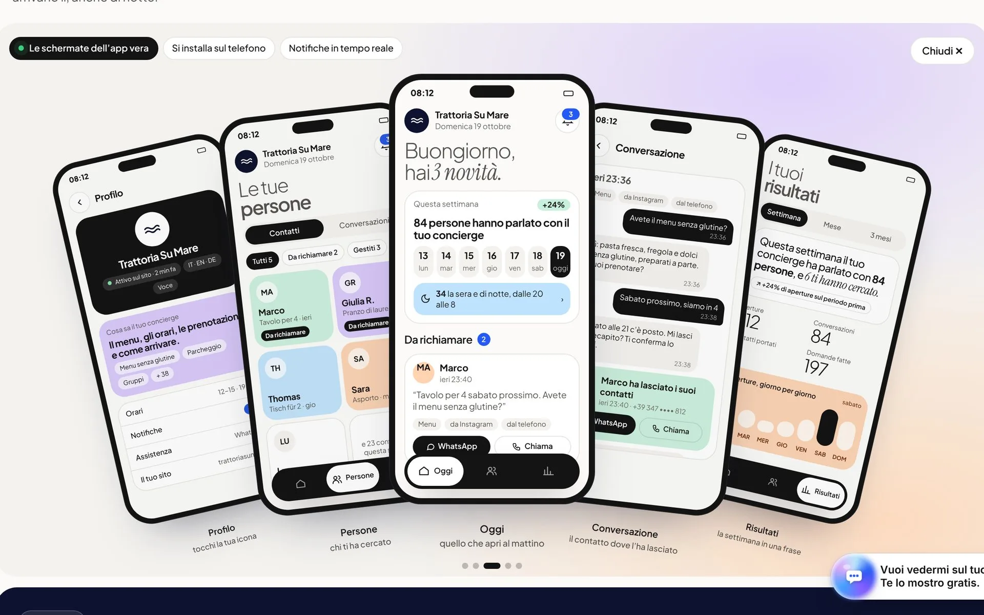
- racconta.si
- Cantine Antigori
- Tenuta Stalder Guiso
- Nanumoru
- Hopfenberg
- Versilia Weimar
- Sa Republica Sarda
- Sud Delivery
- Impresa Restaura
- Green Tech
- Studio Legale Senis
- Avvocato Zuddas
- Manufatti Vinci
- Viapixel
- Tecnicoffee
- Saditappo
- Academia de su Sardu
- Agenzia Labix
- Been Energia
- Il Redentore
- Studio Foto Immagine
- CDA
- Osua
- Punta Falcone Resort
- 5 Star Mooring
- IVV
Frequently asked.
It depends on how many screens and flows there are, and how much there is to observe first. An audit on an existing product and an app designed from scratch are different jobs: the quote is written and free, from the configurator at /en/quote/.
A UX audit usually takes a few weeks. A full design runs alongside development: the first flows are tested as prototypes while the rest is being designed.
Both. We can hand Figma files and specifications to your development team, or build websites, apps and business software ourselves on the same project.
You do. Figma files, components, rules and specifications pass to the client at the end of the project, and another team can pick them up without starting again.
Yes. Interviews, prototype reviews and tests work well on a call, with a shared screen. We work this way with companies all over Italy.
UX/UI design
An interface is judged by the person using it on a Tuesday morning, not by the presentation.
The price depends on the number of flows and screens, how much there is to observe before designing and whether a design system is needed. A UX audit on an existing product is a different job from an app designed from scratch: the quote is written and free, from the configurator at /en/quote/.
WHAT'S INCLUDED
- UX audit with written priorities
- Flows and information architecture
- Clickable prototypes in Figma
- Interfaces for desktop and mobile
- Design system with components and rules
- Specifications for development