Fondazione Bosa
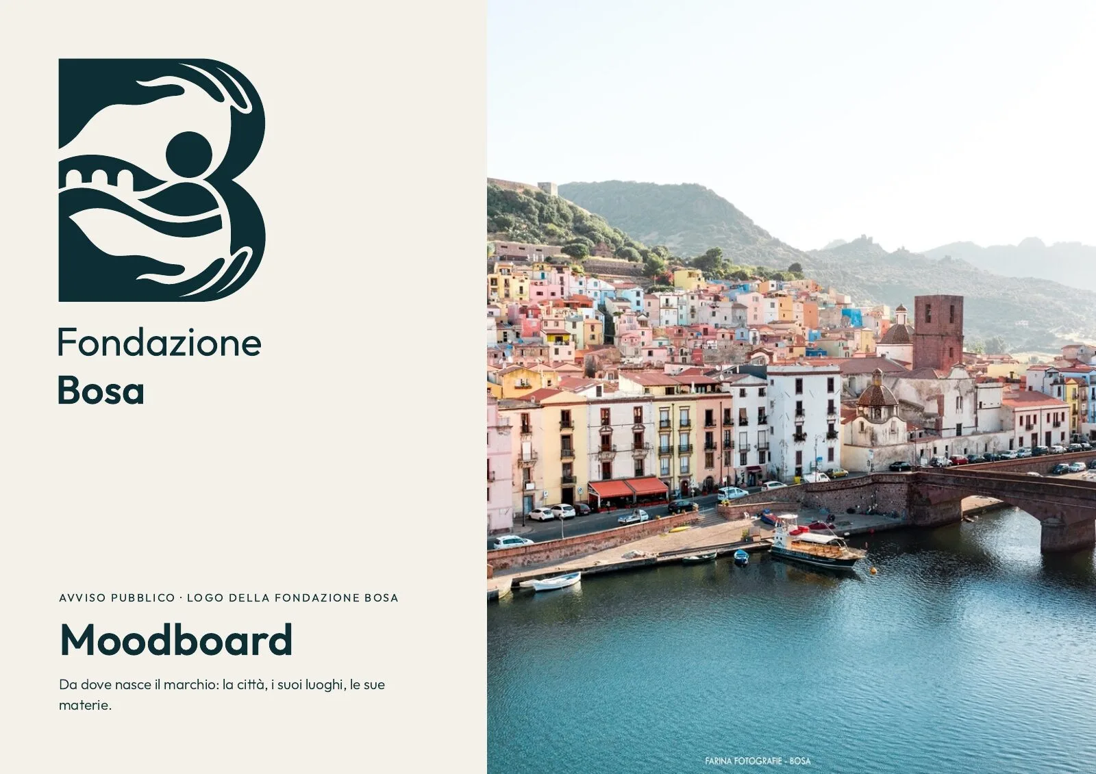
The mark we proposed to the Fondazione Bosa: two hands holding the town.
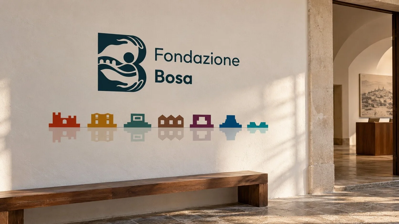
Our entry to the Fondazione Bosa's open call for a logo: two hands that draw the B and hold the Temo river, the bridge and a person. Seven sites, seven icons, seven colours taken from what each is made of, and a frieze mirrored in the river. Full moodboard and brand manual.
- Role
- Mark concept, Vector drawing on a grid, Site system, Brand manual, Applications
- Year
- 2026
- Duration
- Open call
Context
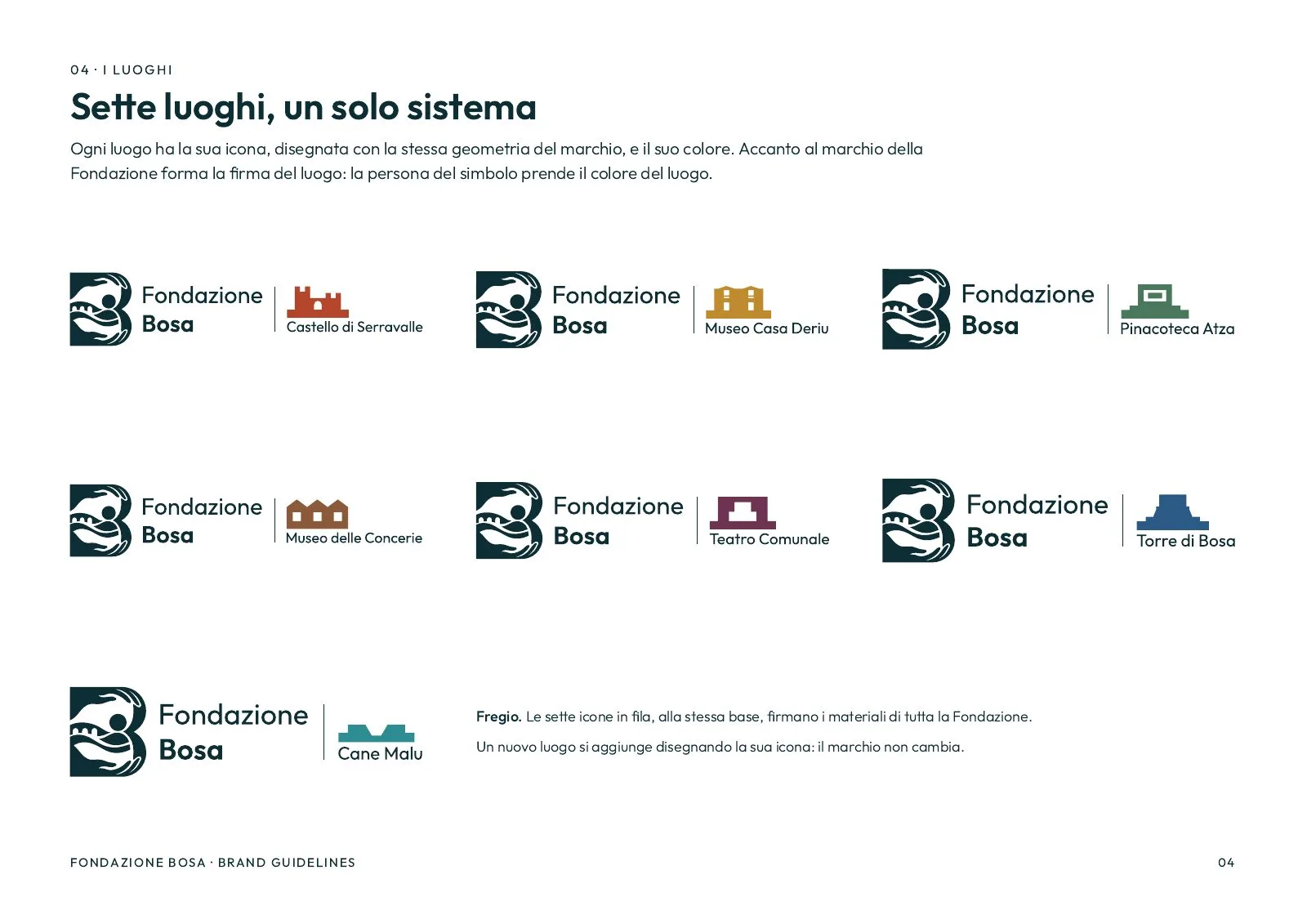
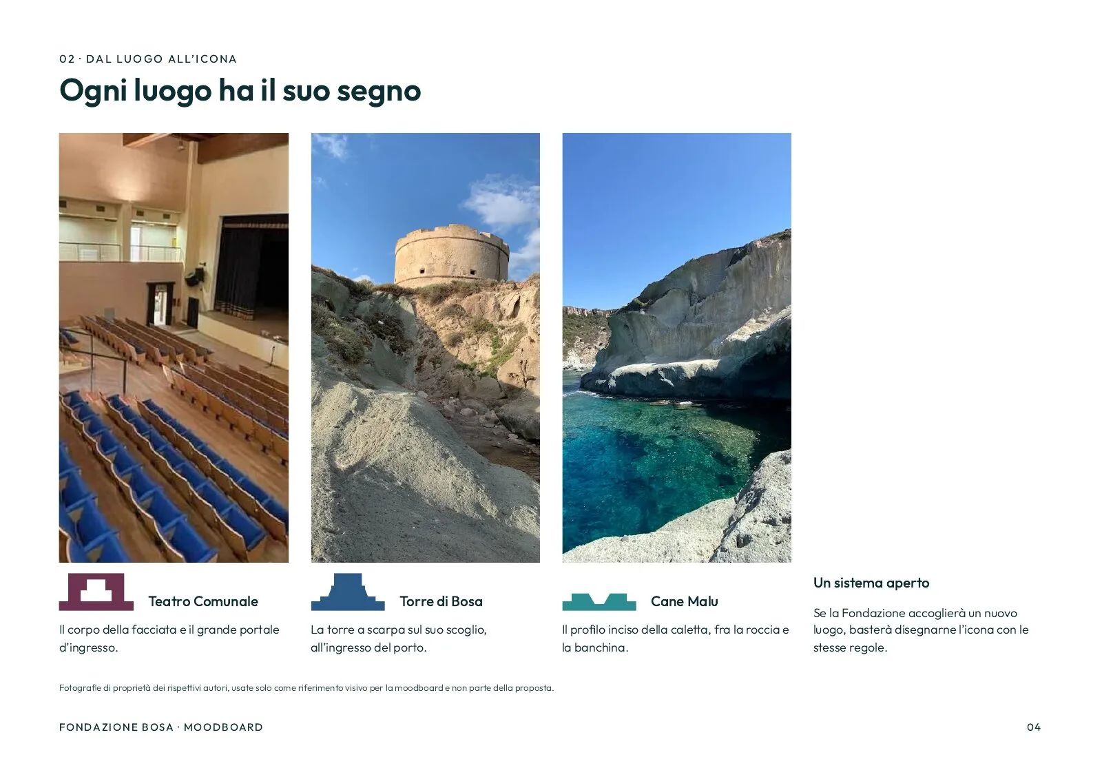
The Fondazione Bosa looks after seven places in the town: the Castello di Serravalle, the Museo Casa Deriu, the Pinacoteca Atza, the Tannery Museum, the Teatro Comunale, the Torre di Bosa and Cane Malu. It opened a public call for its logo, and we entered with a mark, a system for the sites and a brand manual.
Another design won. We publish ours anyway, and say so: it is our work, done in full, and it shows how we think when one identity has to hold several places together.
Challenge
A foundation that runs seven different places can go wrong in two ways. Each site gets its own logo, and the Foundation disappears. Or everything wears the same sign, and a visitor can't tell the castle from the theatre.
It needed one recognisable mark, and a way for each site to speak without redrawing the mark every time.
The mark
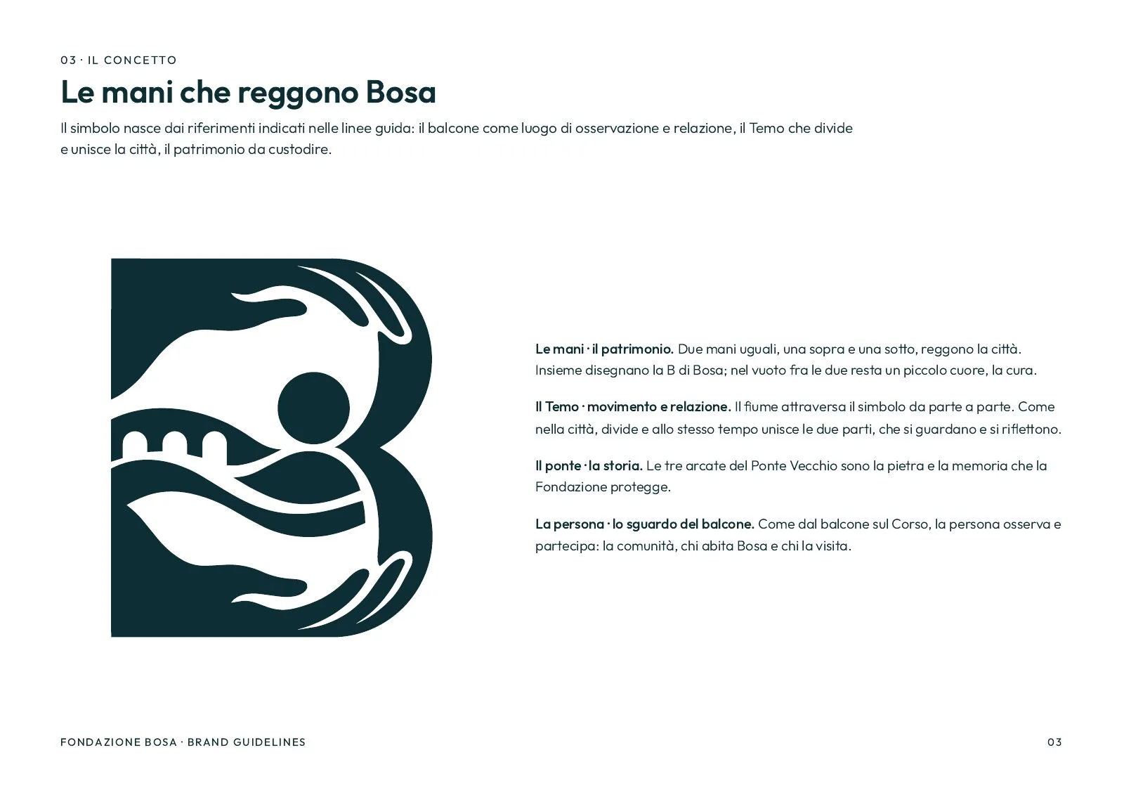
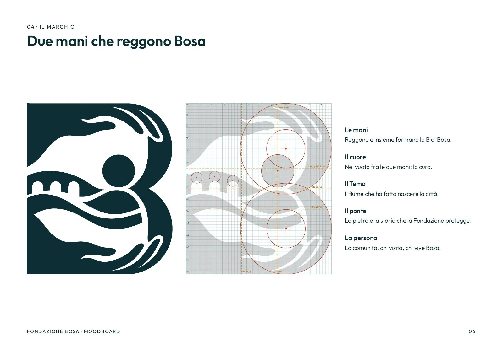
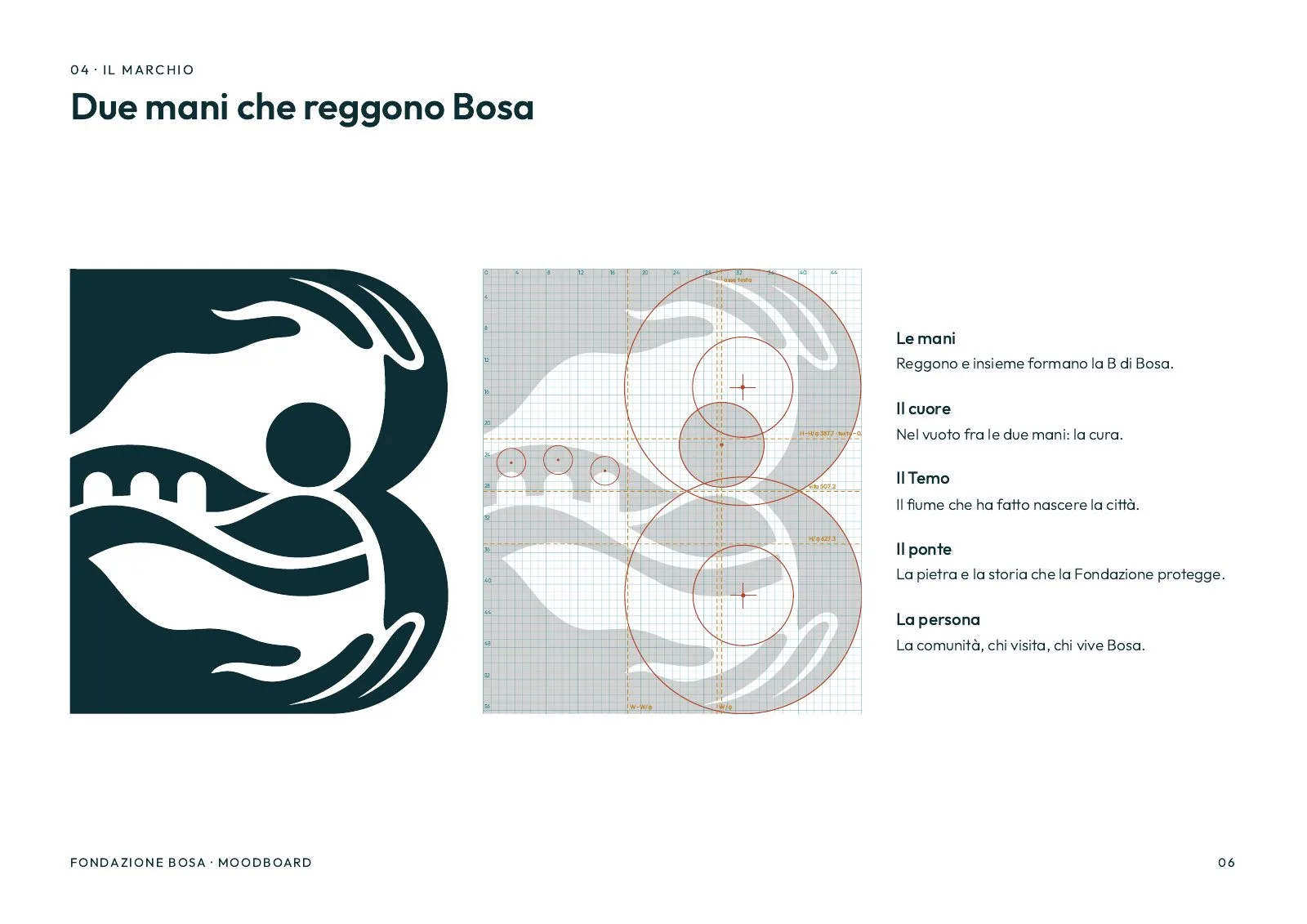
Two hands. One above, one below, identical and mirrored. Together they draw the B of Bosa. In the gap between them sits a small heart: care.
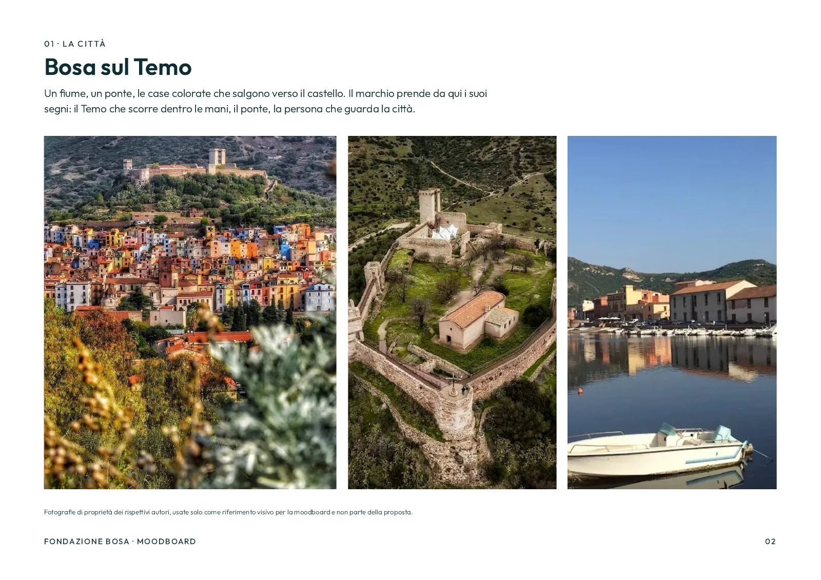
The town inside. Between the hands runs the Temo, the river the town grew from and that still crosses it. On the Temo rest the three arches of the Ponte Vecchio. In front of the bridge, a person looks on, as from a balcony over the Corso: the people who live in Bosa and those who visit.
The mark reads as one sentence: the Foundation holds the heritage in its hands and passes it on to people.

Construction
The symbol sits on a unit grid and a few circles. The two bowls of the B share the same radius, the hands are the same shape flipped, and the main proportions follow the golden section.
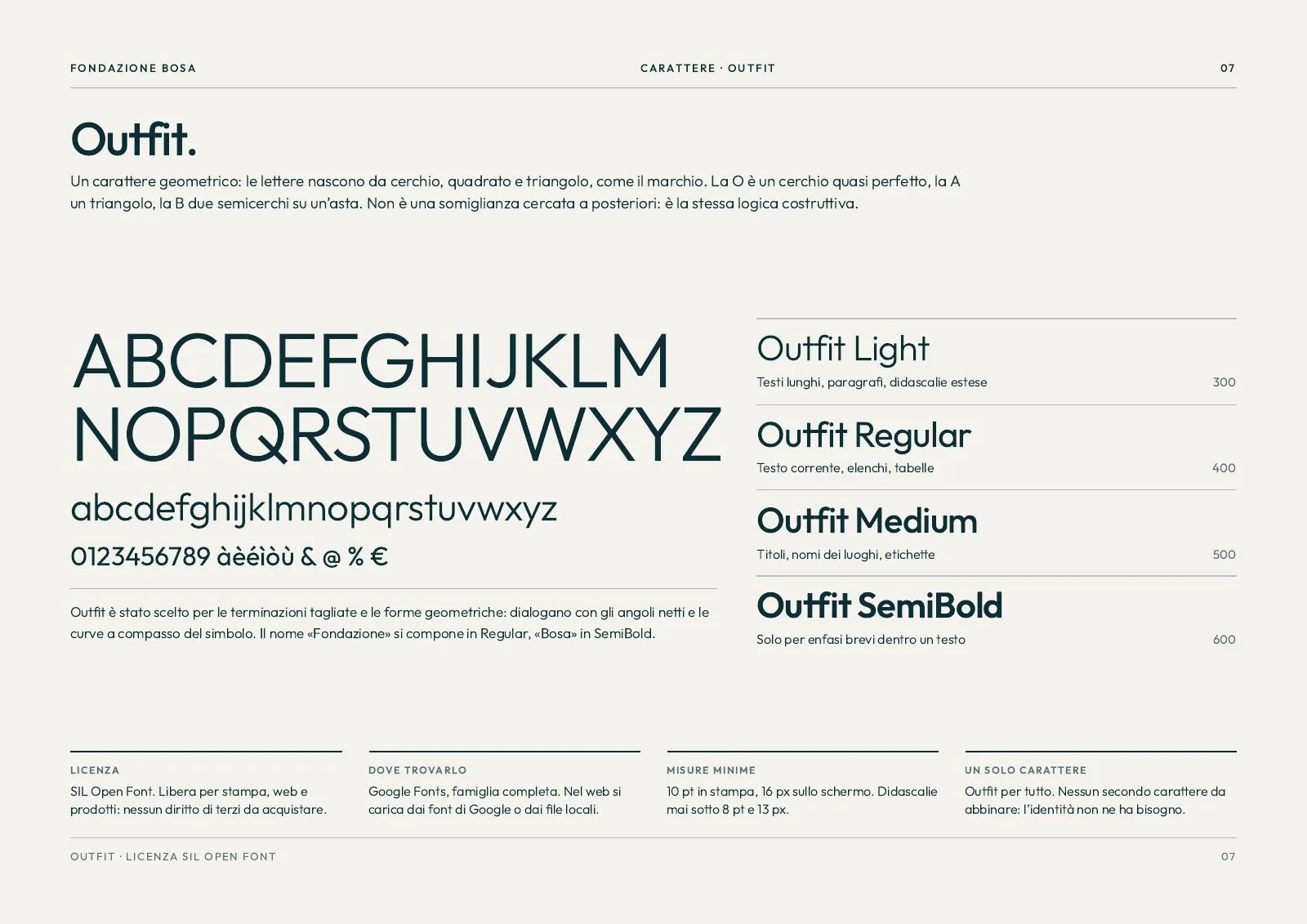
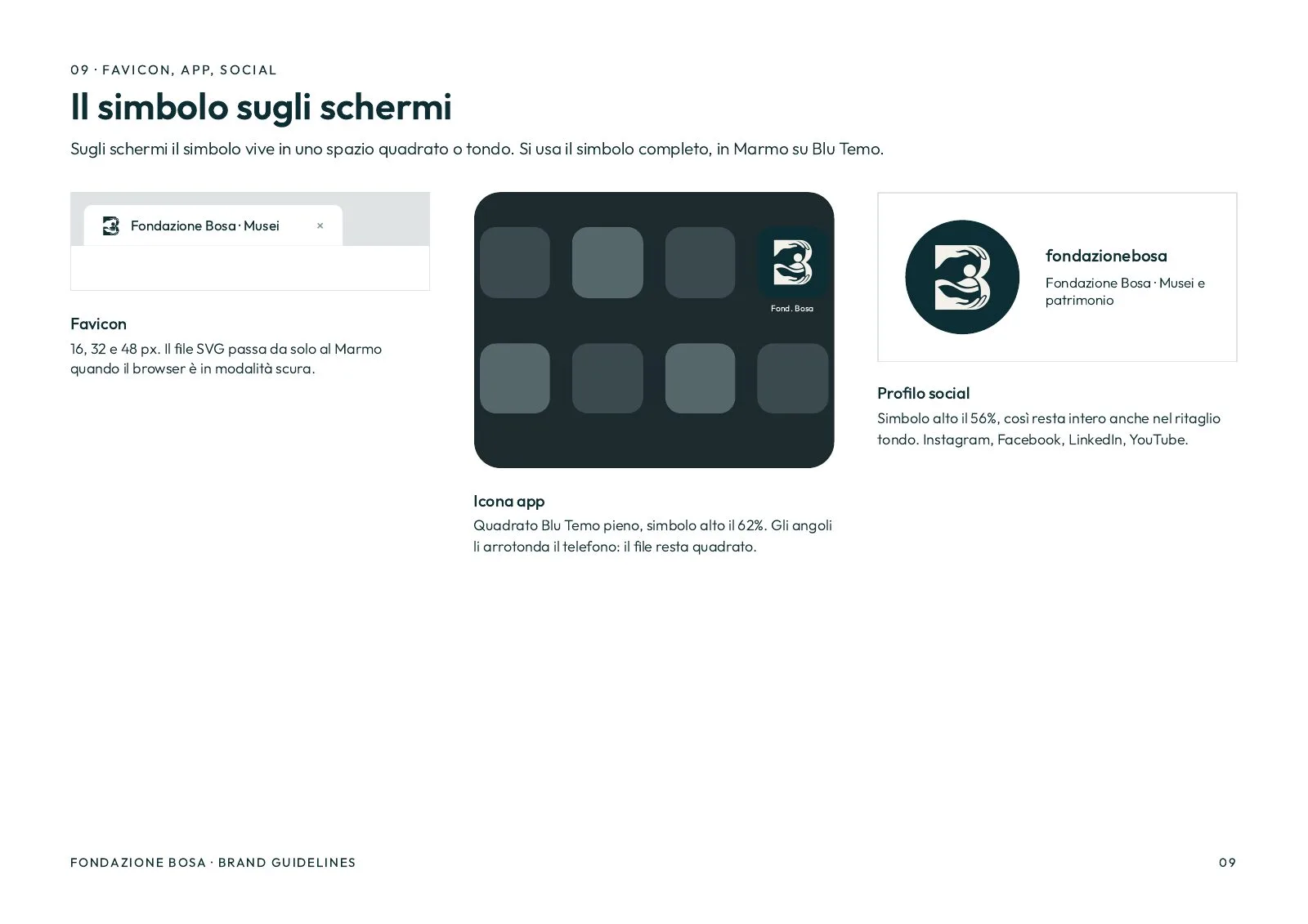
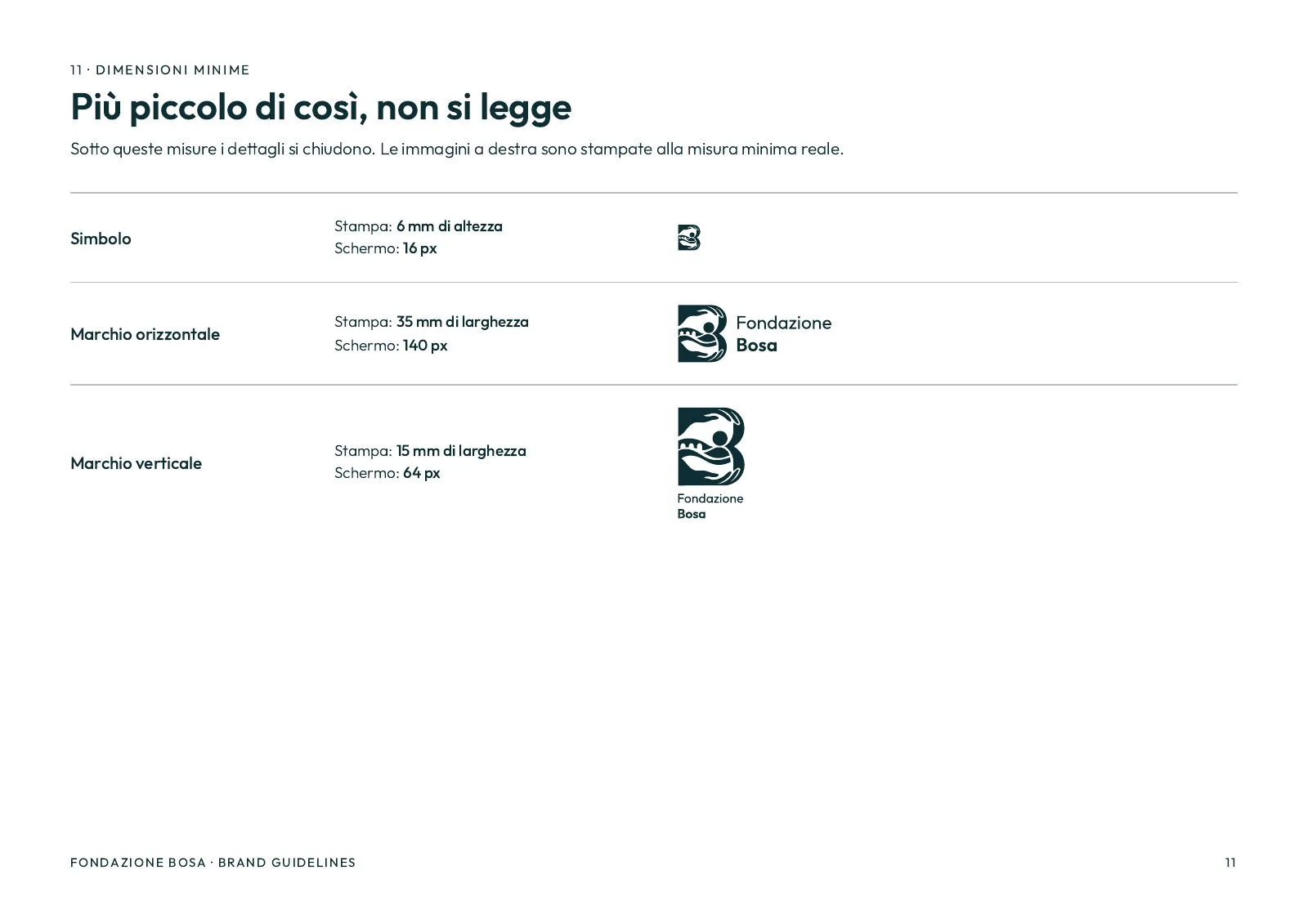
We drew it in one colour first and tested it small: it still reads at 16 pixels, the size of a favicon. The name is set in Outfit, a free geometric typeface whose cut terminals answer the angles of the symbol.
Seven sites, seven colours
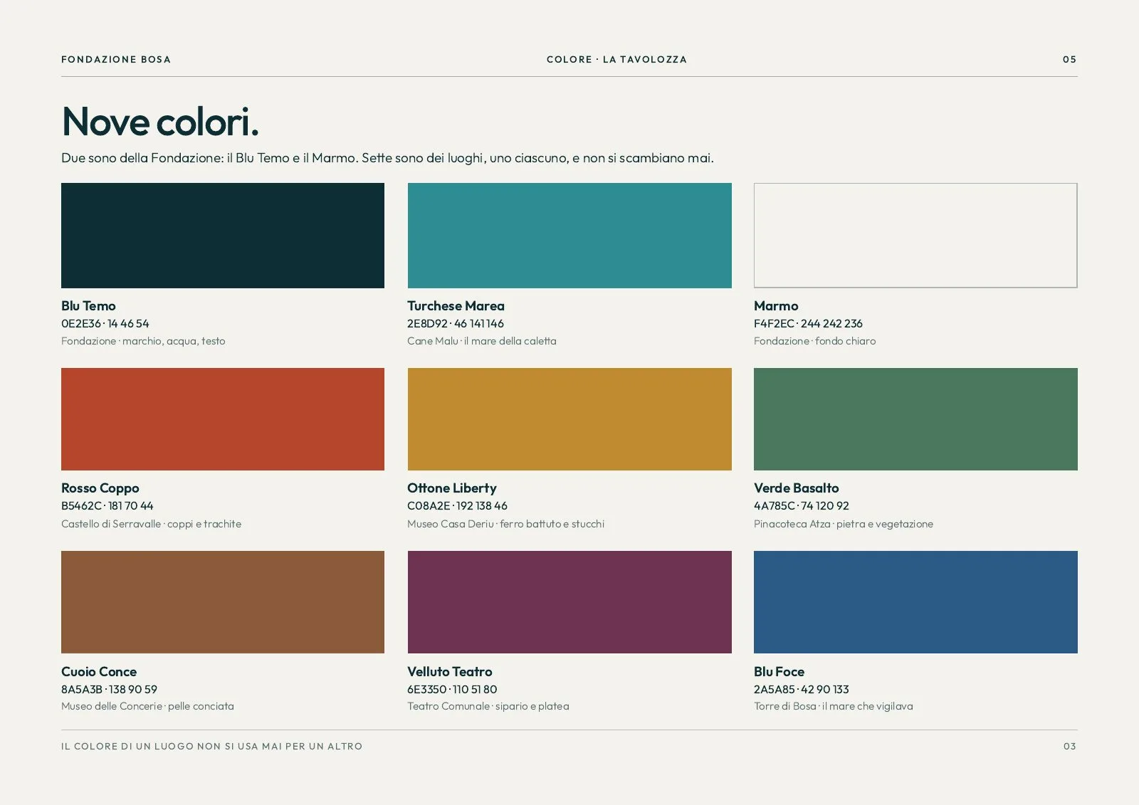
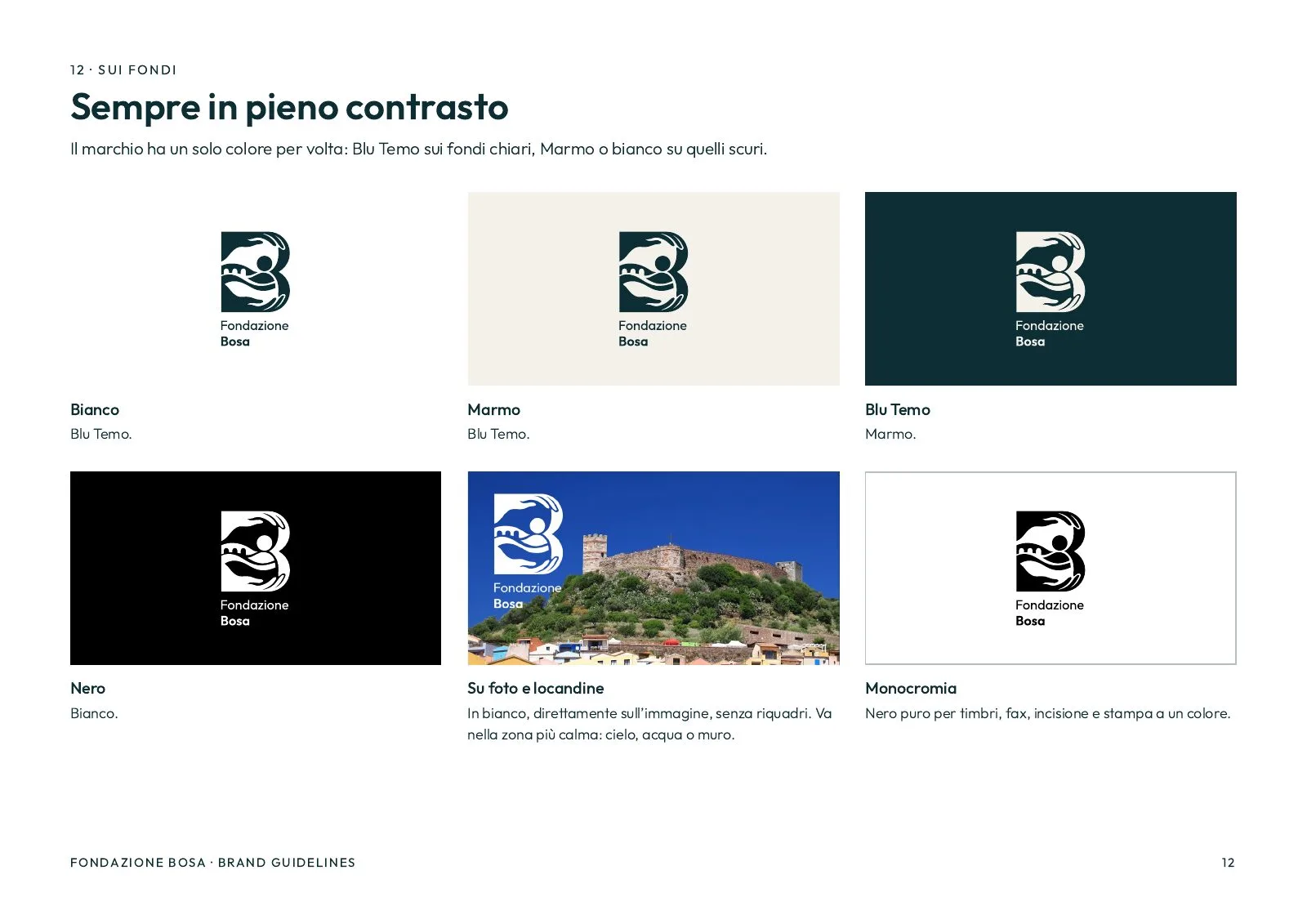
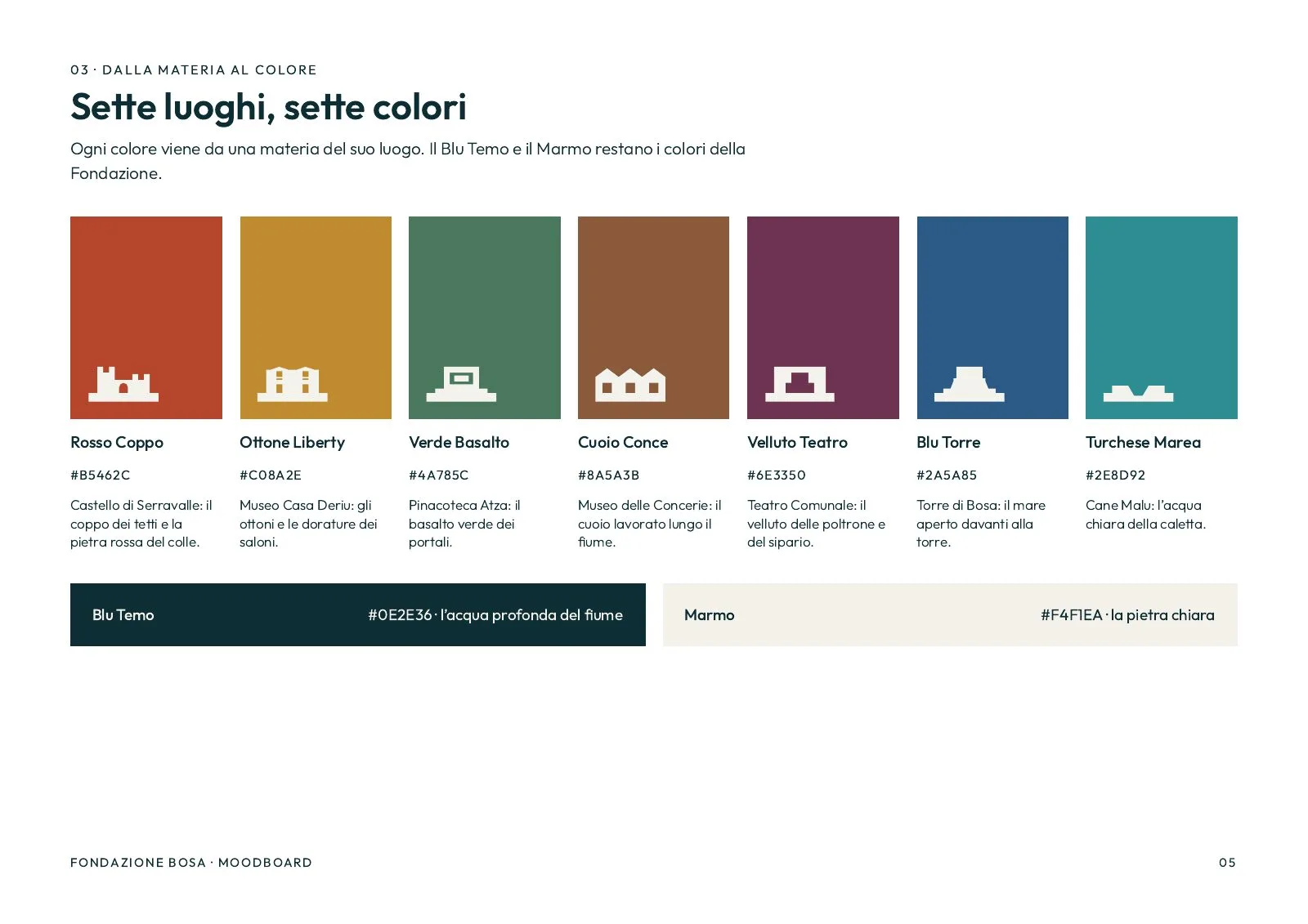
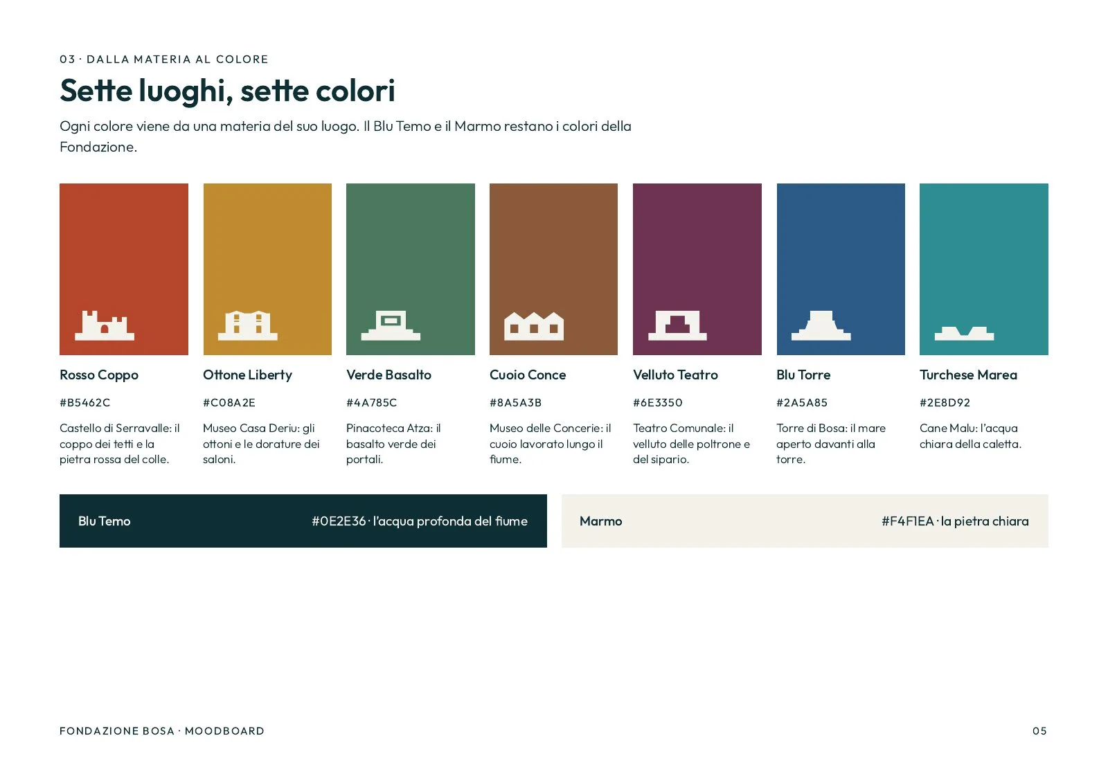
The Foundation's colour is Blu Temo, the deep water of the river, with Marmo for light grounds. Then each site has its own, taken from what it is made of: Rosso Coppo for the Castle, Ottone Liberty for Casa Deriu, Verde Basalto for the Pinacoteca, Cuoio Conce for the Tanneries, Velluto Teatro for the Theatre, Blu Foce for the Tower, Turchese Marea for Cane Malu.
A site's colour is never used for another. On a single site's materials, the person in the symbol takes that colour.
The frieze
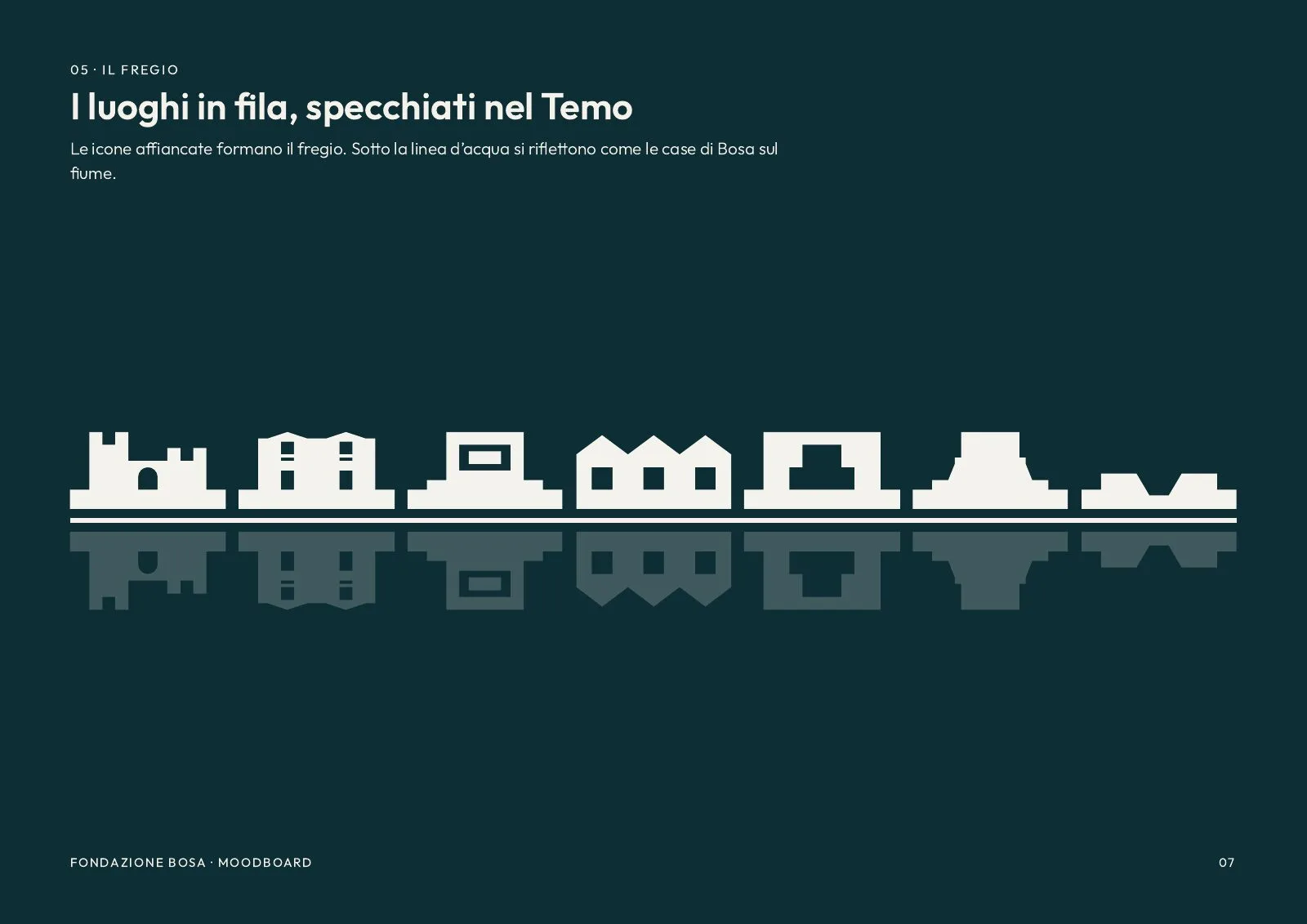
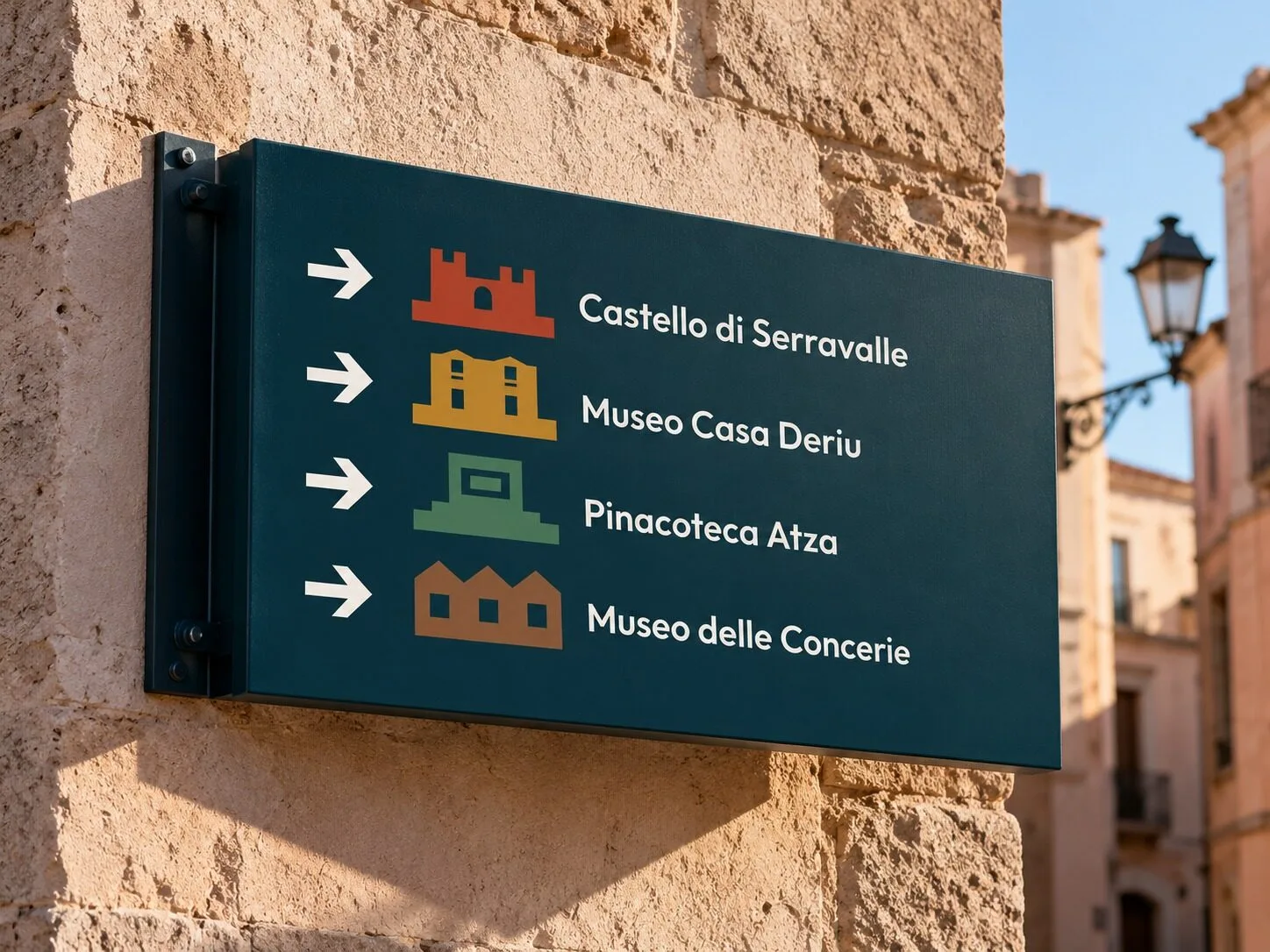
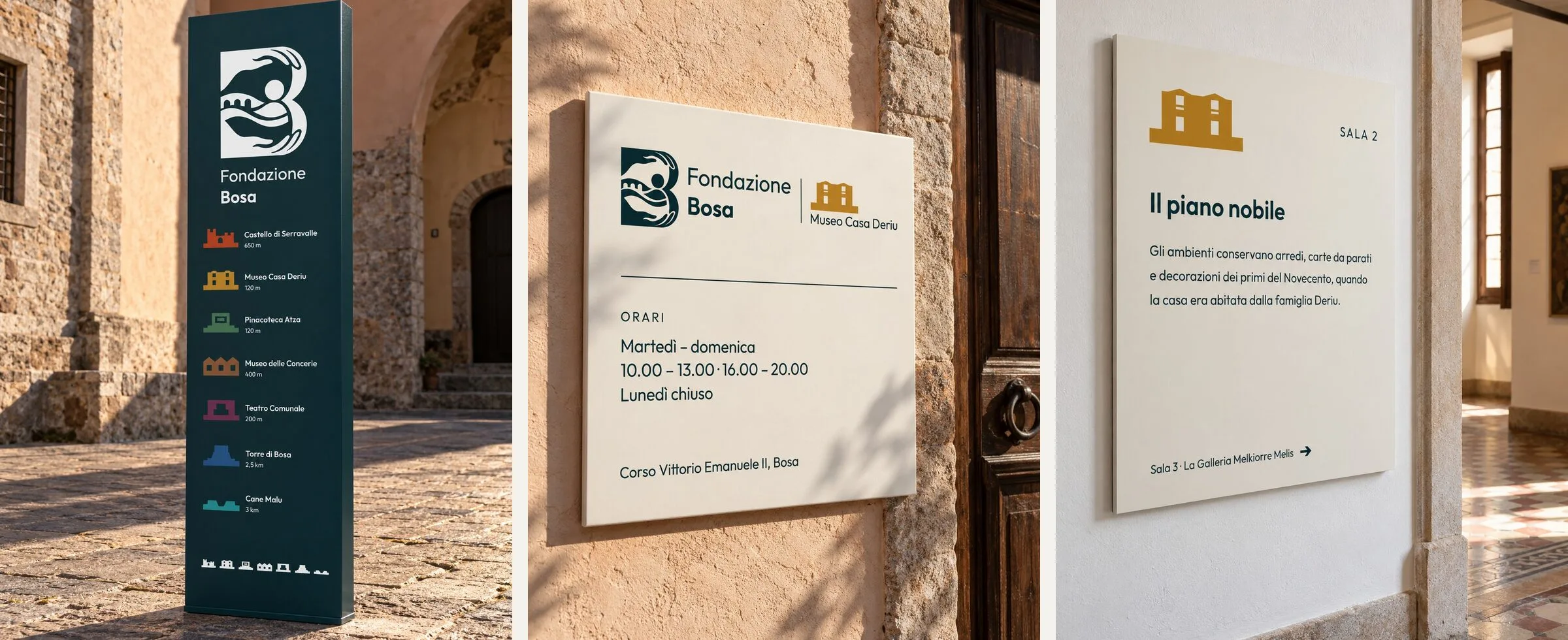
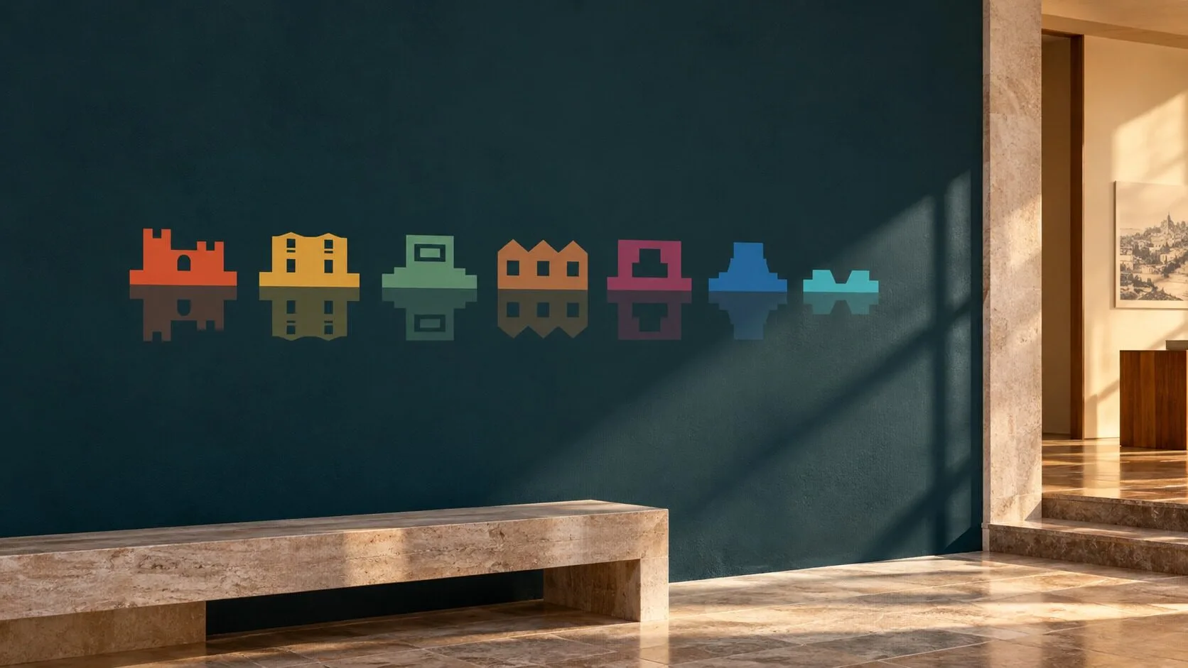
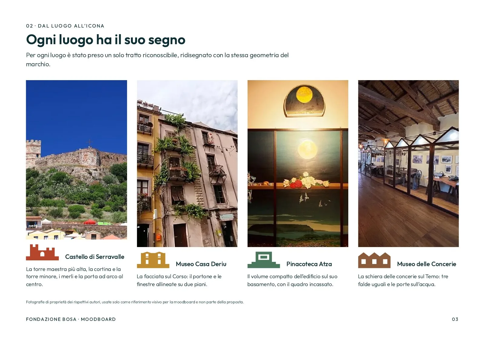
Each site has an icon drawn with the same geometry as the mark. Next to the symbol, with the name under a rule, it becomes the site's signature: tickets, signage, web pages.
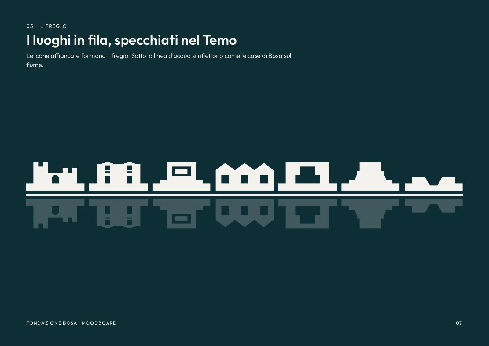
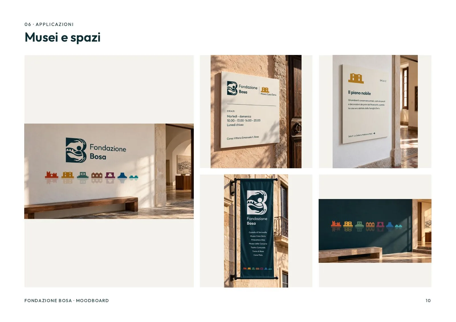
In a row, the seven icons make the frieze, mirrored under a waterline like the houses of Bosa on the Temo. If the Foundation ever takes on a new site, we draw its icon and add it to the row. The mark doesn't change.
- Sites, each with its own icon and colour
- 7
- Colours, and no site borrows another's
- 9
- The smallest size at which the symbol still reads
- 16 px
Applications
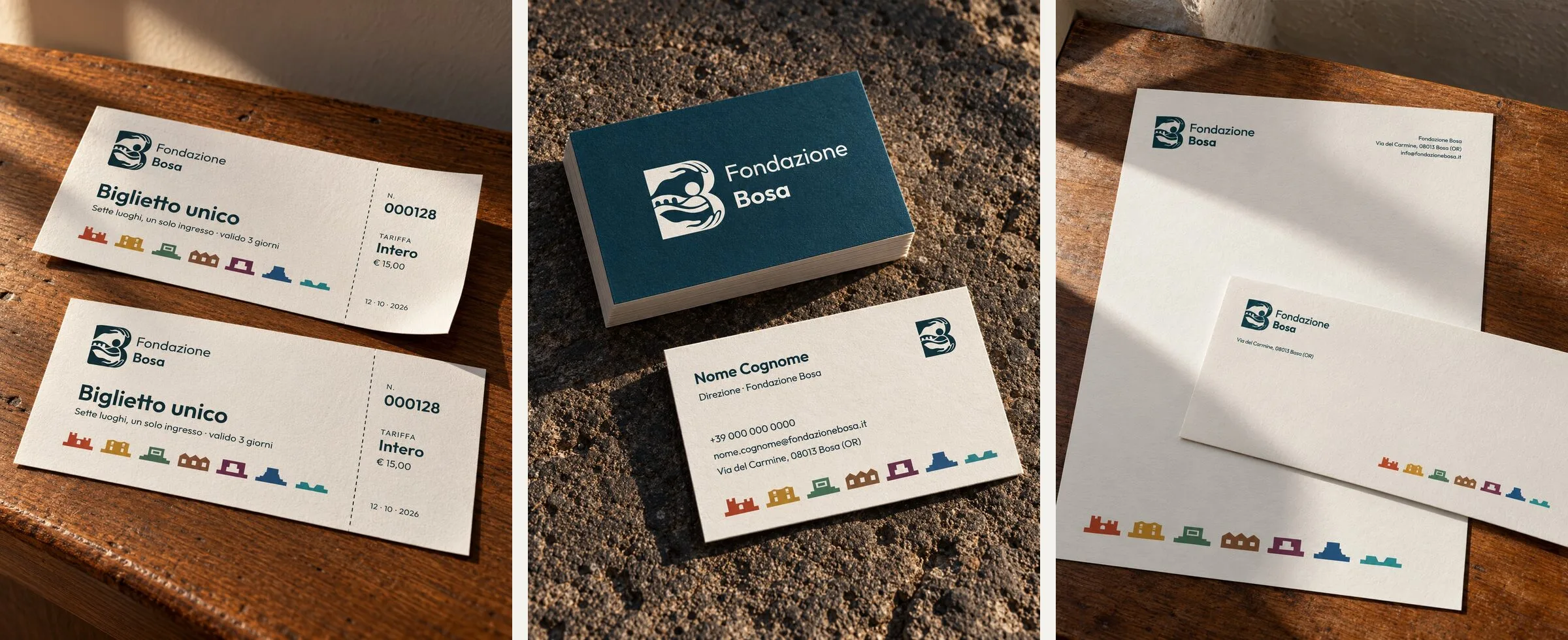
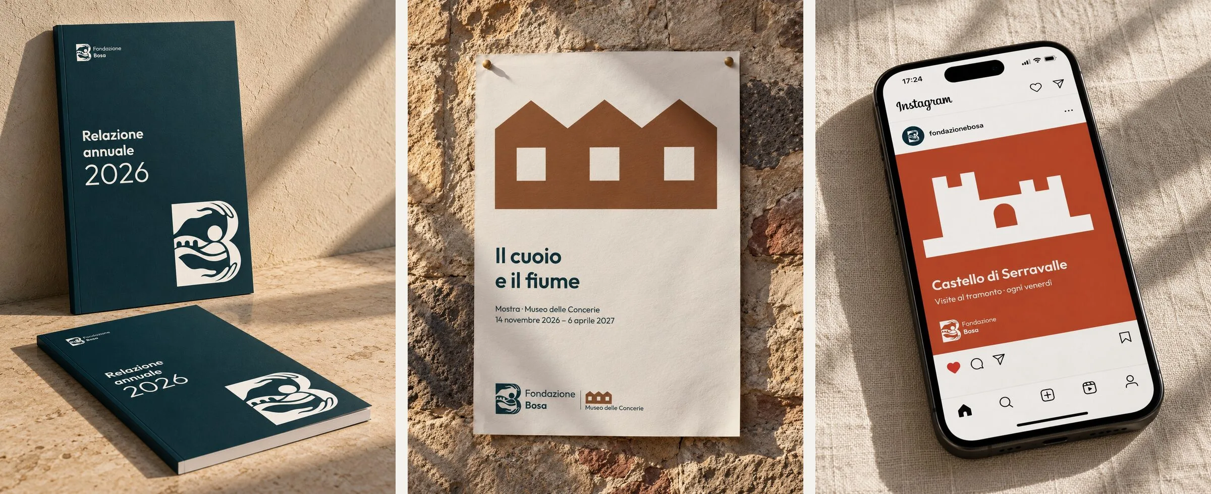
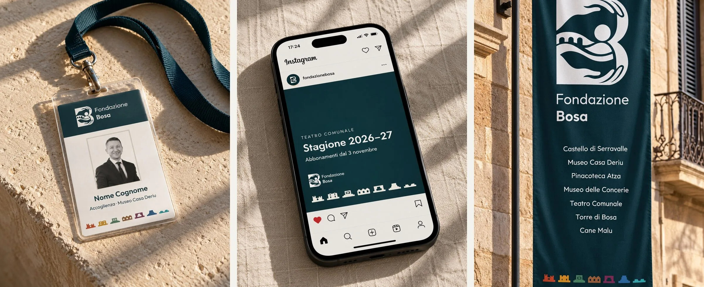
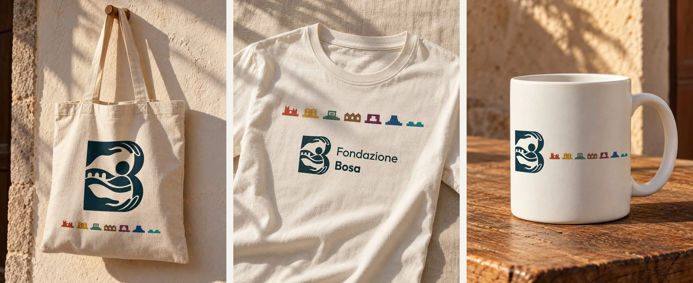
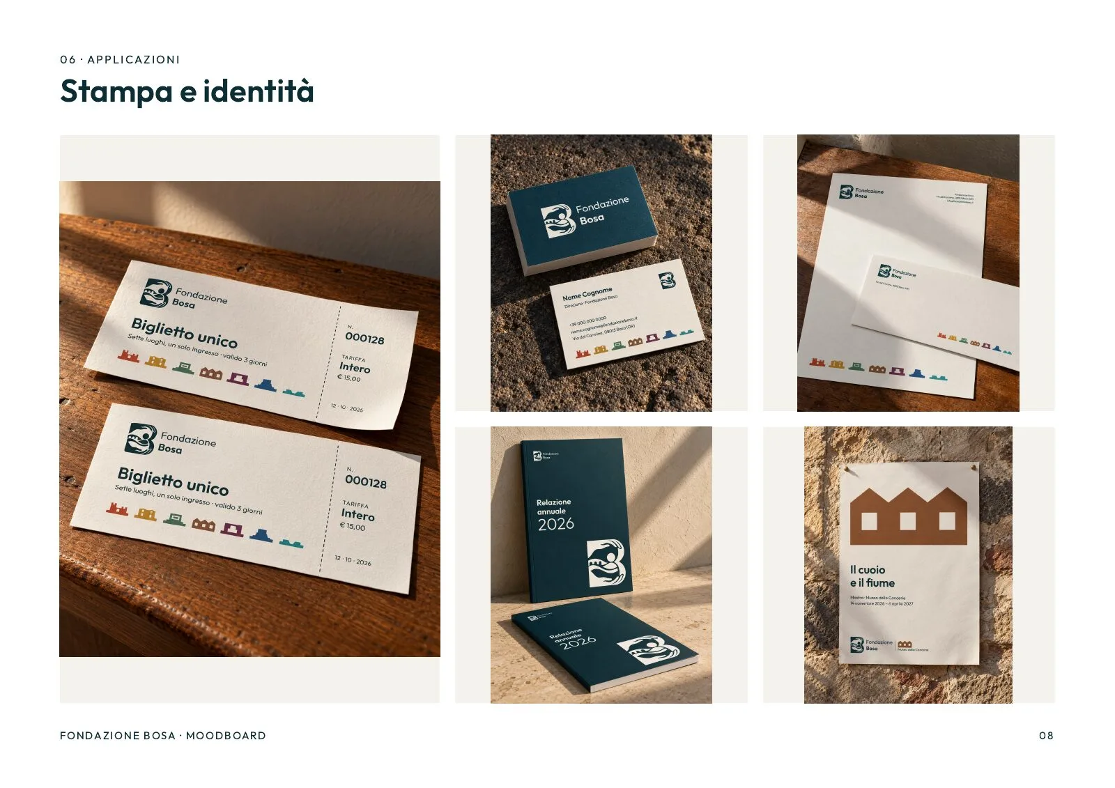
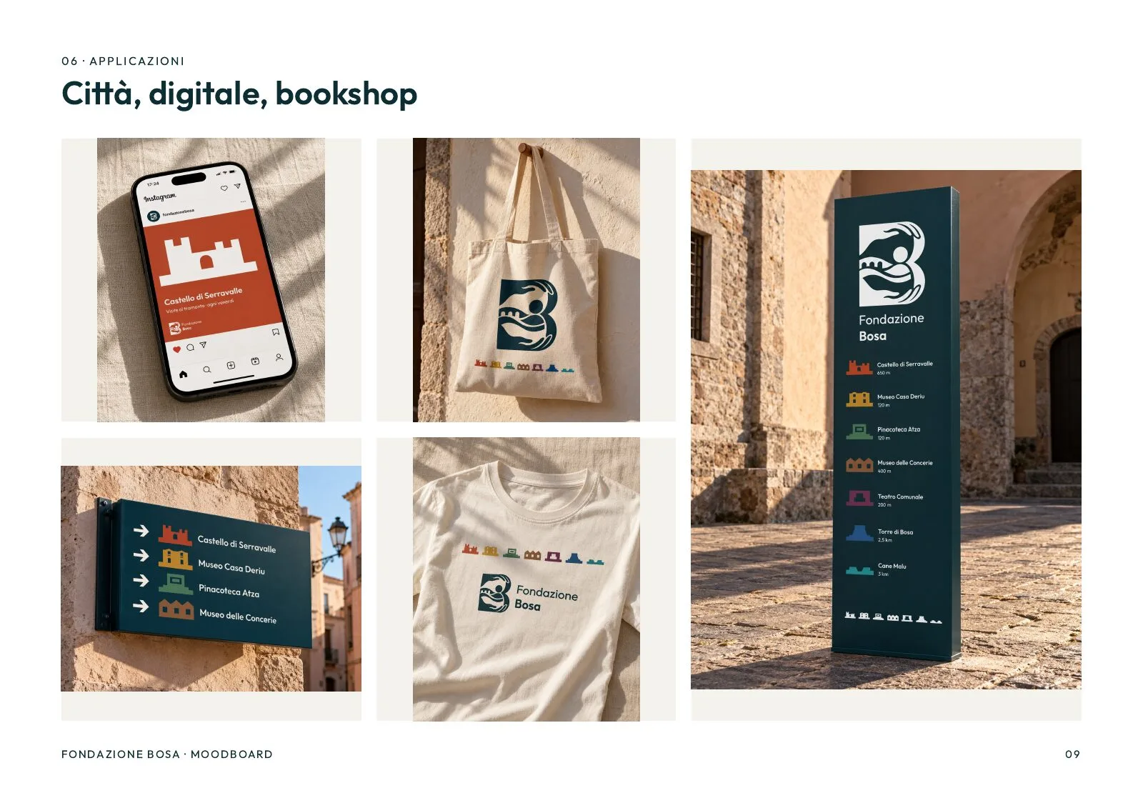
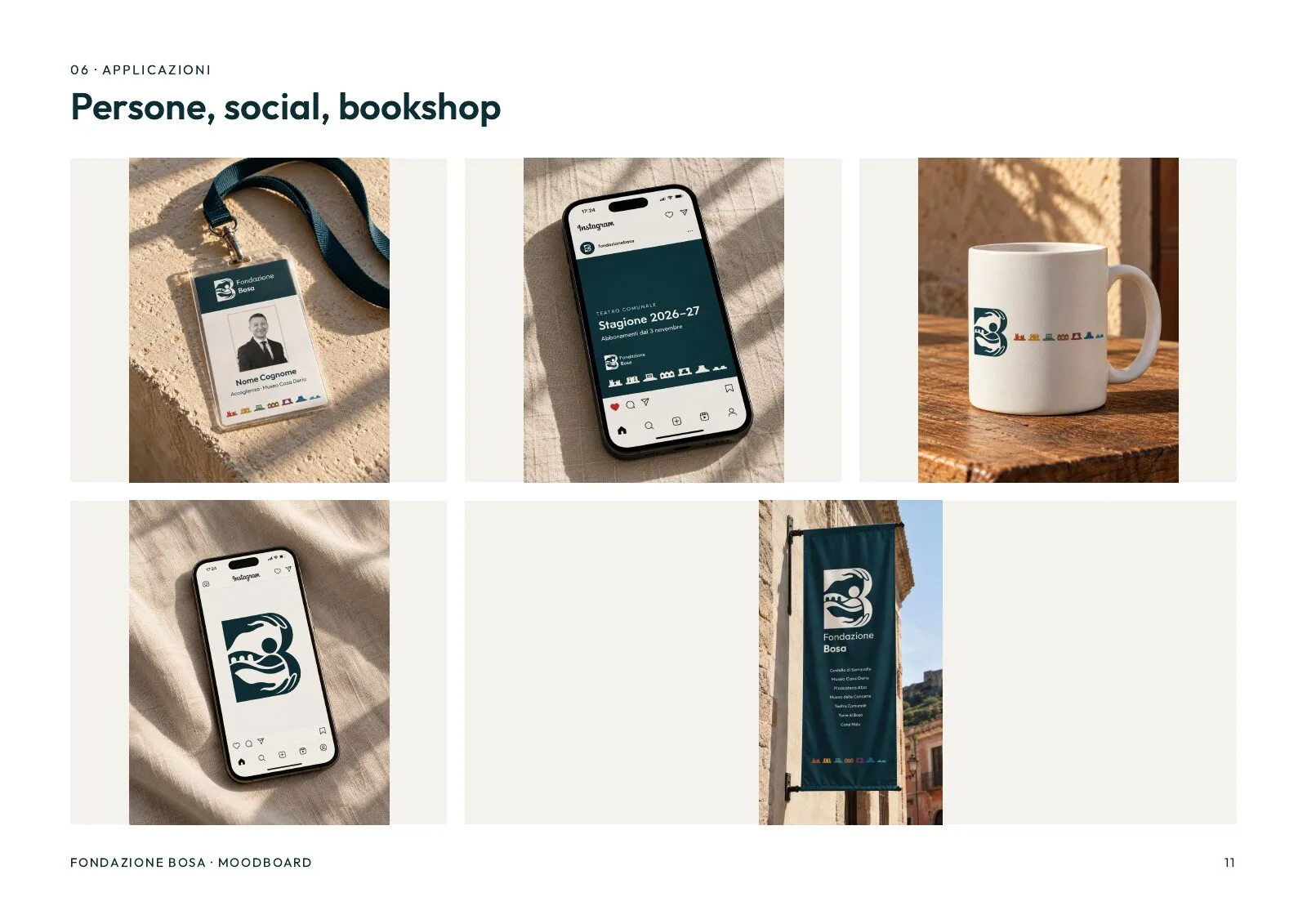
Single ticket, business cards, letterhead, annual report, exhibition posters. Then the town: wayfinding totems, directional signs, entrance plaques, room panels, façade banners. And the rest: staff badges, tote bags, T-shirts, mugs, social posts and the app icon.
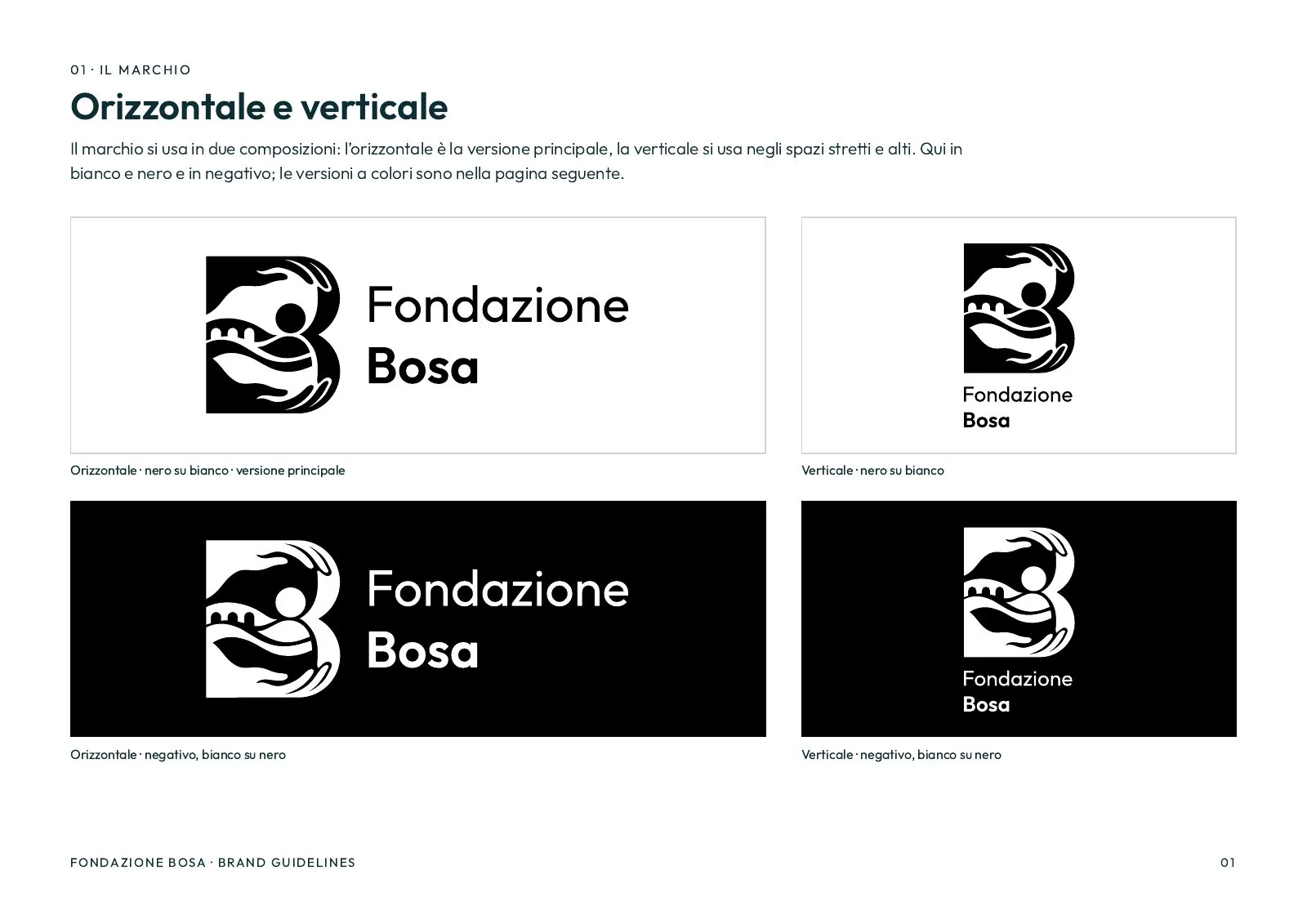
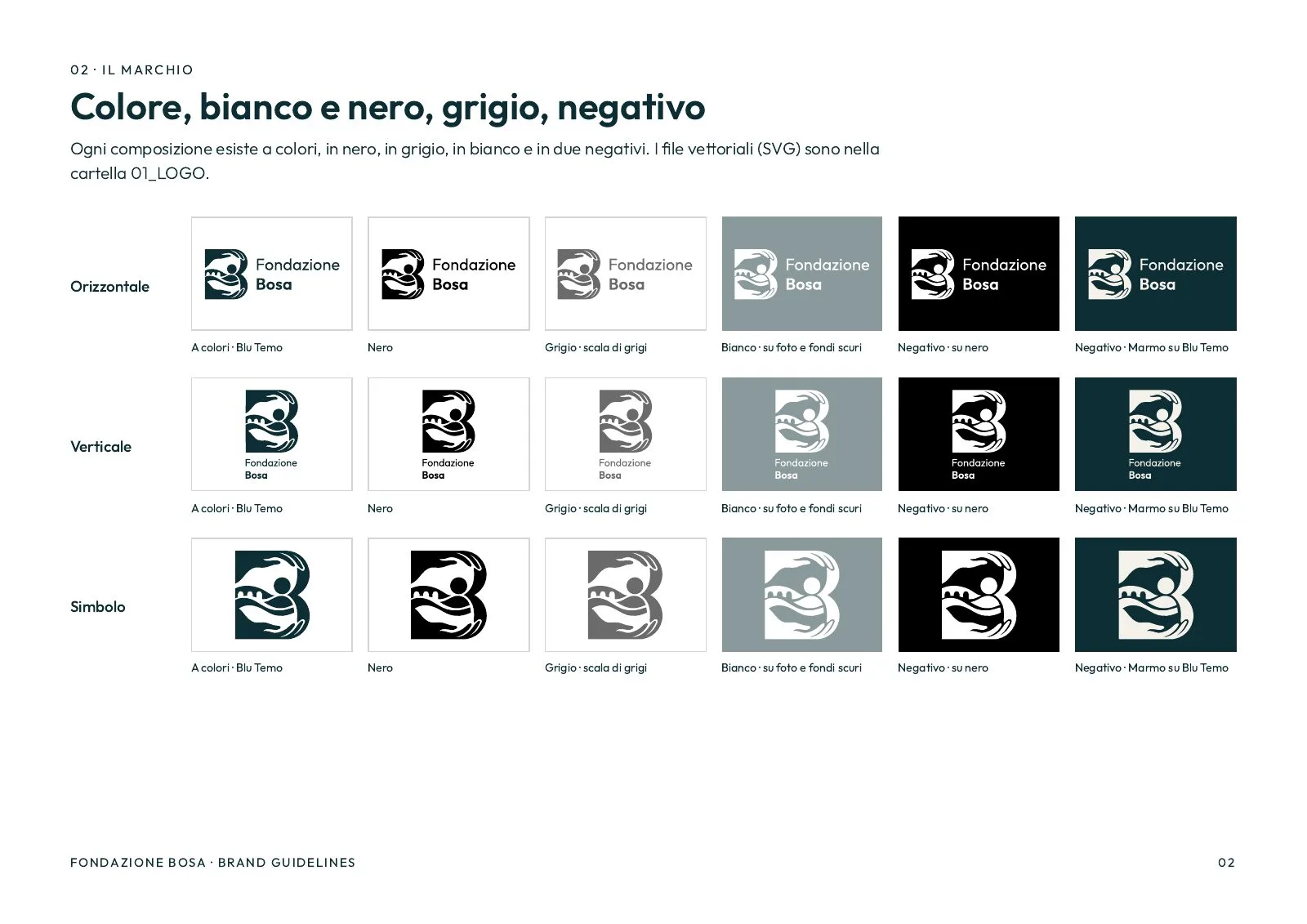
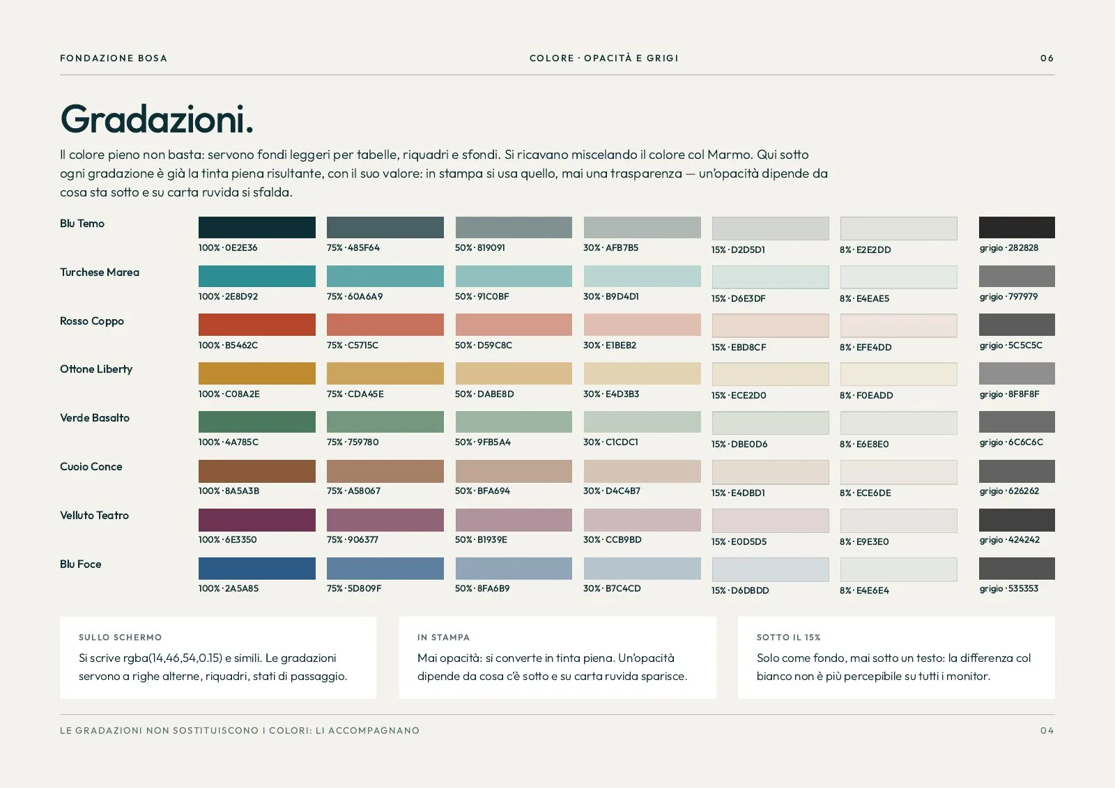
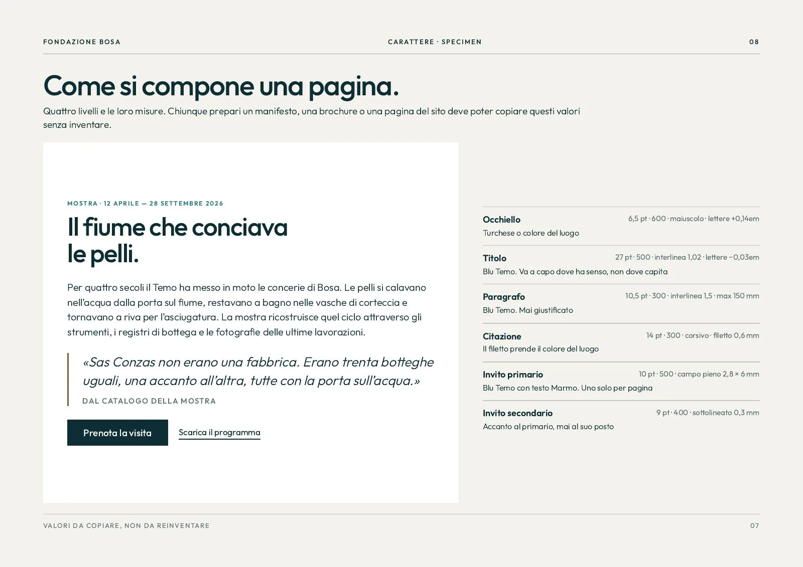
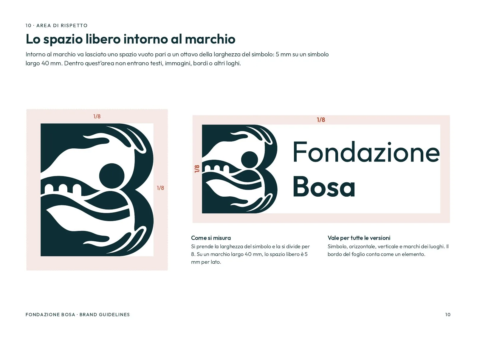
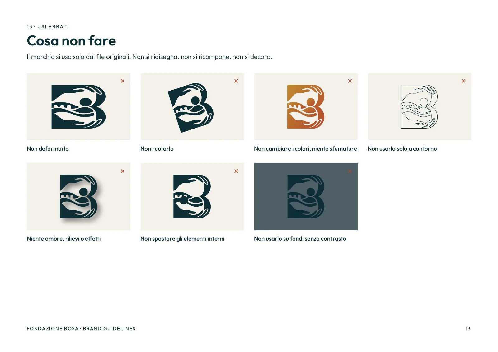
The brand manual gathers it all in fourteen pages: mark versions, colours, tints, typeface, layout, clear space, minimum sizes, grounds and mistakes to avoid. The delivered package holds the mark in SVG and PNG in every version, the site icons and signatures, favicons and app icons.
Symbol, wordmark, icons and frieze are drawn by hand, as vectors, on the same grid.
Board by board.
Moodboard
Brand guidelines