
Label design for wine and food
A label has three seconds to get chosen. We design so that three are enough.
- founded
- 2018
- projects delivered
- 200+
- clients in Sardinia and across Italy
- 65+
- nomination
- Awwwards
- projects for this service
- 0
We design labels for wine, beer, olive oil and food products, from a single product to the whole range, with the mandatory information in its place. Prices start from 250 €, and the work grows with the products and the formats. The files stay yours: you decide on the reprint.
A wine label does its work in three seconds, from a metre away, among forty other bottles. Label design starts there: what reads from a distance, what reads up close, and what the law requires without spoiling the rest.
We design labels for wine, beer, olive oil and food products, from a single product to the complete range. For us label design is a system: the sixth bottle has to look like it comes from the same winery as the first. Then the artwork, the colour proof, the print run followed with the printer.
We work with wineries, breweries and producers all over Italy. Wine label design is decided on a real bottle, not on a rectangle on a screen: every concept arrives mounted on the real format, and the colour proof always comes before the print run.
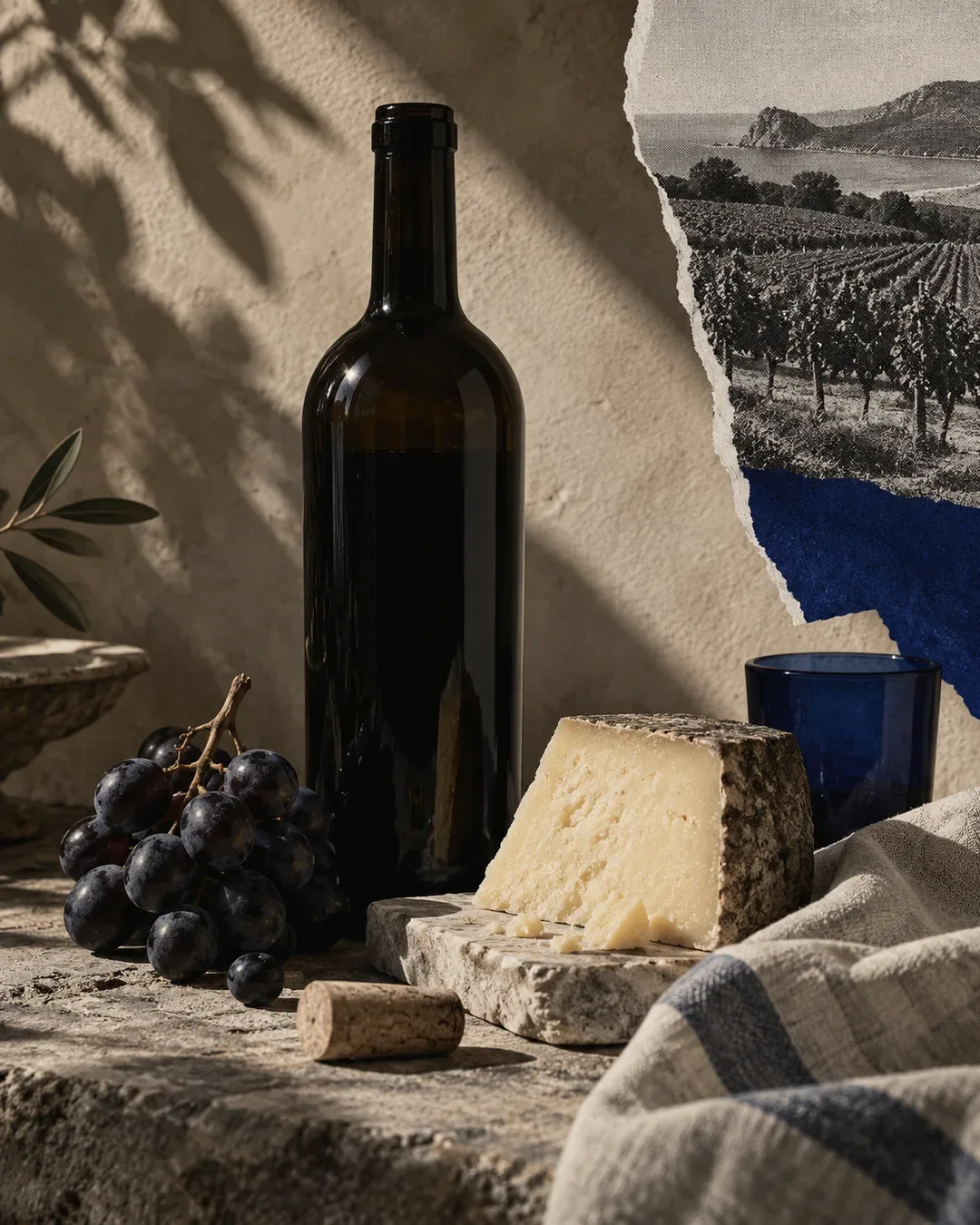
In Sardinia the labels of local products have one more problem: vermentino, cannonau, pecorino and mirto are sold by many, often with the same symbols of the island. Here label design works when it tells the story of who produces, not of the island in general: for Nuraghe Antigori six wine labels hold together thanks to a square that changes metal.
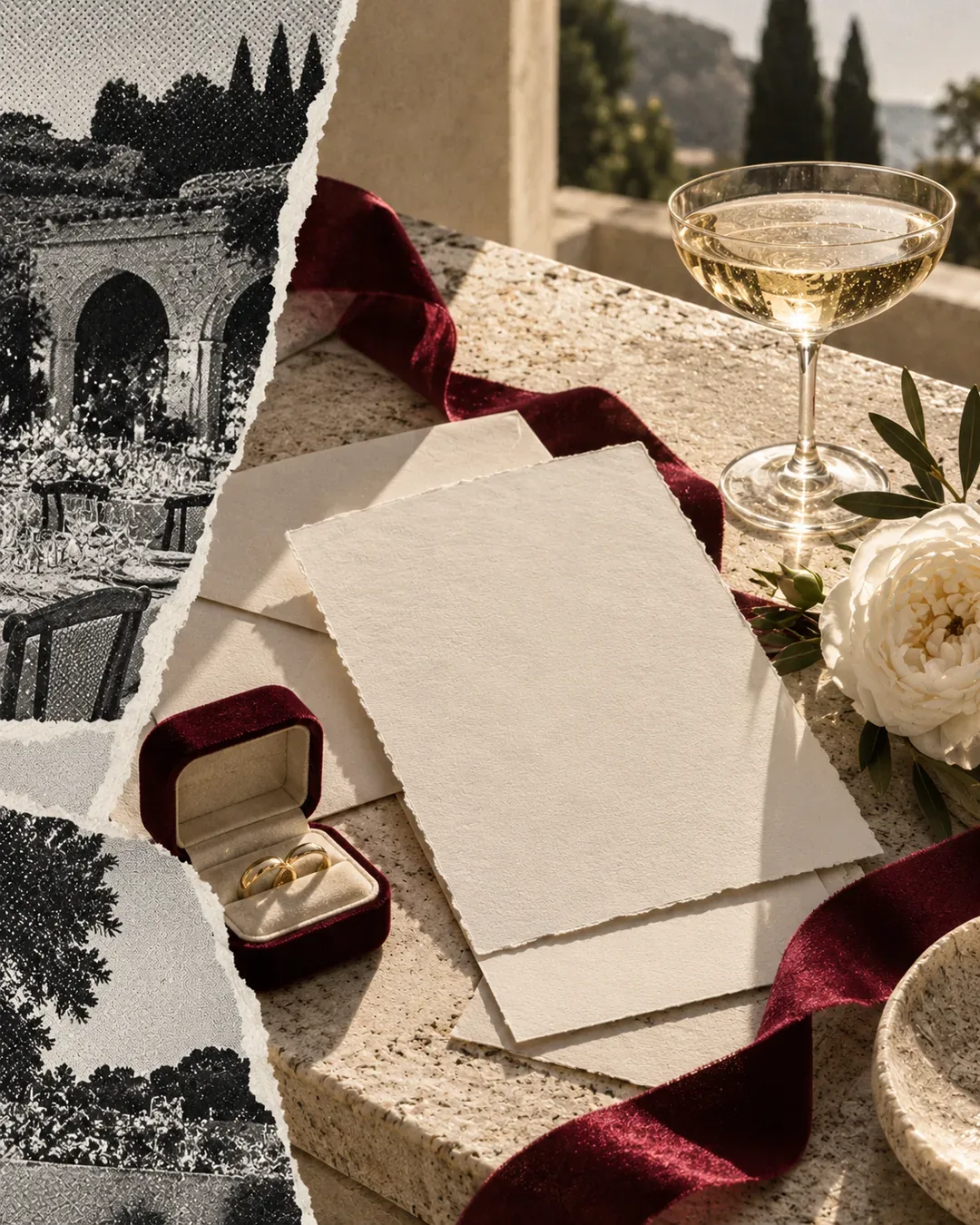
What's included.
TRY IT
The file starts on your printer’s die line, not on a mockup.
02
The range, not the single bottle
We design the first label with the tenth in mind: the same layout, variants recognisable by paper, colour or metal. For Nuraghe Antigori six wines and two bottle formats share a single mark.
03
Front, back and neck
The front catches the eye from a distance, the back tells the story and carries the mandatory information, the neck label or the capsule closes it off. For beer, bottle and can; for food, jars, wraps and seals.
04
Papers and finishes
Uncoated and embossed papers, hot foil, blind embossing, spot varnishes. We choose them when the shelf price justifies them, and we test them on the real paper before deciding.
05
Room for the mandatory
Designation, alcohol content, allergens, lot number, the QR code for the wine e-label, the environmental information on the packaging: they go into the layout from day one, at the minimum type sizes, not at the last minute in a corner of the back label.
06
Artwork and colour proof
Die line, bleeds, spot colours, overprint, and for labels on a reel the right unwind direction for the labelling machine. Then the colour proof: a problem is better found on one sheet than on ten thousand labels.
07
Labels for export
Versions for other markets, with the language, the importer and the information the destination country requires, on the same base and without redrawing the design. You define the content with the importer; we set it on the page.
Shelf and constraints
Formats, paper, print run, labelling machine, sales channels. And the real shelf where the bottle will have to get noticed, looked at before we draw.
Concepts on the real format
Two or three directions mounted on the actual bottle or jar, never on a rectangle. You choose by looking at them among the others.
The range and the back label
The chosen direction is extended to the other products and to the back label, with the mandatory information in its place and legible.
Artwork and proof
Files to the printer's specifications, then the colour proof on the chosen paper. We correct here, not on the print run.
Print run
We follow the printer through to the first run and leave you the open files and the print-ready PDFs: the reprint stays yours.
What we build it with.
The design is built in Illustrator, on the die line the printer sends. Images go through Photoshop, critical colours travel as Pantone spot colours with the CMYK conversion checked on the real paper: an uncoated paper drinks the colour, a coated one makes it shine, and the same red comes out different on the two. The three-dimensional mockups on the real format are there to help decide, and then come in handy for the shop and social before the first bottle is labelled.
- Adobe Illustrator
- Photoshop
- Pantone
- 3D mockups
- Colour proof
- Hot foil
- Blind embossing
- Reel labels
Online printer, template or design?
Anyone looking for wine labels finds online printers and fill-in templates first. Sometimes they are enough, and it helps to know when.
The printer's template
Fine for a party, a limited edition, a market test. The limit is that the same template is chosen by whoever sells next to you.
The home-made file
Good-looking on screen, but with no bleeds or separated spot colours: in print it comes out with white edges and the wrong colour. You reprint, and you pay twice.
The design
A mark that is yours alone, planned for the range and for the paper, with the right artwork for your printer. You pay once and it holds up through every reprint after.
The mistakes you pay for on the print run
A wrong label isn't fixed with an update: it is reprinted. These are the technical mistakes we see most often.
Forgetting the labelling machine
Unwind direction of the reel, core diameter, gap between labels: if they don't match the machine in the winery, the print run stays in the warehouse.
Adding the mandatory at the end
Allergens or a QR code squeezed in at the last minute break the back label, and sometimes fall below the minimum type sizes.
Choosing the paper from the swatch book
A paper that is perfect in the swatch book can peel off in the ice bucket. It is tested on the real bottle, in the conditions it will be served in.
Real projects.
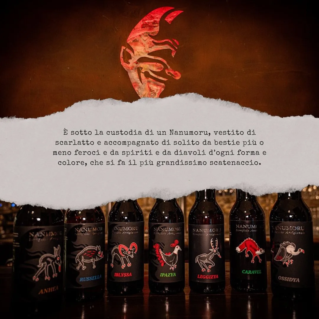
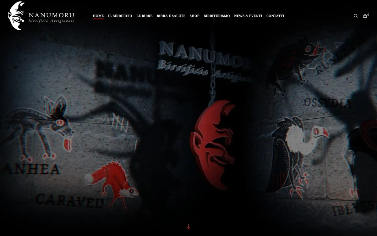
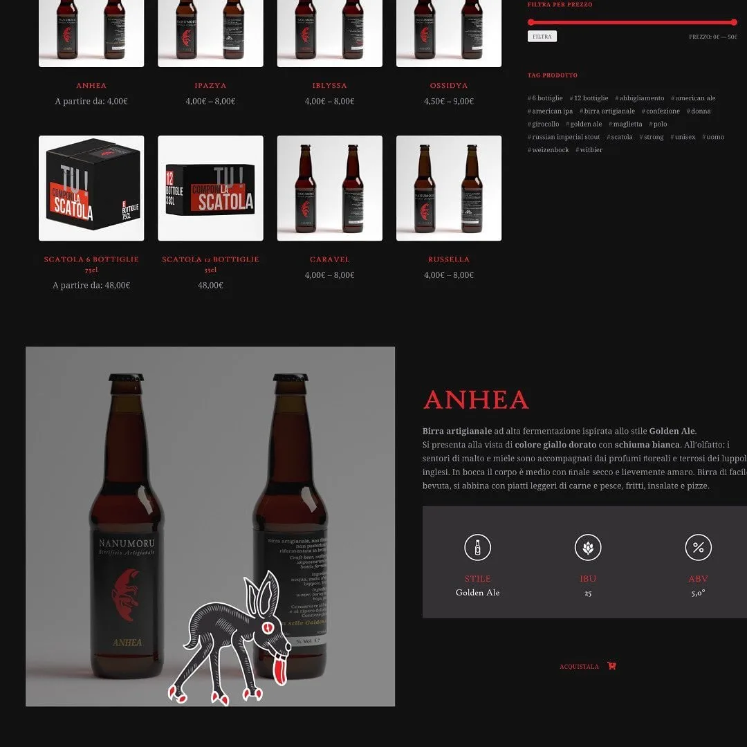
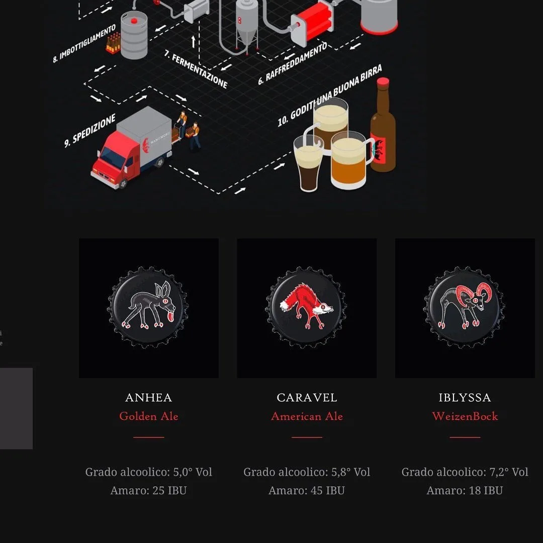
Nanumoru
Six beers, one animal each: the donkey, the mouflon, the fox, the deer, the bird, the vulture. Each animal sits on the label, on the post and on the back door of the van.
What clients say.

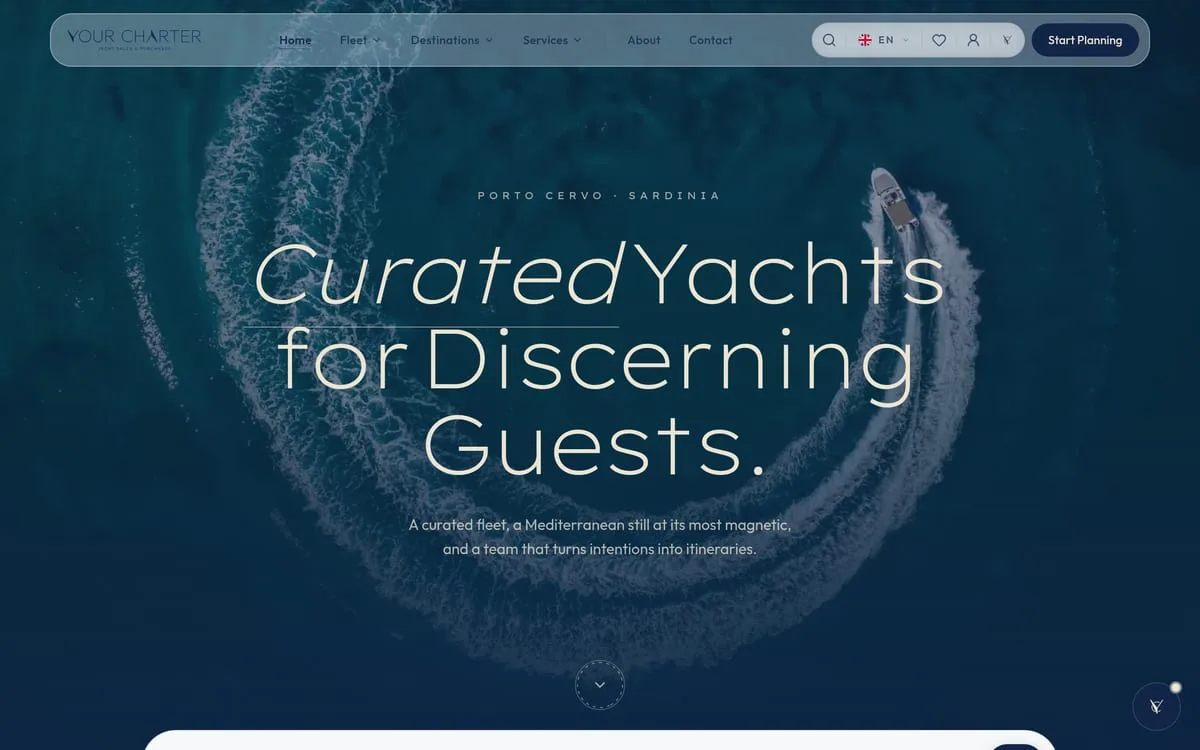
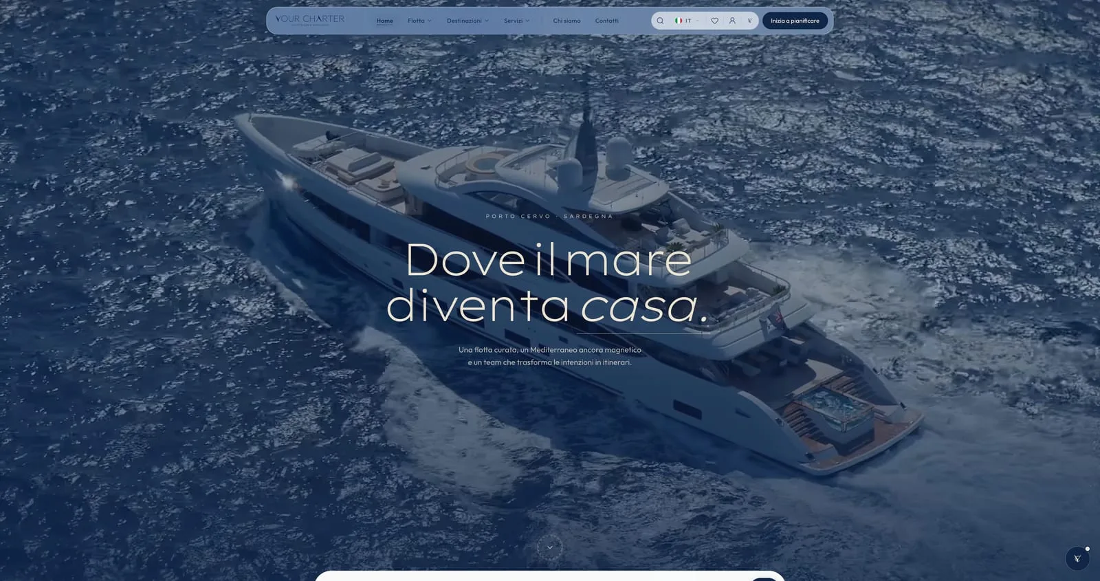
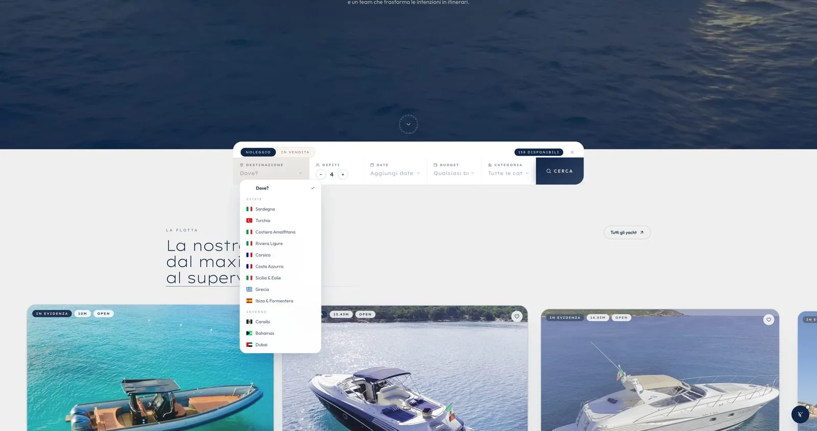
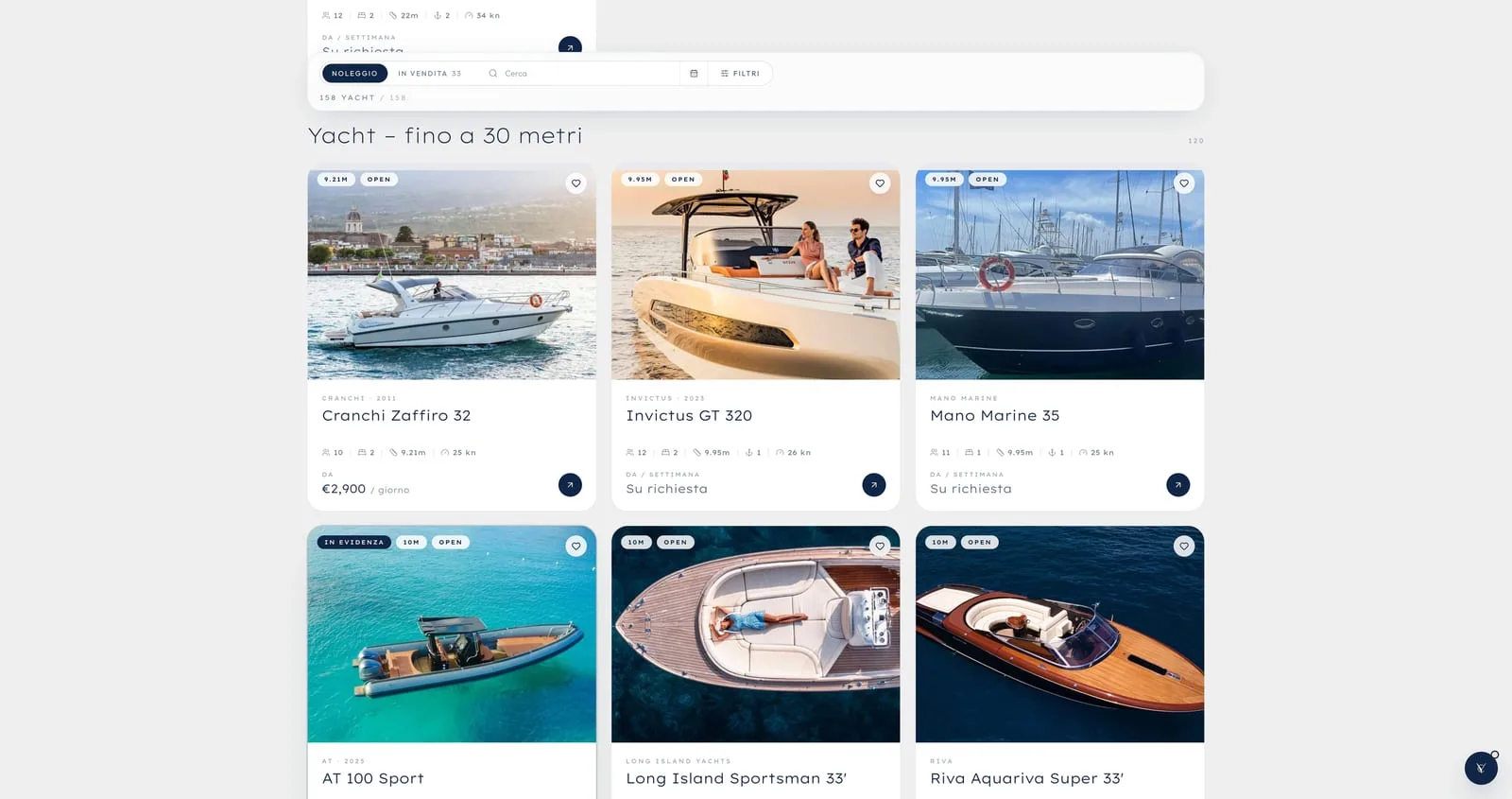
In the world of bilingual yacht charter, the first impression on the web is worth everything. Now our platform is fast, elegant, and provides all the technical details it takes to bring clients on board without a worry.
Your Charter

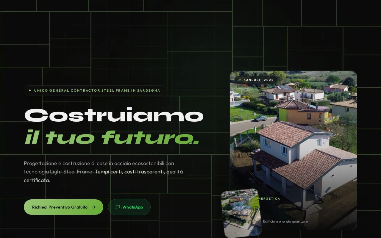
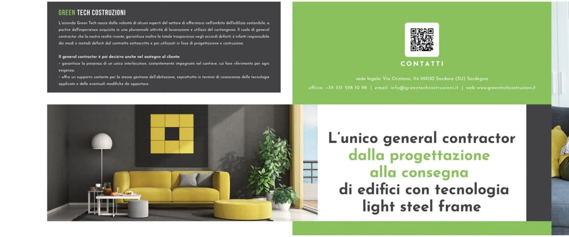
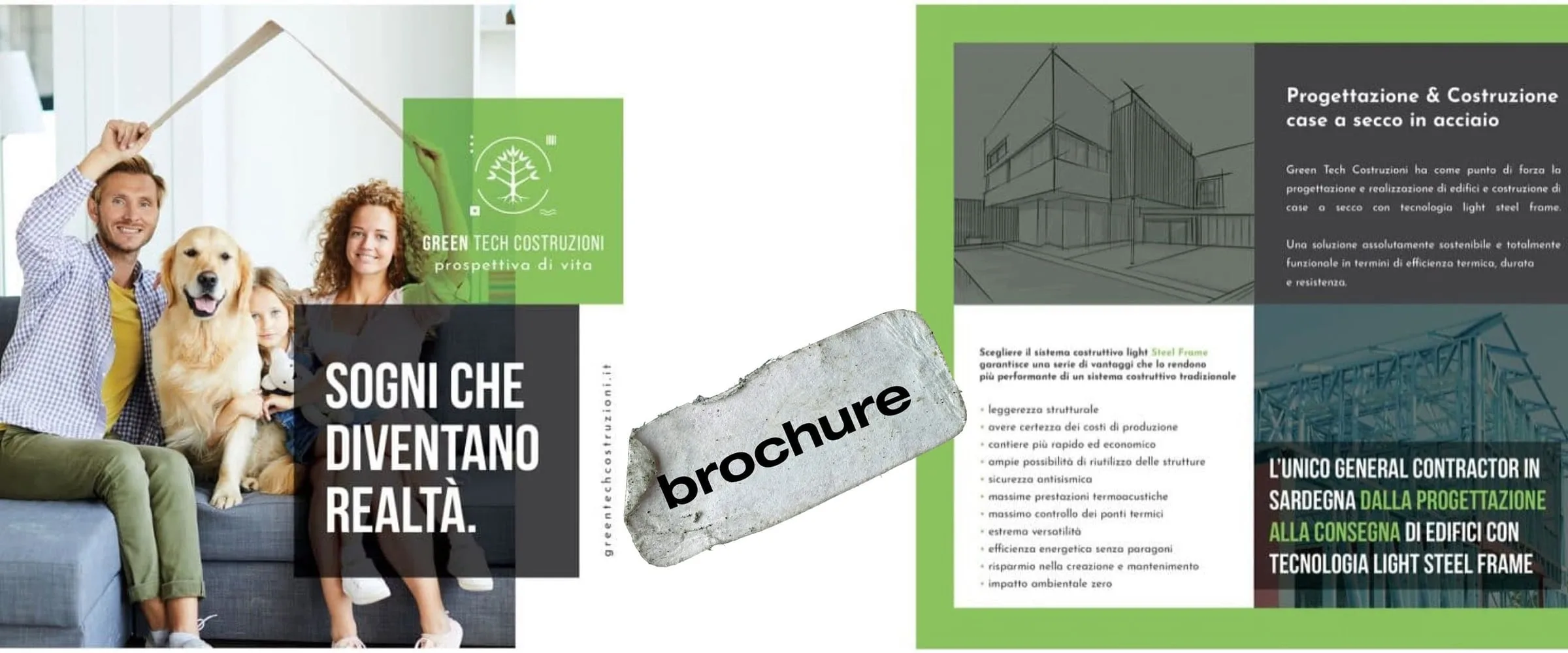
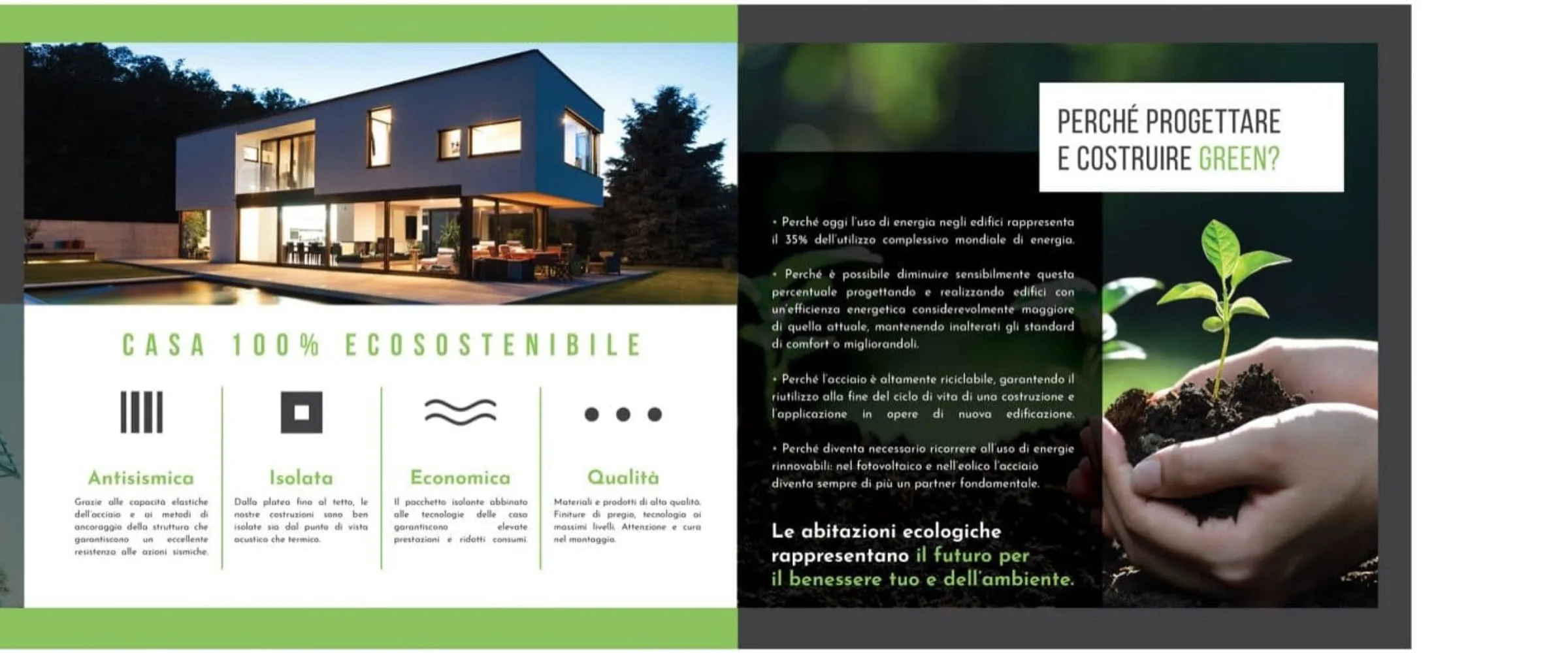
Sanluri is not just a building site. It is the first demonstration that in Sardinia you can build differently — faster, more sustainably, more safely.
Green Tech Costruzioni

We wanted our beauty suite to convey elegance and relaxation from the very first moment. With this new identity and the integrated booking system, clients walk in already in the right frame of mind for wellness.
Estetica Valeria

In our restaurant in Olbia the care for the kitchen goes hand in hand with the guest's experience. Between the digital menu and smart reservations, whoever comes to see us enjoys dinner without a hitch, starting from the choice of table.
La Sartoria del Gusto

Our physical studio in Porto Cervo needed a website as polished as our rooms. Now managing schedules and classes is smooth, and whoever steps in online finds themselves immersed in our very atmosphere.
Flow Studio Pilates

Our floral installations live on detail and immediate visual impact. Having such a well-kept digital gallery lets us show clients our value straight away — and they often give us carte blanche.
Ketty Flowers Designer

At our polyclinic in Palau we care for patients of every nationality, so a multilingual welcome in no fewer than eight languages is vital. Having a perfectly structured website has removed any misunderstanding and sped up access to appointments.
Medica Palau

Telling Sardinia without falling into the usual tourist clichés was our real challenge. This brand and the visual identity we built with the team have tremendous strength and breathe the authentic soul of the island.
Sarda Trips
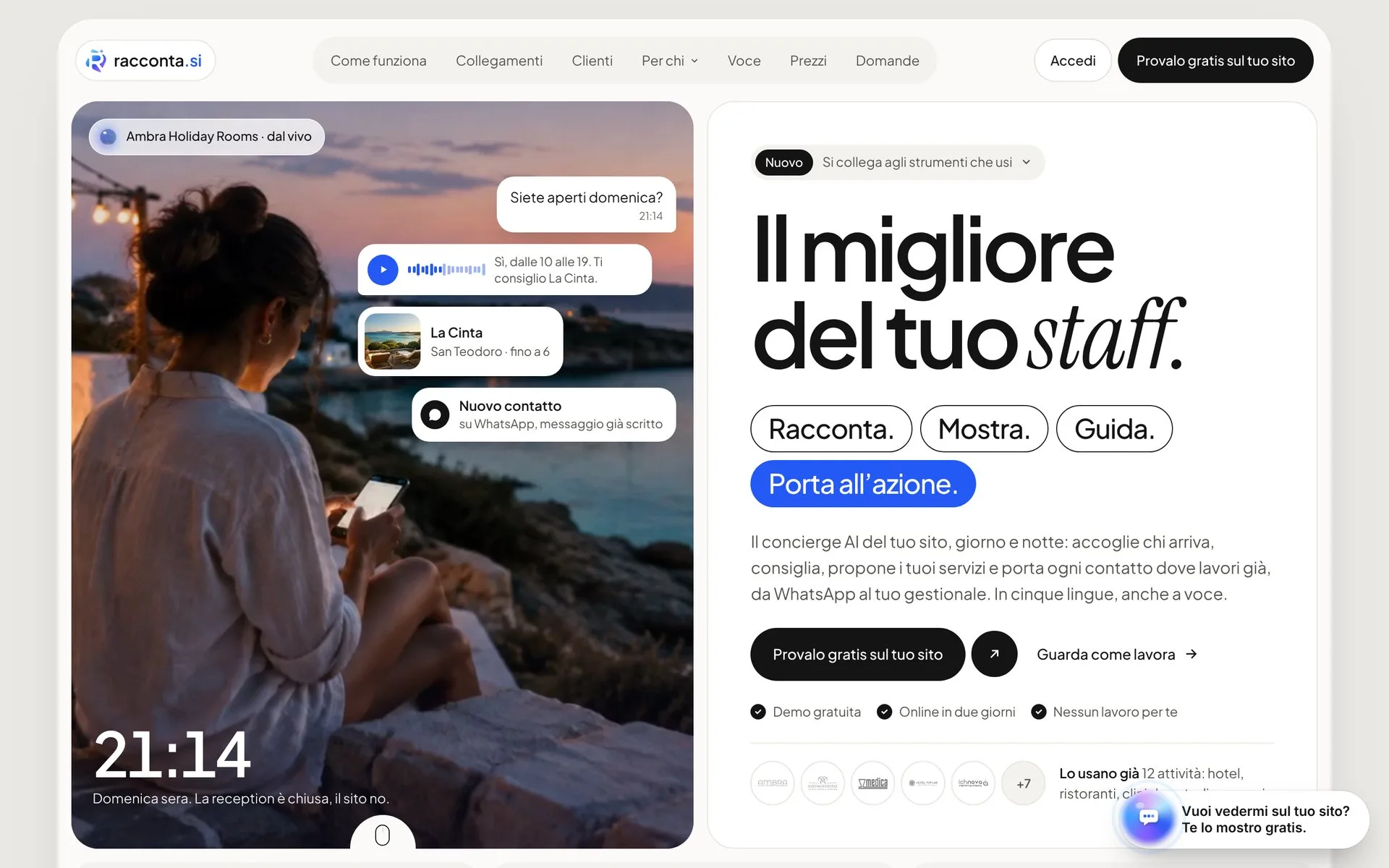
Managing eight lodgings between San Teodoro and Porto San Paolo without handing a small fortune to the big booking platforms seemed a pipe dream. Since we have had our own direct channel, margins can breathe again and guests reach us without intermediaries.
Ambra Holiday Rooms

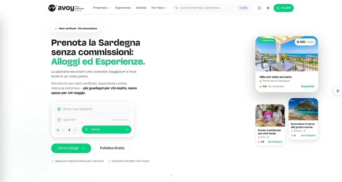
We needed a Sardinian listing platform that highlighted both stays and local experiences, giving owners visibility without punishing fees. With Avoy we have the right tool: fast, organised by category, and without crazy commissions strangling the business.
AVOY
In Sassari we wanted to position ourselves as the Longevity Wellness centre of reference, stepping out of the usual patterns. The new brand and the web platform literally jump off the screen, communicating pure innovation.
LOWE
With three wine shops on the Costa Smeralda we needed an online meeting point that did justice to our labels. Now whoever is looking for the right wine finds the way home straight away.
In Vino Veritas
Management software for restaurants and hospitality has to be concrete help between the tables, not an IT nuisance. This software turned our internal organisation around, cutting errors to zero and letting us work with a clear head.
hoopit
Before launching the app for our Pilates classes, between Porto Cervo and the digital side we lost hours coordinating chats and phone calls. Now our clients manage live and on-demand classes on their own, and we finally get to enjoy the work.
Flow Porto Cervo
Launching a sustainable streetwear e-commerce with print-on-demand was a complex bet. Now the shop runs perfectly, the graphics stand out at their best, and we can focus on creativity alone without the stress of warehouse stock.
Fionard
In our line of work roadside assistance allows no waiting, and the workshop has to be a byword for total reliability. Having such a direct digital point of reference lets customers find exactly the seriousness we put on the road every day.
CDA Servizi Auto
As a creative studio we were tired of having a sloppy image. We finally have a website and a portfolio worthy of our capabilities, which speak plainly to anyone who means business.
Wonder Creators
Companies we've worked with.





- Your Charter
- Estetica Valeria
- Fondazione di Sardegna
- Avoy
- Fionard
- racconta.si
- Cantine Antigori
- Tenuta Stalder Guiso
- Nanumoru
- Hopfenberg
- Versilia Weimar
- Sa Republica Sarda
- Sud Delivery
- Impresa Restaura
- Green Tech
- Studio Legale Senis
- Avvocato Zuddas
- Manufatti Vinci
- Viapixel
- Tecnicoffee
- Saditappo
- Academia de su Sardu
- Agenzia Labix
- Been Energia
- Il Redentore
- Studio Foto Immagine
- CDA
- Osua
- Punta Falcone Resort
- 5 Star Mooring
- IVV
Frequently asked.
A label starts from 250 €. From there the work grows with the products and formats in the range. Printing is paid to the printer, on quotes you see first. Our quote is written and free: after a call, or from the configurator at /en/quote/ with product, formats and print runs.
The design takes 2-4 weeks across brief, concepts, development and artwork; printing adds 1-2 depending on printer, paper and finishes. If there is a deadline, such as the harvest or a trade fair, it goes into the plan from day one.
On top of the long-standing information, wine produced from 8 December 2023 needs an ingredients list and a nutrition declaration: at least the energy value and the allergens stay on the bottle, the rest can sit on an electronic label reached through a QR code (EU Regulation 2021/2117). You define the content with your oenologist or consultant; we set it on the page, legible.
Yes, if you like: we ask printers for quotes, follow the colour proof and check the first print run. If you already have a printer, we prepare the artwork to their specifications and talk to them directly.
Yes. The concepts arrive mounted on the real format in a document you look at in your own time, the colour proof is sent to you or to your printer, and revisions are made in writing. We work this way with wineries and producers all over Italy.
Labels
A label has three seconds to get chosen. We design so that three are enough.
The price goes up with the products, the formats, the finishes and the brand mark, if it needs redoing. You pay the printer for the printing, after seeing the quotes and with no hidden mark-ups.
WHAT'S INCLUDED
- Front label, back label and neck label
- Range system for several products
- Versions for export markets
- Print-ready files for the printer
- Mockup on the real format and colour proof
- Check on the first print run